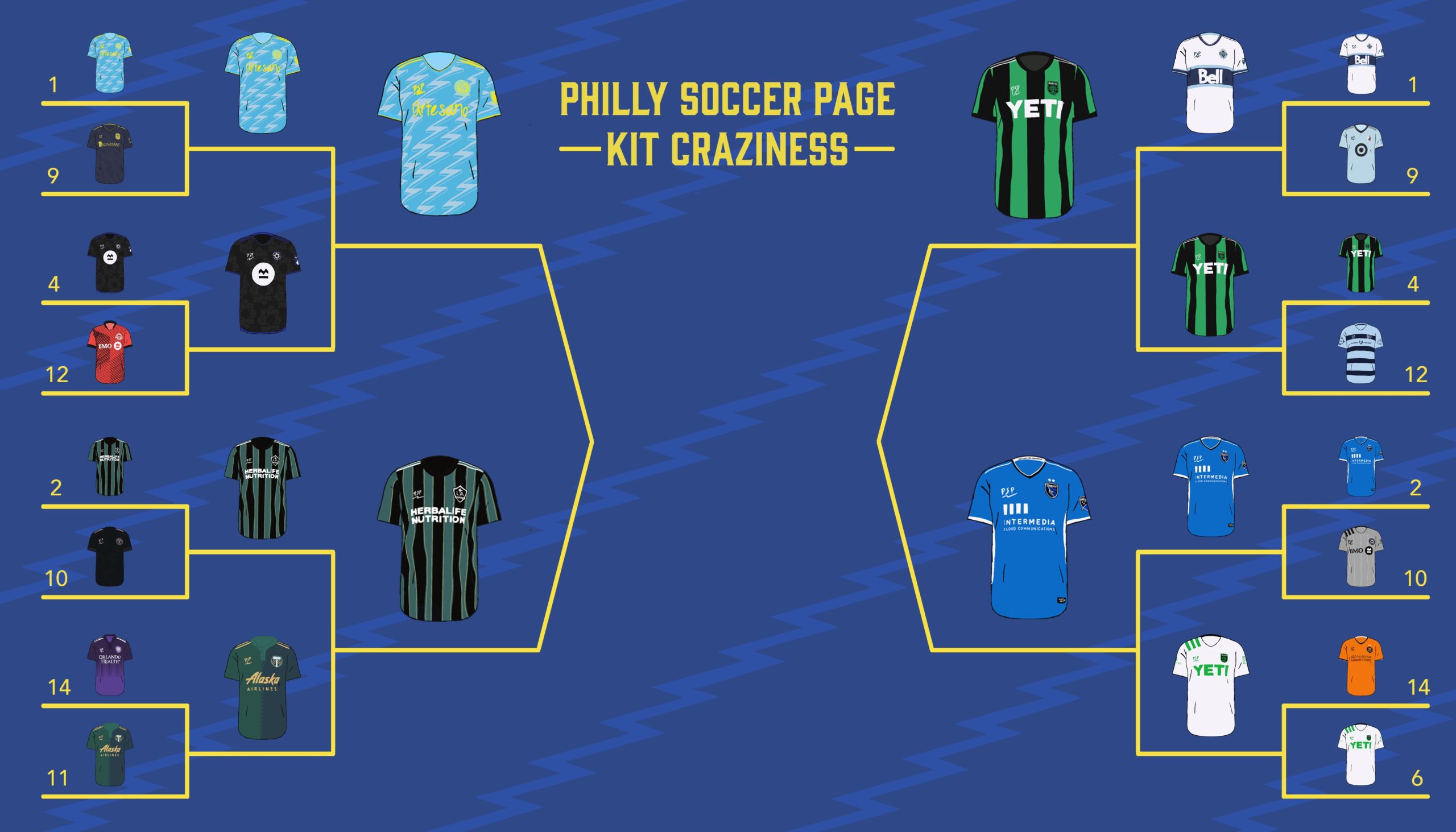
And then there were four. This week kicks off the inaugural Final Four for PSP’s Kit Craziness. It’s been a fun ride with upsets, blowouts, ties, and controversy, but in the end it all comes down to this. The final four kits. Before we get to the final matchups, let’s take a quick look at the last round of results.
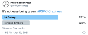
Los Angeles grabs a rightfully lopsided win over Portland, cementing their well-deserved spot in the Final Four.

In one of the two closer matchups, Austin FC’s primary pulls the upset over the top seeded Vancouver kit. Can’t say this one makes total sense to me, but I digress.
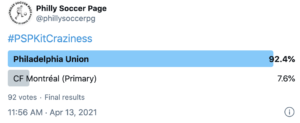
Blowout. Is there any surprise?
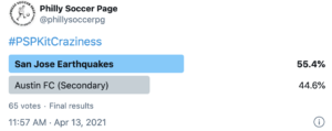
The other close matchup of the Elite Eight. San Jose squeezes by the Austin FC’s away shirt which made an admirable run, despite being nothing more than a white shirt.
Onto the Final Four.
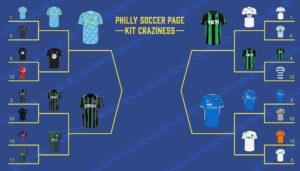
Thomas Hill: Sometimes the storylines write themselves. The right side of the bracket features a match-up between one of the oldest teams in the league and the newest. The kits reflect the history nicely here, with the Quakes opting for a 2002 inspired throwback while Austin obviously sports a design new to the league.
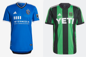
San Jose’s home shirt is an excellent example of how to do “clean.” It skips out on the trend of busy, sublimated designs and instead focuses on distinct, coherent elements that accentuate the simplicity. While invisible when viewed head-on, the Quakes shirt features two blocky white stripes on either side of the kit that are smartly accented by black and serve as a nod to the cup-winning 2002 design. These side panels take what would be a generic Adidas template and elevate it to a thoughtful, meaningful, and clean design for a club that deserves to have its history celebrated. Speaking of templates…
Austin FC enters their inaugural season with a shirt that could’ve been found in the teamwear section of their site just a year ago… and it works. It’s not often that a team can take a generic template and turn it into something special, but Austin’s done just that. Their “Verde” shade of green works in perfect harmony with the black, and the vertical stripes create great visual unity with the roots seen in their badge. While Austin is the second team in recent memory to debut in a vertically striped home shirt, the parallels to the badge make it a bit more meaningful than Atlanta and sets the club up nicely for a solid visual brand for seasons to come.
Chris Gibbons: When top seeds end up in the semifinals, fans are often disappointed: no upsets, no Cinderellas, and no drama. The thing is when the best teams make it the furthest, that usually means the best games at the end. This match-up is “Best in Class” in every way.
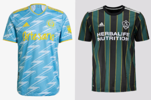
LA Galaxy has a history no other club can match. Five time champs and four time runners up and the home of the league’s three most visible players: Landon Donovan, David Beckham, and Zlatan Ibrahimovic. More than a decade ago, their rebrand ushered in a Real Madrid-esque palette, one that lent itself to only narrow opportunities for creativity. This shirt breaks that mold and harkens back to earlier days, a script that often results in interest and profits.
Philadelphia brass saw the writing on the wall with this jersey, too: no more white templates! That they brought in fans to help make sure this happened was unique, and the result is an all-timer in the league at a moment when the team is also at its height. Should they wear this shirt while lifting a trophy, it would simply cement the legacy of a shirt that will forever be atop design rankings for the league.
Voting for the Final Four is live over on PSP’s twitter, and embedded links to each poll should be up soon after publication!

You know, I appreciate LA’s use of the club’s history and all that… but those colors are just ugly together. (And, watching them last weekend, it looked more like black than anything else on TV.)