
All photos courtesy Philadelphia Union
It came a bit later than many would have preferred, but fans finally know what the Philadelphia Union will be wearing on the road in 2023.
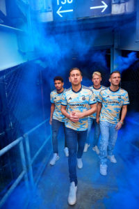
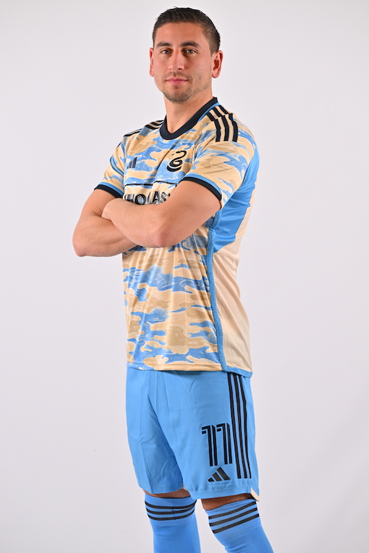
Debuting on Wednesday with a handful of other MLS shirts, the Philadelphia Union released the first images of their away shirt for the next two seasons, aptly dubbed the “For Philly” kit. The shirt is primarily gold, with a signal blue camo pattern across the front. Navy and signal blue accents complete the shirt, which swaps the primary Union badge for just the snake. “THOMAS’” (no relation) swaps in for Artesano as the new sponsor.
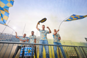
The away shirt replaces the secondary “By U” kit that the club debuted two seasons ago to international acclaim. While this year’s shirt may be a bit more controversial amongst supporters, it continues the newly established creative direction for the club that can only be described as bold.
The shirt is the third designed by the “Union Creative Collective”, a curated group of fans, media members, and employees who work together to compile the brief sent to Adidas that inspires the final design of the shirt.
Amongst those involved in the Creative Collective is none other than PSP’s own Chris Gibbons, who was kind enough to walk through the creative process behind this year’s shirt.
“We liked the idea of laying claim to something in addition to the center bib/sash that no one had done before, and camo was something many in the group liked.” said Chris, speaking on how the Collective settled on the general theme of the shirt. “The question we all had was whether or not the team/league did enough of that pattern on Military Appreciation Day pre-match tops and, frankly, whether we could be sure the league wouldn’t use our pattern on next year’s top too – rendering any uniqueness we might capture moot. In the end, we stuck to the idea but went back and forth between calling it camo or smoke. . . to settle the discourse, it’s both camo and smoke.
To combat the potential for the pattern to feel generic, Chris mentions that Doug Vosik, the club’s then-chief marketing officer, emphasized allowing the design to both be reminiscent of the many murals of Philadelphia and simultaneously hard to mimic. As a result, each jersey should have a slightly different pattern, a first for the Union.
In their press release the Union mention that the smoke/camo pattern pays homage to the 2019 season, and the Union’s first playoff win. “A watershed year for the Union, 2019 marked the first ever MLS Cup Playoff win in franchise history. The tagline of that season was ‘Philly or Nothing’ with a creative look featuring a camo pattern that mirrored the intensity with which the team approached all matches.”
Aside from the smoke pattern, perhaps the most standout part of the shirt is the lack of the full Union badge. Instead, only the snake emblazons the chest, helping to make the secondary shirt truly unique. “The minimalist snake badge is something adidas has been doing/thinking about with a select number of their clubs.” said Chris. “This is a second kit which, in MLS parlance, is meant to be different than the first, toward something other than the club’s primary identity.” Chris also mentions that a few other MLS will eschew their full badge for only a singular primary element.

The shirt features both signal blue and navy accents throughout, including signal blue side tape that features a snakeskin pattern, and two toned bias tape used for the three Adidas stripes on the shoulder. The result of the two toned tape is a hint of signal blue peeking through the dark navy. Chris mentions that the Creative Collective took inspiration from the inaugural 2010 home shirt that also incorporated small hits of signal blue throughout the shirt.
This year’s away shirt will be complemented by signal blue shorts and socks that feature navy branding. Speaking on other options, Chris said that while gold and navy shorts were considered, there were fears about the gold not matching the jersey perfectly, and navy failing to satisfy MLS’ light kit requirements.
While this year’s Union shirt is truly unique for the club, it has drawn some criticism for being too similar to Red Bull’s new shirt, which features a similar color palette. “We received very little guidance from Adidas and MLS – which is the same as the last two kits. Their role is to respond, first Adidas to the brief we created, and then MLS to confirm the competition guidelines. So seeing other teams go absolutely out of their lanes to make interesting kits this year is pure coincidence.”
Speaking of interesting kits, with shirts being designed two to three years in advance, Chris wasn’t adverse to giving a bit of a tease for what Union fans can expect heading into next year’s new home shirt. “The goal for any primary kit should be to augment the team’s primary brand. That’s what we strove for in the 2024 kit and the group is very pleased with how it looks.”
Great to hear, but I and so many other Union fans will now be falling asleep pondering the potential return of the center stripe, a central badge, and perhaps, just maybe the use of gold in a more pronounced manner. If Adidas and the Union can figure out how to avoid it looking tan that is…

First off kudos to the creative team for their time and effort. I will say my first impression was it looked like somebody accidentally spilled bleach on a set of last years jersey. My second impression was that it felt more like a military appreciation night warm up top than a soccer kit. Seeing it with the matching blue shorts and socks brings it together a bit more for me. And as always seeing anything other than bimbo across the chest is always nice.
Hats off to all who contributed. And Thomas, thanks for the article.
.
Gold… Tan… It looks like RSL figured out how to make it work!
Posted previously elsewhere, but for what it’s worth: Here is how I classify my feelings about kits: (1) “not my style”, (2) “like, but not enough to buy”, and (3) “I might actually buy that one.”
.
To-date, only one compelled me to actually buy was the black Bethlehem Steel tribute jersey.
.
My final opinion on this kit is on hold until it is seen in action on a match day.
Bring back the center stripe!!
.
We have been getting some really solid jerseys over the last few years. I am very happy that this is one of the top priorities for Tim McDermott. One of the things I appreciate about his tenure is that his team has put together a very sharp graphics package for the Union that hits much more than it misses.
.
But it’s all scattershot for the jersey design. Our last Center Stripe was in ’16 – The Snakeskin – one my favorite Union jerseys. Since then there has been no real design cohesiveness. They have all been sharp in their own right, but here’s the list from ’17-
’17 Navy arms
’18 Doop Hoops*
’19 Sun Burst
’20 Hiding Snake
’21 Lighting
’22 River Stripe
’23 Smoke Camo
.
(*they aren’t really hoops)
.
Each slides up and down our now 9 color palette (we started with Navy, Light Blue, Gold and White). Mind you the new colors have hit on each of these, no complaints there. All of our new colors slide perfectly into our identity, which is and should be fluid.
.
But visual identity needs more than colors. Individual identity can be tough to grasp sometimes, but the Union had that. The center stripe is rare, and it is something we can call our own in MLS.
.
I’m fine with playing around with new design concepts, but we still need to root ourselves to remind us who we are every now and then. I don’t think we need a center stripe every other jersey, but we need one now after a long time away from the ZO1O design. It’s too late to change anything for ’24 at this point right? But if we haven’t already gone back with next year’s design, now is the time to think about a ’25 Center Stripe.
btw It also makes me happy that we have a design council to get some fan insight into our designs. I’m never a big camo fan for jerseys (your team colors aren’t for hiding – it should be quite the opposite), but this is a solid design this year that will look good out on the field.
On the one hand I think its kind of cool that the cammo pattern isn’t uniform. On the other hand it’s that word, uniform. How can we have uniforms that aren’t uniform.
It looks like Southern California, NOT Philly.
These kits are absolute dog shit. Just atrocious. These are up there with the ‘13 road kits as the worst in their (short) history.
It makes me think of the opening credits from the Simpsons. You can practically hear “The Union” instead of “The Simpsons” as the snake badge emerges from the clouds. Andrew Wiebe on the Extra Time podcast echoed that impression when they discussed the new kits on Thursday’s episode.
.
I feel for this kit like I did for the lightning kit and that one grew on me to the point where I wished I had bought one. I’m gonna get one and hope I enjoy DOOPing in it for the next two years.
Meh.
I like it. Not as much as the previous road kit, but it is far better than the road shirts from the team’s early seasons. For me the Light Blue For U kit is tops, then Bethlehem Steel, and the sunburst, then this one.
.
I get the calls for a center stripe return. I do. I’m not a fan of the center stripe. IMO, the Union’s color palette combined with Adidas’ templates…..it just doesn’t work. Maybe if MLS switches kit makers to Nike it could work, It’s very limiting. Honestly, it’s why they’ve moved away from it. So they could get more creative.
This 100%. If you see what Nike can do with gold, navy, light blue and white it really does make you wonder. I am looking at you PUMAS UNAM which is similar to the Union’s exact color palette. AIK Stockholm also has some amazing kits from Nike in this palette.
Based on the Union’s success with the lightning kits, they should just switch their palette to the Flag colors. Easier to reproduce with Adidas.