Feature photo: Marjorie Elzey
Well, two weeks have gone by since the last Change Strip, and in that time period five new World Cup shirts have seen the glorious light of day.
Of course, none of these shirts have been officially released. But that matters not, as all five are undoubtedly the genuine artifact, and waiting for the official release would only deprive us of talking about them for as long as we can before the tournament.
ALL THREE POINTS
ENGLAND WORLD CUP LEAK
Oh boy, here we go.
In an unofficial, official opening to World Cup leak season, last week both 2022 England shirts were leaked for all to see.
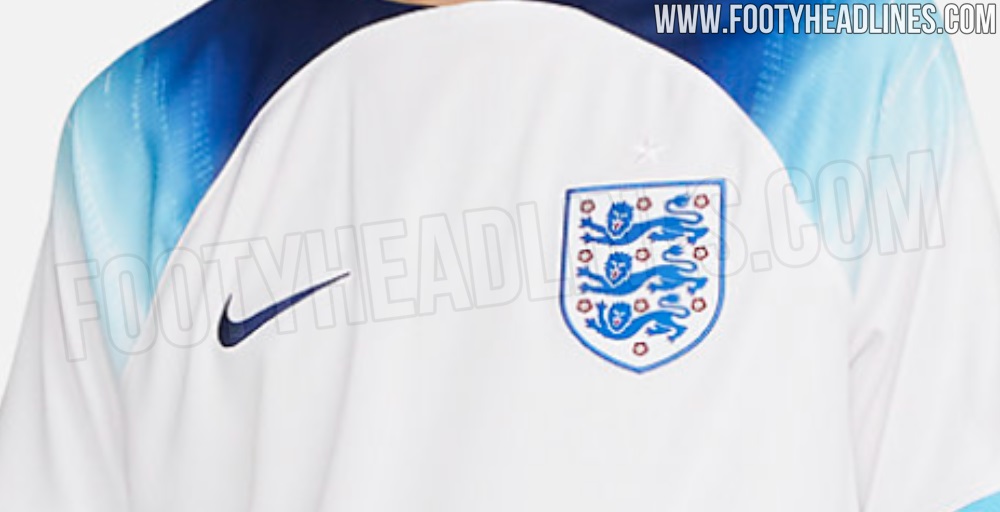

(Image courtesy of FootyHeadlines)
Starting with the shirt leaked first, England’s home shirt is primarily white, with two shade of blue (“Void” and “Fury” officially) accenting the shirt. Using the same template that Nike’s favored for most of their top shirts this year, the body of the shirt rises to the top of the collar, before sloping downwards in a raglan fashion. Accenting the sleeves is a gradient of the two blues, that flows off the shoulders onto white sleeves. The cuffs of shirt are accented in bands of both blues.

(Image courtesy of FootyHeadlines)
While the shirt appears to take no direct inspiration from England shirts of old, it is a bit reminiscent of England’s 1990 number, albeit with a modern twist. While some may find the gradient a bit too modern, the integration of the light blue certainly helps to make the shirt feel a bit more English than perhaps the plain white numbers of 2010, 2014, and 2018.

(Image courtesy of FootyHeadlines)
On the other end of the spectrum, the Away shirt is Immediately recognizable as a near copy of the 1990 away shirt produced by Umbro. The design features a vibrant red base, a navy collar accented with blue stripes, and in a twist on the original design, a color swapped badge that sees England trade their traditional colors for light blue and navy.

(Image courtesy of FootyHeadlines)
If the home shirt is destined to be controversial, the away is destined to be an all-timer. The bold mix of traditional styling and modern changes elevates the shirt from instantly recognizable, to instant classic. Of course, how England perform may have some effect on that. But I suppose not all battles can be won before you step on the pitch. Both shirts are anticipated to be revealed in August.
FRANCE WORLD CUP LEAK
Sticking with the Nike theme, earlier today France had their away shirt leaked.

(Image courtesy of FootyHeadlines)
The shirt features an all white base and blue accents, a move that is entirely unsurprising for the country. What is surprising, though, is that the shirt features an all over graphic print of some of France’s most iconic symbols and moments. Included are historic landmarks, scenes of revolution, and floral accents reminiscent of Manet. A French flag appears to be sewn into the bottom hem of the shirt, but it’s not quite clear if the element will appear on the inside or outside of the shirt due to the angle of the leaked photo.
Unfortunately, there does not appear to be any Sebastian Le Toux imagery.

(Image courtesy of FootyHeadlines)
Joking aside, the shirt is a bold move for Les Bleus, who in the past have stuck to rather traditional all white designs. While your opinion of the shirt will likely come down to how you feel about more “graphic” jerseys, it is interesting to see that Nike is more than capable of printing more complicated graphics on this template, the same seen in England’s away shirt. While England and others see their designs cut off at the intersection of sleeve and body, France’s shirt continues the design, an interesting note for those who feared Nike’s roster of shirts may be overly template based.
SPAIN WORLD CUP LEAK
Yesterday, two Spanish FIFA streamers unveiled the Spanish World Cup shirts. It’s not entirely clear if the even was planned by the national team or not, but the shirts are genuine according to reliable sources, despite the federation not yet unveiling them.

(Image courtesy of FootyHeadlines)
On the simplistic side of things, Spain’s home shirt features a red base, no obvious pattern, and the traditional blue and yellow colors used as accents. The only real element of note is the collar that sees the Spanish flag replicated with bands of red and yellow on a navy base.
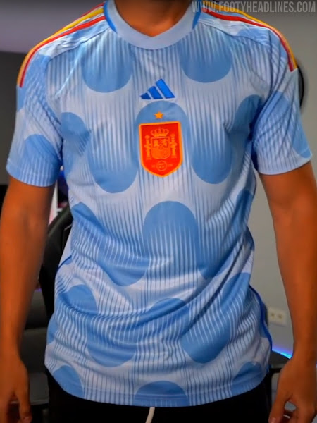

(Images courtesy of FootyHeadlines)
On the other side of things however, Spain’s away strip really is something. Primarily light blue, the shirt features a rather globular pattern of large spheres apparently sliding down (and up?) the shirt. It’s a bit unlike anything we’ve seen before, and it’s a bit more reminiscent of modern art than it is football. The shirt features a blue, centrally placed Adidas logo, and alternating red and yellow shoulder stripes. While experimenting with design and color is usually to be applauded, Adidas and Spain may have gone a bit too far for most peoples tastes with this one.
FROM THE ARCHIVES
There’s Spain’s rather unique 2022 away shirt, and then there’s Mexico’s from 1994.

(Image courtesy of Museum of Jerseys)
There’s nothing to say here but wow. The Umbro mark is illegible, the crest blends in to the design, the numbers look like they were ripped off of a stock car, and overall the shirt has the general aesthetic of a white polo you wore to free Slurpee day at 7/11 right after your best friend threw up on you. Sorry Mexico.
EXTRA TIME
Usually this is where I take a break from soccer to talk about something else but this has been driving me up a wall for months.
The U.S. World Cup kits have NOT leaked.
Yes, there is a photo floating around that shows two alleged strips for the Stars and Stripes, but the jerseys shown are from a knockoff kit manufacturer who jumped the gun trying to turn a profit and replicated renderings from Footyheadlines.
The renders were made with the explicit purpose of showing off potential Nike Swoosh placement, and have nothing to do with the overall design of the shirts.
Here’s hoping the real things are better.

Good news on that USMNT jersey leak – those are lame
I’m very much against a gradient.
–
I think that I’m in favor of the France kit, but don’t know for sure. I like the reach either way.