MLS contributor J. Sam Jones put together a list of the best kits in the league from 2010 through 2019. Your Philadelphia Union’s Bethlehem Steel kit made the list, and it’s hard to argue with many of his choices.
Author’s note: Partiality to argyle is a defining characteristic of personal style.
There are probably 10 other kits that should have made this list, which is saying something considering how many lazy and unimaginative kits there have been over the past decade..
The good folks at The Philly Soccer Page considered a similar article, but decided instead that one “best of” article for the decade was sufficient. However, in a world where there is a Yin, there is also a Yang.
Now introducing a curated selection of the Worst Kits in Major League Soccer, from 2010 through 2019.
FC Cincinnati – 2019
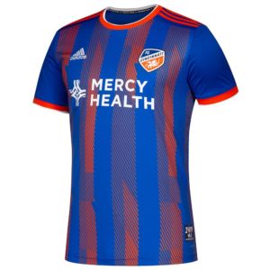
The 2019 debutantes don’t make this list because of style, per se.
The jersey isn’t bad, though it pales in comparison to the kind of world-beating freshness they left in the lower division, here and here. Cincinnati makes this list because these are replica jerseys, required because Adidas didn’t have enough lead time to create authentic kits for the team or their fans.
Read that again.
A professional American sports team played an entire season in replica jerseys. That alone is enough to qualify this shirt for a “worst of” list.
Colorado Rapids – 2013
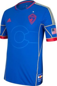
This one is SO close to being great.
When the primary kit was released the very same year, subtle stripes on the shirt listed the names of every season ticket holder. That was a decision both unique and engaging, like when the Union offered to put season ticket holding fan’s pictures on the numbers of kits.
To match such creativity was going to be difficult, and this shirt failed because it tried too hard to do so.
This blue is unique in the league and the subtle “C” representing the Colorado flag is nice. However, there are three accent colors, from red to yellow to white (the color of the player numbers and the eventual shirt sponsor). They’re the remaining colors of the state flag, but they’re also enough to make the whole thing busy.
Columbus Crew – 2016, “For Columbus”
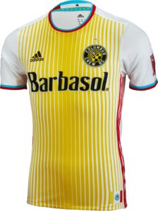
Among the sins committed by Anthony Precourt during his tenure as owner of the Crew was a rebranding of the team.
In addition to changing the side’s logo (as polarizing as it may have been), he moved the team away from their classic BVB-style yellow to this yellow striped monstrosity, one that was paired with light blue shorts and white socks. No, the changes aren’t quite as offensive as what was done to Leeds United, but considering how Columbus went out of the 2015 MLS Cup final, this was simply more insult to already ever-lasting injury.
But, read the press release for this kit, and more importantly stick around for the comments at the bottom.
DC United – 2015
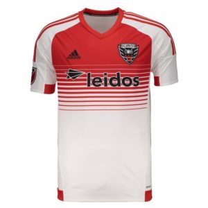
There’s something to the argument that succesful a shirt has to look good in person and on television. It’s part of Union fan’s gripe about the Doop Hoops kit: great idea, poor execution.
This DC United entry isn’t awful up close, a play on the striped kits of the team’s origin. On the broadcast however, this bleeding red neck line looked a lot like the throats of each of the team’s players had been slit.
As an aside, on the league’s website announcing the jersey, a fan actually wrote “Being such a successful club I would have preferred the second kit to be all white…some traditions should not be altered. Consider this to be the third kit(it’s not great).”
There’s always somebody.
Speaking of all-white kits, though..
Minnesota United – 2019, “Drift”
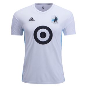
Perhaps epitomizing the disdain of league supporter’s united against “clean” (aka “all white”) jerseys, Minnesota United got rid of a bad white kit for this: an even worse ALL white kit.
Considering the team’s classic kit from the year before they were “promoted” to MLS, this one hurts even more.
For what it’s worth, any number of all-white kits could have been included (because there were 12 all-white entries in just 2019, including 3 or 4 more that are essentially all white) but Minnesota made the grade because they had a brilliant kit, have a world-class stadium, but still look like they’re playing in a Hanes undershirt half the time.
San Jose Earthquakes – 2014, “40th Anniversary”
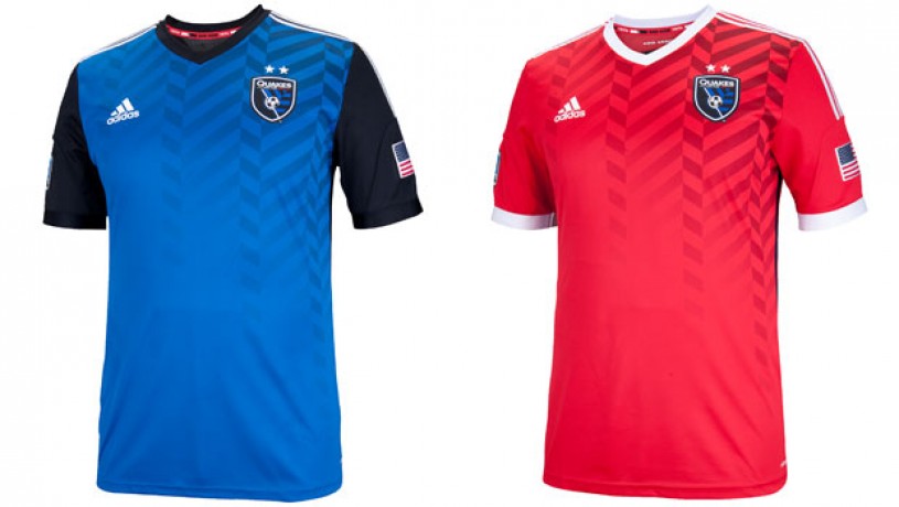
San Jose rebranded their club mid-decade too, going from a totally forgettable and generic brand to a somehow even more forgettable and generic brand. That no company wanted to put its name on the front of these shirts for nearly 2 years says something about the overall impact of the process.
The Quakes are one of the few American clubs to claim legitimate history over multiple decades and leagues, including the first goal in MLS history in these absolutely atrocities/beautiful kits. And yet, despite it being the country’s 10th largest city, most Americans probably couldn’t find San Jose on a map.
These kits didn’t help.
Seattle Sounders – 2010 “Electricity Kit”
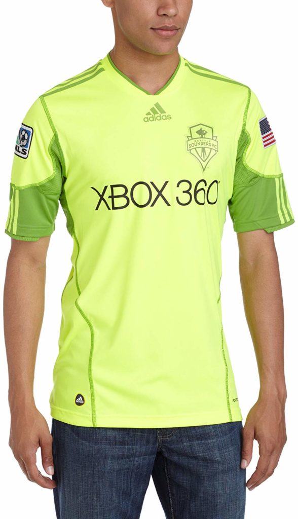
If your eyes are burning, then it’s a Seattle Sounders alternate kit.
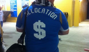
Back in the day of 3rd and even 4th kits, teams could get creative on jerseys they might only play in for cup matches. The Union’s Bethlehem Steel shirt is a good example, worn in the Open Cup and only several times in the league. This was fun for fans but clearly a money-loser for clubs since the practice was ended outright shortly after the Union’s black strip became legendary.
Instead, clubs in the league now get 2 kits and a handful of standardized warm ups they can add their logo and branding to.
For the record, the author actually loves this shirt and realizes that he can be occasionally be wrong.
Just ask his wife.
Sporting Kansas City
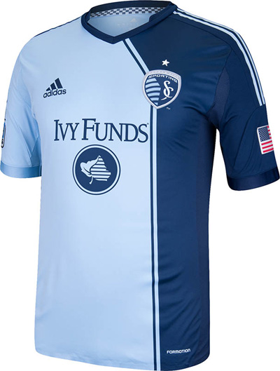
Speaking of the author’s household, this shirt is known as “the one that looked like a figure skater’s outfit” at home.
By far the worst kit from the kind folks in Missouri, a place known in MLS circles as quite fashion-forward, this one is at least a departure from the boredom that came after the team’s removal of “Wizards” from their brand.
In the press release, the clubs mentions that this is the only Adidas shirt in the world with different colored shoulder stripes. Like the movie “Garden State” taught us, just because no one has done something before doesn’t mean it’s necessarily special.
Summary
Given the leaks of kits that will be coming in 2020, it’s safe to assume at least one or two of these “faux backs” to come will ultimately be a flop.
There will be room for those gems on this list of course, and we’re curious to hear your most and least favorites.

Carbon copy Adidas kits are the worst thing to happen to this league since Garber Bucks. It’s bush league stuff. My CASA league has more kit individuality.
Made even worse by mandating Dark and White for home & away.
With the caveat that I know the design wasn’t the reason you picked Cincinnati, I have to say the Cincinnati, Colorado, Columbus, and Seattle shirts in this post are more interesting (and in my opinion better) many of the union shirts in the last 10 years. to me the number one sin of a soccer jersey is to be boring and unremarkable.
First I’m kicking myself for not buying the black union alternate from 2013. Second, I think our original all gold kits are a candidate to be among the worst ever.
ALL NUDES!!! That was a look!
.
The Colorado one was so damn close to being cool. It’s like they ran out of time. I actually like the SKC one, I think the line is supposed to represent the KS/MO stateline.
We need clubs to get their own kit sponsors man……the Union should rock Puma! Imagine how fresh a Union kit by Puma would look with our club colors…..
I’m sorry, but the Crew’s “Taxi” (bright yellow with black checker-board on the side) needs to be on this list.
.
Or the whole list.
Sporting KC is in Kansas, not Missouri.
This post badly in need of a Google of the jerseys in the 90s. The baggy, wildly colored ‘96 Clash, MetroStars, & Galaxy shirts with a ripped down the middle look. The Revs with blue and white slashes nodding to the ‘94 USA jerseys.
Dude, thank God the 2000’s brought form fitting kits……..what the hell was with that baggy look of the mid 90’s? Hey you guys are all fit as hell, so let’s cover it all up with baggy kits that are easy to grab hold of for the opposition…..
Had to do with materials at the time. Did not have the same level of stretch and breathability back then, hence looser fitting was the way to go
Go sports!