Photo: Paul Rudderow
Being a sports fan takes many forms. There is of course the sport itself; taking part either as a player, a coach, a referee, or simply a spectator is inherent in being a sports fan. But there’s also the material side of things. Whether it’s a favorite pair of cleats, or a lucky jersey, every sports fan winds up with some sort of physical object as a result of their fandom. Often times multiple objects.
The most visible of those objects are wearables. Jerseys are the obvious wearable fan objects, and soccer is unquestionably in the running for best jerseys in the world. But in America the hat is the prefered way to show your support. It’s convenient, rarely needs to be washed, and serves functional purposes too. So whether you’re on the way to the stadium, watching the game at a friend’s house, or just doing yard work, you probably have a hat that you wear from your favorite team.
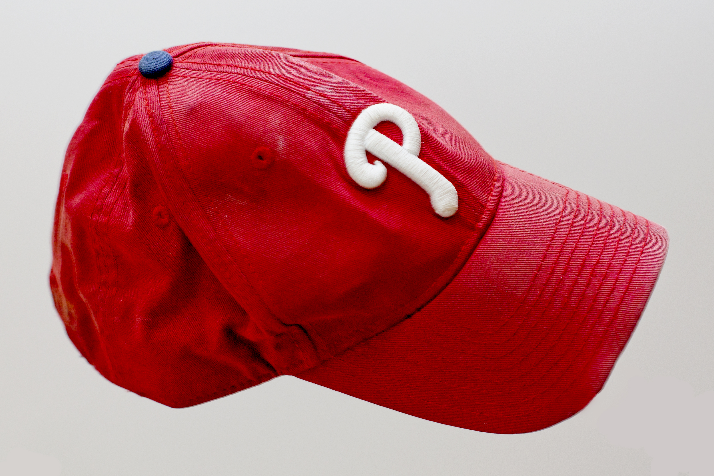
Baseball leads the way on this front, and you’d be hard pressed to find a public place anywhere in the vicinity of Philadelphia without at least one Phillies cap represented. And it’s easy to see why. Since they’re designed as part of the uniform, helping spectators identify the teams from the stands, baseball caps follow a reliably pleasing design language. Bold, primary colors and simple, easy to interpret logos. Even though it’s still a red cap with a white logo, you would never confuse the Phillies cap below for a Cincinnati Reds, or St. Louis Cardinals cap. Despite their similarity, the simplicity of their designs makes it immediately apparent that they are representing different things.
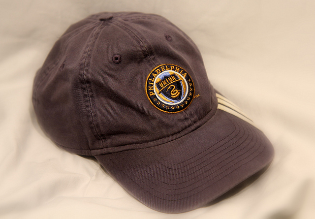
Now before you start to worry that I’ve forgotten that this is the Philly Soccer Page, let’s consider the hat offerings of our local MLS side. Below you can see a Union hat by adidas. How can you tell it’s adidas? Because there are three stripes on the brim. Heaven forbid adidas make a thing without putting three stripes on it. The Union crest, formerly front and center on every Union jersey, feels cramped and compressed on the real estate a hat provides. The detail and interest of the crest just doesn’t translate well to the scale required for a hat. So not only do you lose part of what makes soccer iconography interesting, but you also lose distinction. At a distance, this hat could just as easily be from NYCFC, or even Sporting Kansas City. Or even your local HVAC Contractor.

But the real shame here is that’s actually pretty good, as soccer hats go. Check out this lapel pin of a logo, or this overly-busy horror show. That’s the competition. So while the pictured adidas hat may not perfectly meet the aesthetics we expect of our hats, at least it doesn’t look like the kind of thing a distant relative buys for you at Christmas because they heard you like that soccer thing.
And that is where the problem really starts for soccer in America. Because baseball and, to a lesser extent, football and basketball get free marketing on their fans’ foreheads every time they put on a hat. People see those teams represented, and it changes their perception of the team and the person wearing the hat. It can start conversations, and it builds the community around a team that’s such a valuable part of being a sports fan. But soccer doesn’t get that visibility because our hats are all bad. We don’t start the conversations, and we’re not building a community outside of soccer-specific events, or the occasions where we’re able or willing to wear a jersey. Partially that is because of the difficulty in translating soccer’s aesthetic to a hat, and partially because most of the designs are slightly embarrassing.
Of course it’s a bit of a chicken and an egg problem. Are the hats bad because there are too few fans to make designing good hats worth while? Or are there too few fans because the hats are so bad? Obviously the first one is the more realistic problem. But solving soccer’s hat problem is going to be a part of what moves the sport from “niche success” to “mainstream”.

I have that hat! Ran it into the ground. None since have compared.
1000%. Bought a fitted one late first or early second season. Still have it and wear it. It’s hanging on by a thread. Have not found one even remotely close to it. A shame too. I love a good hat. I totally agree with this article. Well done!
Hi Jim – I kinda like the union hat – it has that old hat look. If you want to send me a hat I’d be more than glad to wear it around and test your theory on number of soccer fans being related to soccer hats worn in public (hey – it was worth a shot)
My 3 stripe-less Adidas Union hat arrived shortly after the new year along with my Adidas 3 stripe-less Flyers hat. The new Union hat has a slightly raised Union shield on the crest, and is basically the same as the one pictured, less the 3 stripes as I said. So Adidas do make things without 3 stripes. 😉
Love the take, Jim. Well worth thinking about.
–
The design mistake is crushing the whole badge onto the hat. Remember when LAFC’s logo took off a bit? A lot of that had to do with the fact that it looked good on a hat. Even Justin Beiber was sporting the winged “LA” logo of the club.
–
I think Philly has a good logo in the snake. If I were designing a hat, I’d focus on that. I’m thinking of similar hats I’ve seen of the Spurs’ cockerel or Liverpool’s Liverbird in silhouette on a hat front. It looks great.
–
Spurs: https://images-na.ssl-images-amazon.com/images/I/51FVq7IzLlL._SX425_.jpg
I bought a cap the first sunny game at PPL (way back when). It had a pre-weathered look about it but it’s authentically weathered by now.
.
I’d like another few but none have spoken to me. I bought the first out of necessity and don’t quite love it. I really want a lightweight golf-style adjustable cap and maybe grey-scale beanie.
.
As I typed that I remembered I had a two-tone blue tiger-stripe (?) beanie. Someone got it for me as a gift but I’ve never seen anyone else with it (probably because it’s hideous).
.
Unfortunately the powers at be just don’t spit out endless headwear styles for soccer enthusiasts. This a funny piece, Jim. Thanks.
We have scarves. Which I see more and more other sports copying.
I am working on a scarf article, which may or may not see the light of day. BUT regardless- scarves don’t have the cultural resource of hats, jerseys, or even jackets. They’re not a thing that says “sports fan” to most Americans, so I don’t think they do the marketing work I see other wearables doing.
I think it is changing. Case in point. I happened to surf by the Clemson v Alabama gridiron game for a second this weekend. I was struck by how many Clemson and Tide fans were wearing school scarfs. I don’t think that was a “thing” to that degree 5-10 years ago. Could be wrong since I haven’t followed American college sports for at least 25 years.
If top tips of the stars aren’t pointing toward the center of the badge, it’s a cheap looking hack. I reject those.
Totally agree. Why cant 47 brand make a proper baseball-style Union hat? The offset Phillies ‘P’ looks great. Why not an offset Union ‘snake’ or ‘U’ in white with a navy blue back? Union being Union i guess.
Hell, its been 10 years and still no viable option for a cap or heaven’s forbid a player t-shirt that doesn’t look awful.
I would buy a quality snake hat in an instant.
I have a few hats but my college bound son usually steals them and returns them when “too dirty”. So I usually go for a Jersey! My go to is the red, white and blue with matching Bimbo logo. It’s a good look!
Dude, there’s options, just sayin’
https://www.mlsstore.com/philadelphia-union/men-hats/t-36014702+ga-67+d-58777513+z-8-1087793484
Three out of every four of those options are thoughtless shite.
i’ve more than a couple Union hats. two of my favorites are the “B” during the Steel kit days and the lone snake (similar to the one in swatjdm’s link). Jim’s got a point on the crest shrinkage. simplification helps.
one i don’t have that i like: https://www.mlsstore.com/mens-philadelphia-union-new-era-navy-20th-anniversary-snapback-adjustable-hat/p-46122382709475+z-9320-1365714361
Maybe just the badge, with The Snake & Union on the front, and Philadelphia on the back would work…
The best thing about any philly union hat is at least I don’t have to explain to anyone why I am wearing something with BIMBO boldly displayed for all to see