All images courtesy Philadelphia Union
Fifteen years after the Union debuted its inaugural jersey with that iconic center stripe, it’s finally back! It’s only been seven years since the club’s jersey last featured the iconic design, but it felt like forever.
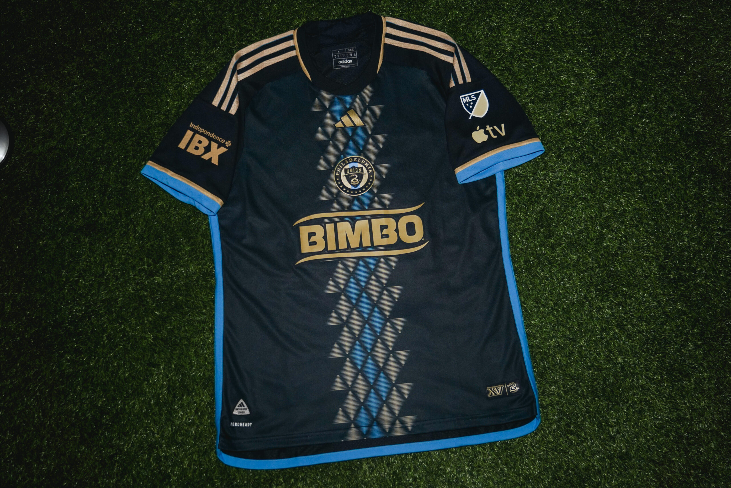
Dubbed the “XV” kit, the shirt features a navy base adorned with gold and signal blue diamonds and triangles that make up a central stripe down the front of the shirt. Signal blue and gold branding adorn the rest of the shirt, with signal blue chosen as the accent color for the piping that frames the sides and bottom of the shirt. An “XV” and snake jock tag sits at the bottom right of the shirt, which also displays a lightning bolt at the back of the neck.
“Union fans have been awaiting the return of the center stripe for many years,” said Union senior creative director Shaun Kreider in a statement released to the press.

“Awaiting” is a bit of an understatement, with fans clamoring for a return to the stripe ever since its 2018 disappearance in favor of “Doop Hoops.” However, new directions for the home kit were favored internally, as the general sentiment from within the Union was that not enough had been done to differentiate home kits over the club’s first few seasons and that different designs would drive sales.
While the delay was undoubtedly frustrating for some, it was worth the wait. The “XV” kit takes a classic formula and elevates it to a point of being unique and also in vogue.
It’s the perfect fauxback that doesn’t feel like it’s trying to be a fauxback. Moreover, the new design embodies the zeitgeist of the modern soccer aesthetic, but with a timeless quality, all while feeling like a Union jersey. Sure, the word “feel” may be a bit vague, but so is team identity at times. If a shirt appears as if it could reasonably be a part of a team’s wardrobe, that’s a fantastic start and more than half of the battle.

The other part of the battle, though, is the meaning behind the shirt. The tangible aspects of team history and identity that get woven into the design to add purpose, and unfortunately that’s where this Union shirt falls just a bit flat.
“The shapes that create the central design mimic the Union’s typical on-field formation and the kinetic jagged band could be interpreted as snake, river, or lightning bolt, all symbols that have been part of the Union’s branding and story,” reads the press release provided by the club.
It’s fine to point out that there are some inadvertent details that feel like they could be related to the club, but it doesn’t feel very intentional, and it reads as more of an afterthought than some stroke of storytelling genius. Another part of the press release that feels just a bit tacked on is the mention of X’s and V’s created by the “negative space” within the stripe. Sure, that isn’t false, but it definitely reads more as a happy accident than a truly thought out part of the design.
One particularly positive part of the press release that stood out was mention of their original source of inspiration, the iconic Commodore Barry Bridge.
“Originally inspired by the trusses of the Commodore Barry bridge that serves as a backdrop to Subaru Park, the XV jersey symbolizes a bridge from the past to the present and the Union’s commitment to bridging the gap between fans and their team with countless initiatives like the Union Creative Collective, who’s input brought this kit to life,” the Union’s press release stated.

The bridge deserves to be the actual focal point as a source of inspiration as it is a unique piece of Union identity. The inspiration from the bridge’s trusses becomes immediately apparent knowing this detail. Leaning more into the bridge identity, with perhaps a bridge jock tag or some other piece of acknowledgement, may have gone a long way in elevating what is one of the Union’s best home jerseys into a league-wide all-timer.
However, it’s important to remember that Adidas and Major League Soccer ultimately control these designs. The Union’s in-house creative team is responsible only for compiling the incredibly restrictive and limiting brief sent to Adidas. Only a handful of official meetings occur between clubs and Adidas, and the club must choose between two designs given to them by the brand.
The Union has unlocked the key to routinely turning these limitations into stand-out kits that expand upon both the brand and story of the club. It is truly awe-inspiring and should be applauded wholeheartedly, as should the return of their center stripe.

I honestly think it’s great, best union kit since the lightning bolts. The colors are great, the look is clean, and I really like the snake scales on the stripe. Miles better then the old home kit for me.
Nice write-up, Thomas.
–
I really like these kits. They did a nice job with the design.
–
The return of the middle stripe is a nice bit of nostalgia, yet a good riff on the middle stripe of old. The diamonds and what they, and the stripe in whole represents, is a pretty cool idea. Love that they intentionally leave that up to interpretation as well. It is art just as much as it is a kit!
–
Also, love the light blue being more prominent in the more recent kits. It plays off the gold and the darker blue so well.
–
There are a lot of sharp MLS kits this year, even more so than last year.