
Photo: Courtesy of FootyHeadlines
It’s a busy time in the world of football shirts. European clubs have wrapped up their season and are dropping new shirts left and right, American teams are slowly rolling out third shirts and special edition tops, and the world’s top women’s national teams are gearing up for the World Cup.
While the Women’s World Cup shirts are admittedly the most exciting new kit news out there, you’ll have to wait for PSP’s full breakdown of all 32 Nations Kit in a change-strip special. For now, let’s take a look at some of the more notable other news from the world of soccer jerseys.
All three points
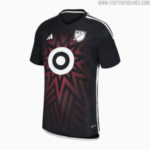
2023 MLS All-Star jersey
Tuesday, Major League Soccer unveiled the jersey for the 2023 MLS All-Star Game.
(Image courtesy of FootyHeadlines)
Keeping with recent All-Star game tradition, the 2023 shirt is a darker, rather simplistic design. White monochrome branding is complemented by a faded red starburst pattern centered on the chest. The design allegedly pays homage to the three stars of D.C.’s flag, however, the gradient fade of the pattern makes it nearly impossible to tell exactly how many stars there are, and the shape hardly resembles the flag’s classic five-pointed stars.
https://twitter.com/brfootball/status/1673720633148973057
The jersey feels like a bit of a step back after two stronger numbers the previous two years, which emphasized understated designs that still felt emblematic of the highlight event. What makes the jerseys even more confusing is that the rest of the league’s on-field All-Star apparel appears to carry the Marvel brand, and be a part of a larger league-wide collaboration with the entertainment giant. Overall the shirt feels like an incoherent miss in the grand scheme of things, despite not being inherently bad on its own.
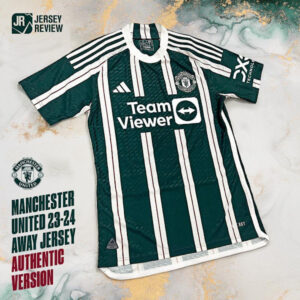
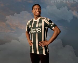
Manchester United away shirt leaks
It’s not often that clubs as historic as Manchester United experiment with totally new kit designs. However, that’s exactly what the club has decided to do for their 2023-24 away shirt, which leaked earlier in the week.
(Images courtesy of FootyHeadlines)
Comprised of a dark green base, along with white and red double stripes, the shirt’s a stark departure from United’s history of wearing white, blue, or black change strips. It’s a shirt that almost feels like it should be a throwback to something the club wore in the 80’s, but the closest the club comes to a similar jersey is in 1903 when they wore white and (much lighter) green stripes. Monochrome branding completes the look.
(Images courtesy of FootyHeadlines)
It’s a great effort from United, and elevating the design to the secondary shirt as opposed to a tertiary design means we’ll all be graced by its presence plenty in the upcoming European season.
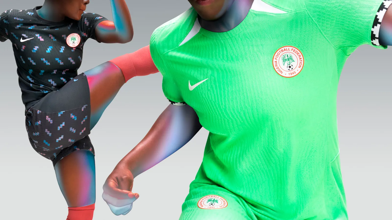
Nigeria Women’s World Cup
Sure, there was previous mention in this article of how Women’s World Cup talk would wait, but honestly, the Nigeria shirts are too good not to talk about.
(Images courtesy of Nike)
Both the home and away shirts simply ooze the overly modern design aesthetic that Nigeria’s national teams have become known for. While in the past Nigeria shirts have been overtly in your face and loud, this pair strips things back for a cleaner, more subtle take on the country’s unique football design aesthetic.
The home shirt’s aggressively bright shade of green is paired with white neck accents reminiscent of Nigeria’s 2002 shirts, along with black and white sleeve cuffs featuring a simple geometric tribal pattern.

(Images courtesy of Nike)
On the flip side, the away shirt raises the complexity a bit with a pattern “Inspired by Adire textiles,” an indigo-dyed cloth made in Southwest Nigeria by Yoruba women. The pattern sits on a base of dark green and is complemented by white branding and a full-colored Nigeria crest.
All around it’s another fantastic effort from Nike and Nigeria, and even if the kits aren’t for you, surely something in this year’s Nigeria/Nike range will be. It’s just that good.
From the Archives
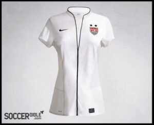
While we’re on the topic of Women’s World Cup jerseys, I just want to bring up the USA jerseys from 2011. Not to shame them (they should be shamed), but to point out how far we’ve come in designing for female athletes. No more ridiculous necklines, no more overly short sleeves or tapered waists. Just good, functional shirts.
(Image courtesy of Soccer Bible)
Extra Time
You weren’t getting through a jersey article on a Philly sports website without having the new Flyers jerseys brought up. They aren’t as bad as some may think, but what’s the point in unveiling totally new threads if you aren’t going to make any real changes?
https://twitter.com/NHLFlyers/status/1671251026186502144

How about those marvel cross over kits? Doesn’t do much for me though I’d take them over the splatter home US kits. Probably take them over the away US kits too…
I’ve seen rumors that the Americana ‘Captain America’ jersey might not be the only Marvel colab with MLS, have you seen anything else on this? I couldn’t tell if it will be training jerseys or full kits but it looks like there may be more coming down the pipeline?
Those SoCal Surfer ‘splatter’ kits have to go… the worst after the league recognized best lightenting kit last year.
—–
PS Man U jersey is stupid. Like the Yankees wearing green pinstries. Just foolish to ignore tradition for mo money, mo money, mo money.