Feature photo courtesy Philadelphia Union
On the brink of kickoff in Major League Soccer’s 2023 season, Thomas Hill and Chris Gibbons sit down together to review the league’s new set of kits.
Atlanta United FC – The 17’s
https://twitter.com/ATLUTD/status/1625887724430323716?s=20
Chris – Atlanta has laid claim to the Five Stripes moniker and one expects they’ll iterate on that forever in their primary kit. This one works for me because it’s balanced and simple.
Thomas – Simple and balanced just like Chris said. As much of a return to the classics as you can have after six seasons in the league, well done.
Austin FC – Las voces
Thomas – Some may say that opinions can’t be right or wrong, but if you think this shirt is anything other than stellar you’re most certainly incorrect. It’s like that one piece of modern art that’s simply too genius for anyone to understand
Chris – Yes, yes, a thousand times yes. Austin has done little wrong since entering the league a few years ago, and this shirt is on the “Right” list.
Charlotte FC – The crown jewel
https://twitter.com/CharlotteFC/status/1626016015648694273?s=20
Chris – This team should have been called Crown City FC or something similar in the first place. That they’re pulling in the city’s identity in this new kit is a plus, and the purple is beautiful.
Thomas – Seconded on the team missing on the name, and everything else said here. Though I have to wonder if the pink could’ve been swapped for blue or white.
Chicago Fire – A kit for all
Chris – Chicago has been a franchise in search of a brand for at least a decade. This kit certainly won’t end that search, but it’s a compelling effort nonetheless.
Thomas – Yeah, it’s good, but it doesn’t really scream FIRE. Here’s hoping we get a more brand-centric effort with their home shirt next year.
FC Cincinnati – River kit
Chris – I want more from this team. Will fans buy a new shirt because it has water across the front when the last kit – the one with the pinstripes – is better?
Thomas – Sometimes, like with pinstripes, subtly is key. A smart wave pattern may have been a bit better than slapping a river across the shirt and calling it a day.
Colorado Rapids – New day
https://twitter.com/ColoradoRapids/status/1625887731640410117?s=20
Thomas – If it wasn’t the best shirt in the league because of the design, it’s certainly the best shirt in the league for the message. As someone who’s struggled with mental health for a large part of my adult life, I know how difficult it can be to broach the subject, especially in the environment of sport. You aren’t alone, there are people there to help and listen, and there is a new day. The national suicide hotline is 998.
Chris – Everything Thomas said.
Columbus Crew – VeloCITY
Chris – Speaking of teams searching for who they are again, I respect the Crew’s decision to keep it simple and remain on brand. This kit doesn’t do it for me – especially in a sea of other black shirts – but I bet it’ll sell like crazy.
Thomas – I’ll disagree and say I’m a big fan. Columbus has been leaning into the whole geometry thing in the last several seasons and I think it works here as well as ever.
FC Dallas – Burn baby burn
Thomas – MLS has finally figured out how to do white kits, and Dallas is the leading example. It’s modern, pays homage to the clubs past, and to be frank, it just looks sick.
Chris – If Chicago’s misses the brand mark, Dallas certainly nails it. Another club without much cache nationally despite massive success on various dimensions, throwing back to a classic is a great decision.
DC United – The cherry blossom
https://twitter.com/dcunited/status/1626363403911548928?s=20
Chris – This is easily the most compelling United shirt in a long time. It’s still a miss because the flowers ought to be in your face – not as subtle or as iterative.
Thomas – It is weird that the flowers aren’t more prominent, but I’m glad they aren’t. Teams have a habit of overdoing designs like this and I’m stoked United kept it simple.
Houston Dynamo – El sol
https://twitter.com/HoustonDynamo/status/1625887494616088580?s=20
Thomas – It’s good, don’t get me wrong, but it’s not as good as it could’ve been. Sure the hexagons are trying to tie into the badge, but they just scream “soccer ball!” to me.
Chris – I like a good 8-bit design and this’ll do. Again, if the shirt is always going to be solidly orange, there’s only so much variation.
Sporting Kansas City – Hoops 4.0
Thomas – It’s fine. Don’t get me wrong, I love SKC’s identity, but their last few hoop shirts have felt just a bit off for some reason. I wish I could pin down exactly why, but nothing really stands out as obviously wrong.
Chris – I’ll tell you what was wrong: in the stripes 3.0, the spacing was off and made the whole thing seem unbalanced. This is certainly better and it seems like KC own the hoops now, for better or worse.
LA Galaxy – LA
https://twitter.com/LAGalaxy/status/1626416193346338816?s=20
Thomas – Few things have been better for the league’s visual identity as a whole than the Galaxy reclaiming their original colors of green, red, and yellow. It’s class pure and simple.
Chris – Amen. Like the Yankees winning or the Cowboys losing, the league needs the Galaxy to be something.
LAFC – Smokescreen
Thomas – It’s not the worst shirt in the world, but the marketing jargon makes me scratch my head. If the shirt is meant to pay homage to LAFC’s “iconic smoke-filled goal celebrations” why the hell is it green?
Chris – Last year’s LAFC kit was spectacular. This one isn’t.
Inter Miami – La noche
https://twitter.com/InterMiamiCF/status/1626613399927889922?s=20
Chris – Pink and black is as bold a color choice as exists in the league and Miami’s shirt will sell a bunch. There’s an authenticity that’s still missing, but that’s kind of the point for a team that purports to be a global brand isn’t it?
Thomas – No further notes, Chris summed up my opinions to a T.
Minnesota United – Northern lights
Thomas – I’ll say it if no one else will. It doesn’t do anything for me. I think it’s a great concept, but it feels like the design team stopped after the first draft.
Chris – I love this idea but am reluctant to get behind gradient designs. They’ll sell a bunch though and isn’t that the goal?
Nashville – The man in black
https://twitter.com/NashvilleSC/status/1626597467130302464?s=20
Chris – Another black kit, but with a much better story. Fans lament the sometimes silly stories that get told when kits get released, but in this case it makes all the difference.
Thomas – It’s good, and Chris makes great points. That said, you’d really expect Nashville to have had a loud shirt by now, not a handful of the most paired down kits in the league.
New England Revolution – Defiance
https://twitter.com/NERevolution/status/1625872733832679424?s=20
Chris – This shirt feels like it’s been out for a year because – well, it has. It’s good too, and looked great on the pitch in preseason.
Thomas – The Revs have finally found their identity, and this shirts hammered it home. One of the better looks in the league.
New York Red Bulls – Daniel Patrick
https://twitter.com/NewYorkRedBulls/status/1625873294212857859?s=20
Chris – I love bringing in a professional to help design the Community kit for a club that has no brand. Whether one thinks it’s a hit or miss is obviously subjective, but Red Bulls have the right idea: nothing they’ve done internally has moved the meter with their fans or the league.
Thomas – Seconded to everything Chris has said here. Soccer clubs have always been reflections of their communities and not much could be a better reflection of New York than a collaboration between a major brand and a high profile designer.
New York City FC – Interboro
https://twitter.com/NYCFC/status/1625872562436579332?s=20
Chris – City fans couldn’t believe the Union would release a lighting bolt kit in 2021 when they believed they owned the intellectual property to the idea of electricity because of their Third Rail group. Weirdly, now they’ve released what looks like a snakeskin kit to lay claim to that idea too. (Author’s note: I really like this shirt, but if this is going to be a rivalry,…)
Thomas – As an avid fan of public transit I love the concept. As a fan of design I hate the execution. If they’d left off the square tiles from the shoulders I think it would’ve been much better.
Orlando City – The wall
Chris – The problem with a consistent visual identity in a primary kit is it’s going to look roughly the same every year, for better or worse (see: the Union’s bib design). I like the patterns here, but didn’t Red Bull do the same thing last year?
Thomas – Does it look a bit like past Orlando City shirts? Sure, but that isn’t a bad thing. It’s gorgeous, and the wall pattern is a great nod to one of the better supporters groups in the league.
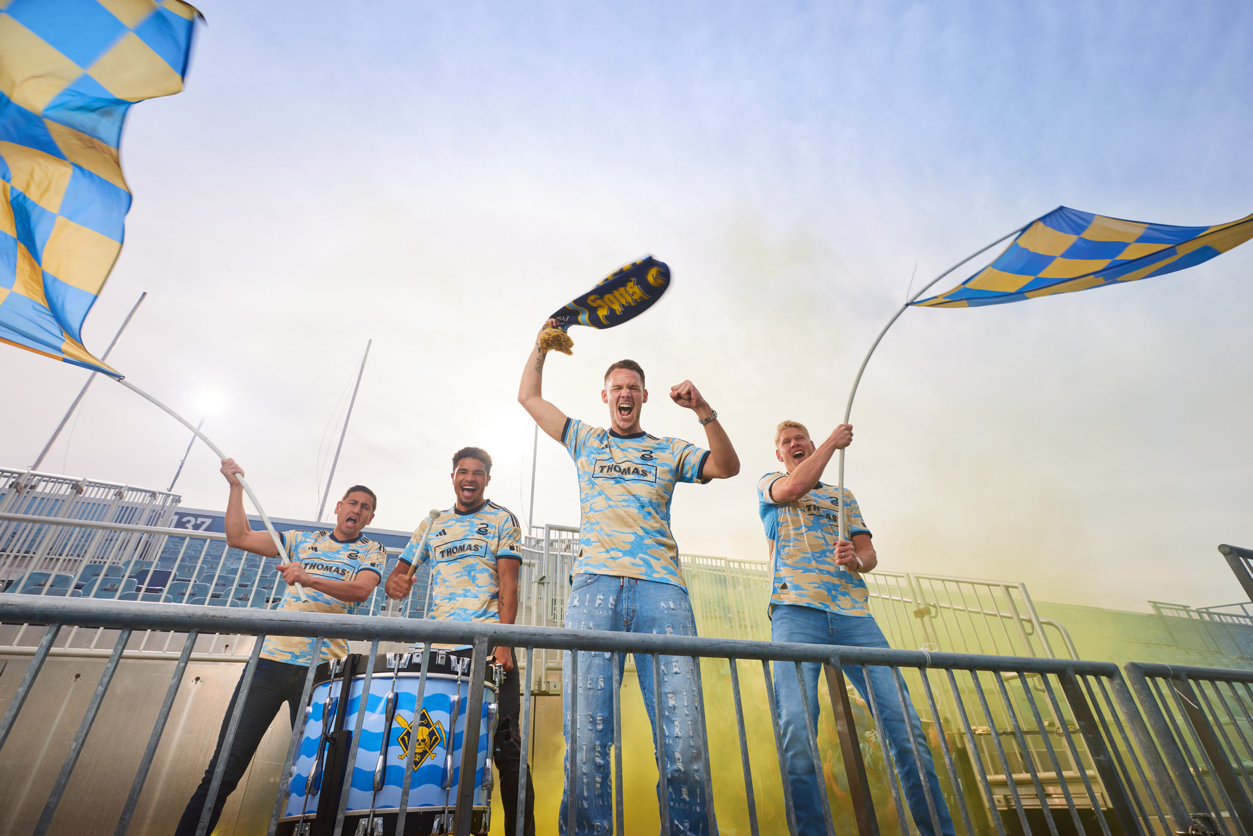
Philadelphia Union – For Philly
https://twitter.com/PhilaUnion/status/1625887857201057792?s=20
Chris – Thomas already wrote about this shirt here. Whether you love this it yet or not, here’s an anecdote: There’s a group of long time season ticket holders who give feedback to the club about all sorts of things (of which I am not a member). When the BY|U shirt was released two years ago – the most successful shirt in Union history, a Top 10 shirt in the world by most accounts – the members of this group resoundingly disliked it, suggested it wasn’t on-brand for the club. Their first impression was that the departure was a failure.
Thomas – I’m torn. On one hand I love the story behind it, and the minute details packed throughout. On the other, it does read a bit as a generic cam pattern. I think after the U get a few games under their belt in the top it’ll start to feel more like a Union jersey.
Portland Timbers – Portland plaid
https://twitter.com/TimbersFC/status/1625903058256375819?s=20
Thomas – I wanted to dislike this. I wanted to say it was too on the nose, too hipster, and too pretentious. I can’t. The shirt screams Portland in the best way possible.
Chris – Another in a long line of great Portland shirts. Who has two thumbs and loves plaid? This guy.
Real Salt Lake – The Beehive State
Thomas – Finally, an MLS team has pulled off clean without straying into boring. Salt Lake have finally found a way to make gold look gold, and accented it with a smart and subtle application of their classic red and blue.
Chris – Amen. An homage to that yellow shirt they wore in Chester way back when. Was it a stoppage time winner for the visitors off a header in front of the River End?
San Jose Earthquakes – Active fault
https://twitter.com/SJEarthquakes/status/1626703503472332800?s=20
Thomas – San Jose has subtly had some of the better shirts over the past decade, with a reliance on simple sharp geometry to hammer home their identity. 2023’s Quakes shirt does that to perfection
Chris – I don’t really like this shirt but Thomas is right. The Quakes are doing their best to become something after the most generic rebrand in professional sports. That’s worth a tip of the cap.
Seattle Sounders – Bruce Lee
https://twitter.com/SoundersFC/status/1625918011403128833?s=20
Thomas – I hate to say it, but this feels like a swing and a miss from Seattle. Everything about the concept should work, but the over-large dragon print dominates the shirt in a way that makes it feel more like a graphic tee than a soccer jersey.
Chris – If it weren’t a Seattle shirt, would pundits be fawning over it the way they are? It’s good, the story is good, the colors are good. It’s good.
St. Louis – CITY and Spirit
https://twitter.com/stlCITYsc/status/1626612118328946688?s=20
Chris – The primary is alright and the community is just a white shirt. First year teams don’t get to have any fun (but also shame on them for being another FC/SC – kit karma exists).
Thomas – In any other situation I’d malign the home jersey as overly loud and the away as too plain. However City had to turn out two shirts in a compressed window, and overshooting on the home when you know the away will likely be exceedingly simplistic is understandable. I’m excited to see what the club does with a proper design cycle.
Toronto – Club
https://twitter.com/TorontoFC/status/1626959728973869056?s=20
Chris – Again, the problem with a long-term, consistent identity for your Primary kit is that if Toronto, say, makes another red one, people won’t buy it (and really, why do you think the Union left the center bib? Fan feedback that said, “We already own one with the bib” and kit sales numbers to prove it – then Doop Hoops broke records almost immediately). This’ll probably sell, even if fans on Twitter don’t like it.
Thomas – Chris is making too much business sense for my art-oriented mind. I don’t think it’s as bad as people think it is, but it certainly doesn’t look great. If Toronto really wanted to do something different it feels like there were better options out there.
Vancouver Whitecaps – Bloodlines
Thomas – Originally I had no qualms. It felt like a natural progression for the club. Then a buddy of mine mentioned that the red made it look like a Fire shirt and now that’s all I can see.
Chris – I love the Whitecaps look, now aligned with home and away. The red accents are fine, and I get the Fire reference – but if the Fire don’t want to be the Fire, why shouldn’t Vancouver? The only downside: this design essentially eliminates the Union’s ability to make a throwback Atoms shirt without looking derivative.

I’m not a jersey/kit person but I enjoy hearing about them from people who have a passion and knowledge of them that I do not possess. Thanks for the write up. That being said, I don’t know why all the release videos don’t ever give you a good look at the jersey. Maybe an edit to the article with stock images of the jerseys for easier reference along with the hype videos for the backstory? Some of us are so old as to prefer pictures over video
+1000. I finally abandoned scrubbing videos on Twitter, and resorted to viewing jerseys of interest on mlsstore.com.
Based on first impressions—purely on the look, not the backstory—my favorite is the Colorado gold. (I’m admitting jealousy here—would love to see more gold in Union’s future.)
.
Least favorite: D.C. (Just not a fan of flowers on my kit when I might need to get rough and tumble on the pitch.)
I admit to being one of the nay sayers in the group when approached by the club with the lightening bolt jerseys.
And the front office staff has never stopped harassing me about my abrupt change of heart when I actually saw it in person.
I’m hoping for a repeat with our new jersey.