Feature photo: Marjorie Elzey
In honor of the 2022 World Cup being days away, PSP is taking a look at all 32 shirts that will be worn at the tournament. Yesterday was the bottom 16, leaving today for the best and brightest of the tournament, the top 16.
As was mentioned yesterday, there’s little logic to the list and the shirts are ranked entirely by how I feel about them. Without further ado, let’s take a look.
16. France, Away

(Image Via Nike)
Usually I’m against subtle patterns, as they usually are done in place of actual strong design elements, but France’s away shirt makes it work. The pattern consists of French iconography ranging from farmers to revolutionaries, and really elevates France’s away shirt.
15. South Korea, Home
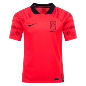
(Image Via World Soccer Shop)
There’s so much to love about this shirt that it’s nearly impossible to condense into a few sentences. The color, the collar, the badge, the tiger stripes. It’s just all so good. Nike’s really hit its stride with South Korea shirts as of late.
14. Belgium, Away
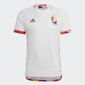
(Image Via Adidas)
Inspired by the Tomorrowland music festival held annually in the country, Belgium’s away shirt is a nice step away from the red, black, and yellow that usually dominates their shirts. Continuing the loud theme to the branding takes the shirt over the top and makes it one of the best in the tournament.
13. Mexico, Away
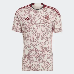
(Image Via Adidas)
While Mexico’s new crest is a bit of a downgrade in my opinion, the away strip is anything but. Its Aztec inspired pattern screams El Tri, and the subtle cream coloring is a complement to the dark red found throughout the shirt.
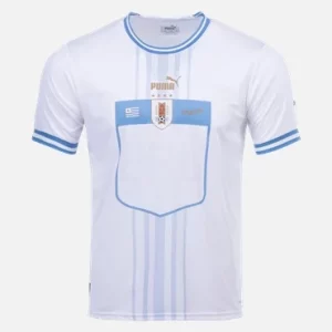
12. Uruguay, Home

(Image Via World Soccer Shop)
Sometimes there’s just no need to mess with the classics. Uruguay’s 2022 home shirt is an almost perfect interpretation of the country’s classic shirt, helped along the way by overly thick cuffs, and gold Puma branding throughout.
11. Senegal, Away

(Image Via Sports Direct)
As much as I want to say the “name tag” effect that Puma is using this year doesn’t work, sometimes it just does. The bordered numbers pop on the Senegal away shirts in a way they don’t on most others, and the shirt is helped along by a great use of Senegal’s unique color pallet.
10. Japan, Home
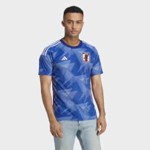
(Image Via Adidas)
Indicative of origami cranes, Japan’s home shirt is covered in an almost hyper-modern pattern. The bright yellow names and numbers really help the shirt stand out as unique, and there was clearly a lot of care put into making the shirt look unmistakably Japanese.
9. Senegal, Home

(Image Via Sports Direct)
If Senegal’s away shirts are good, then their home shirts are fantastic. The chest chevron boasts the colors of the Senegalies flag, complete with a green star that mens the shirt could only be Senegal’s. The three colored cuffs and collar help elevate the shirt even more, and it’s hard to argue it’s not one of the best that the Lions of Teranga have ever worn.
8. Wales, Away
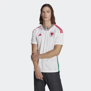
(Image Via Adidas)
You could tell me this shirt was from the 80’s and I’d believe you in a heartbeat, and I mean that in the best possible way. A loud, geometric collar paired with thick side panels of the same design make the Welsh away shirt an absolute stunner. Shame they won’t be wearing it when they lose to the United States in their opener.
7. Japan, Away
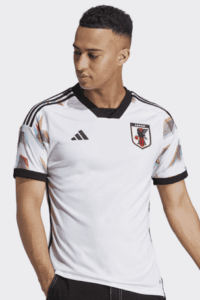
(Image Via Adidas)
It’s oddly futuristic, chaotic, and loud. Yet, at the same time it’s elegant, intentional, and refined. Could Adidas find a better look for Japan if they tried? The 3D effect created by mixing red and blue into the pattern on the shoulders is a great touch, and it’s hard to imagine a shirt getting much better than this for the samurai blues.
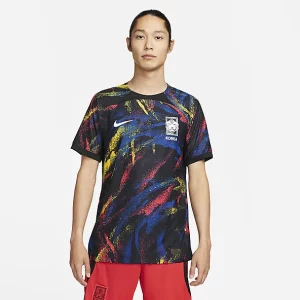
6. Ghana, Away

(Image ViaPro Direct Sport)
Sure, it’s nothing shocking, but man it’s just so clean. The dominant black star paying homage to the team’s nickname, the hits of color on the sleeve cuffs. There’s not much else that can be done to make this shirt any more indicative of the team that wears it. It’s refined perfection.
5. Uruguay, Home
(Image Via World Soccer Shop)
This one’s probably going to get some head scratches, but I think it just works. I know, I’m writing a commentary on football shirts and I should have more to say than that, but honestly I just love it. The gold branding, the double striped collar and cuffs, even the name tag style numbers. I’m all in on the Uruguay away shirt.
4. Portugal, Away
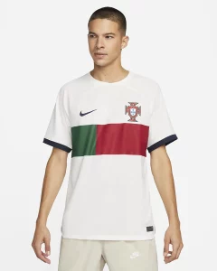
(Image Via Nike)
Who knew that just slapping an elongated version of the flag on the front of Portugal’s shirts could work so well. In all seriousness, the aggressively geometric nature of Portugal’s sets this year works so well, and the number placement in the green box sets it all off nicely. The center stripe wraps around to the back of the shirt as well, which really brings it all together.
3. South Korea, Away
(Image Via Nike)
It looks like a bus seat from the 90’s and I think it’s one of the best shirts ever made. There really isn’t that much refinement to examine, with Nike deciding to just go full on panache for the Korea away shirt. More props to them because the unique design is one of the best of the tournament, if not recent memory.
2. Australia, Home

(Image Via Nike)
The yellow and green of Australia is unmistakable in international football… and yet Nike’s found a way to make it that much better. The subtle distressed pattern found on the jersey instantly evokes the rugged nature found in much of the country, and the tone of green they’ve paired with it on the sleeves and branding ties it together incredibly. Fair play to Nike for being able to pull off such a strong jersey with so few distinct design elements.
- England, Away
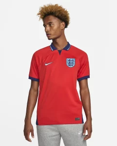
(Image Via Nike)
Yesterday I spoke several times about how Nike had done a great job blending the past and present. England’s away shirt is that concept executed to perfection. The overly bright red is set off beautifully by a cuffs in deep blue, and the hits of a lighter blue do a fantastic job creating depth, energy, and movement throughout the shirt. There isn’t anything like it at the tournament, and with it being number one on this list, there isn’t anything better either.

Your top pick is really nice, but those South Korea and Belgium jerseys at 15 and 14 deserve top 5 honors. Nice to see some creativity that really works, but is still crisp and clean.
Thanks for trying, but this year’s kits are all insipid. I just saw a movie on TV about the ’94 cup and the worst unis then would embarrass this year’s.
Mostly agree with Jack M. But I hate to say that I would wear that the Mexico away jersey if it had another crest on it.
+1
Unacceptable.
FIRE BERHALTER…
HIRE CURTIN.
Think about Walker Zimmerman’s mentality.
.
His actions suggest he did not dare let Gareth Bale control the ball with his back to goal in the goal in the box. He assumed Bale could, and probably would beat him.
.
We now understand why Tim Ream started.
.
The fundamental point about this World Cup is that the younger Americans are getting the experience that will allow them to avoid looking as Qatar did against Ecuador when they are hosts in 2026.
.
If the kids get out of the group stage, that would be gravy.
.
Goal difference will probably determine the second advance out of the group. The Iranians may be more focused on arranging asylum for after the tournament than they are on the soccer being played in it.
.
Anyway… seriously… How cool is this?
Wake up at 400am, watch soccer, the best in the world, for the next 12 hours? YEAH BABE… Just the best.
So I’m curious…. do the muslim nations tailgate?
I see Tunisia allows alcohol… wonder if the 3,000+ mile car ride included tailgating in Doha?
So many fans from all over… Tailgating like the SOBs or no?