It’s time. We’ve waited four years (and then some) for the return of the world’s most prestigious sporting event, the FIFA World Cup.
It’s a tournament that may ultimately be played in order to crown the world’s best footballing nation, but it’s so much more than that. It’s a month-long festival of soccer that sees some of the globe’s proudest nations come together in a rare celebration of diversity and cultural flair.
While each country brings with it its own unique traditions and styles of both support and soccer, each nation’s proud history is unified and consolidated through one shared object, the jersey.
In celebration of the 2022 World Cup, I’ll be counting down the top 32 shirts of the tournament both today and tomorrow, with 16 shirts listed each day. I could ramble on about how I decided the placement of each shirt, but honestly it’s all down to personal preference. Let’s get into it.
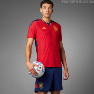
- Spain, Home
(Image Via Adidas)
It’s red, blue, and gold. It’s Spain. There isn’t much about Spain’s 2022 home shirt that makes it stand out as a particularly incredible strip, but it works well as a classy iteration of Spain’s iconic red shirts.
- Costa Rica, Away
(Image Via New Balance)
Some might argue that Costa Rica’s away shirt is a white t-shirt with blue armbands attached to the sleeves. I’d be hard pressed to argue, but something about the simplicity really works for Los Ticos this year, and their new modern crest looks great on the shirt.
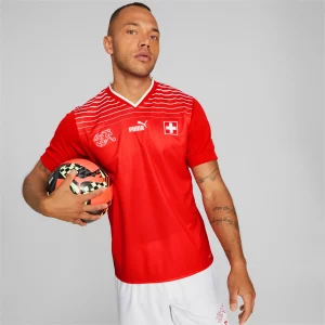
- Switzerland, Home
(Image Via Puma)
While this is another very basic effort, something about the linear shoulder design just fits the Swiss. It’s clean, it’s effective, and when paired with their away shirt, it makes a solid enough pairing.
- Wales, Home
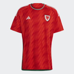
(Image Via Adidas)
There’s little about the Wales home shirt this year that really stands out as shocking, but the pattern Adidas has used on the shirt makes it feel modern, and sleek. The green and white collar does a lot to solidify the shirt as being identifiably Welsh as well.
- Denmark, Home
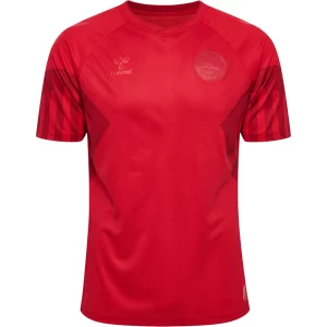
(Image Via World Soccer Shop)
Sometimes there’s more to the shirt than the design, and the Denmark set for this year is a prime example. Featuring toned down branding as a protest against Qatar’s hosting of the World Cup, the Denmark home shirt still cuts a striking image on the pitch.
- Poland, Away
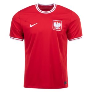
(Image Via World Soccer Shop)
Another shirt that offers little that’s revolutionary, Poland’s away shirt nails the simple aesthetic. A white collar and cuffs frame the otherwise plain red shirt that allows Poland’s fierce crest to jump off the shirt and stand front and center, as it should.
- Germany, Home
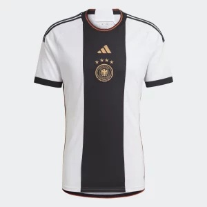
(Image Via Adidas)
No other country could wear this shirt but Germany, something about the bold, harsh stripe just screams German efficiency. Gold branding across the front of the center stripe helps the jersey retain a modern feel as well.
- France, Home
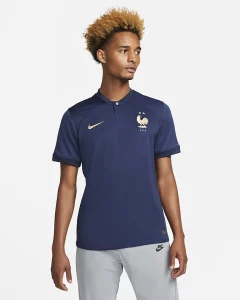
(Image Via Nike)
The French home shirt this year brings little to the table other than the blue base, but when you’re nicknamed Les Blues what else do you need? French flags adorn the cuffs of the shirt, and similar to Germany, gold branding can be found throughout.
- Ecuador, Away
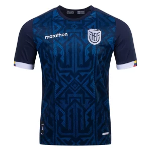
(Image Via World Soccer Shop)
Ecuador’s away shirt is the mirror image of France’s home shirt. A bold pattern dominates the body of the jersey, while the branding has been given a silver treatment. It pairs nicely with the yellow home shirt to give Ecuador one of the better pairings in the tournament.
- Mexico, Home
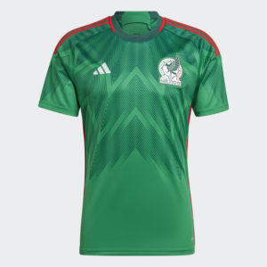
(Image Via Adidas)
Some have been calling this the shirt of the tournament for El Tri. While I think it’s certainly good, the pattern meant to be indicative of eagle feathers doesn’t do as much for me as others. Still, it’s unmistakably Mexican, and a good twist on their classic green.
- USA, Away

(Image Via Nike)
I know, I personally campaigned against this shirt. I’ve seen the error of my ways. I don’t think it’ll become the most popular USA jersey of all time, but in the same way the denim kits’ jarring differences have aged like fine wine, I think the 2022 Away strip may do the same.
- Portugal, Home
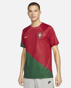
(Image Via Nike)
If we want to talk jarringly different, then the Portugal home kit is the shirt to talk about. It’s only design element is a diagonal line that cuts the shirt into green and maroon, however its inclusion on the sleeve elevates the shirt into its own category of stylishly weird.
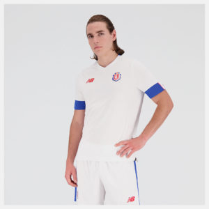
- USA, Home
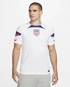
(Image Via Nike)
Again, I know. Most people will disagree with this, but the USA home shirt does a very nice job finding the balance between boring, and elegant. It just feels like a classic 2000’s shirt that’s been modernized, and I mean that in a very very good way.
- Netherlands, Away
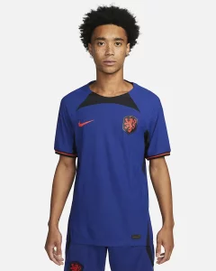
(Image Via Nike)
While Nike might have botched the Oranje’s, well, orange, they’ve nailed the away shirt. Similar to the US’s home, it feels like a classic Dutch design dragged into the future. The simple geometry of the strip really just works.
- Argentina, Home

(Image Via Adidas)
Similar to Spain, this just is an Argentina shirt. It doesn’t do much with the classic formula, but it’s unique element of two thinner vertical lines that evoke the Argentinian flag make this a wonderfully unique version of the classic design.
- Australia, Away
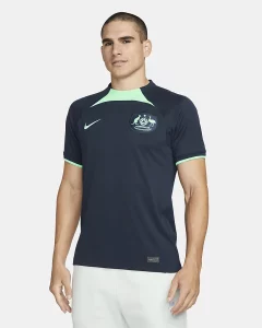
(Image Via Nike)
It’s simplistic, and futuristic. Australia’s away shirt sees the Socceroos dawn a unique color pallet of navy and teal, and pair that with a super simple design. The pairing works well to create a shirt that stands out, while remaining clean.

While watching the USWNT take on Germany a few days ago, the German women were wearing a shirt very similar to the German mens team as shown above. My immediate thought was that looks like some sort of a take on the original Union jersey. And I like it. Would like to see the Union resurrect that design element in the future. Call me old fashioned, I like to be able to identify which teams are playing without having to look at a tiny crest.
Whoever designed the USA home kit, their mother doesn’t like it. It’s atrocious. That dumb color swatch looks like a floppy bowtie on the field. Why does this have to be difficult? Argentina is gorgeous, classic.
The US home kit should be at the bottom of any list. It is atrocious. If I could post a .gif it would feature Tim Gunn recoiling in disgust.