Photo: Paul Rudderow
Well, it happened. After months of speculation, rumors, and flat out fantasizing, the USMNT’s World Cup kits have leaked.
Monday morning, USMNT fan account @usmntonly tweeted photos of both the home and away jerseys with the caption “A fan just DMd me these pictures of the 2022 USMNT World Cup kit.” Initial replies to the tweet doubted the validity of the leak, citing an absence of Nike Swooshes, and an unconventional centered crest.
However any doubts were put to rest shortly after the initial tweet, when a second photo surfaced from a since deleted account. The photo in question displayed both jerseys folded, and placed next to each other, with Nike swooshes clearly visible on either jersey’s sleeves. As the leaked photos began to circulate, multiple people in the know confirmed that these were in fact the USMNT’s World Cup jerseys.
But enough about how the leaks came to be, let’s talk about the shirts themselves.
Home kit
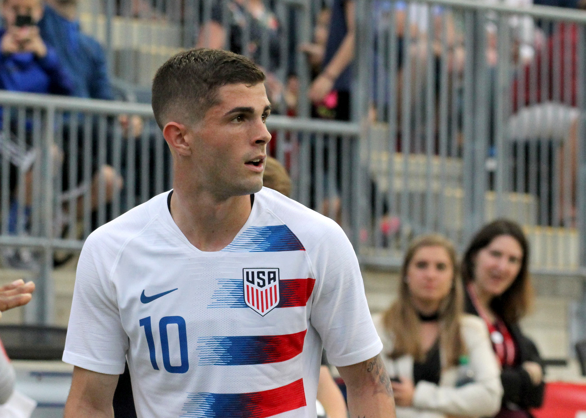
The 2022 U.S. home shirt is, shall we say, rather simplistic. It features a white base, with centered crest, and blue accents throughout, with red being used solely on the sleeves of the shirt. For what it lacks in extravagant detail, it makes up for in newness. Almost every element on the 2022 home shirt is brand new to the United States, from the construction, to the logo placement.
Most notable is likely the latter. For the first time in Nike’s long and storied history of World Cup shirts, they’ll be placing their manufacturer logo (the Swoosh) on the sleeves of the shirt, as opposed to across the right breast as is traditional. This swoosh placement will likely be reserved for the United States, and will serve as Nike’s nod to the country as being the birthplace of the company. This was done previously by adorning U.S. shirts with the 1978 version of the Nike logo that combined both the swoosh, and the “NIKE” wordmark. Some have speculated that the dual sleeve logos are a nod to the NFL, who’s uniforms sport a similar placement, though we’ll have to wait for an official release of the jerseys for any confirmation on that.
Perhaps the second most notable feature of the shirt is the centered crest. It’s the first time the U.S. has worn a centered crest at the World Cup in modern history, and the first time any U.S. shirt has featured a centered crest since 2004. It’s a decision that makes some amount of sense due to the Nike logo placement, however the badge’s positioning does lend itself to the shirt looking perhaps a bit too simplified. It’s logical to assume that numbers will be placed directly below the badge, save Nike pulling something truly unique out of its hat.
Finally, to touch on the last bit of uniqueness, the construction. The 2022 Nike World Cup template (If you can call it that, as it’s made appearances with several club teams already) features rather exaggerated elements that make it feel overtly modern. Most eye-catching of these features is the seemingly turtleneck-esque collar that rises a bit higher, and fits a bit tighter across the collar bones than many of the company’s past designs. For the U.S. shirts the collar has been made blue to provide a clear and distinct collar.Accentuating the template’s exaggerated neckline, is a sleeve construction that appears to be two distinct panels coming together to form the arms of the shirt, not dissimilar to shoulder yolks found on hockey jerseys. Worked into the sleeves, on what appears to be the top of the two panels, are red and blue stripes that follow the cut of the cloth, creating a striped element that points down the sleeve. It’s worth noting that while there was some speculation that the stripes were asymmetrical, a recent video of shirts put on display prematurely at a Dick’s Sporting goods, seems to indicate that the shirt features both red and blue stripes on both arms.
It’s a home look for the United States that, while a bit jarring at first, does do an adequate job feeling like a U.S. shirt. The central placement of the crest, combined with the red and blue stripes on the arm, and blue collar make it feel a bit like a nod to the 2004 home design, albeit with a modern twist. As football shirts continue to evolve, and fans become accustomed to this new Nike template, it’s highly likely that the shirt becomes accepted as a clean, if not simplistic U.S. jersey. Though, if Nike were to enclose the shirt numbers in circles Total 90 style, the shirt could become an instant classic. Just one man’s thought.
Away kit
For all that can be dissected and redeemed in the home shirt, there’s near nothing to be said for the away effort.
It’s blue tie-dye with white Nike branding, and again, a centered crest. Any uniqueness and modernity that the home shirt brought is wasted on the away strip, and the monochrome tie-dye with no accentuating pops of color leave the shirt feeling flat, and unfinished.
There genuinely isn’t much more to say. The only thing that would serve to slightly redeem the shirt, is if it’s paired with white shorts, and tie-dye socks. Navy shorts would leave the effort feeling even more flat than it already does, and plain white or navy socks would leave the tie-dye on the jersey feeling like a mistake.
There is, for what it’s worth, a certain amount of impressiveness to be found in such a lazy effort from Nike. While the home jersey can simply be chalked up to being too new to be appreciated, or perhaps a bit too simplistic, the away shirt is simply poor. While it’s not personally for me, I have no qualms in admitting that the tie-dye is a solid start to the shirt. It’s instantly recognizable as “American”, it’s unique, and it offers a great base to expand upon. The fact that Nike simply left it as is, with no other details is astounding. Now, if circular numbers make their way back into the design, perhaps opinions will change. That said, opinions shouldn’t have to change.
This is Nike we’re talking about. The single largest sportswear manufacturer on the planet. One of two absolutely dominant forces in football equipment. The fact that they cannot be bothered to produce something that satisfies a majority of U.S. fans is a complete failure, and frankly, a bit of a disgrace.
Look at Adidas’s efforts for Germany, its country of origin. Each design, especially during World Cup years, is striking, unique, and inherently German. Adidas has found a way to personify German strength and efficiency in its designs for the national team, and there’s a tangible sense of pride that they’re allowed to outfit the national team. None of that pride is felt with Nike’s efforts for the U.S.
Where Adidas provides Germany with striking designs, Nike gives the U.S. unique logo placement and little else. Where’s the effort? Why is a club in Paris allowed to wear the prized Jordan logo, but not the national team of the country in which the brand was founded? Why are Nike’s best efforts reserved for rivals like England and Brazil? Is it because they feel soccer simply isn’t popular in the United States? That even if it is popular, that their youthful U.S. demographics don’t want to buy U.S. soccer jerseys?
If so, it’s a self fulfilling prophecy. U.S. soccer jerseys don’t sell because so little effort is seemingly put into them. You’re telling me a Jordan brand collaboration with the U.S. national teams wouldn’t fly off the shelf? That a re-worked and modernized “waldo” wouldn’t be in the hands of every fan across the country if it was released today? That any semblance of effort or care put into the jerseys of your company’s own country of origin wouldn’t result in increased brand loyalty and larger profits?
I don’t buy it, and fans aren’t going to be buying these kits.

There is a lot of white on that one, but I do like accents. It could have used more though sim to the 2002’s. I liked the side accents on the 2021’s and this one could have used something more below the crest.
.
The blue? At least I can wear it to concerts?
Check out PSGs elite warmup shirt…
https://store.psg.fr/en/maillot-psg-nike-strike-elite-dri-fit-adv-domicile-22/23-blanc/p-1214709969780797+z-971-3770333531?_ref=p-SRP:m-GRID:i-r0c0:po-0
templates gonna template
I know designers need to work, but everyone wants the Waldo kits back. Why not just give the people what they want? Just make that the home kit forever. I don’t get why this is so hard.
Wholeheartedly agree.
They took the PSG “Elite” warm-up jersey and turned it into this crap. It’s literally the exact same kit/warm-up!! Embarrassing!!
Check out PSGs elite warmup shirt…
https://store.psg.fr/en/maillot-psg-nike-strike-elite-dri-fit-adv-domicile-22/23-blanc/p-1214709969780797+z-971-3770333531?_ref=p-SRP:m-GRID:i-r0c0:po-0
I don’t get all the hate. I think the home kit is quite nice. The away one, I agree, is ‘meh’
It’s a copy cat jersey…. Nothing new or unique about it.
While you are never going to make everyone happy, I feel this is an unspiring drab set of kits not up to the task of trumpeting the US return to the world stage. Not spending a dime on these.
Perhaps if they had “tie dyed” the white kit instead and gone back to formula witb the away kit…
Waldo on neither is sad.
being compared to that PSG warm up is… how high we set the bar? i don’t dislike the center crest but don’t dig that collar. sadly, i’m sure i’ll be breaking out my Italy 2014 home kit again that had a real collar. Their away had a cleaner neck element than this and pinstripes that could’ve been used here.