Photo: Earl Gardner
Even in the doldrums of summer, there are designs to examine. Let’s get on with it!
All Three Points
Inter Milan Leak / paneled templates
On first glance the 2022 Inter Milan shirt doesn’t really do much to justify conversation. It’s black, blue, and vertical in the way that so many Inter shirts before it have been. What is notable, is the forced integration of Nike’s new turtleneck-esque template that sees the shirt broken into distinct front, back, and sleeve panels.
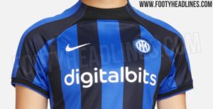
While the separated paneling is nothing new from Nike, it’s certainly a more aggressive separation of panels than we’ve seen in the past, and Nike isn’t the only one doing it.
In the same city, Puma’s 2022-23 AC Milan shirt takes on a, shall we say, bold direction, cutting the iconic vertical red and black stripes off at the top of the pectorals, allowing for a wide breadth of black fabric to highlight the collar and sleeves.
Where this design trend came from is hard to pinpoint, but with Nike employing it as a primary template in its 2022-23 arsenal, it’s safe to say fans will need to get used to it, at least for the coming season.
Venezia’s New Branding
Ever in the footballing fashion limelight, Venezia’s once again captured the attention of the aesthetic community by introducing a new primary mark for the coming season. Gone is the mark that looks so much like a luxury car brand shoe horned into a soccer badge, and in its stead looks like, well, just a luxury car brand.
The new mark combines a stylized lion’s head and “V”, capped with the club’s bespoke orange and green. The mark certainly stands out as unique in the circle and shield dominated landscape of soccer badges, but whether it’s good is up to the individual. It certainly continues on the club’s legacy of striking, unconventional design.
(Image courtesy of Footy Headlines)
To cap off the change, it appears Venezia’s 22-23 home shirt has leaked, looking more like a piece from the newest Versace drop than a soccer shirt. But hey, that’s par for the course when it comes to Venice’s premier football club.
Update 7/7: Since first writing this article Venezia has released their 2022-23 home shirt.
Brazil World Cup Leak
Death, taxes, and Brazil’s home shirt being yellow and green.
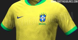
Last week Brazil’s home World Cup shirt dropped, and to the surprise of no one, it’s yellow and green with blue detailing. What does stand out on the shirt is the unique texture that looks like a compromise between the walls of Nickelodeon Legends of the Hidden Temple, and athletic fabric venting.
With the leak emerging being a 3D rendering, it will certainly be interesting to see how the pattern translates to the actual shirt, and whether or not that texturing will be included on the cheaper “stadium” versions of the shirt. Additionally, it’s not yet apparent if this is a texture that fans should expect across all shirts, or something unique to Brazil. Either way, it’s certainly different from anything we’ve seen before.
From the Archives
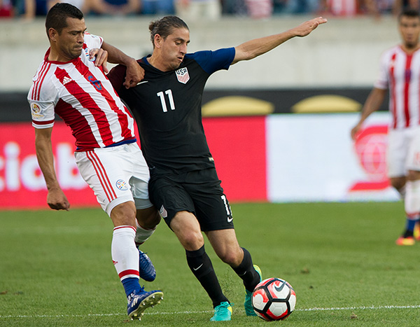
After that mention of segmented Nike templates, I’d be remiss to not mention the 2016 USA effort.
While usually I reserve this section for a bit of kit I find attractive, today we’ll focus on the other side of things. I mean really, who could’ve thought this design was worthy of the USMNT? They hadn’t even missed a World Cup yet! The wrong shade of blue, no bespoke elements, and the debut of a new, lackluster badge. Ouch.
Extra Time
Is baseball ever going to find the mark again? This week the Padres unveiled some… interesting “City Connect” uniforms that allegedly celebrate the friendship between Tijuana and San Diego.
Nothing here screams Tijuana, and the jarring mismatch of Mexico’s El-Tri thoroughly disregards baseball’s more stoic traditional uniforms. It’s different, sure, but it seems to highlight the struggle baseball is facing to embrace the modern, younger sports fan.
Like this:
Like Loading...
Author: Thomas Hill
Thomas Hill is a senior at the Savannah College of Art and design, studying documentary filmmaking. He aspires to pursue his masters in sports journalism. He's been an avid fan of Philadelphia sports for the last 23 years, and regularly attends Philly away games in the south whenever possible. You can follow him on twitter @puertodelphian
The Change Strip: Evolving templates, evolving brands
Posted by Thomas Hill on July 7, 2022 at 10:00 amPhoto: Earl Gardner
Even in the doldrums of summer, there are designs to examine. Let’s get on with it!
All Three Points
Inter Milan Leak / paneled templates
On first glance the 2022 Inter Milan shirt doesn’t really do much to justify conversation. It’s black, blue, and vertical in the way that so many Inter shirts before it have been. What is notable, is the forced integration of Nike’s new turtleneck-esque template that sees the shirt broken into distinct front, back, and sleeve panels.
(Images Courtesy of Footy Headlines)
While the separated paneling is nothing new from Nike, it’s certainly a more aggressive separation of panels than we’ve seen in the past, and Nike isn’t the only one doing it.
In the same city, Puma’s 2022-23 AC Milan shirt takes on a, shall we say, bold direction, cutting the iconic vertical red and black stripes off at the top of the pectorals, allowing for a wide breadth of black fabric to highlight the collar and sleeves.
Where this design trend came from is hard to pinpoint, but with Nike employing it as a primary template in its 2022-23 arsenal, it’s safe to say fans will need to get used to it, at least for the coming season.
Venezia’s New Branding
Ever in the footballing fashion limelight, Venezia’s once again captured the attention of the aesthetic community by introducing a new primary mark for the coming season. Gone is the mark that looks so much like a luxury car brand shoe horned into a soccer badge, and in its stead looks like, well, just a luxury car brand.
(Image Courtesy of Footy Headlines)
The new mark combines a stylized lion’s head and “V”, capped with the club’s bespoke orange and green. The mark certainly stands out as unique in the circle and shield dominated landscape of soccer badges, but whether it’s good is up to the individual. It certainly continues on the club’s legacy of striking, unconventional design.
(Image courtesy of Footy Headlines)
To cap off the change, it appears Venezia’s 22-23 home shirt has leaked, looking more like a piece from the newest Versace drop than a soccer shirt. But hey, that’s par for the course when it comes to Venice’s premier football club.
Update 7/7: Since first writing this article Venezia has released their 2022-23 home shirt.
Brazil World Cup Leak
Death, taxes, and Brazil’s home shirt being yellow and green.
Last week Brazil’s home World Cup shirt dropped, and to the surprise of no one, it’s yellow and green with blue detailing. What does stand out on the shirt is the unique texture that looks like a compromise between the walls of Nickelodeon Legends of the Hidden Temple, and athletic fabric venting.
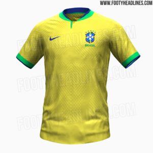
(Images courtesy of Footy Headlines)
With the leak emerging being a 3D rendering, it will certainly be interesting to see how the pattern translates to the actual shirt, and whether or not that texturing will be included on the cheaper “stadium” versions of the shirt. Additionally, it’s not yet apparent if this is a texture that fans should expect across all shirts, or something unique to Brazil. Either way, it’s certainly different from anything we’ve seen before.
From the Archives
After that mention of segmented Nike templates, I’d be remiss to not mention the 2016 USA effort.
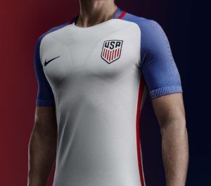
(Photo courtesy of Footy Headlines)
While usually I reserve this section for a bit of kit I find attractive, today we’ll focus on the other side of things. I mean really, who could’ve thought this design was worthy of the USMNT? They hadn’t even missed a World Cup yet! The wrong shade of blue, no bespoke elements, and the debut of a new, lackluster badge. Ouch.
Extra Time
Is baseball ever going to find the mark again? This week the Padres unveiled some… interesting “City Connect” uniforms that allegedly celebrate the friendship between Tijuana and San Diego.
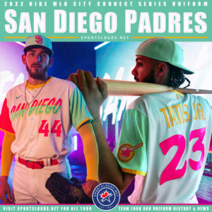
(Photo Credit SportsLogos.net)
Nothing here screams Tijuana, and the jarring mismatch of Mexico’s El-Tri thoroughly disregards baseball’s more stoic traditional uniforms. It’s different, sure, but it seems to highlight the struggle baseball is facing to embrace the modern, younger sports fan.
Share this:
Like this: