
Photo: Paul Rudderow
It’s late June of a World Cup year. In almost every other World Cup cycle that would mean that the group stage would soon be wrapping up, and the round of 16 would only be a few days away. Yet, in a year where the World Cup is being inexplicably played in one of the world’s most inhospitable climates, late June means that we have a handful of jersey leaks to talk about, and not much else.
It’s disappointing to not be watching the tournament yet, but hey, that new U.S. World Cup jersey is gonna look great over your hoodie in December. Until then however, let’s take a look at some of the early glimpses of what we’ll see come November.
ALL THREE POINTS
Argentina
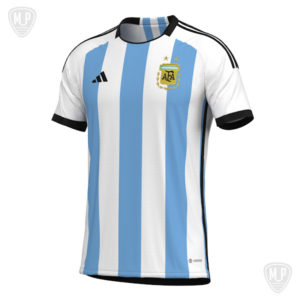
Argentina had their home shirt for the 2022 World Cup leak back in April, and since then more and more detailed renders of the shirt have surfaced.
(Renders courtesy of Martio Rodriguez via Twitter)
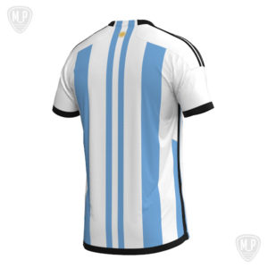
At first glance it looks like a standard Argentina shirt updated for 2022, and in many ways, that’s a fair way to describe what Adidas has done for Argentina this go-round. The front features the traditional vertical blue and white stripes, and deviates very little from Argentina shirts of the past. The back however, deviates from shirts of the past by reducing the size of two of the blue stripes, and centering them in the back of the shirt.
(Renders courtesy of Martio Rodriguez via Twitter)
The two smaller stripes, in combination with the shirt’s neck detail of a sun, mimics the composition of the Argentinian flag, and makes the back of the shirt appear to be composed of a hyper-elongated flag. It’s a simple tweak to a timeless design, but it goes a long way in making the country’s look feel fresh and re-invigorated. It’s at least more innovative than the 8-bit treatment the shirt got back in 2018.
Portugal Away
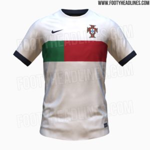
Portugal joined the ranks of countries to have at least one of their shirts leaked earlier this month, and also became the first Nike country to have their design prematurely unveiled.
(Images courtesy of FootyHeadlines)
The sail and obsidian (not black and white) away shirt will feature as Portugal’s alternate number, and features a mid-2000’s style geometric design courtesy of Nike. There isn’t really a ton to say about the shirt, and that’s not a bad thing. The design is simple, clean, and effectively screams “Portugal!” without doing much at all.
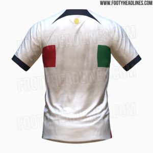
Similarly to the Argentine shirt mentioned above, the back of the jersey stands out as a highlight. While Nike could’ve simply left the back blank and adorned it with a number and neck detail, they’ve elected to continue the geometric design onto the back of shirt, making it more of a hoop design. The two panels in the back are equidistant from the center, completing a smartly asymmetrical symmetric design.
(Images courtesy of FootyHeadlines)
As an aside, there have been some rumors of the Portugal home shirt being leaked, but something doesn’t quite sit quite right with those rumors for me, so I’ve declined to include it here.
New England Away
No, it’s not a World Cup shirt, but it’s far more interesting than the remaining leaks, and it’s absolutely insane to see an MLS shirt leak this early.
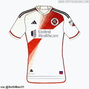
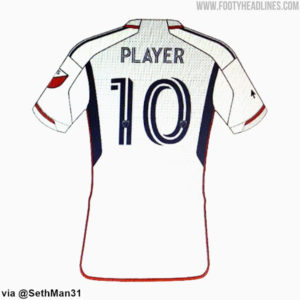
(Images courtesy of FootyHeadlines)
New England’s 2023 away shirt features a red sash running from the badge, down to the bottom of the rib cage, and what appears to be a speckled pine green pattern that runs across shoulders onto the back of the shirt. As presented in the provided template, it’s loud, vibrant and finally screams REVOLUTION. After decades of bland shirts, the Revs may finally have struck gold. Or green and red at least.
From the Archives
With the World Cup looming, it’s hard not to use this section to talk about the best national team shirts of tournaments past. Enter Korea’s 2014 change strip.

(Image courtesy of SB Nation)
The mostly white shirt features two sleeve accents of blue and red, and a raised collar with seams again of red and blue. While the shirt may be simplistic, it seems to perfectly encapsulate Korea. The stellar use of color, along with the non-traditional straight collar that was bespoke to Korea really makes this shirt stand out as one of a kind in the history of the World Cup.
Extra Time
What the hell. In a move that absolutely no one was asking for, the Eagles updated their Word Mark last week from the iconic winged “EAGLES” to what appears to be a modified version of Helvetica Neue.
Jokes aside, it’s a clear downgrade and only makes any kind of sense if the whispered rumors of a larger rebrand are to be believed. We’ll see…

what’s the deal with all of the raglan templates coming out these days from both Nike and Adidas? interesting shift, I don’t think I’m on board but we’ll see what they come up with I suppose
the outrage for the Eagles wordmark online is ridiculous. the Flyers did a similar (and very similar!) retool a few seasons (+/- covid time) to no outrage. The abandonment of the 80s wordmark was much needed by the time the “winged” design came. equally, that is dated now. move along until we get that bigger rebrand. no doubt, it will be better than both LAs and Washington NFL teams.
as for the WC shirts: the Argentina design is reminiscent of the ’14 black stripes and sleeves. don’t know what the lettering and numbering is like so it’s hard to comment on the back but i do like that weight change