Feature photo: Earl Gardner
Last night, the U.S. men’s national team officially clinched their place in the 2022 World Cup. The qualification comes after four long years of healing, reconciliation, and rebuilding following the nation’s failure to qualify in early 2018.
It’s been a hard four years, and while you could jump right back into things by reading the countless previews of the draw, and all of the various scenarios that await the U.S. in Qatar, you also might simply want a bit of a break from the drama. That makes it a perfect time to talk about the least stressful side of football… aesthetics!
THREE POINTS
Mexico’s World Cup kits leak?
Since the World Cup is fresh on everyone’s minds, it only makes sense we start there.
Tuesday, leaked photos of Mexico’s 2022 World Cup home shirt emerged from what appears to be a promo shoot for the team.
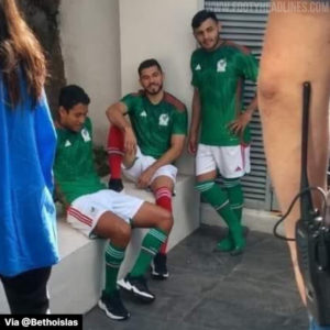
(Photo Via Footy Headlines)
The shirt is primarily green, with red accents, and white branding. The shirt appears to feature a sublimated, jagged dark green pattern on the upper half of the shirt that radiates outward from the neckline.
A second photo posted on the Analistas MX facebook appears to show the design in more detail, though both the Adidas and Mexican branding marks appear to be photoshopped.

(Photo Via Facebook)
It’s a fairly conservative look from El Tri, and their first primarily green jersey since the 2018 World Cup. The strip is completed by simple white shorts, and what appears to be a choice between either red, or green socks.
Red, black, and pink for Arsenal?
World Cup shirts aren’t the only thing leaking.
Six days ago Arsenal had their home shirt for the 22/23 campaign leaked, and just yesterday the second and third jerseys joined the party.
While the home shirt is nothing to write home about, looking much like Arsenal strips of the past, the two alternate shirts are definitely a bit more interesting.
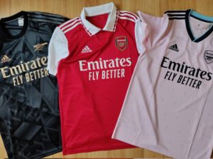
(Photo Via Twitter)
The away shirt, which is primarily black with gold and gray accents, features a pattern that comprises various arrangements and orientations of isometric A’s, F’s, C’s. It’s a unique look to be sure, but not much about it (save the club’s initials plastered all over the shirt) really screams “Arsenal.” Even the badge has been reduced to a simple cannon, as opposed to the full crest seen on the other shirts.
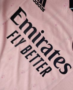
(Photo Via Twitter)
On the other hand, the third shirt, which is primarily pink, does an excellent job taking traditional style elements from the clubs past, and merging them into a stunning modern design. The pattern of the shirt is derived from the ermines (elements often used in coat of arms) that can be found the old Arsenal badge that was used in one form or another from 1949 to 2002. While to some this may be too little to really tie the design to the club, personally I think it’s a great nod to the past that makes the bespoke design feel truly Arsenal’s.
Washington Spirit release home and cup kits
Finally, let’s move from the bold shirts of Arsenal, to the disappointment that is the Washington Spirit’s two new shirts.
On March 18th, the defending NWSL Champions unveiled two new shirts for the 2022 campaign, one for use in NWSL league play, and one for use in the Challenge Cup.
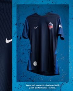
(Photo Via Twitter)
Both are primarily navy designs taken straight from the Nike Teamwear catalog. While the two shirts sport different sublimated details, the main difference between the two shirts is that only the “City” kit used for Challenge Cup play will feature a sponsor.
While there’s not a lot to break down design wise, it is absolutely baffling as to why the club would release two near identical shirts on the same day, at the same time, with almost no info on either. While it may be unrealistic to expect the club to unveil a stunning bespoke design from Nike, it doesn’t feel like a big ask to expect some originality, or at least an explanation on the decision to unveil two nearly identical kits.
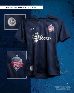
(Photo Via Twitter)
With the recent reveal of two D.C.-based teams’ cherry blossom jerseys, it really is disappointing to see the Spirit elect to unveil not one, but two boring, uninspired shirts.
FROM THE ARCHIVES
With the USMNT qualifying for Qatar, there’s a temptation to break out the infamous denim kits. Instead, let’s take a look at what the U.S. wore the last time they clinched a spot in a World Cup. Behold, the 2013 “Centennial” shirt.

(Photo Via Stars And Stripes fc)
Here’s hoping the U.S. gets something even half as decent for their 2022 jaunt over in Qatar.
EXTRA TIME
It’s the Philly Soccer Page. The PHILLY Soccer Page. Did you think I wouldn’t be talking about the Eagles bringing back kelly green? With the NFL relaxing their one-helmet rule, the Eagles will be showing off two new looks in the coming years.
First, and most anticipated is the throwback kelly green jersey that’s been rumored for years and will debut in 2023. Next year, the Eagles will add a new black helmet, which will pair with the black alternate jerseys that the Eagles have worn since 2003.


Arsenal definitely raided MLS’ closet
Cue the adidas tin foil conspiracy theorists…
Will USA definitely have new jerseys for the Qatar world cup that are different from qualifying? Want to purchase a jersey but not sure if I should wait for the new ones to drop.
Hey Mark!
The U.S. will have new kits for the World Cup. Right now the shirt is anticipated to be on sale starting in September.
The home shirt is anticipated to be primarily white, while the away shirt is likely to be royal blue and white.