Recently, there’s been a lot happening in the world of soccer aesthetics, even with most of the significant European jersey launches out of the way. Barcelona has a new home jersey just for the Champions League, World Cup leaks are slowly appearing, and multiple European third jerseys still have to be officially unveiled.
It’s a fun time to be a fan of design, and the next few months should be packed with tons of leaks, releases, and oddities. Before we can get to those, though, let’s look at what’s been happening over the last few weeks.
THREE POINTS
Barcelona Champions League shirt
The most polite way to describe the ongoing situation over at the Nou Camp is interesting. Barcelona is dealing with massive financial issues caused by apparent decades of fraud and mismanagement, and the fallout, including the departure of Lionel Messi, could just be beginning. The best way to distract people from such a disaster? An equally interesting new kit.
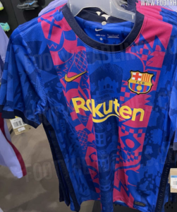
(Courtesy of Footy Headlines)
Leaked by various sources over the past several weeks, Barcelona is set to play their home Champions League matches in a third shirt inspired by the city’s architecture and the club’s own classic Blaugrana.
The shirt, designed by Nike, is said to celebrate the city’s neighborhoods and the anniversary of Barcelona hosting the 1992 Olympic Games. Inside the classic Barca stripes are various icons of the city, all done in a light blue that either clash against the red stripes or fades into the dark blue.
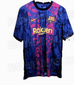
(Courtesy of Footy Headlines)
While the shirt won’t be for everyone, it is nice seeing a club as globally massive as Barcelona strives to emphasize its locality. Though perhaps the Catalonian kits of ole would’ve been a better choice.
USA World Cup Pre-Match Jersey
The World Cup may be over a year and a half away, but that doesn’t mean jersey news isn’t already leaking. This week alone, both England and the United States had minor design elements leaked nearly 16 months out from the tournament.
On the western side of the pond, the United States had their pre-match top leak, hinting at major changes to the American look in the coming year. Taking inspiration from the NFL and soon-to-be-released PSG third kit, the US training top features a central crest, with no Nike branding on the front of the shirt. Instead, the Nike swoosh has been moved to either sleeve, with one mirrored to create a sense of symmetry.
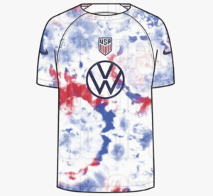
(Courtesy of Footy Headlines)
Whether or not the central crest and relocated Nike marks make the World Cup jerseys is yet to be seen, but for a country that seldom wore a centered crest in modern times, it’s an interesting detail to keep an eye on.
On the other side of the pond, England has had the color pallet for their home shirts leaked over on Footyheadlines.com.
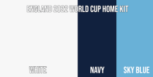
(Courtesy of Footy Headlines)
While the white and navy are expected, what is interesting for the English shirts is the swap of tertiary color from red to light blue. England had used red as their home accent color for much of recent memory, except when only two colors were used. The last time England wore light blue on their home shirt was in 1996, when the lighter shade was used to highlight their navy numbers.
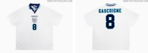
(Courtesy of Footy Headlines)
It’ll be interesting to see if England returns to the traditional use of the light blue or instead use it in some sort of sublimated pattern.
Atletico Madrid Third shirt
Some shirts are simply class, and Atletico’s third shirts are absolute class for this season’s campaign. As a writer, I know I’m supposed to remain objective, but honestly, how can you not love these?
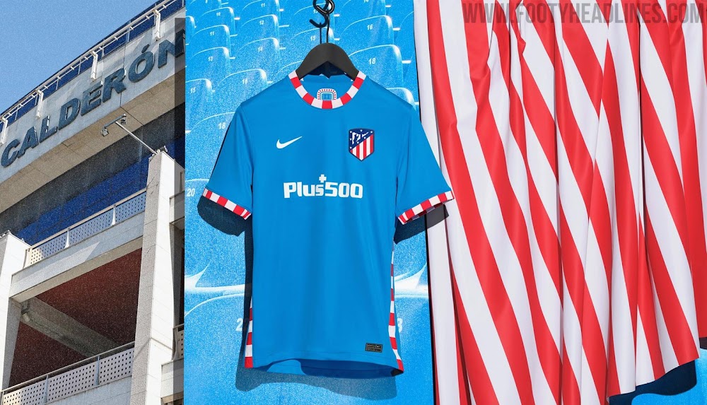
Done as a tribute to the club’s former home, La Vicente Calderon, the shirt is light blue and features a simple but vibrant red and white pattern on the side paneling, collar, and sleeve cuffs. The colors are in homage to the old stadiums seating bowl, which featured a lower bowl of blue and an upper deck of striped red and white.

(Courtesy of Footy Headlines)
While some clubs prefer to go over the top with nods to location, or history, Atleti has elected to go with a simple shirt that’s straight to the point. Devoid of gimmicks, Atletico’s new shirt provides an attractive option for fans looking to remember one of the greatest stadiums of La Liga and football’s past.
FROM THE ARCHIVES
How can we talk about stunning homages without talking about France’s picture-perfect 1998 home shirt? The stripes, the collar, the block numbers. It’s all fantastic.

(Courtesy of Scroll)
The shirt was a throwback before throwbacks were cool, paying respect to the country’s 1984 shirt that they donned while cruising to their first-ever European championship. It seems only fitting that they won the World Cup wearing the 1998 version.
EXTRA TIME
And then on the other side of the coin. The Minnesota Wild unveiled their Winter Classic sweaters earlier in the week, and boy, are they something.

(Courtesy of Icethetics)
They’re so close to being good, but with the unnecessary chest stripe, and the addition of elbow patches, it’s just trying too hard to be retro. It’s a shame because the Winter Classic usually brings out some stunning fauxbacks, including what’s still one of the best Flyers Jerseys of all time.

(Courtesy of Icethetics)
Who knows though, maybe we’ll be calling this one a classic in a few years.

Good stuff. Interesting and fun to read.
All good. Appreciate the hockey inclusion too! Barça kit is sweet.