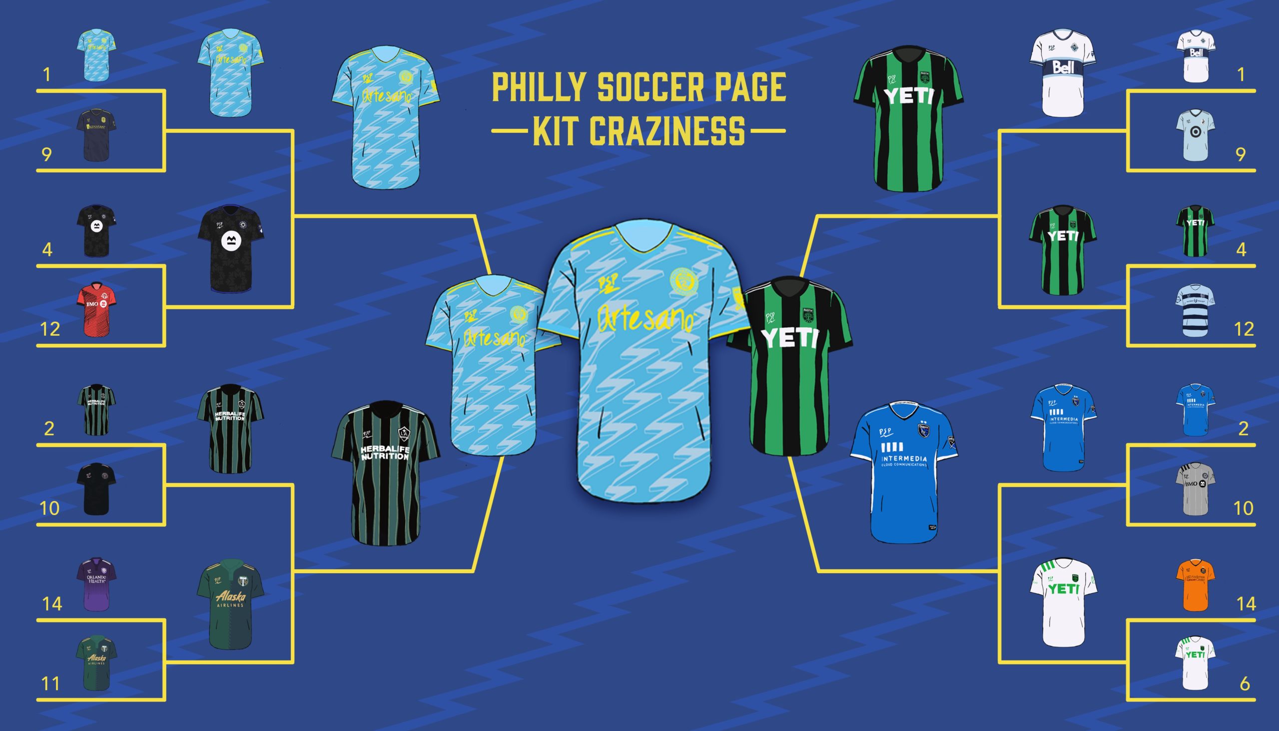
Philadelphian dominance seems to be a trend lately…
With 95% of the vote over Austin’s primary in the final and no margin of victory smaller than 89% through the entire tournament, the Philadelphia Union’s new secondary shirt took home the inaugural Philly Soccer Page Kit Craziness trophy.

While it could be argued that the results may have been the slightest bit biased, there’s really no denying that it’s a deserved win for the City of Brotherly Love. For the first time in their history, the Union capitalized on the lore of their city and created a kit that absolutely screams “Philadelphia.”.
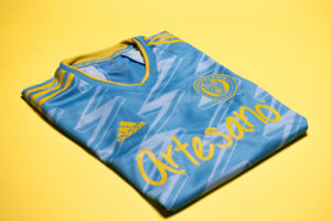
From yellow and blue of the city flag (and Sons of Ben), to the instantly recognizable lightning bolts synonymous with Philadelphia’s favorite son, Ben Franklin, the entire shirt is a love letter to the city and fans that demanded Major League Soccer give Philly a club. A shirt designed by fans, for fans, the Philadelphia Union away jersey rightfully takes home the championship and sets a precedent for clubs across the league on how to properly craft a kit that represents your city.
Speaking of clubs across the league, while PSP’s Kit Craziness saw all but one kit lose, not all losers were created equal.
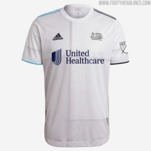
On the ugly side of things, we’ve gotta talk about New England’s effort that saw them eliminated in the first round. While there are objectively worse shirts in MLS for 2021, this Revs shirt has to be the most uninspired. Sure passing off an old Spain template as “inspired by the blockwork of the American revolution” is an excellent way to spin things; it doesn’t at all justify using an old Spain template.
However, with the bad comes the good. While New England’s effort was lazy and uninspired, some other clubs took 2021 to explore unique new directions for their wardrobe. Columbus may have found themselves out in the first round as well, but their grey, stadium-inspired shirt is genuinely unique and a great way to celebrate the club’s new digs. Sure it’s not the most popular design, but at least it’s creative.
Sticking with creative designs, Atlanta United’s “BLVCK” kit takes the familiar five-stripes look and takes it about as literally as you can. Initially panned by fans after the design leaked, the simplified stripes have become quite popular amongst the Atlanta faithful. Simple misfortune saw Atlanta drawn against SKC and knocked out in the first round. That said, with Austin taking on the more traditional striped look for their inaugural season, Atlanta should consider making the minimalistic stripes their new normal.

On the inaugural looks, three clubs revamped both their primary and secondary looks for the new season. Of those three, Chicago’s was the most understated, and both of their designs saw early exits. Their home jersey remained largely the same, while their away jersey simultaneously tried to do too much and not enough. They’ll be rebranding again for 2022. Good.
Montreal was the other existing club with two shirts this year. Their primary look is a clean all-black outfit that focuses on displaying the clubs’ new badge, with a simplified and enlarged version of the mark-making up the sublimated design. Their away shirt is only new on a technicality, with their 2020 shirt being recycled with the addition of the new badge. The Imp- I mean, Club De Foot shouldn’t feel too bad about their tournament performance, with both shirts going out to eventual semi-finalists.
The final club to have two new shirts is obviously the newly formed Austin FC, the Cinderella of Kit Craziness. While simplistic, their classically striped primary jersey made it to the final of PSP’s kit craziness and is clearly popular with fans. Their secondary shirt opted to omit any design entirely and only featured coloration on the Adidas branding details and sponsorships. Surprisingly though, with the bright “Verde” shade of green, this actually kind of works. It was by far the furthest advancing white kit of the tournament, making it all the way to the Elite Eight. Hopefully, Austin aims to be a bit more creative in the coming years, but it’s a solid first effort.


Overall, while there were some… Interesting results throughout the tournament; the bracket went down about how you’d predict. There were a fair share of upsets, but nothing really stood out as totally unbelievable, with perhaps the success of Austin’s primary doing so well. This year’s crop of MLS jerseys definitely ranks above most, though, with only a few designs standing out as objectively poor and a few looks that could be considered all-timers.
As fans slowly return to their hallowed grounds and jerseys are purchased, worn, and viewed in person, it’ll be interesting to see what designs become part of clubs’ histories, and what shirts are left forgotten. With success comes popularity and the ability to generate sales for even the most abysmal looks, while a stunning strip can be the bright spot of an otherwise miserable season. Thanks to everyone who voted, commented, and shared PSP’s inaugural Kit Craziness, and may all of your favorite shirts remain in stock and on sale. (I’m looking at you MLSshop.com)
(All images aside from bracket sourced from Footyheadlines)

RECENT COMMENTS