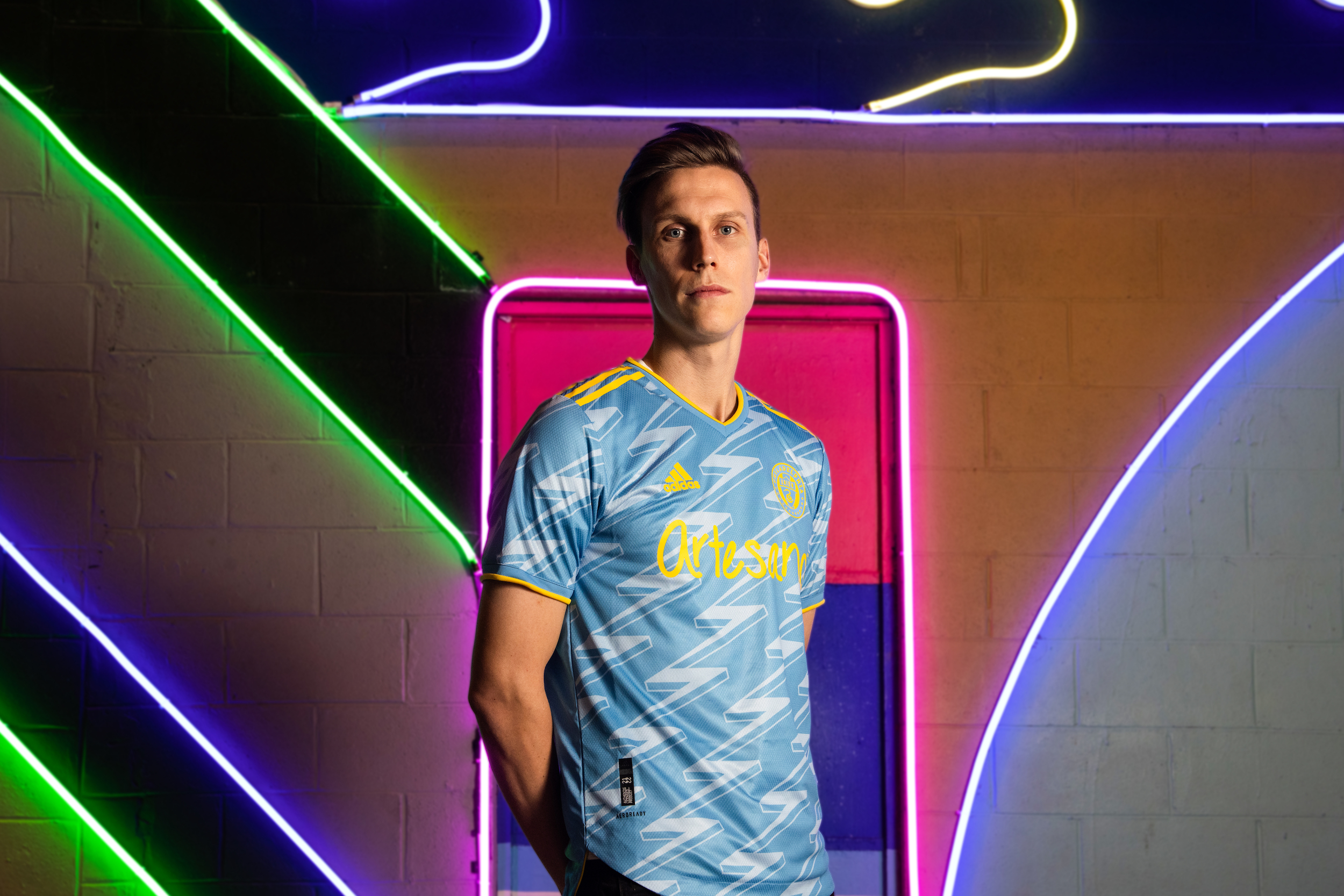
Photo courtesy of Philadelphia Union
Upsets, nail biters, and blowouts, the first half of PSP’s Kit Craziness’ first round had it all. As we move into the second half of the first round, let’s kick things off by looking at last week’s results.
(9) Minnesota United vs. (8) FCC Cincinnati
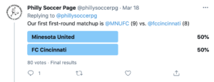
A tie. The first poll, and it’s a tie. Honestly, I’m more impressed than anything else. That said, since you guys couldn’t work out, it’s up to me. Minnesota goes through for their clean use of that Blue.
(4) Austin Home vs. (13) Chicago Away
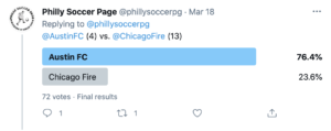
It wasn’t even close, and rightfully so. The quarter of you who voted for Chicago, why?
(5) Atlanta vs. (12) Sporting Kansas City
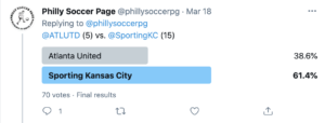
I really thought that the five stripes had this one here, even if they took it a little too literally this time. That said, fair play to SKC for advancing; maybe this look is more popular than I thought.
(2) San Jose vs. (15) New England
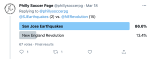
The most lopsided result of the first round and for a good reason. Nothing more to say.
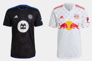
(7) LAFC vs. (10) Montreal Away
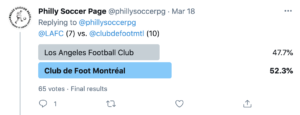
Montreal squeaks by in this one despite re-using the same jersey as last year with an updated badge. We’ll see if they get as lucky next round.
(14) Houston vs. (3) Dallas
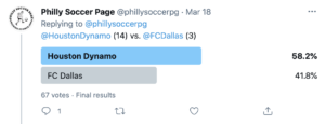
The biggest upset of this set of matchups, and I don’t understand it. It’s orange, and that’s it. Do people hate the speckled pattern of the Dallas shirt that much? Oh well.
(6) Austin Away vs. (11) Colorado Colors
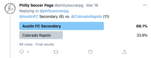
Not totally surprised here; it was always going to be an uphill battle for Colorado. Though, maybe it was a little closer than it should be since the rapids don’t even have a design yet.
Now the next set of matchups.
(8) Chicago Home vs. (9) Nashville
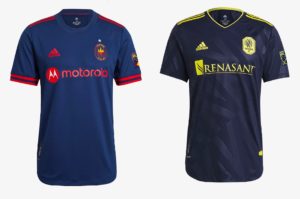
Chicago (H) – Chicago has two new kits this year, and the home shirt is aggressively fine. Chicago will be rebranding (again) in 2022, so it’s doubtful there was any real motivation to make this kit anything special.
Nashville – The subtle pattern saves this shirt from being excessively flat, but there’s nothing else really going on. At least it’s not white? It’s inoffensive at best, boring at worst.
(4) Montreal Home vs. (13) NYRB
Montreal – Another subtle pattern from Adidas, but the symmetrical nature and club iconography make it a purposeful look. Has Montreal permanently relegated blue to an accent color with their new brand, or is the black a one-off? Time will tell.
Red Bulls – The problem with being part of a global assembly line of soccer teams is that you start with a boring template and get the most boring version of that template.
(5) NYC FC vs. (12) Toronto
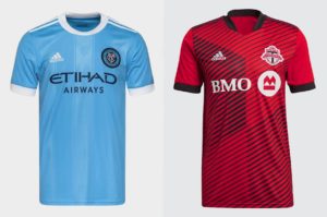
NYC FC – When you’re part of a family of football clubs, it’s hard to avoid your genes. It’s a solid shirt, but it could’ve been a bit more “NYC” using some orange or navy.
Toronto – The TFC Kits have finally dropped, and well… they look just like the leaked photos. Is TFC a line team now? What’s with all the random linear stuff on their two strips? Am I missing something?
(2) LA Galaxy vs. (15) Seattle
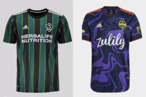
LA Galaxy – Throwbacks are hard to beat in an era where the Venn diagram of “people who like soccer” and “people who might have money” (elder Millennials and their Gen X brethren) overlaps quite heavily in 1996-era nostalgia.
Seattle – I made this bracket before the official release, and I regret it. Just yesterday, Seattle officially unveiled their kit and it’s Jimi Hendrix roots. It’s bold, exciting, and has excellent ties to the city and team. Well done.
(7) Real Salt Lake vs. (10) Miami
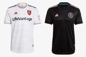
Real Salt Lake – This one is probably better experienced up close, but given social distancing and the fact that RSL is a temporary dumpster fire of a franchise and currently owned by the league, it’s tough to know who will get up close to see this thing.
Miami – Subtle palm fronds do whisper Miami, but could they have perhaps been more defined? Still waiting on Miami to really lean into the pink.
(3) Columbus vs. (14) Orlando
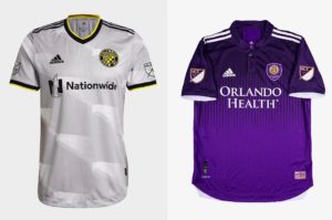
Columbus – Gradients are challenging to make work, and subtle patterns are even harder. This shirt’s already been divisive among Crew fans, but it could be an instant hit if they repeat as Champions.
Orlando – Another hard to pull off gradient, and teams like Spurs have learned that lesson the hard way. Orlando is a weird town, though, so maybe it works there.
(6) DC United vs. (11) Portland
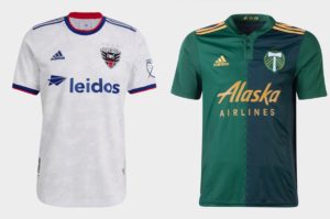
DC United – Red White, and Blue for a club that uses none of them in their pallet. The marble pattern is hard to see from a distance, but that could be for the best for a shirt that would make a suitable top for the US National Teams.
Portland – This jersey doesn’t land on either side of the fence. It’s simple and strong but not particularly interesting.
Voting will open a few minutes after the article goes up, so if the Twitter polls aren’t up yet, check back in a few!
(All images were sourced from Footyheadlines MLS overview)

i recommend using the link tom provided to see the subtle patterns
https://www.footyheadlines.com/2021/01/2021-mls-kit-overview-all-leaks-releases.html
If only Seattle and Colorado had played nicely and released their kits on time… seeding might have been very different. Alas.