It’s March, and if you’re anything like me, that means you’ve been spending an unreasonable amount of time-consuming college basketball and filling out brackets. There’s just something about single-elimination tournaments and the gloriously linear spiderweb of brackets that gets me going.
It’s all perfectly laid out, it’s clean, orderly, and chaotic beyond belief. One upset brings the entire rigid structure crumbling down and opens a world of possibilities once thought impossible. I could go on, but you’re here for soccer.
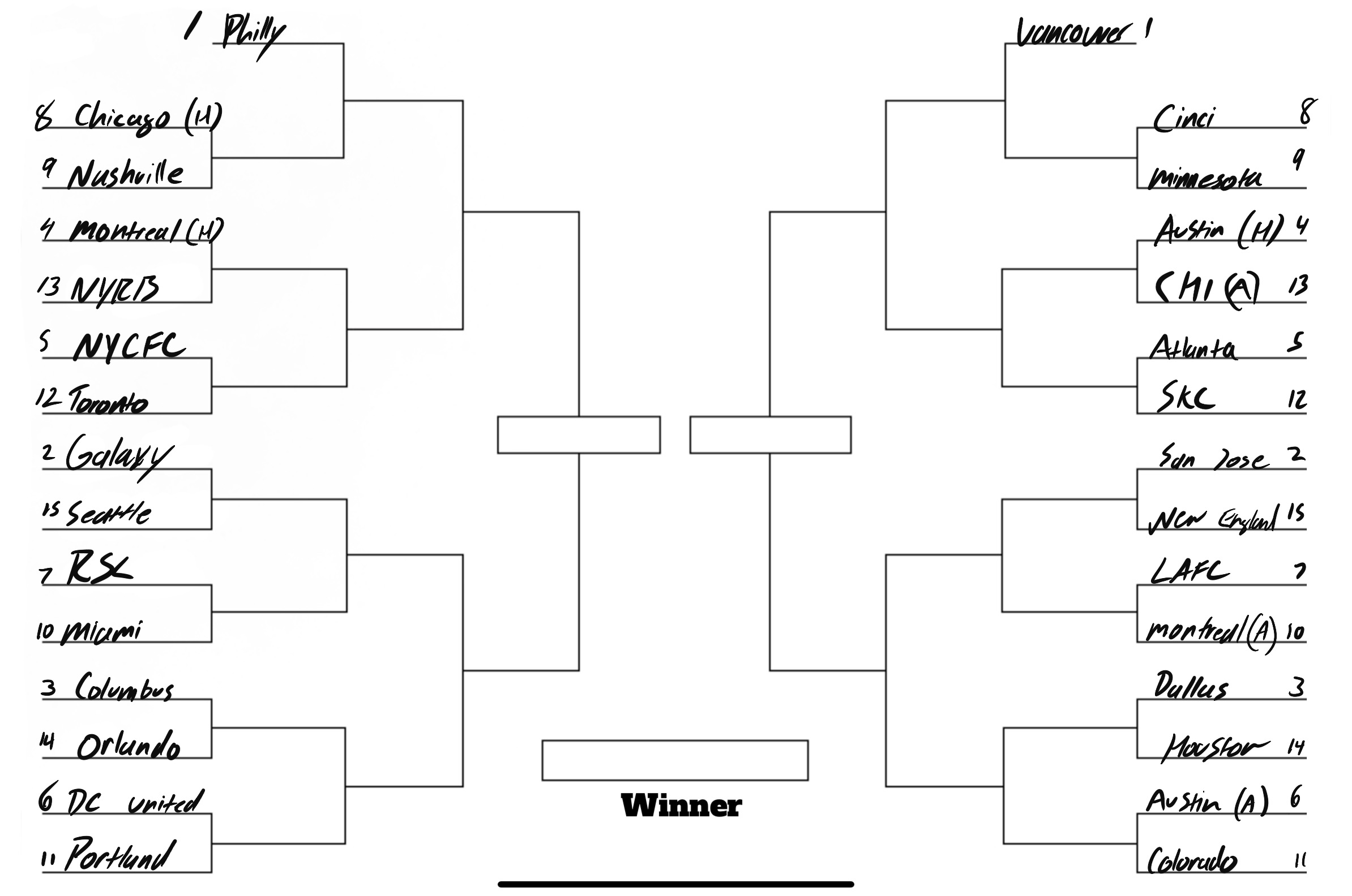
So, what do brackets have to do with soccer and the change strip? Introducing the first-ever Philly Soccer Page Kit Craziness, a 30 Kit, single-elimination, fan-voted tournament for every new MLS kit debuting in 2021.
Voting will be done through Twitter, with embedded polls in each article on PSP. The tournament will kick off today with part one of the first round, and conclude around April 17th with the final. The perfect lead into the new season. Here’s a look at the bracket.
(It’ll get nicer looking after the first round, I promise.)
Kits are seeded 1-15 on each side of the bracket based on my own opinion, and each kit will have a bit of commentary from myself and fellow kit connoisseur Chris Gibbons. Philly and Vancouver pick up the first-round byes as the best two jerseys, in my opinion, and the rest are left to battle it out in the first round. Disagree with where I seeded a kit? Prove it in the polls. Let’s get into it.
Minnesota United (9) VS FC Cincinnati (8)
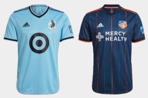
Our first first-round matchup is @MNUFC (9) vs. @fccincinnati (8)
— Philly Soccer Page (@phillysoccerpg) March 18, 2021
https://platform.twitter.com/widgets.js
Austin (4) VS Chicago Fire (13)
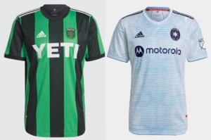
@AustinFC (4) vs. @ChicagoFire (13)
— Philly Soccer Page (@phillysoccerpg) March 18, 2021
https://platform.twitter.com/widgets.js
Austin (Primary) – The Sassuolo jokes are tired. Austin has a brand before they’ve ever kicked a ball, which is a step further than a lot of MLS teams.
Chicago – Linear patterns have got to go. They’re hard to read and do little more than making it look as if a white jersey was washed with the wrong color. Chicago should revisit the city flag idea more deliberately way once the new brand is revealed.
Atlanta United (5) VS Sporting Kansas City (15)

@ATLUTD (5) vs. @SportingKC (15)
— Philly Soccer Page (@phillysoccerpg) March 18, 2021
https://platform.twitter.com/widgets.js
San Jose Earthquakes (2) VS New England Revolution (15)

@SJEarthquakes (2) vs. @NERevolution (15)
— Philly Soccer Page (@phillysoccerpg) March 18, 2021
https://platform.twitter.com/widgets.js
San Jose – Throwbacks are all the rage right now, and this shirt hits the mark. Clean and inoffensive for the casual viewer, reminiscent of past glory for San Jose diehards.
New England – “Inspired by the block-work of the American revolution” is a good way to spin a recycled Adidas template. It’s not bad, but doesn’t really do anything other than “not bad”.
LAFC (7) VS CF Montréal (10)
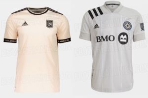
@LAFC (7) vs. @clubdefootmtl (10)
— Philly Soccer Page (@phillysoccerpg) March 18, 2021
https://platform.twitter.com/widgets.js
LAFC – Subtle. Golden. On-brand. Might this lot win a title wearing this? As Doris Day once said, “Perhaps, perhaps, perhaps.”
Montreal – This is last year’s kit with a new badge, and it was better last year. It’s the only grey kit in the league which is at least unique, but with the introduction of a black primary strip, it leaves Montreal’s wardrobe feeling flat.
Houston Dynamo (14) VS FC Dallas (3)

@HoustonDynamo (14) vs. @FCDallas (3)
— Philly Soccer Page (@phillysoccerpg) March 18, 2021
https://platform.twitter.com/widgets.js
Houston – It’s orange. There’s not really much else to say. A bit disappointing, considering the club just went through a minor rebrand. Hopefully the entrance of Austin will force Houston to consider more interesting designs in the future.
Dallas – One suspects this will be paired with navy shorts and light blue socks. Should pop with that combo, and the patterns are nice. Otherwise a safe and solid entry, but still not close to the faux Taco Jersey from several years ago.
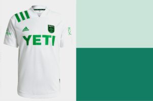
Austin FC (Secondary) VS Colorado Rapids (11)
It’s not easy being green #PSPKitCraziness– pic.twitter.com/eNUfcxg3N8
— Philly Soccer Page (@phillysoccerpg) March 18, 2021
https://platform.twitter.com/widgets.js
Austin (Secondary) – Cynics will call it another white shirt; optimists will call it clean. The “verde” green does make it a bit more compelling than plain white shirts in the past though.
Colorado – Are the Rapids a sleeper pick to win a cup this year? They might be, and this jersey might be a sleeper for kit of the year. It’s not out yet, and the ‘Pids haven’t played a game, but isn’t that the point of preseason?
(All images were sourced from Footyheadlines MLS overview)

Minnesota consistently boring
Love the Autin
Altanta minimalism
Quakes-Revs zzzzzz…* oh, umm, color, i guess?
LA-MTL zzzzzz…* oh, umm, wait! no color, i guess… stripes?
Houston Dynamo VS FC Dallas: i love the new dynamo logo and orange but the Dallas color scheme reminds me of the Le Mans car so i went there.
Rapids because my imagination is better than either real option