Photo courtesy Philadelphia Union
June, 2019
We’re back again, just two months after our initial submission went in. The second group is smaller than the first.
We’ve lost the out-of-towners, as just like in April we were called to come together quickly (we are Voltron, remember?), but we’ve kept a core of the locals and have no choice but to move forward; deadlines are deadlines.
Heck, we even lost Doug to a sick puppy.
The presentation begins with more detail about the adidas campaign, it’s slick and goosebump-inducing, focusing on the path from the pitch to the streets and back. It’s very much aligned with FIFA’s “Career Mode,” a narrative about how the players on the field became who they are.
“This is for people much younger and cooler than me,” I think aloud.
No one argues with me about whether I’m old or not cool, which is reasonable because it is a statement that in itself inarguable. There’s no time for such a thing anyway, to be honest: we’re on pins and needles to see what adidas has returned to us.
We don’t have to wait long.
A few types of sausage
Once the video presentation is over, and it’s just 90 seconds from start to finish, we dive right in.
The very next slide in the Powerpoint deck is a white page with the first set of kit options.
They’re jaw-dropping, bright and modern, unique and shocking.
“This kit is PURE,” says the former Twitter troll and adorned Liverpool fan (who happens to be an exceptional kit designer in his own right). He’s absolutely right, and none of us has ever seen anything like it (though Roma released their version of a similar shirt that summer).
It’s a shocking yellow base with an enormous blue bolt of lighting right down the center, and next to it its chromatic inverse, yellow on blue.
We’re blown away.
The mood in the room is suddenly a bit more buoyant than a second ago and a full truck-load lighter than the last time we were together. We have a choice in front of us that is so beautiful we’re not sure what to do, and we’re so glad not to have been let down that we clearly don’t know what’s supposed to happen next.
Tonight’s host, Alyssa Gentile, who’s since joined Inter Miami as their senior manager of brand and marketing, says, “Okay, here are the other two options.”
Other options?!?!?! We’re giddy.
We nearly fall out of our seats and applaud the second set.
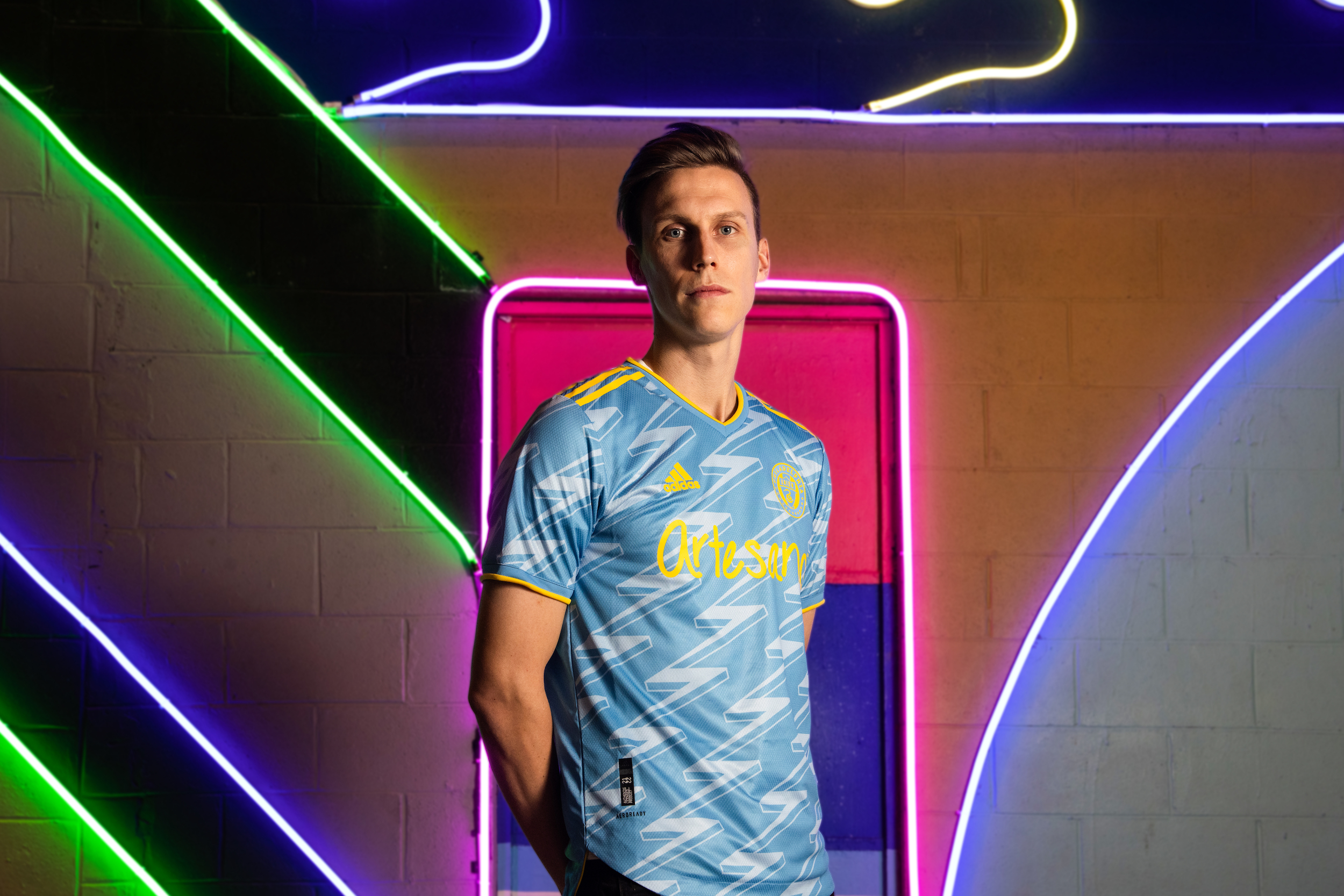
They’re somehow even MORE unique than the first set, but in a completely different way. If the opening kits were pure and clean, these are busy and bothered and brilliant; the streets to the pitch, pitch perfect.
The sponsor logo is different too, Artesano instead of Bimbo (and at this stage, no Union shirt had ever said anything other than the parent brand). Yet the kits are so fascinating it’s an afterthought. CHANGING THE SPONSOR IS AN AFTERTHOUGHT, passed over in conversation like it’s never mattered before and never will again.
That’s what this kit has done to us.
There’s a blue option and a yellow one, the same either/or as the lighting bolt shirt. Four incredibly interesting options, each with their own beauty, and we have to pick one.
Just one.
Sophie’s choice
The thing is, the Union would be notable in either of these kits.
Nothing like any of the four has been on the field since the early days of the league, and even the boldest of designs doesn’t touch either template’s audacity. That Alyssa and the other Union reps in the room are smiling lets us know that they’re happy with our efforts too, and they tell us as much. Union brass are all about this, and they’re leaving it up to us to vote.
We are no longer Voltron, we are now Abraham, except we actually have to kill three of our four beautiful sons (jerseys). This is biblical, and we’re circling around our individual favorites.
The debate begins, opinions that lean into nudges that merge into coercions. It’s a feeding frenzy as we offer suggestions of things to change or essential things to keep, trying to make sure that we get the best kit, whichever one it is that each of us prefers.
We love the lighting bolt, especially in yellow. It’s undeniable and bold, almost comically so, and would be instantly recognizable across the soccer landscape. We’d kicked around the award winning Watford template early in the process, so our choice here makes a bit of sense.
We love the other template, especially in blue. It’s forward-moving and on par with the best designs in modern soccer. To me it harkens to Ajax’s away kits of 2018 and 2019, subtle patterns and sharp lines.
We love all of our children equally! THROW OUT THE BATH WATER!!
…We have to vote.
In two rounds of deliberations, we’ve made up our mind. It’s close, but it’s the busy and brilliant kit in blue. We all agree that each of the four is worthy of its own squad, but only number four is the one worthy of ours. As it turns out, this is the one Union brass and Doug and Alyssa’s team wanted too, but they let is come to our conclusion separately.
In agreement, we know that this the community kit we’ve been waiting for… and it’s spectacular.

Question for ya, Chris. So first off, love the kit. But I was surprised that it was blue, even if it is off-tone. So for instance when the U travel up to the Bronx to play NYCFC, who sport their own sky blue jerseys, will the Union just play in their home shirt? It might even be worse with clubs like SKC and Vancouver who have blue shirts somewhere in between the Union’s dark navy and lightning kit. Just curious if you got a read on how that would work.
Great question. The home team picks their shirt and then the away team has to use its alternate. Since each are required to have a light and dark option, the outcome is fairly preordained. The U often feature their newest shirt in their home opener, which is why they wore white against Toronto at home two years ago.
Scenarios such as the ones Steven presented are why I wish more MLS clubs had third jerseys. I read there are criteria that MLS clubs must satisfy before being allowed to have a third jersey. I think Atlanta United is the only MLS club that has a third jersey. It seems like most – if not all – of the clubs in the Premier League have a third jersey. I don’t know pretend to know how much it would cost to produce a third jersey for each club. But third jerseys would prevent bizarre color clashes.
Do you know what the Short / Socks are that go with this Jersey ? Is it White ? Navy ? Yellow ? or the Light Blue ?
I don’t know, but expect them to have options like with this year’s away kit. It was built around an all-white template, but then they wore blue shorts in LA and never looked back.
YOU BIG TEASE!!!!
.
Where are the pics of the other 3 options?!?!?
.
The big bolt option really sounds cool too…
I wish I had pictures of those other ones. Honestly, if we could’ve picked one of them for next year’s kit, we would have. They were so good.
I think this new kit is horrible, but at least it doesn’t say BIMBO on the chest!