Feature photo courtesy Philadelphia Union
Editor’s note: The Union unveiled their new secondary shirt on Wednesday morning, culminating a design process that started nearly two years ago. Our own Chris Gibbons had the chance to be a part of that process as a member of the “Union Creators’ Collective.” In this multi-part series, Chris takes you behind the scenes of how the Union’s new look came to be.
April, 2019
It’s a shade after 6:30 p.m. on the 11th.
We’re walking down some stairs into a dark hallway. There are fewer than 10 of us, all relative strangers, plucked from media lists, fan forums, and Twitter engagements; a motley crew.
We’re at The Wharf, the large building adjacent to Subaru Park that serves at the corporate offices for a handful of companies including the Philadelphia Union. The facility’s interior theme is almost all white and spartan, at the behest of owner Jay Sugarman, he of the open-concept, clean palette, by-the-water methodology. This space checks all of those boxes. Down here though there are no windows and even a bright eggshell paint isn’t enough to show the way.
To our left is an open door and we’re guided through.
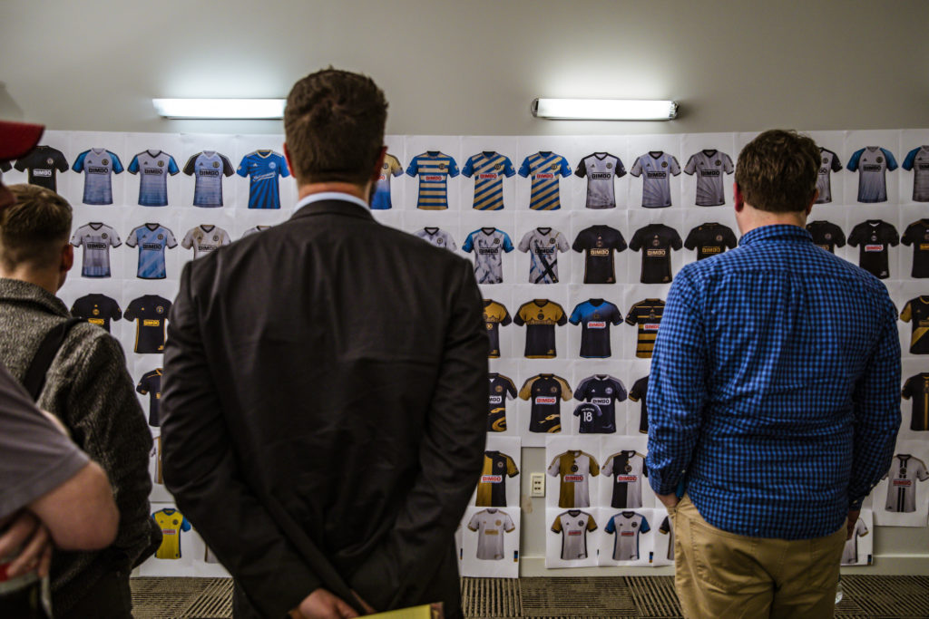
We enter a small room, the size of your childhood bedroom perhaps, lit like a stage. On the wall to our right are printed papers of Union jersey designs, a gallery wall of Boys-in-Blue nerd-dom. Dozens of options, from stripes to hoops, solid colors to rorschach tests. There are bridges and snakes of course, and one has to crouch or stand on one’s toes to truly capture everything. This myriad of creativity is encompassing, and it is a rainbow that includes not only the basic team colors and but also every iteration of chromatic in between.
It takes up the entire wall from floor to ceiling.
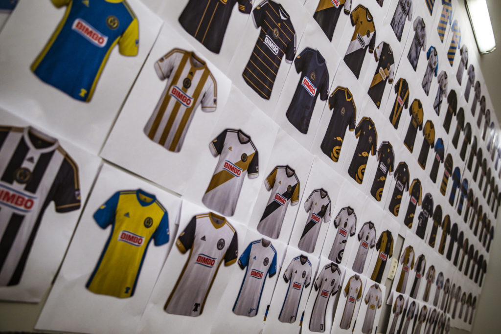
It’s a kit-lovers mecca, and the team let us bask in it.
“Well,” Doug says, “what do you think?”
Doug Vosik, our host for the evening, is the Union’s chief marketing officer, a Union fan-turned-employee who has opened his world to our eyes.
What do we think?? What do we THINK?!?!? This is the coolest damned thing any of us have ever seen, Doug, THAT’S what we think.
We immediately begin picking our favorites.
There’s a gold and navy hoop designs that stands out, and one that looks a bit like the “Take On Me” video by A-Ha, sketched and frantic (this one is slightly triggering for me, as I’ve had a recurring nightmare since I was a boy that includes a “Take On Me”-esque forest where I am being chased along a fence, and only as I’m arriving at a break in the line to escape do I become captured and scared into consciousness…). The distribution is as one might expect: some are instantly engaging, others less so, and there are plenty to fill the space.
The wall is Philly Soccer Page’s inaugural kit-design contest on steroids.
This, it turns out, is the input part of the Union’s creative process over the last three seasons. An orgy of graphic design, a mood board of a thousand moods, the many branches of a Philadelphian tree named Club and Community and whatever else an actual Chief of marketing might conjure for storyline.
That’s why we’re here after all.
A home shirt exists to represent the Club, to be authentic and bold, and to act as a statement of the team as recognizable as the name itself.
An away shirt, the one we’re tasked with creating tonight, is one to represent the Community of Philadelphia, of Chester, of the fans themselves.
The wall behind us appeared to be blank when we walked in. Now that we’ve had our time to salivate over what the team has submitted to their designers, it is revealed that our blank wall is merely a sheet of paper.
The paper is removed and behind it are fewer than a dozen more detailed drawings, most of them variations on a theme: several Doop Hoops, a New England Revolution kit in Union colors, two variations of the team’s prior starburst and white kit, and a faded yellow one with white shorts. Some are familiar, sketches of the shirts the Union actually wore over the past 6 seasons. Others are slightly less interesting, but clearly designs that have come out the other side of the sausage-making process.
We comment on those too.
Trust the process
Just a half an hour before we made this trip, our group met for the first time, ate some pizza, and were brought up to speed on the process of how a jersey gets made in Major League Soccer.
The simple timeline goes like this: Union brainstorm ideas and themes (lightning, snakes, bridges, etc…) and submit them to adidas, along with preferences for color. Teams aren’t allowed to ask for design elements per se, but can be very clear in their boards for what they think is important. Adidas responds with a few options, the group meets again to whittle those down to a few finalists (and any coloration or minor tweaks that the team considers to be crucial), and adidas responds again with final options.
Then, the team picks one and moves forward.
This is Meeting 1 of the three-meeting process, called roughly a week prior when adidas gave the league its submission deadlines. We essentially have an hour or so in this conference room to create the actual imagery and suggestions that the team will submit to adidas the next morning. It seems crazy, but we are Voltron… Union Kit-Nerd Voltron.
We move swiftly in our task, finding it easier to rule things out than to identify things we really like.
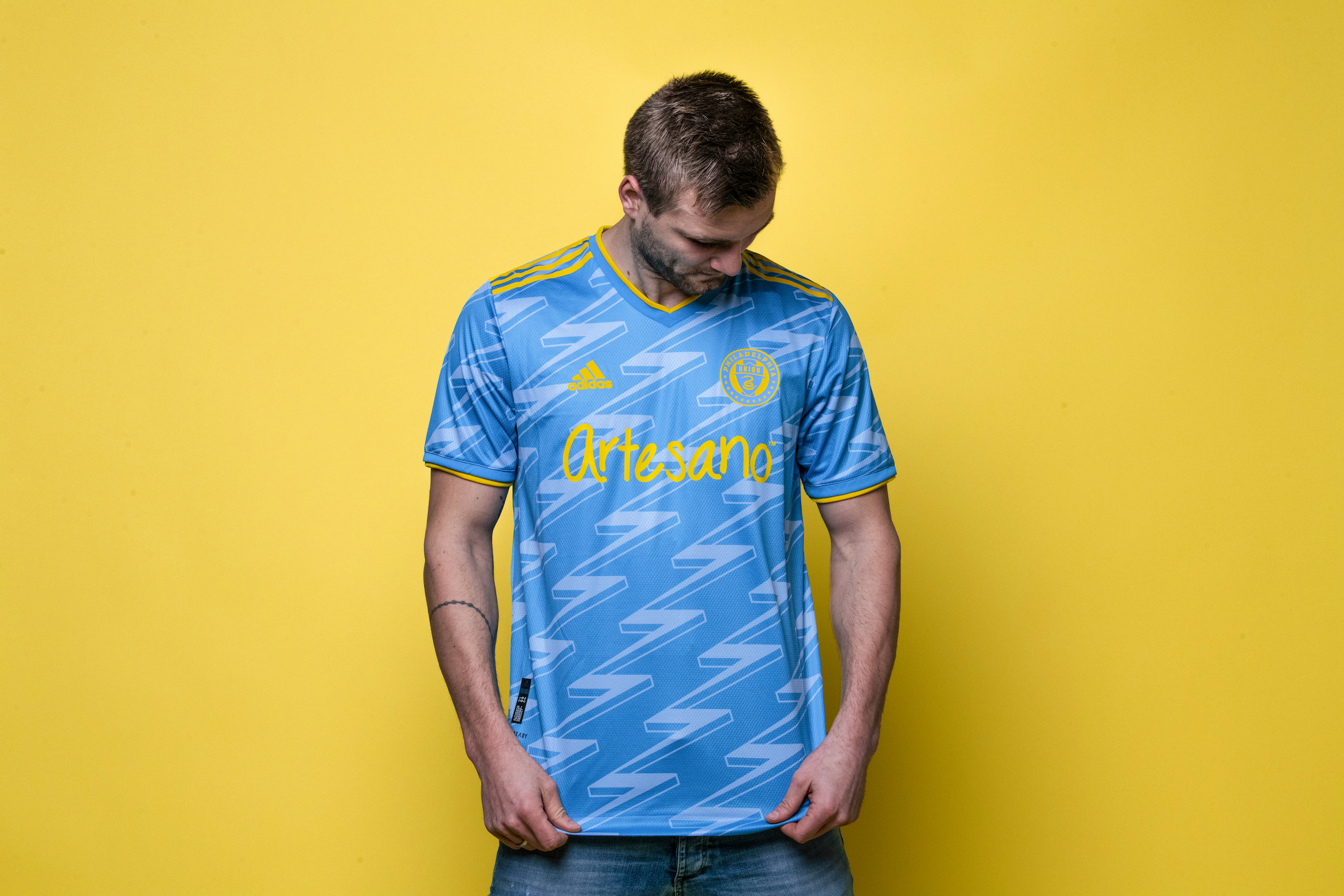
Each club in the league is required to have one light kit and one dark one, so since the Union’s primary is navy, our palette will be soft. We opt not to use white, though Doug tells us that the players say they “feel faster” in white. That’s worth something, but not enough for us.
We like the colors of the flag of Philadelphia, which are clearly displayed on game day as those of the Sons of Ben. That affiliation is polarizing to some in the fan base and we talk openly about that, Sons of Ben members and not, but we see it as an opportunity either way. The Union have never done a yellow shirt before, and the signal blue effort from nearly a decade ago was a hit. We decide those will be our options and move forward.
We talk about the bridge (if you think having BIMBO on your chest requires some explaining as a women, imagine if there is also a bridge on it too with spires that crest at chest-level), we talk about smoke (as in smoke from the River End), we talk about Ben Franklin, Old City, lightning, and the Liberty Bell. We talk a lot about Chester. In the end, we’ve covered a who’s-who and what’s-what of Philadelphia regional icons and cliches.
The idea of lightning starts to stick as the conversation bounces around the room, leaving sublimated patterns and camouflage behind. Also left behind is any talk of bringing back the bib for this kit; we have room to be creative, and though we all have nostalgia for the template, this isn’t the iteration for it.
Then we’re done: light blue and yellow, lightning bolts, and a few other suggestions of things that make Union fans tick.
Time’s up
It’s impossibly fast this first meeting, and my heart is thumping when I get back to my car.
Before 6:00 p.m., I didn’t know the first thing about this process. By 8:00 p.m., I and a group of people I only “knew” through Twitter had built the board that would be sent to adidas for the next Union jersey.
The actual jersey.
Where we succeeded was in putting years of collective fandom into what we thought our team represented, what we thought needed to be changed, and what parameters we thought made sense to help adidas come the same conclusions as we did.
Our brief is good, and now it’s out of our hands for a few months.

Question: did you guys feel like you were owning the process? You weren’t being guided to go in a certain direction? Didn’t get the feel you were from your recap, but I’m just curious. Good stuff as always and for what it’s worth, I also like the new design and will probably be buying one.
We really did feel ownership. Doug facilitated conversation, but it was our discussion.
Cool. Glad to hear. Enjoy it a lot and bought one today
I just think this is an ugly jersey.
I’m sorry you feel that way. So far the feedback has been nearly universally positive, and we’re really proud of the finished product.
It really doesn’t feel like a soccer jersey. It looks more like a warm up top to me.
This is interesting, and from my seat it seems like a broader trend in soccer design. Patterns are coming back en Vogue for jerseys after being relegated to warm ups for a while, and the line between the two is blurrier by the day.
Great article Chris! I like this new one, sharp looking and the yellow really pops – great work!
I could have easily spent well over an hour just staring at that wall of jerseys. Would love to see them up close. The one off the left shoulder of the guy in the suit intrigues me.
That wall was magic. I could’ve stood there for hours too.
Regardless of whether it suits everyone’s design sensibilities, I enjoy that we have some real regional symbols and representation involved with the design. The fabric of Philly is woven into the jersey. This is important.
.
Also, it suits my design sensibilities. I’m still ready for the Union to get back to their center stripe, but this makes for a great 2nd!
.
Maybe it’s a low bar, but at least it ISN’T another white tshirt. A lot of there teams are losing their identity with their jersey designs in recent years. I think we strengthened ours with this one.
Not the biggest deal in the world but what color are the shorts….yellow with blue stripes?.. or is the design going straight down and through the shorts
Well it’s great to get the insight into the process! We will be getting one for sure! Keep up the good work!!
I am also curious about the shorts and socks pairing with the jersey. Did you guys have any input for that? And thanks for saving us from another generic white away kit.
Chris I think you all did a great job. I like the kit and it’s probably the first one I’m really interested in buying. It reminds me of the old Arsenal kit.
It’s fine.
Looks like something a keeper would have worn in the 90’s.
At least it isn’t a white shirt with a grey smudge that can only be seen under an ultraviolet light.
I’m a fan of the jersey. I would have liked the trim parts of the jersey to be in the darker (navy) blue.
.
But can we talk about the navy/gold/navy sash in the upper right-ish corner of the first photo? 8^D