Well, that happened.
Last Tuesday, the Union departed the MLS Cup in a performance that, dare I say, was stereotypically Union. Honestly, as a writer, I don’t even want to think about it. It happened a week ago, and it’s still too soon for me. All I can muster are thoughts such as “Sad…” “Damn that sucks…” and, “So here’s how Salzburg could theoretically loan us Aaronson…” As you may be able to tell, these are not the most rational or coherent thoughts.
So, rather than processing my feelings, and writing down my thoughts, as any good writer would do, I’m instead going to talk about soccer jerseys. Why? Because I’d like to, and this is my coping mechanism. I’m fine, it’s fine, everything is fine. This is plenty healthy, I assure you. Anyway, you know the drill. Three points, one throwback, and one other sport let’s do it to it.
THREE POINTS
1.) HOUSTON DYNAMO REBRAND
Two weeks ago, the Houston Dynamo unveiled a new brand for themselves. They kept “Houston Dynamo” but added the increasingly popular “FC” to their name. With the name change (expansion? alteration?) came a new badge and branding to match.
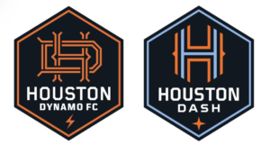
(via the18.com)
I really like the badge and the direction the branding seems to be going, but two things trip me up just a little bit. First, The addition of “Football Club.” It’s just a bit unnecessary to me, but sure, fine, I get it. The second thing, though, I don’t get. “Hold It Down Football Club” It’s a line that’s appeared on new merch for the team and something that the club seems to be calling themselves in social media posts.
Sure, “Hold it Down” is a fair motto or catchphrase, but why add “football club”? Is it a nickname? If it is, it’s way too long. Is it a saying? Okay, but then why add Football Club? Is it a totally different entity than the first team? That’d be cool, especially if it was an urban engagement initiative, but it really just seems to be some odd piece of branding that defies categorization. Whatever it is, Houston definitely took the right steps here, and I’m excited to see what they do with the new brand when it comes to jerseys and merch.
2.) AUSTIN FC REVEAL JERSEY
Yeah, I know I talked about this last time; those were just speculations; however, this is the real thing. Behold, the inaugural Austin FC kit.
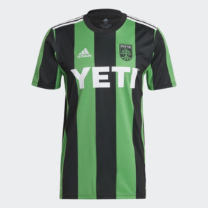
(Via Adidas)
It’s uh… well it’s something! It’s not bad, it’s not amazing, it just kind of exists, and that’s really confusing for me. Shouldn’t MLS and Adidas strive to create designs that really stand out and encourage fans to buy a jersey? Especially when it’s the club’s first year? Or is their logic that fans will buy anything because there’s no other option in the first year? That has to be their logic because it’s the only line of thinking that could explain Nashville’s lackluster debut strip.
Maybe Adidas saves a killer design for the club’s second year, hoping that fans will double-down and buy jerseys in consecutive years. I don’t know; I really hope so, though. As much as the design is “clean” and gets the job done, personally, I always prefer something that’s unique and different, even if it isn’t as objectively good looking. Jerseys, in my opinion, should serve to be instantly recognizable, or at very least stand out from generic template designs on the Adidas website. I genuinely wonder what the hell goes through a design team’s mind when they release something so generic. Surely time isn’t an issue? I whipped up this rough concept in under 20 minutes. (once I remembered how to use photoshop)
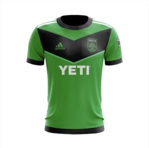
It’s nothing to write home about, but the V across the chest isn’t used elsewhere in the league and could be a neat way of emphasizing the “Verde” brand the club has been pushing since launch. Anyway, I digress. Whatever the issue, it’s disappointing to see the recent trend of expansion clubs lacking unique style. At least the Union had that gaudy center stripe for a bit, even if it’s lost to time. (please, god, bring it back.)
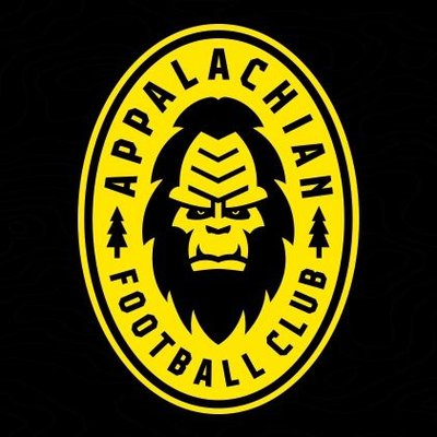
3.) APPALACHIAN FOOTBALL CLUB
On November 17th, Appalachian Football Club unveiled its branding, and god is it beautiful. Or, maybe not beautiful, but certainly unique.
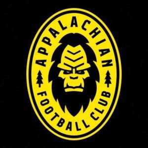
(Via Appalachian FC)
Going in the complete opposite direction as Austin, Appalachian FC showcased a truly unique identity and one that’s frankly just enjoyable. The badge features a sasquatch dead center and two pine trees on either side. It’s not some tremendous artistic feat, but it’s fun, and that’s the point, especially at the lower level.
Attention is repeatedly given to teams that embrace more local branding and decide to have fun with it. It makes you wonder why MLS seems so dead set on using branding focused around buzzwords instead of real, local flavor. The most successful brands in the league come from clubs like Portland and Minnesota that have truly embraced their location. Personally, I think mirroring what the NBA has done in terms of jerseys could be a great idea. Have one jersey that follows the traditional design prompts to satisfy those who want a classic design, and then have another shirt that focuses on local, city-inspired style. Hopefully, after the most recent wave of expansion dies out, we’ll see clubs ditch league driven design prerogatives for city-centric branding that produces relatable and unique designs.
FROM THE ARCHIVES
For this article, I wanted to just briefly talk about the Argentinian national team home shirt, specifically the one worn by Diego Maradona in the 1986 World Cup final.
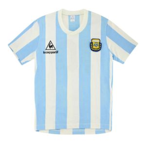
(Via Football Kit Archive)
There’s really not much to say about it in terms of the design, in all honesty. I really love when national team jerseys incorporate elements from a country’s flag, aside from just the colors. Argentina does that to perfection here with the stripes, reminiscent of the flag’s horizontal white line. It’s not really a revolutionary concept, and something that many nations do, but I could stand to see more of it, especially in the case of the United States.
It’s not often that a player transcends the world around him, but Maradona certainly did, and he did it while wearing the iconic blue and white stripes of Argentina. Rest easy.
EXTRA TIME
A few weeks ago, I talked about the Flyers jersey leak that eventually came to fruition as part of the “Reverse Retro” series in the NHL. The concept is that every team in the league would take an iconic design from the past, and flip the colors, or apply their modern colors. That’s sort of what happened, and some teams took way more liberties than others. Amongst those were the LA Kings. The results? Stunning.
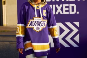
(Via NHL Twitter)
The Kings took their iconic 90s jerseys popularized by Wayne Gretzky and mixed them with their retro purple and gold colors from the 70s and 80s. It’s more of a retro retro than a reverse retro, but you’ll get no complaints outta me. Hopefully, some sales leading up to the holiday will ensure my wallet isn’t complaining, as I’m sure to pick one up.
As usual let me know in the comments why my takes are horrible and awful, or tell me that I’m totally right and boost my ego. Either works.

You’re totally right … ego boost, ego boost, ego boost. But also I really do like the Appalachian FC branding I think it’s so eye catching but in a good way!
Kudos to Appalachian FC for doing something different. Very cool. I also enjoy the Austin kit. The stripes and colors are well done. When I see it, I know it’s them. That’s cool. Would love the Union to do something bold and different.
.
Cool article. Thanks!
I like that Appalachian FC logo… way to be bold and different in a good way
I definitely prefer your Austin jersey over theirs!
RE: Appalachian FC – I always associated Bigfoot/Sasquatch with the Pacific Northwest, but still cool.
Austin is fine. it’s classy, the white 3 stripes work with the sponsor logo, and a rare occasion where having a recognizable brand across the chest helps. Nashville lacks all of this.
i like how the union adopted the snake in a diamond for the Open Cup throwback last Final. no type, definitely no FC, simple and enjoyable.
You artist types! Thanks for just using your art brain and keeping me smiling! I’m going to try to purchase an Appalachian jersey! It’s just to cool and fun not too! Also…I have walked parts of the trail so kinda the thing that reminds me I need to go back!
Thanks Tom! No worries about not writing about the loss! It sucks but maybe baby steps are more sustainable than a lightning bolt to the top!