Feature photo credit: Earl Gardner
If there’s one thing supporters of the beautiful game love as much as the game itself, it’s the style. You could argue it hasn’t always been this way, but let’s be real. It has. From casual support of the 1900’s, to hooligan culture of the 80’s, to the MLS supporter in 2020; looking good has always been paramount. It’s taken many different forms over the years. It will continue to evolve in front of our very eyes until the sport ceases to exist. For that reason, I figured, “Hey, why not write about it?”
Today is the first in a new biweekly series where I’ll break down the aesthetics of the beautiful game. I’ll typically be spending a lot of time focused on jerseys. Still, the column could really touch on any stylistic point of the game. I’ll hit three points (get it?) a week, take a brief look into the game’s visual past, and then add on one minute of extra time devoted to another sports design news. Sound good? Let’s get into it.
THREE POINTS
1.) RB SALZBURG
Brendan Aaronson is going to Red Bull Salzburg. I know it, you know it, and by now, both of our extended families know it as well. That being said, with the kid on the move, I’ve seen a lot of people throwing around the idea of grabbing a RedBull Salzburg jersey to support him. It’s not the worst idea, and I totally get the sentiment of wanting to support our brightest prospect to date. However, I’d like to make sure everyone here is an informed consumer.
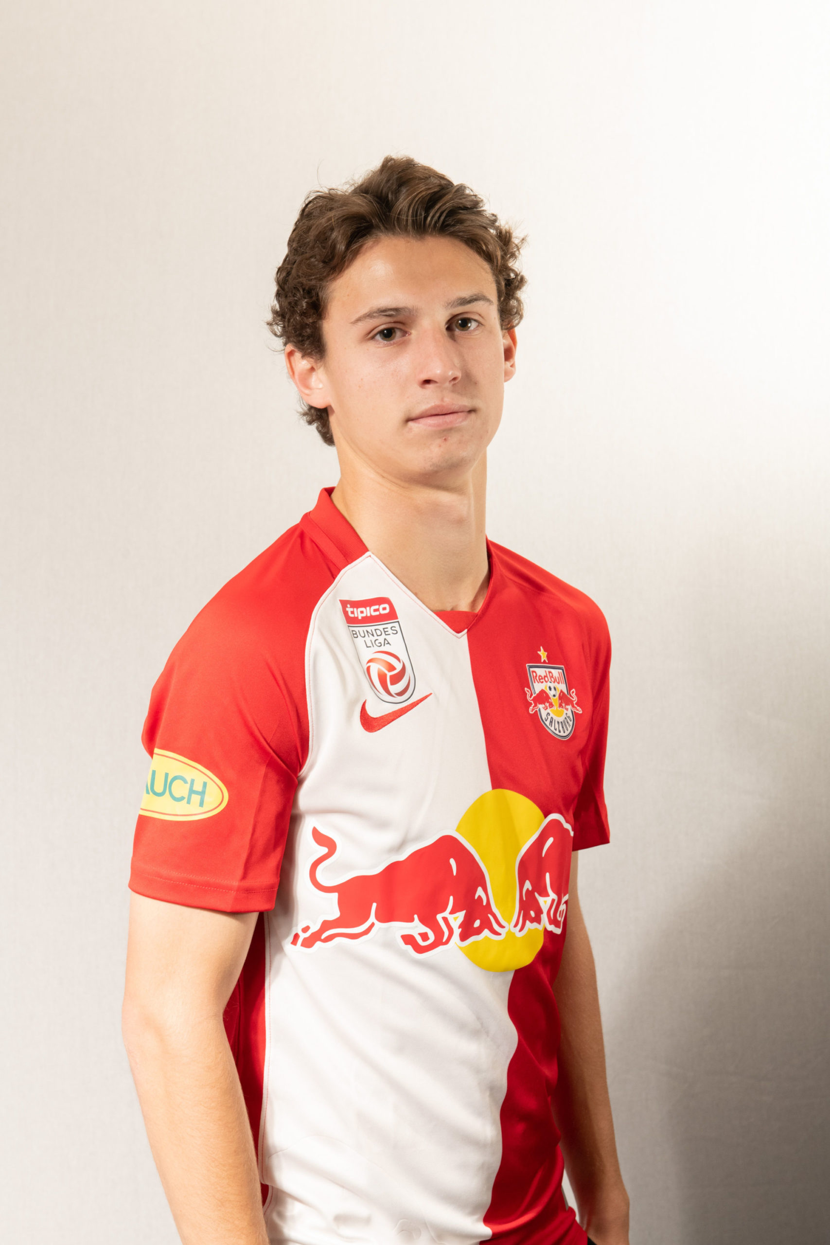
(Image Via Scrimshaw PR)
While Aaronson has been photographed wearing the 2020 home shirt, there’s a much more appealing option for us Union fans out there. Enter the 2020 Salzburg away strip. While it’s not devoid of that gaudy sponsor logo, I think Union fans will find it’s blue and gold color pallet a tad more appealing. Because after all, we know who wears red to Union games.
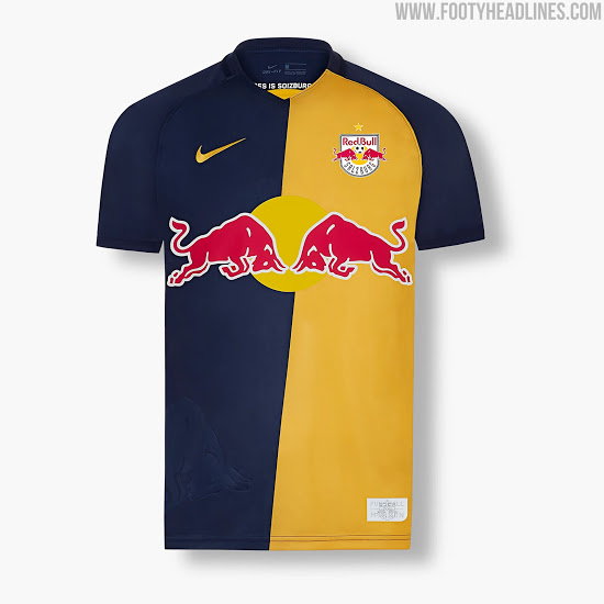
(Image Via RB Salzburg)
2.) MLS ALL-STAR LEAK
2020 has been the year of cancellations, and even with MLS chugging on, it’s not an exception. The 2020 MLS all-star game fell by the wayside, and with it fell the jerseys to be worn by the league’s best. That doesn’t mean we don’t get to look at what could’ve been, however.
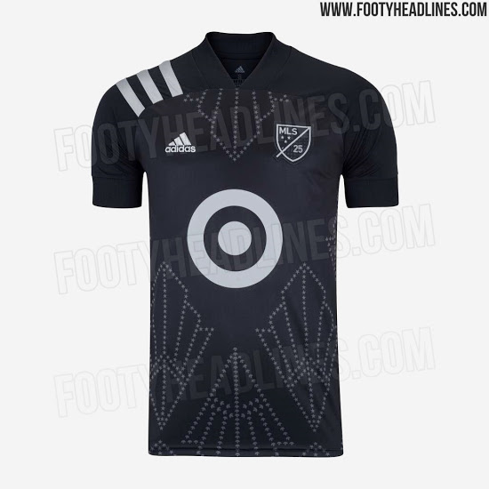
(Image Via Footy Headlines)
Last month, Footy Headlines revealed what would have been for the LA Based 2020 All-Star game. The jersey is based on the 25th-anniversary template by Adidas and features linear designs that could be reminiscent of Los Angeles theater marquees. MLS All-Star jerseys are nearly always controversial, and there’s no doubt these would’ve been as well if they’d been released.
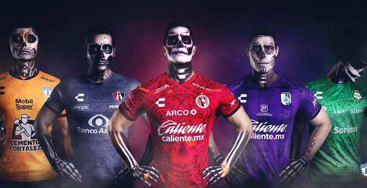
3.) DÍA DE MUERTOS
Mexican football brand Charly has rolled out a series of Día de Muertos (Day of the dead) kits for five Liga MX teams just in time for the holiday.
(Image via Footy Headlines)
Each kit features prominent imagery of the Mexican holiday, including sugar skulls, Papel Picado (decorative tissue paper cutouts), and traditional celebratory flowers. Each jersey will be worn once by the club, around the date of the holiday.
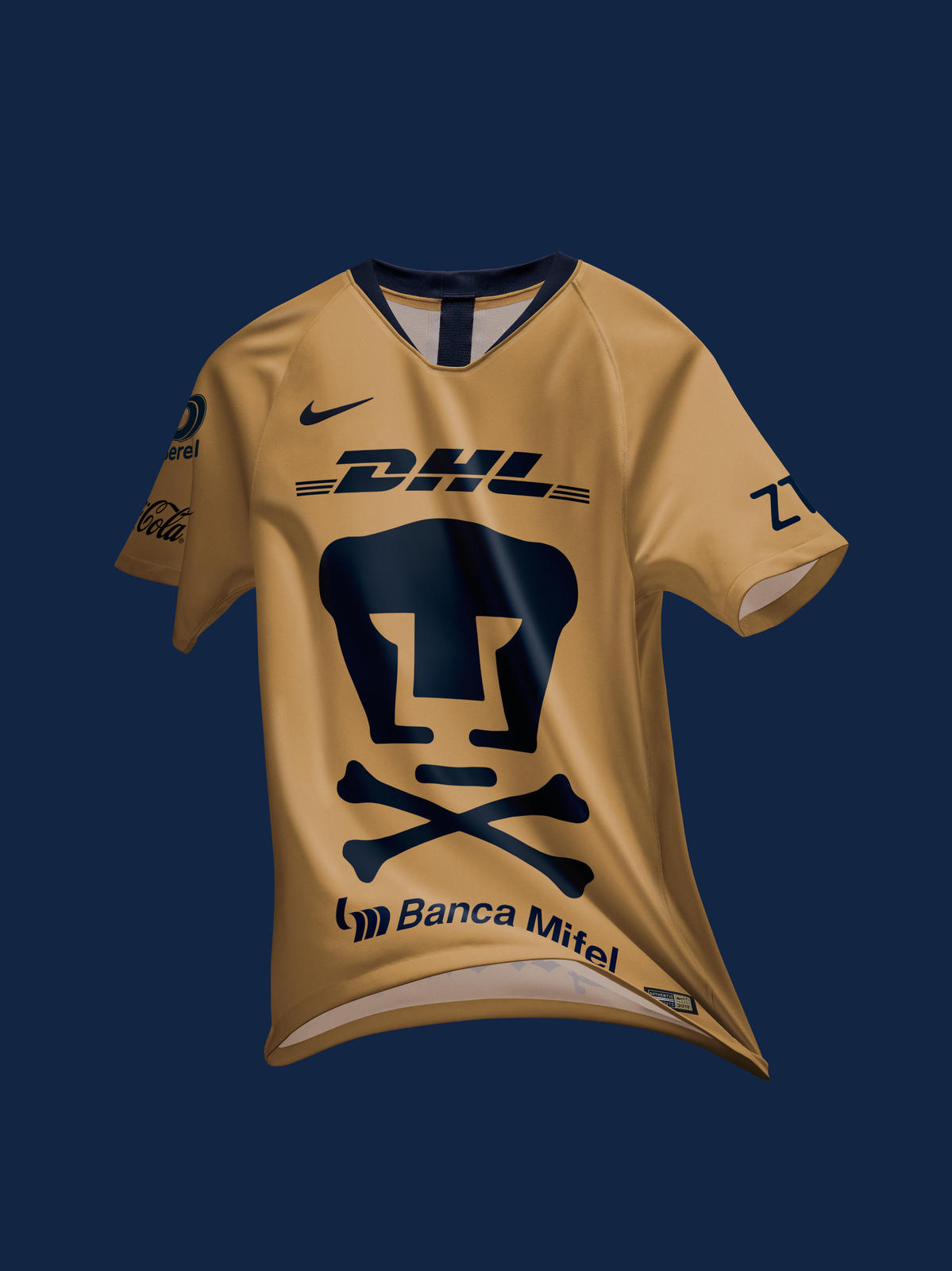
FROM THE ARCHIVES
Sticking with the day of the dead theme, Liga MX club Pumas was the first club to dawn day of the dead threads two years ago in 2018. The shirt remained mostly unchanged from their regular home shirt, but featured a set of crossbones under their traditionally oversized badge.
(Image via Nike)
EXTRA TIME
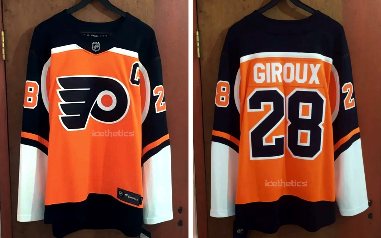
A week or so ago, a new Flyers jersey leaked courtesy of Icethetics. The jersey seems to be a series of new fourth jerseys through the league that inverts classic designs. The Flyers sweater appears to be a flip of the 1983 away jersey. Love it or hate it, it’s an interesting look regardless.
(Image via Icethetics)
Loved what you saw? Hated it? Want to see a different format? Want to see different topics?
This is a brand new column, so feel free to throw any suggestions my way via the comments.

Would love to see a “Football Shirts in the Wild,” style feature that you come across through the time between columns.
Also, more obscure team strips in Union blue and gold! Not that Salzburg are obscure – sorry, Brenden.
1+ on “Shirts in the wild”
Great stuff! Never hurts to see/dream of possible Union concepts…
How bout those Pharrell/Adidas collaboration kits? I may have to pick up a Gunners kit.
Saw those! The Man U/Arsenal/Juventus/Madrid ones were really nice!
The Bayern shirt looked a bit meh.
“Change is good …” and Change Strip is awesome.
*
Love it already, Thomas!
Looking forward to this. You hit on a few things I regularly read and am passionate about here. As a sports apparel designer, I geek out over this stuff.
I’ll get the Flyers awful alt jersey out of the way. It reminds me of a 90s Starter jacket, not in a good way. I vented about this elsewhere when leaked. However, since then, Dallas tweeted out their alt and it’s awesome.
https://twitter.com/dallasstars/status/1321469550509150209?s=10
Why can’t we do this, just in Orange? Gah!
–
The Charly kits I saw in my mailing from Live Breathe Football. I recommend anyone who appreciates style to subscribe to their email. Since Covid lockdown they’ve been putting out weekly content about news and fashion. Charly did a fab job on these. A shame they only get one time wear.
–
Won’t be sporting anything RB. Sorry, Brendan.
–
I’m a City fan and would’ve dropped cash on a Messi kit but thankfully the delay of his inevitable arrival spares me from the WTF with all their kits this season. Not a fan.
–
Finally, I got to see this year’s Union primary kit in person at Wednesday’s match. The detail of the snake is well-designed but almost invisible to the naked eye at distance and most lighting conditions. A poor execution for what could’ve been a top 3 Union design. I feel like the organization was wowed seeing this up close, in their hands. It’s so important to appreciate scale in these matters and seeing this element get lost while in the stands, on tv and even their promotional material shows how demure it is. It’s a badass snake and it’s demure. #fail