Photo courtesy of Philadelphia Union
“It’s gonna have a big a$$ snake on it,” she whispered.
“What?,” I said, lifting my head from my mobile Twitter feed and refocusing my attention.
“The new jersey. It’s gonna have a BIG. A$$. SNAKE on it,” my source said again, shuffling her feet and looking over each shoulder.
“Hm,” I thought, a bit puzzled.
That sounds kind of dope actually…
“Yeah, Sugarman’s been trying to get a huge snake on the jersey for years and he finally got it.”
Her tone was almost giddy.
“Really? For years?” I was now even more incredulous.
“Yeah, a big a$$ snake” she said, shaking her head in disbelief.
I thought some more about it.
That actually sounds really dope…
Launching blind
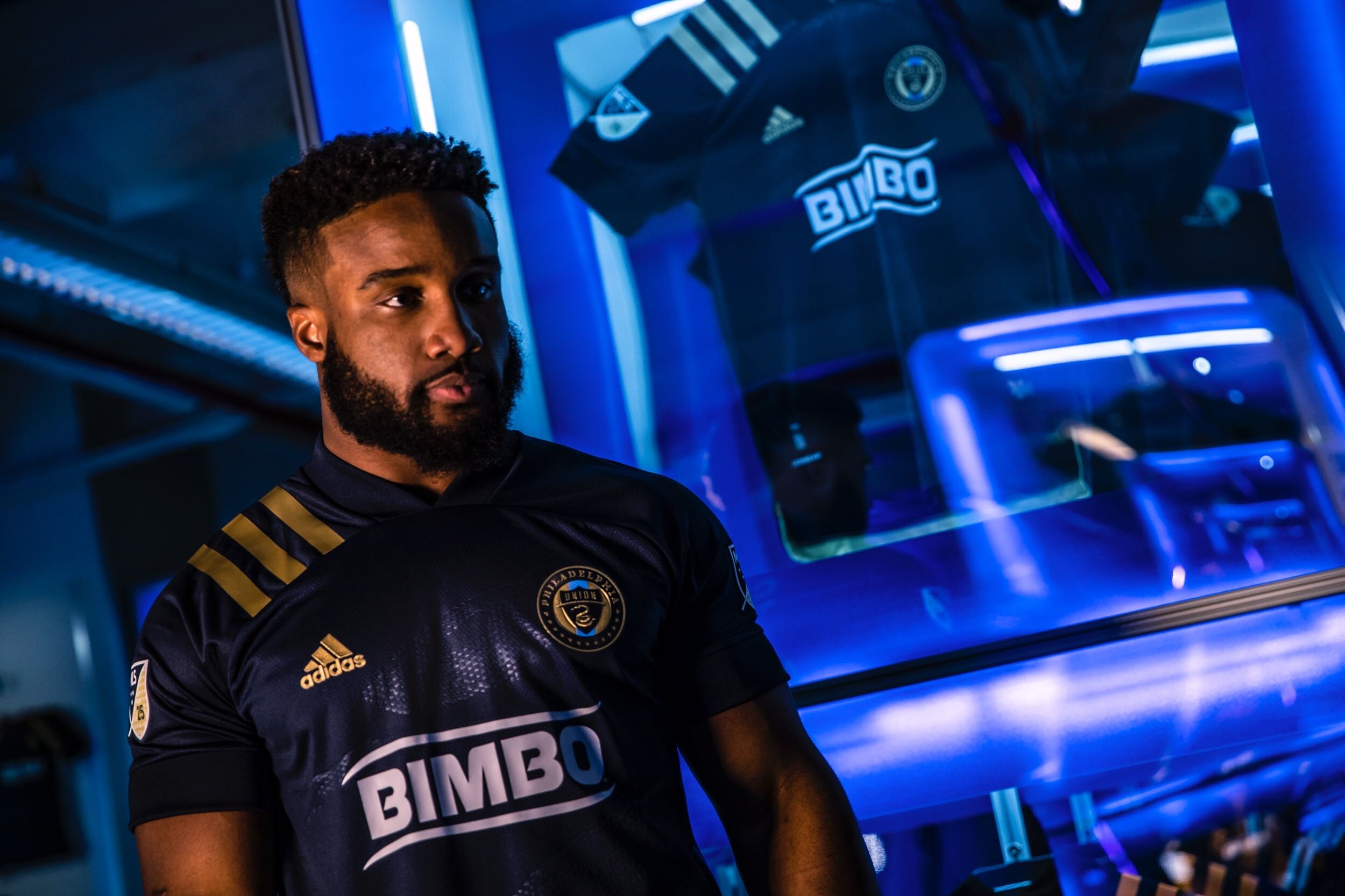
Sugarman, team owner and snake whisperer, apparently got his wish Wednesday when the Union released their much anticipated 2020 home jersey.
https://twitter.com/PhilaUnion/status/1225238755910529024?s=20
On the front? A big a$$ snake… Vintage lines, gold accents, and one BIG A$$ SNAKE.
It looked like a whirlwind of a night, with influencers and media moguls all promoting their relative teams (with the Philadelphia Eagles’s own Boston Scott representing the Union and oh, hey, Colin Hanks?), but it was one fans couldn’t actually watch it in real time.
Although the team and the league promoted this launch as a 25th anniversary event to match the league’s first official jersey unveiling, like the one below…
…there was no stream, no feed, and nothing but “after” photos to be shared on social media.
For a league that has tripped over its own feet (by many fan’s measure) incessantly over the years, but has seemed to do so less and less recently, this seemed like a missed opportunity: people were interested in this and might have watched it.
Alas.
But speaking of missed opportunities…
Forever blue, forever gold,…
The Union’s tweet above says it all: Forever blue and forever gold, because blue and gold are the Union’s colors.
The only thing people will notice on this shirt unfortunately is the big white logo on the front which is neither blue nor gold, completely incongruous to the shirt’s entire theme. Across the league, Bimbo’s is the only shirt sponsor not to take the color of its respective team’s shoulder stripes or Adidas logo.
Have a look.
Given the incredibly seamless integration of shirts sponsors like UHC, Bell, and Alaska Airlines, those that blend nearly completely into being part of the shirt, it’s massively disappointing that Bimbo isn’t written in gold.
That’s it, that’s all it would have taken to complete this design.
The white sponsor is so jarring that last week’s league-wide leak of jerseys, including the Union’s, had Blue fans believing the Bimbo logo had been photo-shopped.
https://twitter.com/0F0BALL/status/1222751308832223233?s=20
Naturally, Union fans will be looking for someone to blame for this… but blame is going to be difficult to assign. As Pablo Maurer so accurately described in his recent piece for The Athletic, kit design is a messy process.
Author’s note: the author participated in the design process for the team’s next jersey, to be released in roughly a year. He is limited to what he can share at this point, but can confirm the messiness.
Moreover, there are at least four parties involved in the final decision: the team, the league, the kit designers, and the sponsor.
It’s complicated.
In the end
For most Union fans, the ranking of all time team jerseys goes something like this: the original kit, before Bimbo was a sponsor, and the Bethlehem Steel black 3rd kit are in the top tier.
The signal blue away kit is in the next echelon, with one or two subjective others (many liked the snake skin golden bib of the 2016 endeavor and as far as white away kits go, the 2017 number was generally given an awkward dancing thumbs up).
Everything else is in a third tier of forgettable blandness.
This kit had a chance to be very much in that top tier: it’s got great lines, a beautiful and on-brand sublimation, and enough differences from prior Union kits to break most of the “I already have a shirt with a bib” mindset.
If the Bimbo logo can be peeled off with an iron and a measure of de-constructive savvy, some might choose to go that route: purchase the kit and prep for a DIY project (Author’s note: this worked for the signal blue and 2011 jersey, but isn’t always an option for newer kits where the sponsor is printed into the fabric instead of glued on the jersey). For many others, the final product simply missed the mark.
The worst thing is it didn’t miss it by much, just by one white sponsor.

Is is a good shirt? It is I guess.
Is it a good Jersey? No.
.
For all the talk of brand sublimination and great lines it fails at you know. Being a jersey.
.
It is a dark blue shirt. If you are more than 5 feet away it will read as a dark blue shirt. The unions on photos ones where they are supposed to to put the shirt in it’s best light struggle to.make any of the design elements pop in any other way than to read dark blue shirt.
.
Much like the away design it is almost embarrassed of it’s design elements and don’t want to draw attention to them. And that is the opposite of what a jersey should do.
.
The opening season Jersey is is a favorite for a reason it was unique instantly recognizable jersey that you could recognize easily from the stands.
.
But a cabal of dorks have taken over who think a shirt should be worn once to take an Instagram selfie then out away forever next to Maurice Edu’s sneakers.
I mean let’s face it today you are going to see at least 100 pieces of Eagles and Flyers gear before you see one piece of Union gear.
And if you do see a Piece of Union gear it will be a track jacket worn by The Guy Who Wears Soccer Track Jackets Everywhere.
HEY! As a guy who has a Union track jacket… this is hurtful!! 🙂
.
I have my long sleeve, pre-Bimbo, blue, 2010 original… and until they release one close to, or better, I will rock this.
Try 100,000 Flyers, Eagles, Phillies, Sixers, to one Union. Even at your kids soccer games premier league, Barcelona, bundesliga, or uswnt. Heck you will see Swansea jersey before Union. More important than a goofy mascot, or an MLS Cup, pro soccer won’t cease being a sixth regional sport behind college basketball while it still has a jersey with logo that most fans, especially female ones, find offensive and detest.
UnionGoal #MeToo
They could come on the field like RHCP wearing Sox on Cox and I wouldn’t –nor couldn’t — care less about the uniform: it’s bangles, gold adornments (which for the record I never liked the gold), 3stripes or hidden snake image.
.
Let’s just play…FFS……… it has been an eternity, the time between last and first games is unbearable and way too long.
To be fair, El P , it isn’t so much about what players wear.
This is about growing fanbase in this region for a pro sport that lacks appropriate recognition. Proud fans need to choose to proudly wear their team jersey.
The article above by someone who states he isn’t just a great reporter of the team but also to some degree connected to Union’s uniform process. And even Chris is offering suggestions on how to remove the offensive logo.
Whether you agree or disagree as to how offended people should be, point is that a substantial number of people are, enough to state it over and over again.
Jersey sales not only are extra cash for Union but also help grow recognition of team in region. You’d be surprised at number of people unaware Philly has a pro soccer team, even as their kids play the game.
Maybe this years away jerseys, might finally show success of a jersey with different sponsor. Have to admit, rather it was home jersey that didn’t have bimbo if we had to choose one.
We shall see.
UnionGoal
Well reasoned, Union Goal.
Thank you, El P.
My eyes must be worse than I thought. I can’t see the “snake” in any of the pictures.
If that snake had been even faintly gold, I think this may have been a homerun. What’s the point of putting it on there, if you can’t see it?!? Maybe you can see it more in person? I don’t know.
I suspect it’s better in person and outdoors. Reserving my opinion until then.
They continue grossly, vulgarly, and ceaselessly to disrespect every human female in the Delaware Valley and around the entire English-speaking world and all the men who respect, love, and cherish them. Period.
Because, OSC, not a single person in Union front office or marketing has the brains to get a better sponsor or the Balls to say FUCK NO to bimbo.
Entenmann’s I’d buy in heartbeat; same with Thomas or Sara Lee or Stroehmann or Boboli. All brands we grew up with and love. They even added BallPark.
Come on, Sugarman, this isn’t that hard. Heck I’d even buy a jersey with your name on it, Sugarman, just NEVER bimbo. Get it?
There’s money left on table by not doing right thing. Money to be made to support buying good players and keeping Academy funded.
Makes it tough for die-hard fans to support team, and especially to attract new fans despite recent success on field.
Question—what are union2.0 or whatever they are calling Steel these days using for sponsor?
Disgusted UnionGoal
Yup…your user handle is accurate….OLD soccer coach. No one has used the word Bimbo as a slang term in decades. The last person I ever heard use that term is my mom before I was a teenager….and I’m in my 40’s…..
.
Seriously, it’s not a thing. There are thousands of women at Union games wearing Union jersey’s with the sponsorship on them.
.
and to Union Goal….Bimbo Bakeries is PAYING the Union Millions of dollars to have their logo front and center. Since they are ones footing the bill, they make the rules. Until another company ponies up the cash, you might as well get used to it.
.
Things could be worse, they could have a multi-level marketer on the front.
First off– shame on you knocking osc. I actually enjoy what he, el p, tim jones and others add to conversation no matter their age.
Secondly, yes, bimbo bakeries is sponsor due to a million or so over a few years. Getting another sponsor clearly hasn’t happened, which is surprising, but supports my point pro soccer is at least sixth in terms of attention of philly sports fans. But as I pointed out, it is incumbent on union front office to push for better brand on front, emphasize the other more recognizable philly brands. Having bimbo on jersey helps neither union nor bimbo. I’d say the same about mondelez —Oreo is recognizable, and that brand in advertising helps sales, mondelez not so much.
And clearly fans have been objecting. There aren’t thousands of female fans wearing bimbo–to A.’s point below, many fans buy non-bimbo, union merch. I think union gets a much smaller cut on that, plus jerseys are whats needed to grow fanbase.
Why put unnecessary obstacles in way of selling jerseys? Who benefits from bimbo logo? Sorry,bimbo doesn’t –at least nowhere near what using their more popular brands could bring in from the extra exposure. And I don’t mean artesan, but hey that’s a start.
UnionGoal
First off, I enjoy what all commenters bring to the conversation. In this instance I disagree with both of you.
.
The sponsor on the Union’s jersey does NOT support your opinion that the Union are at least sixth in Philly sports fans minds. Also, putting a Philly Centric brand on the front is not going to help the sponsor gain attention across the league/North America. One of the league’s criteria for Jersey Sponsors is that they be of a National Brand.
.
Bimbo’s goal is not to sell more Union jerseys. This sponsorship is to bring more awareness of the brand in the US and Canada. In case you haven’t noticed, Wonderbread is now Bimbo…
.
Clearly a small minority of fans and non-fans alike do not like the sponsorship. That hasn’t stopped the literal 1000’s of fans in attendance each game wearing a Union jersey with the Bimbo logo on the front. Jersey’s aren’t what is needed to grow a fanbase either. Wins, consistent winning seasons, playoff victories, and championships grow fanbases.
.
Also the apparel deals in MLS, are league wide. Teams get a cut of the total deal, and total of merch sold across the league. They also get a percent of their own merch sold. That’s ALL merch, not just jersey’s. Of which, there is a crap ton of Union apparel sold every season. The team store is a mob scene on gamedays, and there is almost always a long line.
.
Bimbo does benefit from the exposure. If they didn’t you wouldn’t be on a message board posting about it, now would you? You also wouldn’t know what other brands they sell either. You might not have been aware before this sponsorship that their North American HQ is located in the Philly burbs and employs thousands of people.
.
I suppose Harrah’s, or Fanduel would be more acceptable?
.
People need to get over the fact that locally based companies such as WaWa, Aramark, Amerisource Bergen & Comcast simply do not advertise this way or at all in the case of ARA. Perhaps WaWA could be a sleeve sponsor, but they aren’t a national company that will be approved by league HQ’s to be on the front of the jersey.
JayKoz–you work for bimbo? Look not trying to bust your chops for having pride for where you work…but I do believe your company is making huge mistake trying to push that brand on the shirts when they have so many good ones. Personally I’d like to own an official Union Bedoya jersey but will not buy one with the Bimbo so I will buy one one of the new away jerseys this season.
Jay, you contradict yourself if they are trying to get exposure outside of Philly, why allow alternate logo only away jerseys and not home jersey?
Bimbo is not Spanish, the pronunciation emphasized is theirs as is is a made up word with a cute bear logo. We don’t get the bear nor bakery after the name on the jersey, just bimbo which is offensive by itself to some and at very least offsetting enough to others preventing them from wearing something with the word. Look at every article covering this the past 10 years.
Grupo Bimbo is a holding company–and as I understand it, only a small part of SouthWest and California in US had “bimbo” branded bread prior to 2017. They bought other US brands over last 10-20 years–much popular ones for North Americans so not sure why they didn’t and still don’t use any of those brands.
As for “Thousands” of women wearing the jersey every game–I don’t see that. I go to a few games a year and apart from River End (predominantly guys), only about 1 in 6 adults are wearing union brand which includes scarves and other non-bimbo apparel. Rest are more casual fans, with general soccer shirts (premier league, messi, ronaldo, etc)
Adult women tend to be about 35-40% of stands around me but we’d probably need one of those facial recognition cameras to verify that–still safe to say about 6,000-8,000 women at most on packed game day, and 1 in 6 would be at most 1,000-1,500. Thousands with Bimbo jerseys?
I’ve seen women in the shop gravitate toward the non-bimbo items. Twice I was in the shop during USWNT games and young women, clearly not union fans, were laughing at the unfamiliar logo.
The non-bimbo union stuff my family has–some came from Ross or another discounter, some came from events at the local soccer clubs. Again, not sure what profit club saw from that.
I’ve heard the brilliant suggestion several times over the past few years–Grupo Bimbo should market several union jersey’s each year with their various brands, or if prohibited by rules, at least rotate the brands every year of their multi-year agreement. Then you’d have great marketing study!
In the end, no matter what I say, I doubt I’ll ever change your mind, and to be honest, you’ll never get me to buy jersey with bimbo-logo, at least not by itself–add bakery after it, I’d consider it.
Enjoy the season in your Bimbo logo jersey and I will in my non-Bimbo jersey!
UnionGoal
Bland. Souless. Kinda weird piecemeal cheap looking thanks to that two tone look between the shoulder material vs the body. No separation from the rest of league. Just the separation of two blue tones that don’t appear to belong on the same shirt.
.
And I don’t get, at all, what the deal in with the 3% opacity “hoops” last year, and the 3% opacity snake this year. (BTW, where are the freakin’ arms and legs on that thing anyway? Don’t all snakes have arms and…Moving on). If you’re going to do something that stylistically “bold”, make it VISIBLE from more than 5 feet away.
.
And nice going Chicago, yours is even worse. That new badge (WHY???) makes it look like the Motorola logo had an accident trying to find it’s way off the front of that thing. Yeesh.
this.
Honestly the uproar over jerseys (in terms of regular people buying them) is always so funny to me. More people wear t-shirts or hoodies of their favorite teams than jerseys anyway. This honestly solves basically all the issues people complain about (tons of styles, no Bimbo).
I met the marketing manager once at a Bethlehem Steel event at Talen. I said to him “I wish I could wear a Union jersey to work but I’m a middle school teacher. I can’t wear Bimbo across my chest!” His reply, “you should appreciate Beeeembo- we’re lucky to have them as sponsors. And it’s Beeembo not Bimbo.” Well not in the US!
If Jose is pronounced Hoseayy, why cant Bimbo be Beembo…