Cover photo: MLSSoccer.com
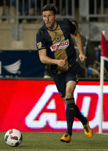
After weeks of (not necessarily well-received) teasing on social media, the Union unveiled their new home kit on Thursday afternoon:
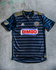
It’s quite different from the Union’s previous four home shirts. While the bulk of the shirt is still navy, the gold stripe down the center has been scrapped. In its place is a subtle two-tone navy hoops pattern.
Kit talk isn’t for everyone, but for the most notable change to the Union’s identity since the team’s founding, it seemed appropriate to check the pulse of The Philly Soccer Page on the topic. We asked PSP’s stable of contributors three questions.
- Is the new shirt an upgrade or a downgrade on last year’s look?
- Is getting rid of the gold stripe the right move, or too much of a departure from tradition?
- What’s your favorite soccer kit of all time?
Peter Andrews: Count me as liking the idea more than the execution. Hoops are an interesting design that almost always looks good, but going with two-tone navy blue instead of blue and gold (or even light blue, the other color from the crest) seems like a mistake. I’ll call it just a slight downgrade for now, because I didn’t think last year’s shirts were anything special. The club also loses some of its distinctiveness by ditching the gold stripe — one almost wonders whether they’re ceding that territory entirely to LAFC. The “BIMBO” logo looks more out of place without the stripe, too. It’s a real shame that they didn’t recolor it to match the rest of the shirt. As for a favorite kit, give me simple designs and bold colors. That’s why I loved the 2013-14 Arsenal change kit. (Never underestimate how much socks can do to help your overall look.)
Chris Gibbons: The new shirt is clean and modern, and the presentation video is very much “on brand.” The gold stripe was perhaps the second most identifiable part of the club, after one of the the following items: stadium/bridge/game experience, overall ineptitude, Nowak, Sak, M’Bohli… the list goes on. I’m against removing the gold, though, namely because MLS kits have generally been very boring and the Union’s home shirt was not. My favorite kit of all time is probably Lazio’s 115th anniversary kit.
Christian Sandler: The shirt is surely an upgrade from last year’s look. It’s sleek, clean, and has some subtle nuances that make it fully unique. The stripes and gold trim work really well. I can understand wanting more gold featured and I would even like to see an all-gold alternate at some point, but the Union are the “Boys in Blue” after all. I’m totally okay with heading in a new direction on the shirt because I don’t think the club’s tradition lies in the threads. Branch out and grow the image. As for a favorite kit, I don’t even know if this kit was ever used and I don’t even care.
Nick Fishman: No kit was going to live up to the insane amount of teasing that led up to its unveiling. It’s a clean look, but it’s pretty risk averse as well…which is a weird thing to say after the club abandoned its defining gold column in favor of hoops. It’s a nice look, but doubling down on the blue at the expense of gold and tradition leaves me ambivalent. The back is solid because of the reliance on gold. Overall, I think it will grow on me. One more thing– the new secondary crest is dynamite. I love the shift away from the circular emblem, which has become all too common in American sports. Oh, as far as favorite kits, give me the three lions. No, not those three lions. This one, this one, and this one (okay the last one is a puma.)
Dan Walsh: It’s an upgrade, because it’s different, it’s interesting, and it looks cool. Innovation is good, and tradition means less when you only have nine years of history, so the loss of the gold stripe isn’t a big deal. The gold is still there, and that blue/gold combo is a great one, even if it’s downplayed here. (Mind you, my favorite Union kit is the light blue from 2013, which lacked a center gold stripe and may be the only Union kit where the Bimbo logo didn’t look jarring.) I had no problem with last year’s jersey though, to be clear. For context, my favorite kit of all time is probably the Sporting KC kit from a few years ago.
Ryan Rose: Every other kit change has pretty much been toying around with the same basic design. Why not switch it up and try something different? The club is still young enough to do that. The new look is an upgrade for now because it’s refreshing. I can’t tell if the “BIMBO” logo sticks out more or less without the gold stripe, but I think that may be because I’ve trained my eyes to unconsciously ignore it. Either way, I dig the monochromatic blue. My favorite kit of all time? This denim gem from the 1994 U.S. Men’s World Cup team, complete with fully-maned Alexi Lalas.


We’re talking about shirts? Shirt? I’m trying to talk about the game I love.
https://phillysoccerpage.net/2018/01/26/can-the-union-be-a-destination-team-for-young-americans/
–
https://phillysoccerpage.net/2018/01/25/is-lee-nguyen-the-missing-piece/
I’m just glad there is no more gold and yellow. Who thought those colors went together. Really just need the bimbo logo to match color wise more that anything.
Thank you. To me that’s the best part about the stripe going away.
Interested to see it up close, but pictures look good. Breaking from the gold bar in the middle opens up a lot more options for future design, including full blown hoops, which I think is great. Only 9 years, and no major history occurred with the vertical gold stripe. I’m fine moving on from it. And the Bimbo logo has one less color to clash with now.
I likes the gold stripe. it was immediately identifiable as Union. Everyone and their mother has hoops.
.
I think this would make a good third jersey but the unnecessary metallic blue will make everyone look like they are wearing a candy wrapper.
A uniform is an irrelevancy. The only part that has use is the number, and that only if it is in high contrast to the background on which it is displayed (see Tampa Bay Rowdies kit at Goodman Stadium last summer for a negative example.)
.
With stylistic and syntactical obeisance to El Pachyderm, …
CAN. THEY. PLAY. SOCCER? … W. E. L. L. ?????
(Double meaning intended.)
Nice choice of photos.. Can we get SEBA into the new kit?
They hyped it up, they created a #DoopHoops hashtag, they showed the employees going nuts when first seeing it…but they didn’t give us actual hoops. Don’t get me wrong, the kit is nice and I was never a fan of the vertical gold stripe, but they should have gone all-out with real hoops. Just take this exact template but make the hoops gold. Maybe two years from now…
I like it. Don’t love it, but I do like it better than most of the new ones they’ve released over the years. I did like the gold stripe down the middle though.
.
I would love some full blown gold hoops and either a new sponsor or the Bimbo logo integrated in with color of the jerseys.
.
I have an original, pre-Bimbo logo, jersey – and that’s still the best.
I love the Bimbo money but I wish they would accept our color palette. They do it for other clubs, google it. Lots of clubs wear Bimbo on their chest but with colors that match. Why not Us?
That’s a bummer too, they did once already with the black kits. It was still red, but at least they customized it to work better with the design.
Totally agree. I think that most people could get comfortable with the word “Bimbo” on the shirt if it didn’t stand out and clash with the rest of the shirt.
Or why not one of their brands that match our colors. Entenmanns would be perfect.
I want to see it up close. My bride was unimpressed.
@ The Union – You keep on using that word Hoops. I do not think it means what you think it means.
Won’t be impressed with any new jersey until it no longer has “Bimbo” splashed across it!
Nor will we buy one with that logo.
Bimbo owns other brands…couldn’t we use one of those?
Just as bad, it doesn’t blend with this kit or any others.
UnionGoal
I feel like the Lazio players don’t share your excitement for that shirt …
They should just be glad there wasn’t a swastika on it.
Both of these comments are valid… having Italian and Jewish heritage leaves me wildly conflicted about loving this kit. That Pescara kit is phenomenal, though, and their baby-beluga badge is unmatched.
Seems unwise in the current climate in this country to risk pejorative double entendres.
.
Does the Union wish to become the Washington Redskins of MLS?
You would think this team could have figured a way to remove this particular logo in favor of one of bimbos other brands.
Selling more merchandising could have been good financial motivation for all parties including sponsor.
But OSC, I am told I am only one of a few malcontents and that it has no impact on jersey sales.
Probably not as bad as redskins situation…where many in sports media refuse to use nickname…Union logo has to have some negative repercussions.
UnionGoal
We bought the inaugural kit, but haven’t bought a new one since. It’s annoying. I want a new kit but for as long as it says Bimbo, I won’t. My wife and daughter are more important to me than a Bimbo sponsored Union kit.
Also there seems to be an alternate Bimbo logo with a slightly darker shade of blue, which I feel they could go even farther with and then remove the white background:
https://careers.bimbobakeriesusa.com/sites/all/themes/careers/images/bbu-logo.svg
—
And the logo looks slightly better on Chivas, but the blue still doesn’t match:
http://cdn.asicentral.com/idesign/newsletters/sp/images/vol89sp_cvr01.jpg
If you’re gonna do an Adidas kit with horizontal stripes in the body, those stripes either have to be larger ones or use a random pattern of large & small stripes. This new kit looks a little too busy in my opinion. There are very few Adidas kits that go for this look that the Union have done as it’s very tough one to pull it off.
–
I applaud the slight tweaking of the colors. It might look different in person, but the blue seems brighter and more dynamic. The metallic gold is an improvement as well as they get further away from that awful khaki color that the first few kits had. The new badge and patch are improvements as well.
–
I think that designers can go a little overboard with their kit designs. I always like a cleaner look when they don’t try to do too much with it.
Big, big, BIG uniform/logo geek here. “UniWatch” is one of my most clicked sites.
.
I’m not totally against a team “experimenting”, but I am also aware that the O-N-L-Y reason a team does this is to separate a suporter from her/his dollars. (And that bugs me) That having been said…
.
I do hate to see the Union lose their center stripe/center crest uniqueness. The hoops motif can give you years of design variance (and marketing possibilities). I’m a QPR fan, so the hoops thing is in the DNA.
.
I was hoping we’d see something really unique: the center stripe, with five thin gold (or second tone blue) hoops extending from the edges of the stripe around the rib cage/trunk). I’ve seen a mockup a friend did of this approach and it was really cool.
.
I’m really not in love with the threes gold stripes on the shoulders, it seems to fight the hoops for attention. I know why they have to be there, but…Something just doesn’t feel right looking at that.
.
One thing for sure, if we’re going to make a color shift in the gold, FOR THE SAKE OF GOD…make sure it matches throughout the damned uniform INCLUDING THE NUMBERS.
.
Nothing stands out more as “bush league” than a uniform where the tones of a color don’t match. It’s happened in the dozens of times and it just screams “we didn’t care”.
.
Favorite soccer kits: Actually, this year’s QPR home and alt kits are among my favorite kits so far.
.
Have always been happy with the Union center stripe, but the light blue away jerseys from a few years ago and the Bethlehem honor kits were really sharp.
.
I though the Columbus all yellow and all black kits from a couple of seasons ago were among classiest I had ever seen. Even the Barbasol sponsor crest looked like it looked like it belonged there. They were as close to perfect as I’ve seen so far.
I just want to know why/when “horizontal stripes” suddenly became “hoops.”
And, surely, all you folks know that Bimbo is Mexican company, right?
It’s pronounced “beembo” and in this case, ignorance is not bliss.
Will never love the shirt while BIMBO is the sponsor. This was a disaster from the start. The shirt will never be a big hit with female fans.
The stripe design in person is much more subtle than what ad shows. Would have liked it better if it looked more like the ad. Kind of a bate and switch if you think about it.
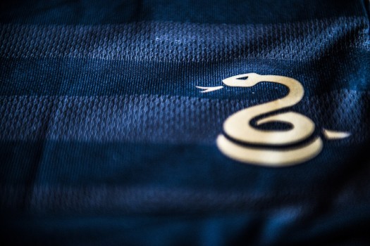
New alternate if they decide to do one should utilize the snake symbol more.
Well that is enough on the Jersey…. by the way….
Where the hell is the Barnetta replacement we have been waiting for 2 years???
Union management is always a day late and a dollar short on getting the players they need to get to the next step. Where are you Lee???