Sounder at Heart reacted immediately yesterday to the MLS schedule announcement, posting an analysis of strength of schedule. They did a great job collecting the data, and concluded that “Seattle’s getting it about as good as you can get it in the West, but of course the league bends over backwards for the Galaxy once again.”
First of all: thanks to sidereal for collecting the data and posting it. Sensational. Everything should be done this way.
But I have a nit to pick.
The strength of schedule differences between conferences are real (code is in R), see table 1 below. The West has a tougher time of it. But the claim that there are differences, from team to team, in strength of schedule, isn’t supported by the data.
Presenting a series of means is not data analysis. A mean of 1.4 opponent points per game is not necessarily bigger than 1.2. If we want to know if the differences between those means are meaningful, we have to use inferential statistics. This will tell us whether we should believe the difference, or whether we can’t make a conclusion because there’s too much noise.
Using sidereal’s data, I ran an ANOVA on team × location (home/away). Lo and behold, as sidereal’s intuition showed, location mattered. Team, however, does not seem to matter.
Bad data note: For some reason, Colorado comes up with a 35th game home and away. I’m not sure why that is, but finding and removing those contacts should not affect the conclusions below, in any case.
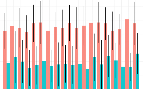
If seeing is believing, look below. Away games are in red, and those opponents (i.e. the home teams) have a considerably higher Points Per Game (PPG) across the board, but the differences between teams are indistinguishable. Same with the ones in blue (home games); the between-team differences are not noticeable. There’s too much noise in the data. If I remove Home/Away from the analysis, the differences between teams are still meaningless. As appealing as it is to look for conspiracies and excuses before the season even starts, this one doesn’t hold much water.
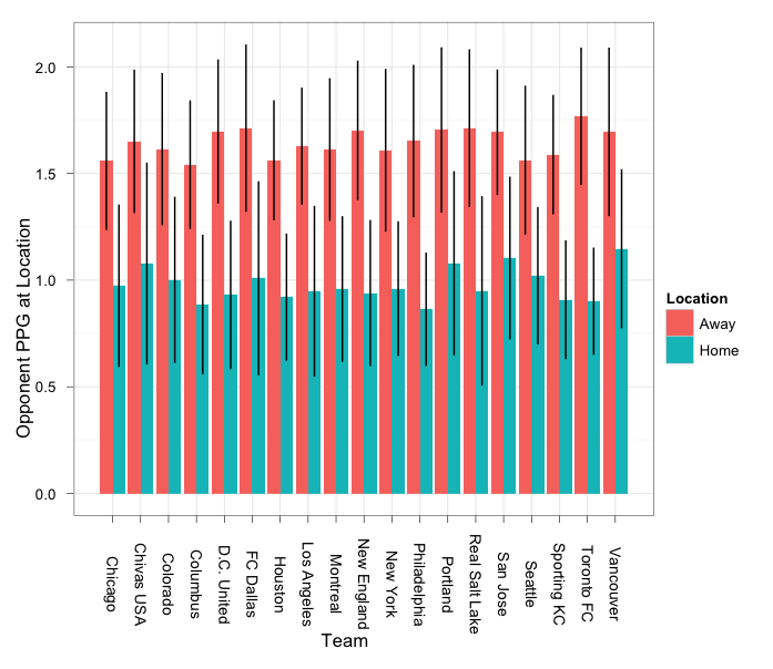
ggplot(data=mls2012,aes(x=Team,y=Opp.PPG.at.Location,colour=Location)) + geom_boxplot() + theme_bw() + opts(axis.text.x=theme_text(angle=-90)) + scale_x_discrete(name="") + scale_y_continuous(name="Opponent PPG at location")
In the spirit of sharing, here is the data I used.
Table 1: Result of ANOVA of Conference and Location as factors.
> summary(aov(data=mls2012,Opp.PPG.at.Location~Conf+Location+Conf:Location))

Df  Sum Sq Mean Sq F value Pr(>F)

Conf            1    0.88    0.88   7.276 0.00717 **

Location        1   71.99   71.99 596.997 < 2e-16 ***

Conf:Location   1    0.25    0.25   2.079 0.14980

Residuals     642   77.41    0.12

---

Signif. codes: 0 ‘***’ 0.001 ‘**’ 0.01 ‘*’ 0.05 ‘.’ 0.1 ‘ ’ 1
Table 2: Location and team as predictors of opponent points per game
> summary(aov(data=mls2012,Opp.PPG.at.Location~Team+Location))
           Df Sum Sq Mean Sq F value Pr(>F)

Team       18   1.95    0.11   0.884  0.598

Location    1  72.02   72.02 588.855 <2e-16 ***

Residuals 626  76.56    0.12
---

Signif. codes: 0 ‘***’ 0.001 ‘**’ 0.01 ‘*’ 0.05 ‘.’ 0.1 ‘ ’ 1
Author’s note: Following up after this post was originally published… I ran pairwise comparisons for the teams, and there is no difference between any two of them—even the “easiest” and the “hardest” are indistinguishable.
Further, looked at NY, LA as a separate class of “Marquee” teams; again, the differences were indistinguishable (mean ppg for non-marquee teams: 1.31; for marquee teams: 1.29, df 84.129, t=0.4633, p=0.644).
Just for good measure I ran all of the above with non-parametric statistics (e.g. Kruskal Wallis non-parametric ANOVA) and got the same results. Conclusion: If you’re going to argue that the unbalanced schedule benefits somebody, you can’t use this points-per-game measure.

Interesting, according to Sounder @ Heart, Columbus has the easiest schedule in terms of both ppg and miles traveled…
I wonder if they are easiest in terms of “Miles travelled” because they are one of the more central teams?
Anyway, the PPG is pretty meaningless, because a team finishing near the bottom 1 year (i.e. us last year) can finish near the top the next year. You have no idea who is going to be good or bad when making up the schedule. Someone is going to look at their schedule at the end of the year, that maybe missed out by 1 point and say “we had a harder schedule, that’s unfair” – but at the end of the day, you all play 34 games, and all you can do is to beat the teams that are put in front of you.
p.s. I’m sure Man Utd would have loved to have 2 home games against Blackburn this year…. oh.
Barry, I hear what you’re saying, but do think there’s likely a year-on-year correlation of points. That said, there is so much damn luck involved in soccer that points themselves probably aren’t the best measure of quality. Would be interesting to look at shot differential, shot-on-goal differential or goal differential to see if you could predict results better than by looking at last year’s points.
Tim, yes, but as I argue, “easiest” is meaningless, according to the numbers. I haven’t run the post-hoc comparisons but my guess is that there’s no statistical difference even between “easiest” and “hardest.” If you’re going to argue—as some might—that the league intentionally gives its two glamor franchises easier schedules, you could test that.
Furthermore, I had a long twitter conversation today with Scott Kessler, and there is a lot of dimensionality in the idea of “travel.” He argued that it’s more about time zones than miles traveled; I’d imagine that the effects if any are greater during compressed week (e.g. going to the west coast after a midweek game). Further, there may be differences between teams, in how they prepare, conditioning, etc., that could affect how well they’re able to adapt.
Following up… I ran pairwise comparisons for the teams, and there is no difference between any two of them—even the “easiest” and the “hardest” are indistinguishable.
Further, looked at NY, LA as a separate class of “Marquee” teams; again, the differences were indistinguishable (mean ppg for non-marquee teams: 1.31; for marquee teams: 1.29, df 84.129, t=0.4633, p=0.644).
Just for good measure I ran all of the above with non-parametric statistics (e.g. Kruskal Wallis non-parametric ANOVA) and got the same results. Conclusion: If you’re going to argue that the unbalanced schedule benefits somebody, you can’t use this points-per-game measure.