Photo: Stephen Speer
Well, it’s roughly two months before kickoff of the 2022 Fifa World Cup and every World Cup shirt save two (Tunisia and Cameroon) have been officially released. It’s a proverbial Christmas for shirt collectors and enthusiasts alike, and while the tournament may still be months away, it suddenly feels a lot more real. Like every World Cup cycle, the batch of 2022 shirts fields a solid mix of designs that range from nostalgic to futuristic, and from uninspired to overly ambitious.
While there will undoubtedly be a World Cup Jersey power ranking to come (please? Editor’s Note: Yes.), for now lets take the expanded format that the Change Strip provides to look at some of the most interesting stories to come out of this year’s crop of shirts.
All three points
Nike avoids design templates
For the first time in Nike’s illustrious history as a football shirt manufacturer, the company has elected to ditch design templates for the World Cup. This means that no two Nike shirts will feature the same base template when the tournament kicks off in mid-November. To get ahead of comments, yes Nike will be using a template for shirt construction, but there is no set template when it comes to the visual elements of the design.
The move to transition Nike’s major club and national team partners away from templates was announced back in 2020, after severe backlash to the manufacturers 2016 Euro kits – which all used essentially the same design in different colors. It’s taken a long time to see the shift away from templates reflected in a major tournament like the World Cup though, as major football shirts are regularly designed more than three years before debuting.
In the moment, the decision for Nike to step away from templates seemed like the shift so many fans had been waiting for. Each major country and club would get its own bespoke design that signified its own traditions, values, and flair.
Unfortunately, the reality seems to be that designing 24 unique shirts for the World Cup alone has led to an increase in uninspired designs that may technically be unique, but leave much to be desired. Of course there are some true standouts, but far too many of Nike’s shirts this year look to be inspired by a desire to be different, not good. The Dutch shirt serves as a prime example. Perhaps Nike should remind themselves of a phrase popular in the design world. “It’s better to be good than original.”
Unconventional Colors
Sticking with the theme of uniqueness, the 2022 World Cup shirts feature their fair share of unconventional colors for some of the globe’s most iconic nations.
Of course, deviations in color happen almost every World Cup, but 2022 seems to feature more of these variations than usual. In fact, in the field of 32, four teams will be wearing shirts that feature colors never before included in the team’s identity. A handful more will be making small, but significant tweaks to their color pallet as well.

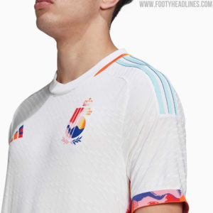
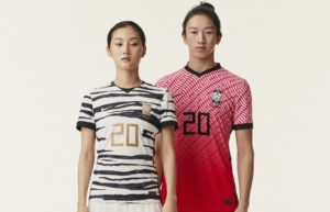
Most notably among those debuting new colors in their shirts is Argentina, who will be donning purple for the first time in their history, Belgium will be adding accents of pink and blue to its familiar black, yellow, and red, and South Korea will for the first time be wearing a primarily black shirt.
While Argentina’s purple is a subtle change from its usual navy away shirt, and South Korea has incorporated black into design in the past, Belgium’s use of pink and blue in their away shirt really stands out as a unique direction for the nation. The colors and design of the shirt are inspired by the Tomorrowland music festival held in the nation.

More minor tweaks in this years pallets include Mexico debuting maroon and cream, the latter of which is a new addition for the nation; Brazil toning down their vibrant yellow into a paler version of the primary color; and the Netherlands swapping their iconic bright Oranje for a mix or lighter, orange adjacent tones. Reactions to these subtle tweaks have been largely well received, though Netherland supporters have been vocal in their disapproval of the change.
Callbacks remain constant
While so far this Change Strip has focused largely on the innovations of this year’s cycle, there’ll be more than a few shirts taking inspiration from the past when teams take the field this November.

Germany, England, Morocco, and Denmark, take near direct inspiration from historical shirts, and even more in the field of 32 take slightly more subtle cues from past uniforms. Perhaps England’s away shirt, which is modeled after the 1990 design, is the most interesting, as its classic styling both juxtaposes and complements Nike’s desire to lean into more unique styles. The shirt clearly has its roots in the 1990’s, but Nike’s own flair shines through with the inclusion of all-blue brandings.
https://twitter.com/sportbible/status/1572483848360890371
Of the countries pulling less direct influence from the past, it’s worth turning again to South Korea’s black away shirts. While at first glance the shirt appears to be inspired by early 2000’s bus seats, the shirt in fact takes its inspiration from a series of Korea shirts from 1993 to 1995 that all included bold yellow, red, and blue geometry thrown on top of the country’s traditional colors of white and red. Shirts like this are a fantastic way of tying a country’s footballing past to it’s present – while remaining fresh and innovative, and the result here from Nike is frankly gorgeous.
From the archives
We’re going with an oddball this time – as it really isn’t that far removed from current times – but we have to talk about the tiger print South Korea shirt.

This thing was absolutely gorgeous, and unless I’m remembering incorrectly, never saw a second on the field. Due to the global pandemic South Korea never actually played a team wearing the design, and it’s frankly a bit of a shame that we didn’t see the design return as a primary shirt for the 2022 World Cup.
Please Nike, let these see the light of day (or if they have someone, please correct me).
Extra time
The NHL is losing its mind in the best way possible.
Over the last few days, several NHL teams have announced uniform changes for the 2022-23 season, and two of them stand out as absolutely fantastic. The Golden Knights will be permanently switching to wearing their audacious, obnoxious, and perfect for Vegas sparkly gold jersey for all home games, while the San Jose Sharks will be dawning all teal at home, and teal pants on the road.
https://twitter.com/GoldenKnights/status/1572630956720410624
https://twitter.com/SanJoseSharks/status/1570255346744307712
Both of these moves are over the top, non-traditional, and perfect in every way. The NHL is embracing the weird, and they couldn’t be better off for it. Now if only the Flyers could sort out going back to black…


That Sharks uni gives me all the NHL ‘95 for PC kind of feels.
That Argentine shirt is literally and figuratively absolute fire! I think we will use the money not spent on the disgracefully boring US kits to buy those. We have great friends in Buenos Aires and already have a number of Argentine kits and swag. Cannot believe those were the US kits designed to herald our return to the biggest stage in the world. Unless, somehow they are prophetic to have kits that allow us to fade into the background for uninspiring efforts like the one today against Japan…