Photo courtesy Philadelphia Union
The most glorious date on the MLS calendar. No, not the season opener, decision day, or the MLS Cup Final.
Kit Release Day.
After months of speculation, rumors, and leaks, the 2022 Philadelphia Union primary shirt has been officially unveiled to the masses.
⚡️
Be one of the first to get your hands on our new kit!
RT this post
️ tag a friend
✅ entered#DOOP pic.twitter.com/xrNm24NEd4— PhilaUnion (@PhilaUnion) February 16, 2022
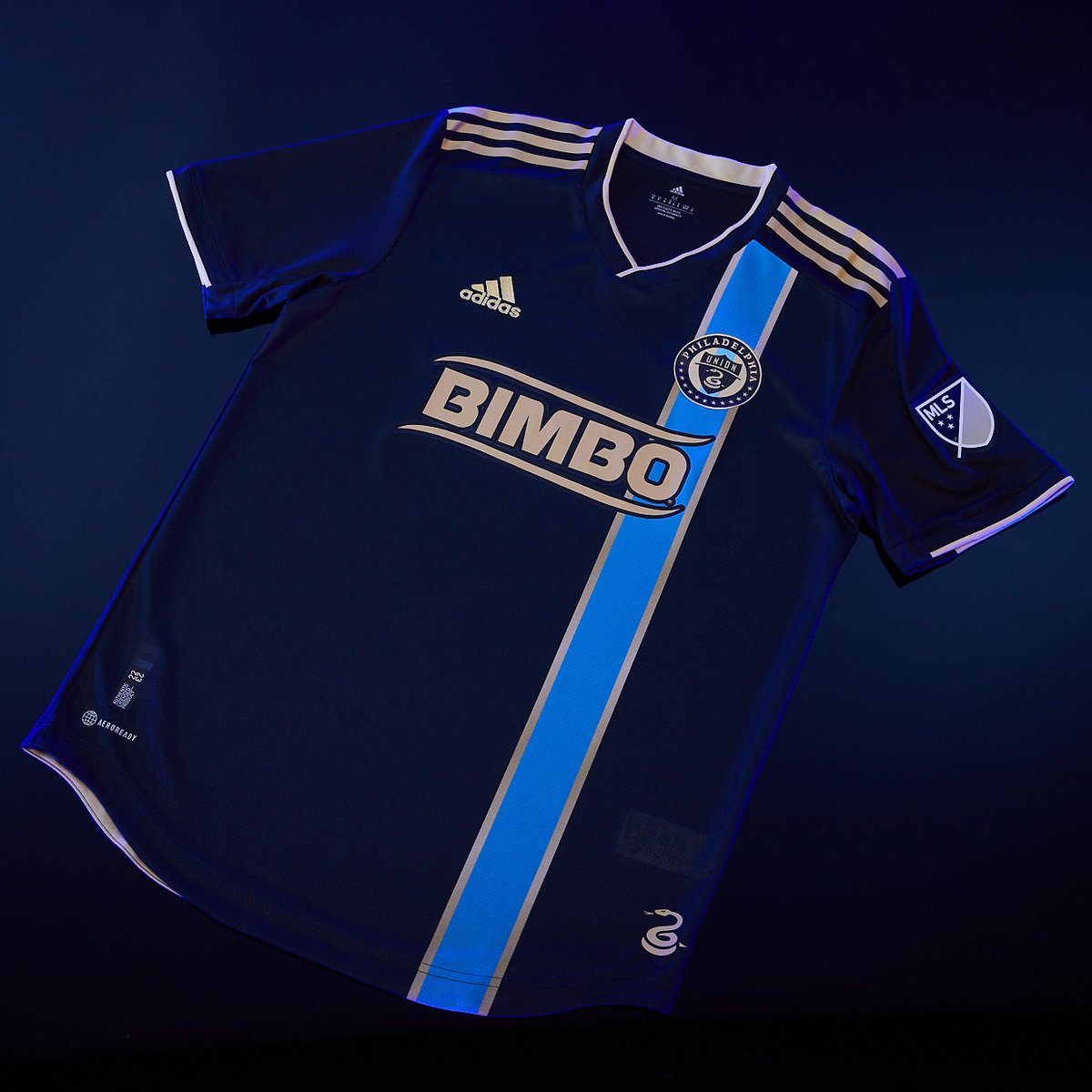
With a navy blue base and metallic gold Adidas branding, the focal point of the 2022 “For U” kit is the singular, vertical signal blue stripe that falls underneath the club’s badge on the right side of the shirt. The stripe is bordered by gold, a highlight that also appears as thin accents on the cuffs of the shirt. Finishing off the design is the familiar snake hip detail on the front, and a new for 2022 lightning bolt detail above the nameplate on the back.
While the shirt was officially revealed yesterday, in what’s becoming more and more of a rarity in MLS, a mockup of the design leaked on twitter roughly two weeks ago.
Reaction to the leak was mixed, with many fans lamenting the decision to include a left-aligned stripe, as opposed to the traditional center stripe that was used on shirts from 2010 until 2017. Despite this critique however, a majority of fans seem pleased that the club has moved away from the simpler navy designs used from 2018 and 2020.
With the raging success of the unique “By U” shirt in 2021, some feel that the Union’s 2022 offering may be a step backwards in the design process, and it’s not hard to see where that perspective comes from. While the 2021 away kit was branded as being full of fan input and city imagery, this year’s shirt has an unfortunate resemblance to NYCFC’s 2019-2020 home shirt, and an air of corporate Adidas about it.
What many may not realize however, is that the Union’s new shirt actually involved fan input from the “Union’s Creative Collective” in a similar way to the 2021 “By U” shirt.
“We were there from the beginning and built the brief that became the kit.” PSP’s Chris Gibbons told me when we talked about the shirts design process yesterday afternoon. Chris is a member of the Union’s Creative Collective, and helped to provide a bit of insight into what went into the design of the 2022 shirt.
While the 2021 Creative Collective included a multitude of meetings and design rounds, the 2022 affair was unfortunately shortened by the pandemic. “The pandemic hit just after we submitted our brief to Adidas,” said Chris, “and the slot we scheduled for our second meeting, the one where we give feedback on their designs and come up with a final vision, had to be abandoned.” While Chris came short of blaming the pandemic for a more conservative design than last seasons, it’s likely the lack of subsequent meetings lead to the shirt being a bit more plain than some had hoped for.
However, despite the lack of anything as loud as last season’s shirt, this years Union shirt does inherently feel like a Union jersey.
When asked what the vision was for the Collective going into the 2022 design process, Chris replied by saying that the group “…wanted to make sure the history of the club and the center stripe wasn’t lost, but also that it wasn’t stale.” Giving context, he added “the DOOP Hoops [in the 2018-19 shirt] were a necessary design departure. The reason the team abandoned the bib in the first place is because of so many fans gave the team feedback that they didn’t want to buy another jersey with the same gold stripe on the front.”
DOOP. ⚡@PhilaUnion unveil 2022 primary kit.
— Major League Soccer (@MLS) February 16, 2022
While some would argue that it’s hard for an iconic design to go stale, when part of a club’s motivations are monetary, creating multiple designs with little variation isn’t always the best strategy. The Union are hardly the first club to ditch an iconic design for something fresh, hell, just look at Barca’s shirts this season. While the shift to the right side of the shirt may take some getting used to, it really is refreshing to see the Union bring back some semblance of design continuity.
On the subject of continuity, one thing many fans have lamented after seeing the Union’s 2022 home shirt, is the clubs switch from the familiar gold for the singular stripe, to signal blue. Though the club has smartly positioned the change as a nod to the fervent support of the Sons of Ben, the switch could in reality have more to do with the difficulty of utilizing gold on jerseys. If you look at the Union’s kit history, the shade of gold used on shirts is seldom the same from year to year, and in some cases from element to element on the same shirt. Rumblings from around the club indicate that the Union are steering away from using gold on kits moving forward, unless they can utilize a metallic finish, similar to what’s seen on the Adidas stripes from recent seasons.
Hmm…a handsome skinny blue stripe. Wonder where they got THAT idea. #DOOP pic.twitter.com/jdHifv4tkP
— Phang (@PhilaUnionPhang) February 16, 2022
When discussing the subject of gold, and the color of the stripe, Chris mentioned that “gold is really tricky to work with on a jersey,” echoing the sentiments of others involved in the design process. Chris also theorized that the stripe color had a bit to do with BIMBO’s decision to allow a gold shirt sponsor this year. “I suspect they wouldn’t have been so willing had the stripe been gold too – the logo wouldn’t have stood out enough.” It’s worth noting that the BIMBO mark appears in the metallic gold the Union seems to prefer.
Keeping on the subject of color choice, this is the second Union jersey in a row that features signal blue as its primary draw. With the popularity of last year’s shirt, and the use of the color again for ‘22, I asked Chris if we could expect to see more of the color in the coming years. “Perhaps perhaps perhaps,” is all Chris had to say on the subject.
That wasn’t the only vague answer Chris gave.
Before wrapping things up I couldn’t resist asking about what may be in store for 2023, and graciously, Chris gave a bit of a tease. “Just like this shirt, the process for the 2023 shirt began in 2021 and the design phase is entirely finished as of last week. The 2023 away jersey will be a one-of-a-kind piece in the league, without question. Since it’s not the primary shirt, it will stand out in much the same way as the 2021 shirt does.”
Now I’ll be fixating on that shirt for the next year.

“…the slot we scheduled for our second meeting, the one where we give feedback on their designs and come up with a final vision, had to be abandoned.”
~ what? no Zoom?!? sounds like Adidas wasn’t very interested in getting feedback.
It had nothing to do with adidas actually. It was equal parts “Wait and see if there’s a break in COVID where we can get back together,” which obviously didn’t happen, and “How do we ensure this intellectual property isn’t being shared offscreen?” It’s one thing for all of us to sign NDAs and stick to them when we’re in person, it’s another thing altogether to have 20 people on a Zoom meeting and count on the same level of secrecy.
–
We’ve done a bunch of zoom meetings since, but at that stage in the pandemic (April, 2020) it wasn’t clear what the next step ought to be.
The off-center stripe reminds me too much of early 2000’s pop punk fashion
But hopefully the era of you have to be standing 2 feet away and under a blacklight to see the design is over.
Been a STM since day one. I bought a long sleeve (bring them back!) pre-Bimbo dark blue jersey. That was my only jersey, up until the light blue kit I picked up last year – which was just incredible. However, I bought this one as well. I like it. It’s clean looking and I think the stripe – albeit resembling other kits from another team – is still a nice touch. Very excited to see what next year’s kit will be.
It’s tough to top last year’s masterpiece. This year’s is fine. I wish they would go back to the center gold strip, but maybe this is a first step in that direction.
One of the things I do like about this jersey is the Sons of Ben representation on the jersey itself
.
Too often the sg’s across the league are referenced in a jersey’s design, but rarely does it get an actual visible element
.
I’d love to hear more about the process after it leaves your hands, if they told you anything about what happens then
.
It kind of sounds like a playing the ‘telephone game’ from when it starts to when it is made (at least for this round since you didn’t have as many meetings)
I like it…
……….. I think.
I do not. Looking at what else dropped across the league this week, I guess we’re in the low, middle in my ranking. Pros: it doesn’t have a snake you can’t see nor an awful ray shooting out from a snake at bottom. It has signal blue in it.
Cons: just not interesting design.
–
I don’t need By U pt. 2 awesomeness. I just want something I’m happy to see 17+ times a year. Been years since I could say that. Man, really… the hoops kit was our only home departure I truly love
My thoughts are a complete 180 from yours — I think this is easily one of the best jerseys in MLS this years and I’m actually surprised by how mediocre many are. And I thought the “hoops” primary was the worse one that Union has had – just way too plain and boring (my feeling is if you can’t see a design element from the stands or on TV, it’s kinda pointless).
I think the 2016 primary was the best, if they could just make something like that but with Bimbo in one color that harmonizes (say, in white or light blue) and not a bumper sticker.
I also find the comments about it being similar to the NYCFC one silly. This is much better executed in particular with how the stripe is not broken for the sponsor. And it’s not exactly that unique of a pattern.
I can’t wait to see the third jersey for Leagues Cup.
I think this is better than some mostly plain navy affair, but it doesn’t knock me out. I’ve yet to see an official jersey beat more than half a dozen fan creations I’ve seen over the last 5 or 6 years. I’d really love a blue and gold hoops jersey or, as has been brought up, a return to the big center stripe, a territory that to the best of my knowledge is really only occupied by the Union in MLS. This is a B in my book. Maye a B+.
I’ll take a B/B+ for a primary shirt. By definition, they shouldn’t change all that much from one iteration to the next.
–
Some context:
–
This is anecdotal, but many players hated the gold bib shirts.
–
DOOP Hoops was conceptualized as a much higher contrast blue and gold striped kit, but had to be paired down to meet the light/dark guidelines of the competition committee.
–
As far as I can gather from conversations, the best selling Union kits of all time are 1) 2021 (BY|U), 2017 (Doop Hoops), and 2010 (original, no sponsor).
Interesting that the players didn’t like the center stripe. That gold did get a little gulden’s mustard-y at times….
–
I’d be surprised if the Bethlehem Steel 3rd jerseys weren’t top 5 best-sellers. People really dug those.
–
And boo to the competition committee. Blue and Gold (a more yellow-y gold) Doop Hoops would have been the best ever.
The problem is kits that sell well are generally going to be the more unique ones, simply because they’re unique. And it’s hard to create any kind of a traditional look if you always change up the designs to sell more jerseys. I always liked the continuity the Bib jersey offered, but I never felt like I needed to buy more variants of it.
Pretty meh, but at least it is better than those beige things they once wore! I’m talking the horrid 2010 and 2011 away jersey:
https://www.footballkitarchive.com/philadelphia-union-kits/#2010s
The 2017 away kit is my fave. Onyewu wore it that season.
Doop!