The fall isn’t often an excellent time for kit news. MLS is wrapping up, months away from any new shirts, and the European leagues have already kicked off, meaning that we won’t be getting any new looks from across the Atlantic save the occasional third shirt. It’s a proverbial dry spell and tortuous for an aesthetic enthusiast like myself. However, thanks to some exciting branding decisions, and a purported rumor, we’ve got some solid content to start the month of October. Let’s get into it.
THREE POINTS
Chicago Fire adopt new badge.
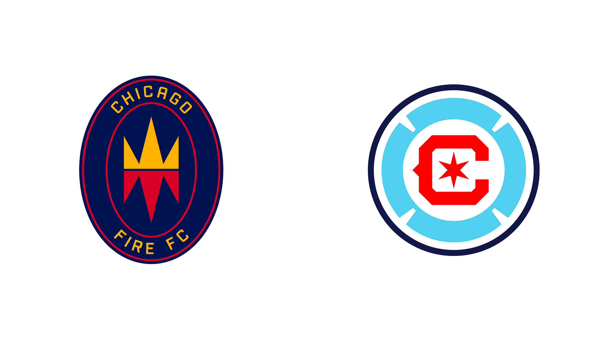
The Chicago Fire will be formally adopting their new, reworked badge this Friday on October 8th.
While the new badge was unveiled in June of this year, the Fire continued to use their “Fire Crown” mark, leading many to believe that the Fire would wait until the 2022 season to make the switch to the new look.
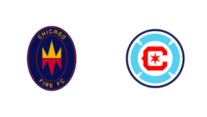
When asked about the decision to make the switch in the middle of the season, Kyle Sheldon, the senior vice president of marketing for the Fire, said, “This week is a historic one for both Chicago and our club – this Friday, October 8th, we will recognize the 150th anniversary of the Great Chicago Fire of 1871 which coincides with the date of our club’s founding on October 8th, 1997. We felt it was appropriate to fully launch the new crest as we both honor our history and look to the future. “
https://twitter.com/ChicagoFire/status/1445026340537782272
The Fire’s new logo is a fantastic homage to the city they call home, featuring iconic Chicago imagery throughout. The club has stressed authenticity and commitment to Chicago since they decided to re-brand from the “Fire Crown.” Their choice to officially adopt the mark on such an important date for their city and club emphasizes their conscious effort to get things right.
Chicago will also be returning to red home kits for the 2024 season, continuing that effort of authenticity. While the club would likely switch to red sooner, Sheldon mentioned that the 2022 home shirt (which will be navy) had already been designed when the club elected to re-brand.
While the Fire’s new logo will be present on social media, and graphics for the remainder of the season, they’ll play out their remaining games wearing their old “Fire Crown.” The new badge will make its appearance on kits starting next season.
Cherry Blossom Kit DC United.
Keeping on theme with pleasant aesthetic changes for the league, DC United is rumored to finally be getting a cherry blossom-themed away kit for the 2023 season.
First proposed for the 2019 MLS season, DC United has been toying with the idea of paying homage to its gorgeous cherry trees for a while now. However, when designers first pitched the design in 2019, DC United rejected it for fear of how fans would react to a shirt that incorporated so much pink.
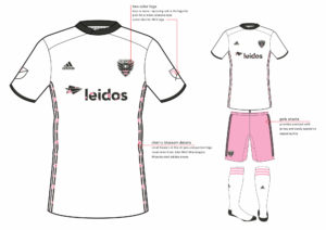
(courtesy of FootyHeadlines)
Three versions of the proposed 2019 shirt were uncovered early in 2020, thanks to an Athletic article that tried to get to the bottom of who was to blame for the rash of uninspired, white away shirts across the league.
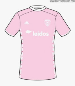
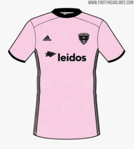
(Courtesy of FootyHeadlines)
While no details are yet known about the 2023 shirt, the design is likely to be finalized soon, with most major Adidas shirts being finalized 18 months before they’re put into production. Here’s hoping that we see designs reminiscent of 2019.
Chile unveils 2021-2022 shirts.
Saturday, Chile unveiled their new home and away shirts for the rest of 2021 and 2022.

(Courtesy of FootyHeadlines)
While there’s nothing too eye-catching about the two designs, both are clean and instantly readable as Chilean. What’s unique to the home shirt is the button-down collar that (as far as I’m aware) is a first. It features a bit of a high collar, almost reminiscent of the odd, priest-like collar featured on the Union’s 2012 kits.
It’ll be interesting to see if any MLS shirts sport the unique collar in the coming year.
FROM THE ARCHIVES
With the Fire adopting their new brand and the anniversary of the club’s founding coming up, it only seems right to look at the club’s inaugural home strip.

(Courtesy of Chicago Fire)
Nike manufactured the bright red shirt that featured a bold horizontal stripe and accents of white and blue throughout. It’s a classic shirt that, while nothing special at the time, harkens back great pre-Adidas memories now. Here’s hoping that the Fire’s new red primary shirt in 2024 can live up to this classic.
EXTRA TIME
It’s not often that I dive into the world of college sports here, but I feel like Tennessee’s new “Dark Mode” football uniforms deserve a shout.
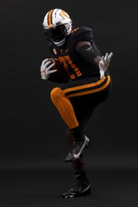
(Courtesy of The University of Tennessee)
The Volunteers’ new look swaps their iconic orange for black while retaining orange in the numbers and stripes throughout the uni set. While most schools go overboard on any blackout jersey, often forgoing their traditional color scheme, Tennessee has done a great job making sure their new threads still scream “Volunteers.”
Tennessee will be wearing their “Dark Mode” jersey’s this Saturday vs. South Carolina.

I’m not saying I’m addicted to the PSP but when you guys go radio silent for a few days I do sweat a little
I second that… I also love these uniform columns… a lot of times it gives me good ideas on which one to buy next