And just like that, March Madness is over. Two fantastic tournaments, two worthy champions.
I don’t know about you, but the end of the tournaments always leaves me feeling a bit empty. Your life is totally consumed by two crazy, non-stop basketball tournaments and then there’s nothing. Thank god we’ve still got Kit Craziness then, huh?
The second half of the first round saw just as many upsets, blowouts, and controversial decisions as the first, and has left us with a Sweet 16 ripe with kit diversity and intriguing match-ups. Let’s take a look at the results that brought us to the round of 16.
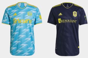
(8) Chicago Home vs. (9) Nashville
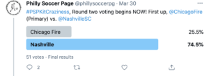
Yikes, this one wasn’t pretty. Nashville dominated Chicago taking home nearly 75% of the vote in a contest I thought would be way closer than it was. I really want to know the deciding factor for people here since they’re pretty similar objectively.
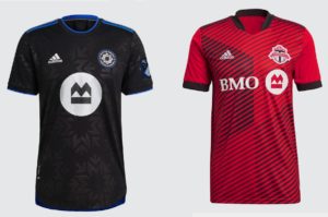
(4) Montreal Home vs. (13) NYRB.
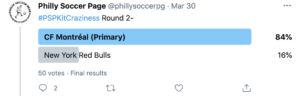
We all hate Red Bull. No other comment.
(5) NYC FC vs. (12) Toronto
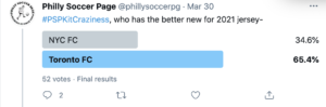
I’ve gotta assume there was a lot of biased voting going on here; as for me, the NYC shirt is better looking by a mile. However, there’s a good chance that’s just my anti-linear design biased kicking in. The people have spoken, TFC to the round of 16.
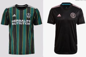
(2) LA Galaxy vs. (15) Seattle
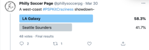
I’ll take the blame here. Seattle being a 15 seed was a total miss on my end, as I was working off the leaked design, not the final product inspired by Hendrix. I’m sorry. At least LA is a strong pick.
(7) Real Salt Lake vs. (10) Miami
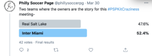
Two subtle designs enter; one walks away. I really don’t have too much of an opinion either way here, though I did slightly prefer RSL’s look just for the cuffs. Rightfully a close one.
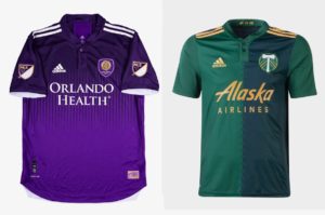
(3) Columbus vs. (14) Orlando
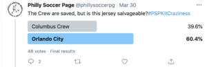
Every person I talked to told me that Columbus as a 3 seed was wrong, and it looks the people agreed. Vamos Orlando.
(6) DC United vs. (11) Portland
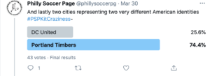
This was another match-up that I thought would be pretty close. I was wrong. I still don’t know what to think of the Portland shirt. Sometimes I love it, sometimes I hate it, but obviously, it’s a bit better than I’ve given it credit for. Fair play.
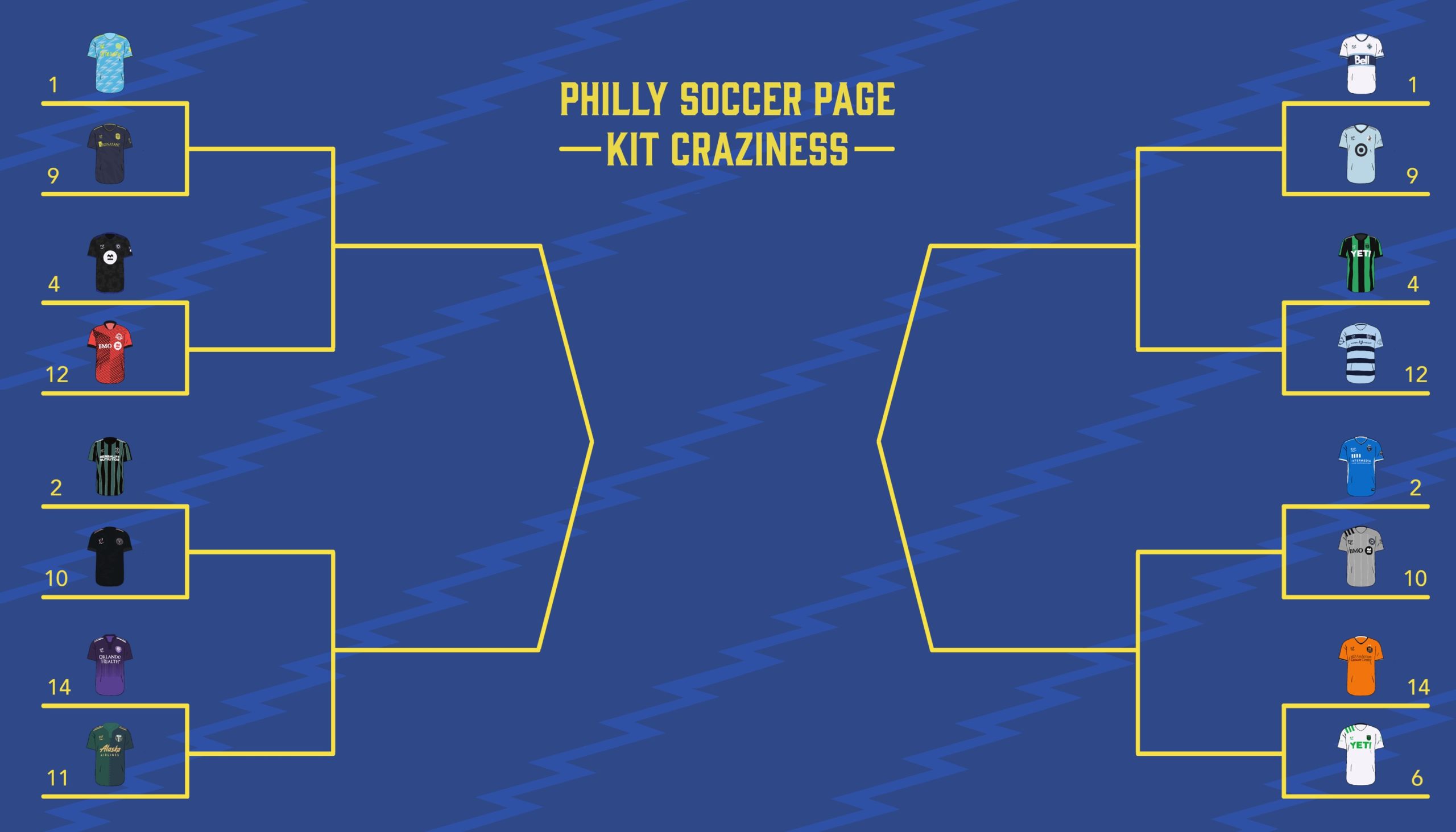
Onto the round of 16. I told you there’d be a better looking bracket at some point!

Instead of sharing Chris and myself’s thoughts for each shirt, Chris and I will be giving our thoughts on each match-up, directly comparing and contrasting the two designs. I’ll grab this weeks match-ups, before handing it over to Chris for the Elite 8.
Oh, and one last thing, the one seeds enter the fray now, which means we’ll start things off with the fan-favorite, and overall number one seed
(1) Philadelphia vs. (9) Nashville
Is this even a fair match-up? It doesn’t feel like a fair match-up. The U have their fan made, Philly centric design, and Nashville? Well at least they have some sort of pattern this year.
(4) Montreal Primary vs. (12) Toronto
Two very different takes on subtle patterns, and I know which I prefer. While Toronto’s shirt features a somewhat random linear design of various widths, Montreal’s opted for purpose and chosen to emphasize the club’s new brand. Still, Montreal’s design could prove hard to see from distance.
(2) LA Galaxy vs (10) Miami
A classic throwback up against an undeniably futuristic look. Two very different shirts square off here, with LA’s bold stripes competing against Miami’s subtle palm fronds. Miami’s got the geographic reference going for them, but damn that LA throwback is nice…
(14) Orlando vs. (11) Portland
The only round of 16 match-up between two lower seeds, these shirts mimic each other in that they both use two similar tones juxtaposed against each other, and I think they both work in their own way.
(1) Vancouver vs. (9) Minnesota
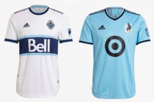
Two cold weather teams with a similar color pallet face off in this match-up. There really aren’t many similarities between these two, though you could consider both looks “clean”. Un-seen in this image is Vancouver’s decision to go with two colors for names/numbers. Red for numbers, Blue for names.
(4) Austin Primary vs. (12) Sporting Kansas City
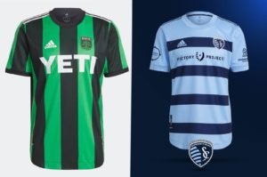
The age old debate, hoops vs stripes. They both pull off their chosen look well, with my only complaint being SKC’s decision to compact the sponsor, crest, and branding in the upper 4th of the kit. Both have a solid chance to move forward, and the winner could hope to do real damage in the following rounds.
(2) San Jose vs. (10) Montreal Secondary
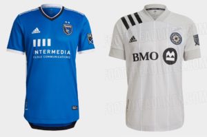
San Jose dominated their first-round match-up with the Revs, and I’d expect them to do the same here. San Jose offers up a fantastic throwback that looks perfectly blocky, sponsor included. On the other side, though, Montreal offers a highly inoffensive monochrome shirt that could win over fans with its more obvious pattern.
(14) Houston vs. (6) Austin Secondary
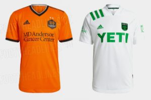
This is an interesting match-up with two kits that are totally devoid of design, subtle or otherwise. I’ve got a feeling that Houston will advance based on it not being white, but Austin’s away shirt somehow looks better than most other plain white jerseys, perhaps for its green shoulder stripes and sponsor.
Polls close at Saturday morning so make sure to get your votes in ASAP!

One point that I think makes a difference on the Union’s 3rd kit: All of the marketing (smartly and cheekily) show Artesano as the sponsor on the new kit. However, in the CCL match, BIMBO was the sponsor on the kit. Will they be showing both? Or will they market one for praise, then revert to the other maligned branding?
The Union’s secondary kit will likely retain the Artesano for domestic competition, and feature Bimbo for international (CCL) play, since Bimbo is the more prominent brand.