
Photo courtesy Major League Soccer
I think that it’s a requirement in the world of sports aesthetics that as soon as I write a Change Strip, whatever I was talking about has to change.
I mean, seriously, within 48 hours of last week’s article going up, CF Montreal had their new brand leaked, Atlanta United had their home jersey leaked, and the Flyers promptly unveiled their new helmet sponsor (yuck…).
I’m not that upset about it. If nothing ever changed, I’d have nothing to talk about, but really, is it too much to ask for things to slow down a little? It’d be a dream if I could have an article stay up to date for at least a few hours after it was published. A dream it will have to stay, however.
With the league officially kicking off in a little over two months on April 3rd, MLS kit news will be pretty much non-stop until the season kicks off. Hell, it may even continue into the season with some rumors that the third jerseys won’t be revealed until May. I’ve wasted enough time complaining though, let’s get into the week’s news before it becomes outdated.
THREE POINTS
1.) MLS MOVES AWAY FROM WHITE KITS
Over the last few weeks, we’ve been treated to more info about the upcoming crop of MLS jerseys for the 2021 season. While no one aside from Atlanta has suffered a full blown leak, more and more clubs have had their colors revealed over on the ever-reliable Footy Headlines. What’s most exciting about this is the relative lack of clubs using white or grey.

(Colorado Away Colors via FootyHeadlines)
As you probably know, Adidas hasn’t exactly been the most creative when it comes to MLS away strips for the last season or so. (Or this season if you’re Austin.) Of the 26 teams in the league last season, only ten escaped wearing white on the road, and out of those ten, three wore white at home. It became such a significant problem that The Athletic did an article on the issue.
As mentioned before however, it seems Adidas is finally wising up. Of the five clubs to have their away colors leaked, only one appears to be using white as the primary color. Instead, Adidas seems to be leaning towards using a lighter version of a color synonymous with each club. LAFC is getting a soft tan à la Man U’s tan shirt from 2019, and Colorado is getting a pale mint outfit reminiscent of their inaugural colors.

(LAFC Away Colors via FootyHeadlines)
While it’s hard to make too big of an assumption off of only five away leaks, it’s safe to say that it seems like a step in the right direction if Adidas relies on clubs’ lighter shades instead of a generic white. It makes you wonder about the 2021 Union shirt, doesn’t it… signal blue, anyone?
2.) AUSTIN FC REVEALS STADIUM NAME
Yesterday on January 25th, Austin FC finally gave a name to their new stadium: “Q2 Stadium”. Austin’s new digs are named after, well, Q2, an Austin-based online banking software provider. While corporate stadium names typically have an air of “eh…” about them, Q2 is about as good as you could ask. “The Q” has a nice ring to it, no? With Austin naming their new ground, though, it only seems right to take a quick peek at the new stadiums we’ll be seeing in 2021, no?

(Via MLS)
Joining Austin’s Q2 is FC Cincinnati’s West End Stadium, a new ground that’ll seat a cozy 26,000 once fans are allowed back. Cincy’s new home has gone through a few different designs, with the most notable change coming between 2017 and 2018 when the original “general admission” style stadium was scrapped for a more traditional seating bowl largely inspired by Minnesota’s. The stadium’s current and finalized iteration features 3,100 safe standing seats that, combined with the other 23,000 seats, could lead to West End Stadium being one of the hardest places to play in MLS.
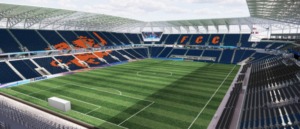
(Via FC CINCINNATI)
The only other club to get a new home in 2021 (probably) will be the Columbus Crew, and boy, has it been a long time coming. The defending champs will be moving from their storied Mapfre Stadium into a new 20,000 seat box that’s more or less in downtown Columbus. The move is honestly long overdue despite Mapfre’s historical qualities, and on the heels of the Save The Crew movement, and the club’s newest MLS Cup, it seems like the right decision.
The design seems like an asymmetrical take on Orlando’s new park, and honestly, it’s a great look. It’s square enough to provide clean sightlines but distinct enough to feel special. If you’re anything like me, I highly recommend poking around in the seat viewer to understand better what the stadium will bring to the league.
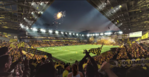
(Via Massive Report)
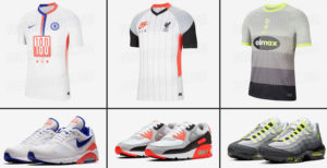
3.) NIKE AIR MAX KITS
Man, Nike is honestly killing the sneaker/European football crossover lately. A few weeks ago, it was the PSG Jordan 1’s, and today it’s the Premier League Air Max kits. Chelsea, Tottenham, and Liverpool will receive special kits inspired by different classic Nike Air Max silhouettes and colorways.
(Via FootyHeadlines)
The shirts all feature the club’s typical sponsor swapped for a Nike inspired design, and both Liverpool and Tottenham have their Nike logo manipulated a bit as well. The sponsor swap means that the clubs can’t wear the shirts for matches, but it’s interesting to watch Nike continue to push their ties between sneakerhead culture and football.
NO ARCHIVES JUST CONCEPTS
Instead of a throwback today, I wanted to shoutout a creator I noticed on Reddit a few days back, along with their Union concepts they shared. U/Imannyz did the designs on the website fifakitcreator.com, a fun tool to play around with if you want to try your hand at custom kits without the complications of a photoshop template.
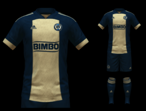
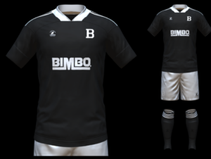
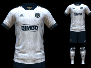
This article’s packed already, so I’ll leave you to form your own opinions on the designs, but overall I think they work well together, and I’d kill to have the Union return to the center stripe.
EXTRA TIME
The Washington Capitals dropped a new third jersey Monday, ditching the throwback threads they wore for a few years. The new-look combines their two outdoor jerseys into one clean design that looks a bit more like a Washington Hockey Team jersey than a Capitals sweater, but regardless it seems good.
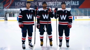
(Via Russian Machine Never Breaks)
Honestly, I’d love to see the Flyers go with the mashup approach in the coming years. A black version of their 2012 Winter Classic sweaters, maybe?
Disagree with my takes? Want to share links to your own concepts? Do either in the comments.

Thomas, great article again – thank you. Also, I couldn’t agree more – please bring back the center stripe on the Union kit. So distinctive and classic.
I totally agree – bring back the center stripe!
Yes, please do away with PIAA rules for home and away kits in the MLS…………..it’s bush league.