
Photo: Marjorie Elzey
Happy New Year! Sorta. It’s the second week of 2021, but it’s the first Change Strip so I figured it was due. If the first few days of 2021 are anything to go by, we’re going to have an incredibly hectic year in terms of soccer aesthetics. Whether that’s a good thing I suppose will be seen, with multiple teams unveiling new identities, the regular slew of jersey news, and the strange schedule caused by COVID there’s no telling exactly what we’ll get out of 2021, aesthetics or otherwise. That being said, let’s get into the first news of the year.
THREE POINTS
1.) MONTREAL IMPACT REBRAND
It came out late last month that Montreal will be dropping the nickname “Impact” from their identity and adding “FC”. As someone who doesn’t follow Montreal all that closely, it seems like it’s a move a bit out of left field and another step towards the eurofication of American soccer names. As a result of the name change, they’ll be picking up a new crest and likely new visual cues for their jerseys and branding in the future. The new crest will be revealed on January 14th if the club’s cryptic Twitter posts are anything to go by.
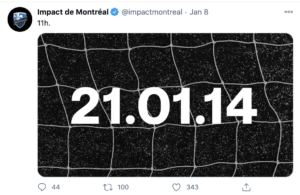
(via Twitter)
It’s interesting that Montreal has gone with a grayscale theme for all of their teasers, considering that the club has almost exclusively worn blue and black since their inception. Still, I doubt that it actually signifies the removal of the blue from the clubs’ pallet. We’ll just have to wait and see, I suppose. There’s no word on if there will be a new jersey unveiled by the club simultaneously, but I’d figure there’s at least some chance. If a jersey is released it’ll be a new primary shirt. Jersey or not, Montreal’s rebranding will be interesting to watch, and we can only hope that it goes over better than Chicago’s who’s rebrand was so poor that they’ve announced another one coming in 2022.
2.) MLS THIRD JERSEYS
Last week Portland Timbers owner Merritt Paulson confirmed that MLS will only allow teams that have sold over 100,000 jerseys over the previous season the opportunity to use a third jersey. It’s an interesting requirement, but I get where the league is coming from, especially during the cash crunch caused by COVID-19.
You’ve got to figure that with the 100,000 jersey requirement, the U likely aren’t getting a third kit anytime soon, but with the 2021 away jersey set to come out in mere months, I think fans will survive. While the Union may be left on the sidelines for third shirts in 2021, Atlanta won’t be.
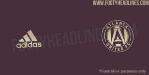
(Via Footy Headlines)
Footy Headlines confirmed Atlanta as the first team to definitely be receiving a third jersey in 2021. The picture above shows the color pallet for the jersey, “Team Maroon”. With Atlanta United already wearing red and black, the colors don’t really feel all that special. It’s a bit disappointing considering how third jerseys are often used to experiment with non-traditional colors, so hopefully, the design takes more risks.
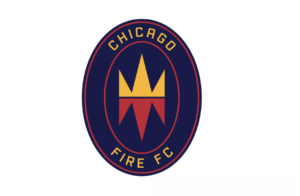
3.) CHICAGO FIRE RE-REBRAND
Sure it was brought up earlier, but we’ve gotta talk about this.
Just a little more than a year after unveiling their new look in November of 2019, Chicago is heading back to the drawing board for 2022 and going through another rebrand. It’s definitely the right choice, but that doesn’t mean we can’t poke fun at it. I mean, really… how does something like this even happen?
(Via Chicago Sun Times)
It’s so… weak looking. There’s nothing of substance in the logo, and every single element looks like it was inspired by clipart. I’ll give it a break though, Chicago’s logo has been torn apart enough, and I’m already a year late.
What excites me most about Chicago’s re-rebrand is their apparent reliance on the community to build their new identity. They’ve already got a webpage set up for fans to provide detailed input on what they’d like to see in a new crest, and they’ve compiled a “council” of Chicago centric figures that will provide feedback and opinions on the new look.
Many clubs throw a prompt at a design firm, and trust whatever comes out, lauding it as influenced by the club’s history or some other branding buzz words. Chicago seems genuinely interested in involving the community after their miserable failure a year ago, and while it should never have gotten to this point, I respect the honest attempt.
FROM THE ARCHIVES
With Montreal ditching Impact for “Montreal FC”, It’s only right to look back at a jersey from another eurofied MLS team, Sporting Kansas City.
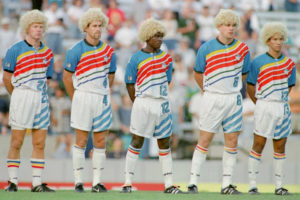
(Via Footy Headlines)
The Wizards, as they were called back then stepped on the pitch for the first time in 1996 wearing a jersey that largely defies explanation aside from “modern classic”. While simplifying identities and jerseys may be good for the domestic league’s overall appeal both at home and abroad; it is a bit sad to see how creative jerseys used to be, especially compared to the bland strips we get now.
EXTRA TIME
A few weeks ago, the NHL announced that teams will be allowed to sell helmet sponsorships for the 2021 season. It’s the first time that ads have appeared on NHL uniforms and marks the second “major 4” league to adopt a uniform ad in the last 5 years.

(Via Winnipeg Jets Twitter)
As of now, there doesn’t seem to be any word on whether or not the ad’s will stay after the league returns to normal in the next few seasons, and no, the Flyers haven’t announced one yet. (let’s hope it stays that way)
Loved it? Hated it? Want Chicago to consider your feedback for their new crest? Drop a comment.

Just bringing some insight to the Impact rebrand from Montreal. “Impact” will most likely be dropped but”FC” will not be added as the official team name is and always has been “Impact de Montreal FC”. Rumour has it that the “FC” will also be dropped and replaced with “CF” for the more grammatically correct french “Club de Football”.
Indeed, MLS acquired rights to the domain name cfmontreal.com and for a few hours last week, the URL redirected to impactmontreal.com
My feeling is that most supporters are not happy with the name change. As for the visual identity, there is both a sense of openness and anxiousness about a change in club crest. However, I think there will be a hugely negative backlash should the blue be removed from the team colours. IMFC’s staunchest supporters feel this rebrand is unwarranted and untimely.
Thank you Marc. I hope Montreal gets a rebrand (that no one was asking for) that they can be proud of. But with this league I doubt it. It’s sad MLS seems to want to devolve into the blandest branding (names, jerseys, etc.) that they can think of. Seems to me if you want attention you should go the opposite way and take some chances, but oh well. Good luck.
I’m most disappointed you chose that picture for the KC Wizards and didn’t explain why everyone is wearing blonds wigs. I assume they are wigs, but in the 90s I can’t be sure. Sort of looks like a Carlos Valderama style but I don’t remember him playing for KC. Maybe Valderama was retiring and they were honoring him?
–
I’m not a design expert by any means, but those KC unis have a 1970s feel to me. I wonder if KC had a team in the 70s that they were throwing back to with those things? They definitely don’t look as 90s as some of the others of that time period. Jeez- some of those were just hilariously terrible. I think this was a picture of the original reveal. I mean just look at these things:
–
https://www.mlssoccer.com/post/2020/02/02/blast-past-remembering-1996-major-league-soccer-jersey-reveal
Reposting here from daily roundup since it’s more applicable:
good for Chicago to ditch the rebrand. If i were in Montreal now, i’d be paying close attention to that both as the ownership who thought it wise to scrap “Impact” and fans realizing if Chicago could do it, we can too.
–
I really think it overrated that the crests have the team name in them. How many teams do this? All but two. For as many cries for Revs to rebrand, they at least have a non-text crest.
Branding is hard, and even smart companies get it wrong a lot. The Montreal decision gives me a lot of anxiety, simply because they have a brand in the way that few MLS teams do.
Club Foot Montreal?