Feature photo: Earl Gardner
Soccer, politics, and pandemic. It’s been a crazy last few weeks. No one at all would blame you for running away to your parent’s basement and booting up that copy of FIFA 2005 you’ve still got on Playstation 2 in a box somewhere. However, as lovely as that sounds, it’s probably a bit unrealistic.
Instead, why don’t you take a few minutes out of your day, kick back, and read up on the totally relaxing and comforting topic of soccer jerseys?
THREE POINTS
1.) MLS THIRD JERSEYS
In 2013, the Philadelphia Union unveiled what is to this day my favorite Union jersey of all time. The Bethlehem Steel inspired third jersey. In my opinion, it’s one of the most incredible soccer jerseys ever made. If you’re reading this and have an authentic medium you’re willing to part with, please hit me up. I’m eager to pay handsomely and trade you my small Shannon Williams jersey, or the knockoff I have, or both.
Anyway, where was I? Right. Third jerseys. In 2015, MLS announced they were scrapping the third jersey program due to revenue issues. 2021 will likely see this decision reversed. Rumors are starting to swirl that MLS’s highest-grossing clubs (think Atlanta, Seattle, etc.) will have third jerseys starting next year. This is an attempt by MLS to maximize revenue from these teams and build the MLS brand domestically and abroad. Unfortunately, this likely excludes the Union for now, but it does open the door for something down the line.
Third jerseys are incredibly interesting. They allow teams to experiment with colors and designs not typically associated with their aesthetic. For that reason, I’m a huge fan. I’ll be eagerly awaiting the upcoming designs and forever hopeful the Union will be granted the opportunity to roll out an alternate jersey in the coming years.
2.) AUSTIN FC JERSEY REVEAL
Love em’ or hate em’ Austin FC’s got style. Starting play in 2021, Austin FC will reveal the most essential part of their identity next Wednesday, their kit. Tuesday night, the team teased the kit in a video depicting two different craftsmen at work. I know that kind of sounds odd but trust me, I’m describing it as best I can. Just take a look for yourself.

(Via Austin FC Twitter)
While the video is devoid of any actual glimpses of the kit, one design element stuck out to me throughout. Lines. From the first craftsman’s bandana to the lingering shot of the second studio’s linear lights, the video places emphasis on line. Even the final image incorporates the element on what appears to be fish. I don’t exactly know what this has to do with Austin (I avoid Texas as best I can on principle), but I’d be surprised if the kit doesn’t feature some sort of thin lines throughout. A hoop pattern circa Germany’s current home jersey is my best guess. Whatever the case, you can see the kit revealed next week on November 18.
3.) “NEW” U.S. HOME JERSEY.
Look I know these came out a while ago, but I didn’t have this column back then, so let me have this.
Unveiled in February of this year, the United States ditched their old threads from 2018 and 2019, respectively, favoring one unified look across both men’s and women’s national teams. The away kit features some odd attempt at camo, and the home shirt features, well, nothing of note.
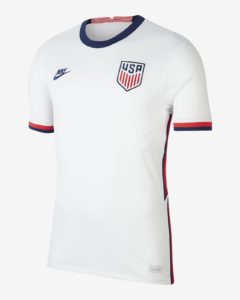
(Via Nike )
I like the home shirt. It’s simple but inherently American. I love any jersey that features defined cuffs, and boy does this shirt have defined cuffs. Also, the Nike Futura logo (exclusive to the U.S. through all of the Nike outfitted countries) adds a chic touch of modern style to the shirt. That being said, I really wish Nike and U.S. Soccer could settle on one look for the home shirt and stick with it. Brazil is yellow, England is white, Croatia has their checkerboard; I wish the U.S. had something as recurring and Iconic. A plain white shirt can look great and be a refreshing change, but it’s not going to stand out to define the U.S. when they take the field. The Waldos, on the other hand…
From the archives
Sticking with the topic of MLS third jerseys, I wanted to talk about this gem. Enter the 2012 Portland Timbers’ third jersey. Why this particular third jersey? Because I think it stands for everything, a third jersey should stand for.
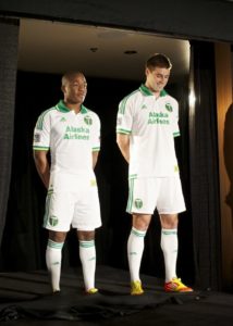
(Via Oregon Live)
While the shirt isn’t some shocking discontinuation of Portland’s aesthetic, the shirt takes a different direction. Instead of Portland’s modern identity’s darker green and gold, the shirt reaches back to the Timbers’ past with lighter colors and simple designs. The shirt allows them to forge a connection to something besides their modern identity and represent that. For older clubs like the Timber’s, a throwback is perfect, yet for other,s a more city inspired design would work well. Whatever the inspiration, third jerseys should reach into what truly drives the supporter. Thiss nod to history is a perfect example of how to pull it off. Sticking with the topic of MLS third jerseys, I wanted to talk about this gem. Enter the 2012 Portland Timbers’ third jersey. Why this particular third jersey? Because I think it stands for everything, a third jersey should stand for.
Extra time
Last week the 76ers teased the return of the classic black Iverson era jerseys. This week the 76ers drove a stake through the heart of anyone who actually expected them. Complete with strange boathouse row line art and a misplaced “Philadelphia,” the new look leaves a lot to be desired. While teams like Memphis got incredible throwbacks, the 76ers got, well, whatever this is.
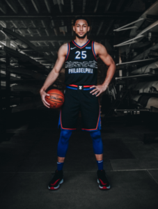
(Via 76ers Twitter)
In reality, it’s not that bad; it’s just not what fans were expecting. If you like it? Good on you; I wish I could.
Good takes? Bad takes? Let me know either way, I go to art school, I’m sure I’ve heard worse.
Thanks to those who made suggestions last week, I’ll be working over the next week or two to integrate some of them into the column. Any new ideas are welcome, and I’d love to hear what you guys want me to focus on in the column.


US NT third jersey should go back to the Denim jersey of the mid 90’s.
The US should own hoops and make that their trademark. The Waldo jerseys and the 2017 Gold Cup jerseys are legendary.
Yes.
Since the hoops are really the stripes of the flag, this leaves the door open for lots of cool star-type away/3rds. Obviously the occasional denim throwback, included.
I always thought a White jersey with one blue shoulder and a red bottom corner would be a good looking jersey. Basically a super wide white diagonal stripe.
.
I don’t mind the Sixers new one and definitely don’t get all the hate on it. Its a black jersey and Boat House Row is a pretty iconic site at night. Could be much worse.
.
I don’t mind call backs to classic jerseys, but don’t see the fuss over bringing back the old AI era jerseys in total, its not like they won the title in them. Similarly I don’t get why people have such a massive hard on for Eagles going back to Kelly Green jerseys.
Completely agree on the Kelly green, and I’m definitely old enough to have grown up with them. The midnight green is a superior color and it makes for better unis hands down. As far as clamoring for the AI jerseys, it’s probably because the team has been a train wreck for 32 of the last 35 years. That tiny 3 year window is all fans under 50 have.
– Eagles Kelly green is a hill I’d die on. It looks so good. This midnight green has lived too long.
– I like the Sixers jersey but I really don’t care for NBA jerseys. I will say, the NBA seems to have the most fun with new jerseys. I didn’t appreciate the reflection in the water of Boathouse Row till Casper video putting it on. Is it an Iverson throwback? No, but that’s what fans wanted.
The adidas partnership kills innovation in MLS.
Really hate the 76ers jersey! That being said. I usually only get the home Jersey! I did snag a Bethlehem Jersey but the washer took the Bimbo logo and ate it for dinner! I was very disappointed! But that one was a classic!
I think a recap of your soccer experience through this crazy year, and the challenges of college may be a nice thing. Also a way for us to share our thoughts as well. Use that artist brain to think up something out da box? What ever you come up with will be great I’m sure! Having a young writer cut their teeth here is almost as much fun as a homegrown signing!
My Bimbo started flaking too! I wore it to the final game last weekend and noticed the B was worse due to the seatbelt rubbing on it.
Bruh. Texas is the best state in this country.
A few years back there was a picture of Seba (my hero!!) wearing a Revolutionary War continental soldier inspired jersey for a July 4th match. I couldn’t wait to get one… It was GREAT! Then I found out it was a joke…
No denim…….and yeah, Tuck Fexas! Lolz!
Texas >>> Pennsylvania in every way imaginable.
Looking for info on a Union shirt/jersey I saw at the Supporters’ Shield picture day.
It was nearly Royal Blue, with an enlarged snake crest on the left chest, and Bimbo in the BSFC print.
Kinda looked like a Mitchell/Ness styling.
I would love to find one but I’m having trouble searching for what I want.
Hey!
Looks like you’re talking about the warmups worn in the 2018 Open Cup Final. Definitely a good looking shirt.
Probably gonna be hard to find as I believe they were only sold at the team store for a brief period of time, but you could try asking around online.