For several weeks now, the mobile video game “FIFA Mobile” has been leaking Major League Soccer jerseys.
The Colorado Rapids were first, followed closely by Atlanta United.
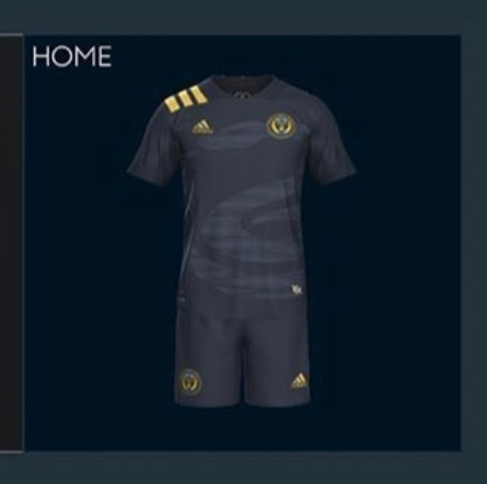
https://twitter.com/Kit_Watch/status/1207698945264234496?s=20
Inter Miami’s inaugural shirts found their way online too.
Quickly thereafter came LA Galaxy and your Philadelphia Union.
https://twitter.com/Kit_Watch/status/1212790739136065536
Each team updates one of their two jerseys every year. This year is the league’s 25th anniversary, and the stripe pattern on the shoulder is likely a nod to shirts from that era (though not in MLS).
There’s a chance this is real and awaiting a final sponsor to fill it out.
What do you think?

I don’t mind either – is the home jersey black or just a super dark navy blue? For the away, since its small maybe I’m not quite seeing the design pattern, but is it a Japanese battle flag or something?
Oh and Happy New Year everyone!
Interesting idea. Sublimated designs are worthless and invisible beyond 10 feet. They might as well just go with a solid blue. Getting rid of the gold strip down the middle was a huge mistake. The shoulder stripes could be cool, but one shoulder looks odd.
agree with you for the most part. the single shoulder evokes an epaulette and is bold branding without being invasive like most Adidas kits. they typically run the 3 stripes down the arms or, like the last wave, more discretely down the torso. i think it’s a sharp design. otherwise, sublimated snakes and rays will not be fondly remembered. this front office is wowed by techniques that poorly translate. it reminds me of how the firm that redesigned the Federal Express logo pitched it to upper management not on boards or paper or boxes but rather the side of a jumbo jet. “FEDEX” big and bold, readable from miles away in the air. aside from being unique to the kit landscape, the center stripe was a core element to our identity. you could also pick it out from the cheapest seats to the tiniest thumbnail.
I also noticed the “epaulette.”
In the British Navy during the Napoleonic and Revolutionary era, a single epaulette meant a Captain but of less than three years seniority.
.
The youth and newness implied by the single epaulette fits for the Union. Only now does the club seem to be starting to learn how to succeed on the pitch after a decade of mediocrity. Only now is the club beginning to move forward on the riverfront re-development that was used to justify substantial taxpayer dollars to bring them to Chester.
.
Let us hope that the second epaulette is earned in the next two or three years.
I think union will take step back unless they sign some better players to replace the ones that left and some older players. Not confident the signing this year will be at same level or hit jackpot like they did with kacper. The José Andrés Martínez Torres is 25 and no caps with Venezuelan squad who is weaker then us most positions.
I like this design. I think it will look pretty good with, perhaps, a gold monotone bimbo on it. I was never one of those in love with the “old school/throwback” gold bar in the middle.
I like it. It’s subtle. Also blue trunks with the sun burst white Jersey is a good look!
Breaking out the old Adidas Equipment line from the 90’s, I rocked a kit like that in college! Very cool to bring back that line.
As long as the “Bimbo” isn’t one large piece of vinyl. I think that kills the purpose of the breathable shirts. (Especially for those of us sitting on the sunny side of the stadium.)
Agreed. Haven’t bought a new jersey since my season one sponsor-less one. Not really cause of Bimbo… more cause I didn’t care for a lot of the new jerseys. I like, but don’t love this one. If it’s not Bimbo, it may push it over the edge. If it is, it’ll make me think twice. I do need a new one though, the stripes are falling off my original… and it’s long sleeve, which they don’t make anymore. We’ll see…
Not bad if those are genuine issue. Particularly like the white and blue.
–
Those Inter Miami kits…. Zzzzzzzzzzzz.
some comments on the “no sponsor” kits leaked in the game: i expect the real ones to have the BIMBO sub-brands like “Artesano,” etc. Colorado may have this so they’re also blank. Atlanta and LA may not have subs to flex so they’re in the game, as-is.
Boring! absolutely nothing to get excited about! Having an entire league kitted out in jerseys of the same template is really, really uninspired,lazy and disrespectful to the fans. It wouldn’t be so bad if the the teams were using different templates made by Adidas but fans are being reamed. The only thing that separates DC from Atlanta ( apart from the geographical miles 🙂 are the colours of the fabric. At least with the European leagues the teams have different kit manufactures
If non-bimbo jerseys outsell the bimbo ones by 2x or more, will someone in union marketing finally get a ducking clue. Never owned and never will buy bimbo -logo. Would gladly buy 10 non-bimbo ones if union would confirm it meant end of bimbo logo. Use Entenmann’s or Thomas, Stroehman,BeefSteak, Boboli, or Sara Lee, all familiar brands. Fuck bimbo logo.
UnionGoal
The home kits look like an intramural kit as almost every kit in the MLS does. Their is almost zero originality in any MLS kit. blue team, navy team, white team, red team, yellow team… It’s almost pathetic. I don’t think the teams have a say. Seems like Adidas gives them a kit and that’s it. I knida of like the away kit because it is, at least, broken up with navy shorts. The teams need to create their own identities though and they fail miserably.