With the Union’s official kit now launched and out for review (and the party to celebrate it this Friday night in Chester, PA), fans of the team now know what The Boys in Blue will wear when they take their talents on the road. However, while they waited, readers of The Philly Soccer Page stepped in and designed their own kits.
Here are the entries (in the order they were submitted), descriptions of the kits in the creator’s own words (if possible), and an opportunity to vote for your favorite at the bottom.
Enjoy!
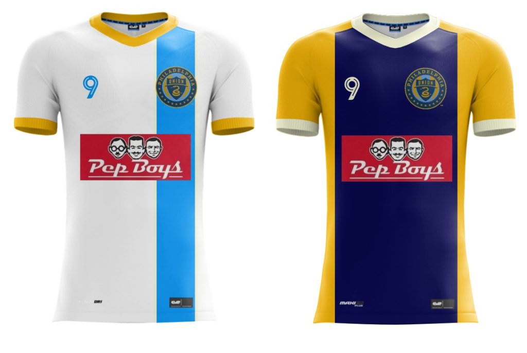
A revival of blue and gold – Vince S.
The gold is underrated and it stands out from the dearth of plain “dark” shirts in the league. Pep Boys is the obvious new sponsor; local company with nation wide appeal… I’m bringing back the light blue, paying homage to SoB, in the stripe. Collars and trim are gold.
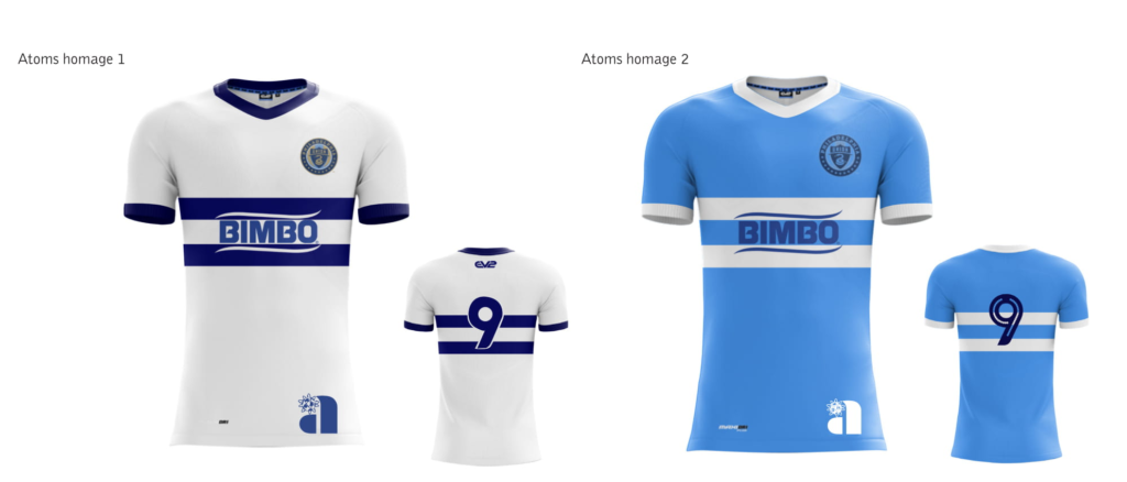
A tribute – Chris R.
A throwback to the 1970s and the Philadelphia Atoms.
It’s what makes the Union the Union – Cyle R.
I used the redesigned secondary crest for a cleaner look than the primary. I brought back the stripe but moved it over & made it Signal Blue because it’s the main color of the SOBs & the outline on the old home kits. I trimmed the stripe with the gold off the original home stripe to completely invert the old home bib colors. I also used Subaru as the sponsor because so many people dislike the Bimbo sponsor & Subaru America’s HQ is in Camden.

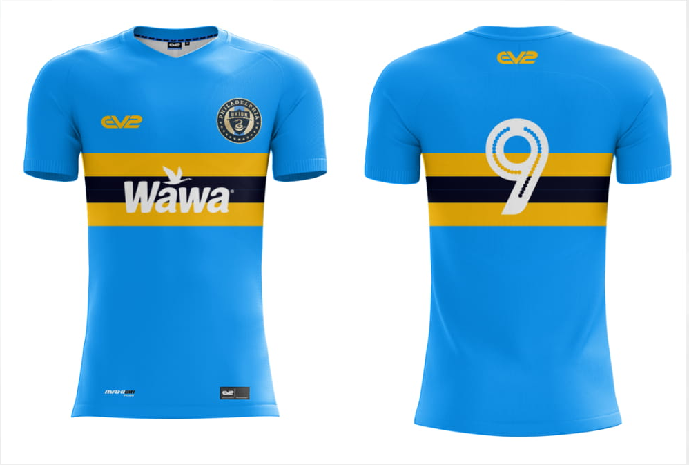
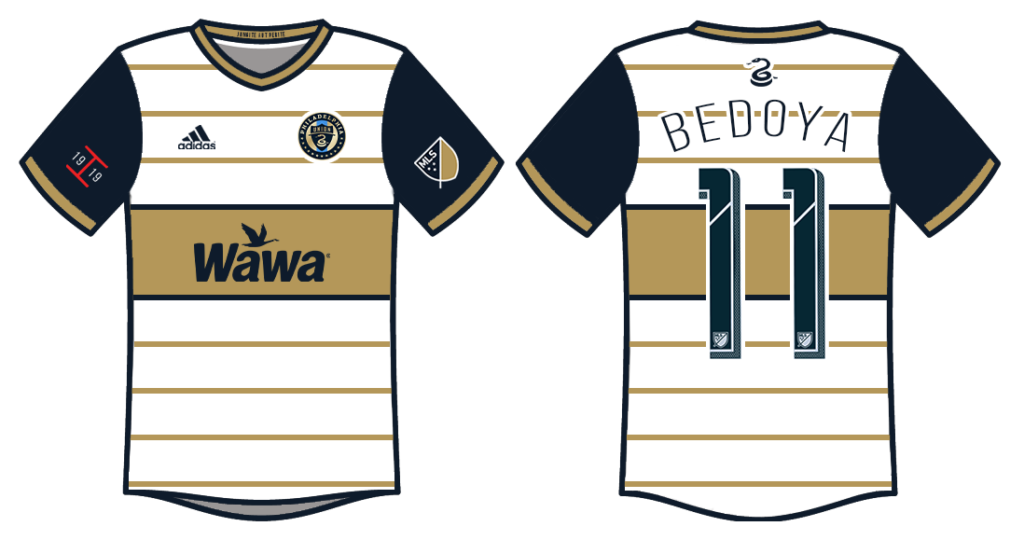
Wawa is Philadelphia, Philadelphia is Wawa – Bora U.
Horizontal stripes make color contrasts stand out and I decided to use light blue as the main color because that was the Union’s old away color. I think light blue is a beautiful color and should be used more on Union kits. The gold and dark blue are the main colors of the Union, which I prefer over a single-colored kit. The Wawa sponsorship is much more recognizable and synonymous with the city of Philly than Bimbo.
Cool and creamy – @Phillyunionnation
Clean, subtle, and very much on-brand.
Well-crafted, with local flair – Phil A.
To coincide with last season’s new home jerseys, I added horizontal hoops to the jersey. I chose gold hoops and kept the blue sleeves to incorporate a better color contrast than just a white jersey. On the arm I added a patch commemorating the 100th anniversary of Bethlehem Steel’s 1919 Open Cup final victory. Maybe it’ll inspire the Union to finally win the cup! Lastly, I pretended to play owner and mercifully retired the Bimbo sponsorship logo. I replaced Bimbo with Wawa as the new sponsor. A guy can dream, can’t he?
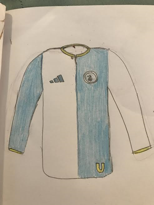
Dutch influence – Andrew M.
Designed after watching Feyenoord beat Ajax this weekend. Th[is] hand drawn version features a subtle collar with a single button. It also has matching gold trim at the cuffs of the sleeves.
The left hip has a signature U. The jersey would ideally be worn with a navy short but it obviously would look awesome with a light blue or white short as well.
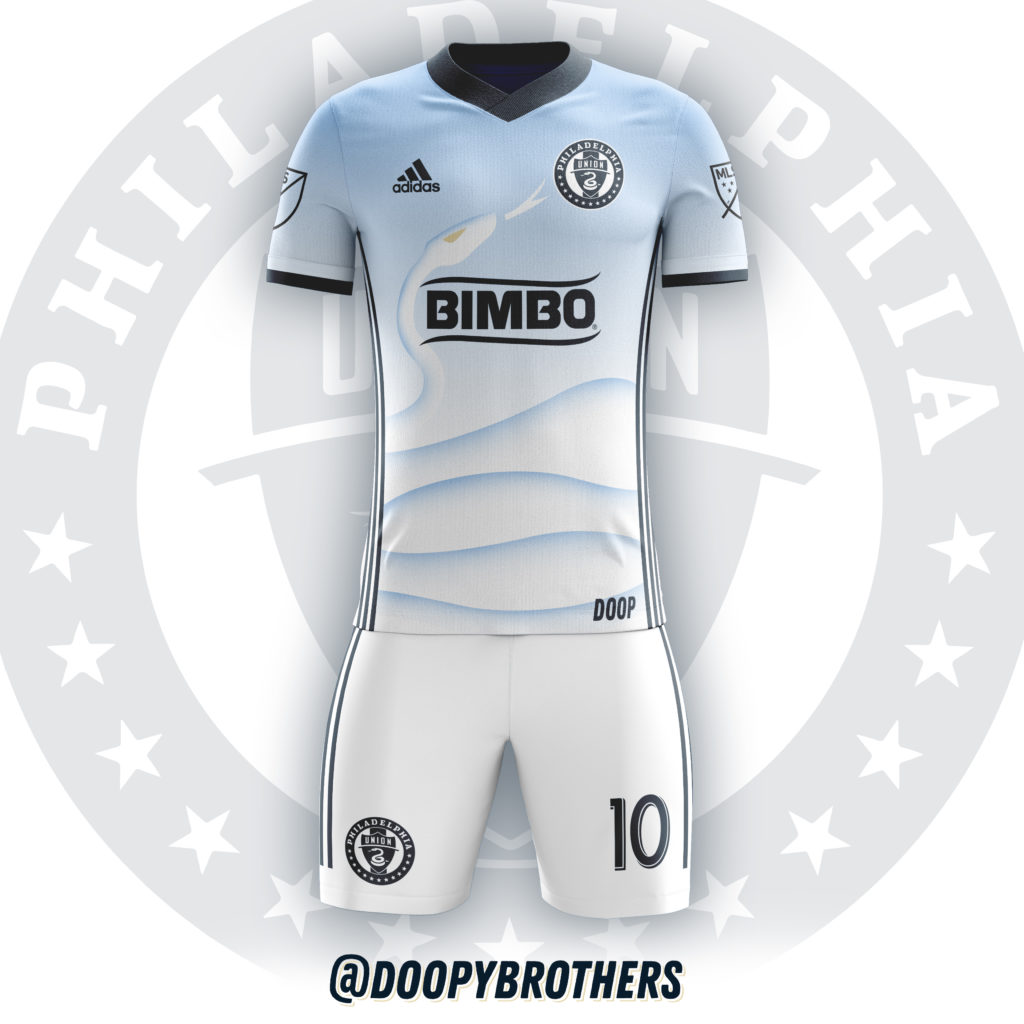
The snake – Luke M.
The thought of my design was to show the snake wrapping around the jersey and facing the crest on the jersey in a way that isn’t super cheesy using the secondary blue to define its shape.
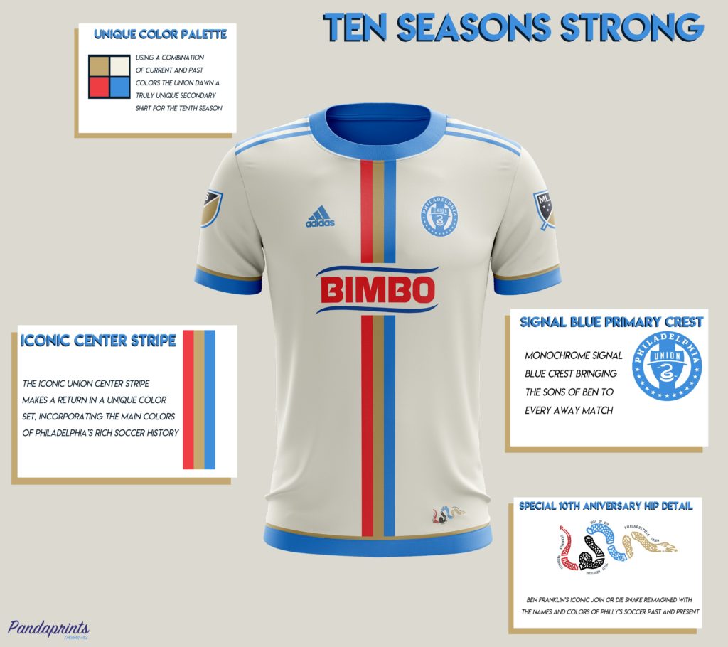
10 years strong – Thomas H.
Description below.
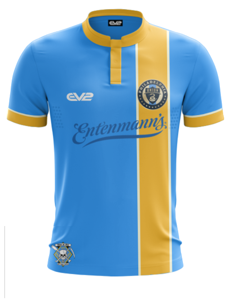
Getting back to how we got here – Stef S.
I went with the colors of the city of Philadelphia to celebrate the city and our 10th season as the city’s MLS team. I brought back the “stripe” down the front since it was part of our signature look before the Doop Hoops. Not a fan of the Bimbo logo, I went with one of the their regional brands that blends with the kit better and will not deter as many people from buying one.
Finally, I added the Sons of Ben logo to the bottom to celebrate and pay homage to the supporters group that helped get us here (and also help boost sales of the kit to the group).
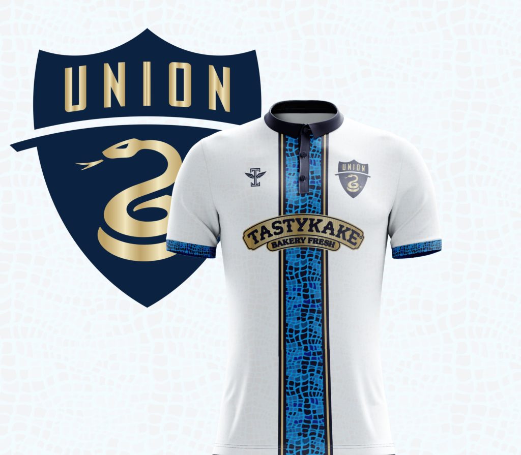
Snakes and Tastykakes – Robert S.
Staff submissions (not eligible to win)
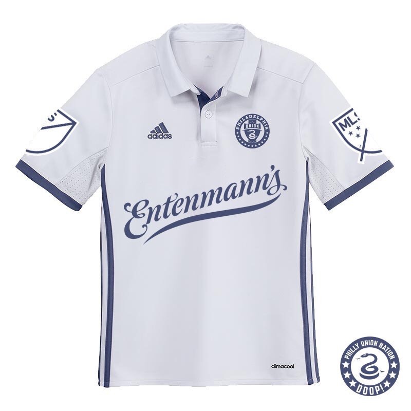
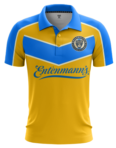
An alternate reality – Jim O.
It does so many things the actual jersey won’t do. It’s a change jersey that isn’t white. Instead I went with a gold-dominant design using colors from the flag of Philadelphia. The fact that it doubles as an Eagles throwback is fine too. It continues the Bimbo sponsorship, just using a less troublesome and better-integrated Entenmann’s logo. (In this alternate reality, the primary jersey gets a Thomas’s logo.) And it’s a collar, because we’ve never had a collar.
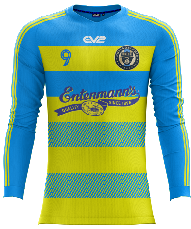
Mr. Brightside – Peter A.
If we’re doing hoops, let’s actually do hoops. Borrowing from the colors of Philly’s city flag (and the Sons of Ben), this is a bright change kit that would be unique in MLS. Using the brighter shade of gold avoids the flesh-toned issues with the first season’s change kit. As we’re in the realm of fantasy, I went with Entenmann’s as the Bimbo product on display on the front of the kit.
One sweet jawn – Mike S.
A Philadelphia original.

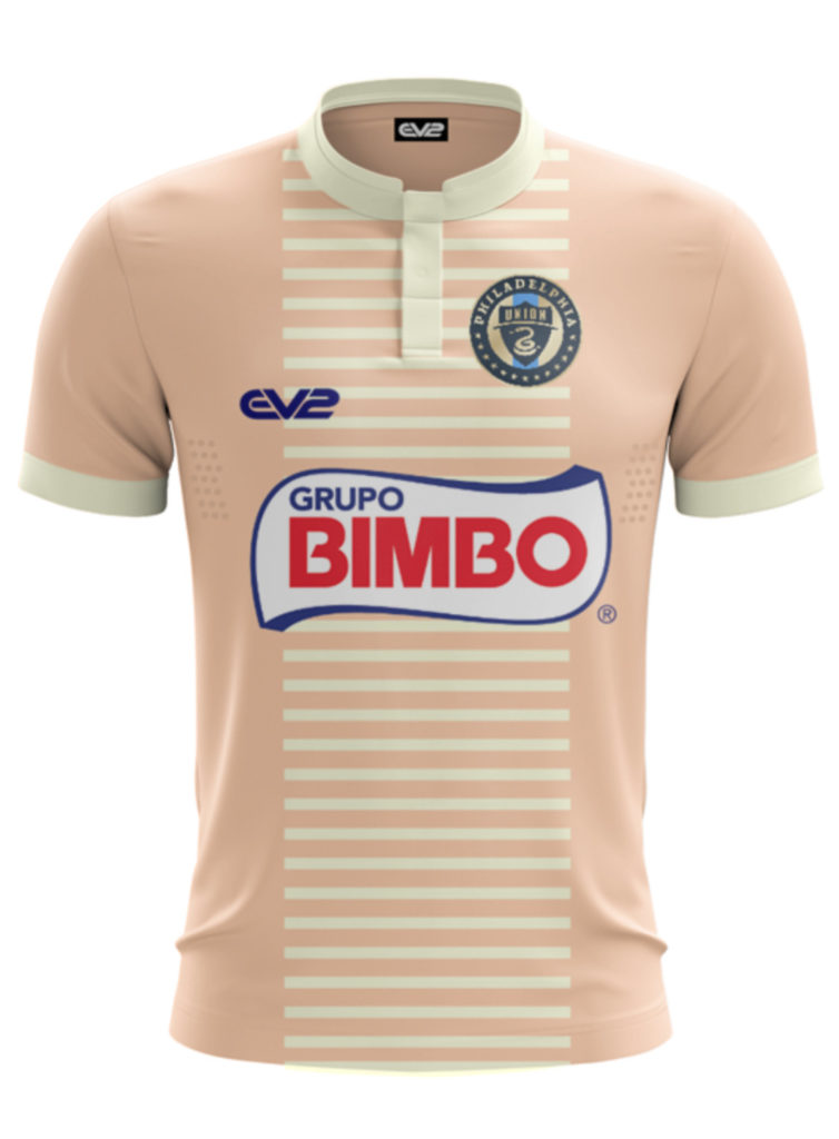
Author’s submission, Too much of everything – Chris G.
If “Living Coral” is 2019’s official color, then why not throw a little pink into the Union away kit? Keep the hoops, bring back the bib, and you have the ugliest, most fashionable, worst Union kit since the original all-tan monstrosity. Then, change up the Bimbo logo for good measure and you can have my $120, thank you very much.
In the coming days, PSP’s staff will vote on a winner, who will receive a PSP shirt of their own.
Let us know your own opinion in the comments section below!

Personal favorites: Phil A., Andrew M., Cyle R., and Chris R. But to be clear… they are all WAY better than I could’ve done. Maybe one day we’ll be lucky to have something similar to one of these. Well done by everyone!
“Getting back to how we got here” is the winner. I love my own submission, but I can freely admit that this one is a hands-down winner.
I opened this thinking… wheats it gonna hurt to look- its fodder.
.
Every single one of these entries is thoughtful and really really cool…and a few are absolutely dead spot on.
.
Thank you. totally impressed.
I’m with Pachy on this. All are outstanding. Adidas designers have been put to shame. I particularly like the Atoms throwbacks, the gold jersey with the light blue chevron and the “10-seasons-strong” jersey.
–
A round of applause for you all.
Yep, one more agreeing with El Paquidermo (thank you, Google translate). I expected a train wreck overall, but these were awesome. Well done everybody!
Everyone of these is better than ANY Union official jersey yet. Wonderful job everyone. So good in fact I don’t want to chose because I have no clear favorite.
These are all fantastic!!! Every single design is light years better than the new white kit. It’s heartening to see that all the fans appreciate a brighter blue and yellow, too. Now if only the team listened. No more white jerseys. Bright and bold!
My personal favorites, with some comments:
.
Chris R.’s “Tribute” jersey: I love this one. It even makes the Bimbo logo look OK. I love that there’s two options – a white one, because for whatever reason second jerseys need to be white it seems; but if we want to break that mold, we have the really cool light blue one. This one grabbed me right off the bat and became my proverbial leader in the clubhouse early.
.
Cyle R.’s “It’s what makes the Union the Union” jersey: This is sharp-looking, and Subaru is a nice choice as a potential jersey sponsor. I think the logo needs to be a little smaller – probably stopping in the middle of the blue stripe, roughly. It has great contrast, and would look great on TV – still white, but distinctive so that when you see it, you know who it is.
.
Phil A.’s “Local Flair” jersey: I like the way this one plays off the doop hoops primary, but offers a good contrast with white as the main color. As with Cyle’s, this one will show nicely on TV, I think. As discussed in the original thread on this, though, I don’t see Wawa being a viable jersey sponsor as they’re too regional. That said, I don’t think the all-blue Bimbo would look bad on this jersey.
.
Luke M.’s “The Snake” jersey: Holy cow, do I LOVE this one! Chris set a high bar at the start as I was scrolling down, but this one is my leader in the clubhouse. My only real concern here is whether or not the snake would show well on television. I suspect the snake head would show well, but the body might get lost. But for my money, this is a great second jersey option!
.
Well done, all! These were great!
+1 for The Snake, that is a Union jersey I would actually buy
I agree!
Bravissimo to all. Great job!
These are incredible. So thoughtful. So creative. Well done and thank you for sharing!
The “snake” jersey and the “Atoms” jersey are personal favorites.
Andrew’s Dutch rendering for the win (I also watched that game). It’s on brand because it used crayons.
.
No one wants AMEX for a sponsor for the Nick S homage?
Luke M’s Snake design is awesome! I’d buy it right now.
I’d buy most of these even if they weren’t the official ones (aside from the sponsor names) and were just bootlegs. Very well done!
“Snakes…why does it always have to be snakes!”
I would buy that snake Jersey in a heartbeat!! Well done by all!!
+1 for the movie reference.
Thanks for the kind words, fellow kit lovers. I design sports apparel (chances are some of you own one or more) so this was fun. I stuck to Bimbo but if I could pie in the sky, you guys nailed wawa and Entenmanns (I’m more a tastykake man though).
If I had to vote, it’d go 10 seasons strong and then cool and creamy. Really great use of red (sacrilegious! Lol) and integrates the full color Bimbo well. Also, I’m a sucker for anything remeniscent of McQueen’s Le Mans.
Both are clean white kits infinitely better than what we have this year.
I was scrambling on the last day to put something together but I gave up because I realized it would be too much work and I was tired after work. I’m glad to see Jim O. submitted pretty much exactly what I was going to make anyway
Dig the Atoms one. I’m a sucker for US soccer nostalgia. Good job!
The Union alluded to the Steel kit being the first in a series. Given the reception it received, I expected a follow up soon after. The league killing 3rd kits and/or waning organization enthusiasm killed nostalgia until the Open Cup final last year, which was basically Steel-light. I wanted to carry the torch with the Atoms. Many teams have done nostalgia right (Houston’s Astros homage, recently). Given the history of soccer here, it’s something the Union should do, even as warmups like the Open Cup.
Our readers should be designing all the Union jerseys.