Images courtesy of Philadelphia Union
This time last year, the Union lost their strongest claim to a visual identity. Love it or hate it, the broad gold stripe up the front of the Union’s primary jersey was a constant from the very first season up until that time. But Adidas, MLS, or the Union, or most likely a combination of all three, thought it was time for a change.
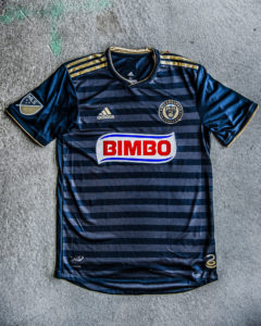
The Union’s primary kit, as revealed last year.
And change came in the form of #DoopHoops. Again, love or hate, they represented a significant change in how the team looked. In the photographically perfect world of press releases, the tonal hoops added texture, and gave the jersey a more subtle and refined look than previous uniforms.
But these jerseys exist outside of that idealized world too. In the real world they’re just blue shirts. Look at any of PSP’s photo essay’s from last season. Our photographers provide some of the best depictions of the game available, and overwhelmingly the subtle and refined nature of the #DoopHoops are just lost in all but a handful of views.
Now the Union has the new all-white secondaries. The rules are a little different for secondary kits. Teams don’t wear them as much, and the need to ensure visual contrast winds up really limiting the designer’s ability to deliver something truly exceptional. With a handful of exceptions, secondaries are white, and unremarkable. Which is exactly what the Union got.
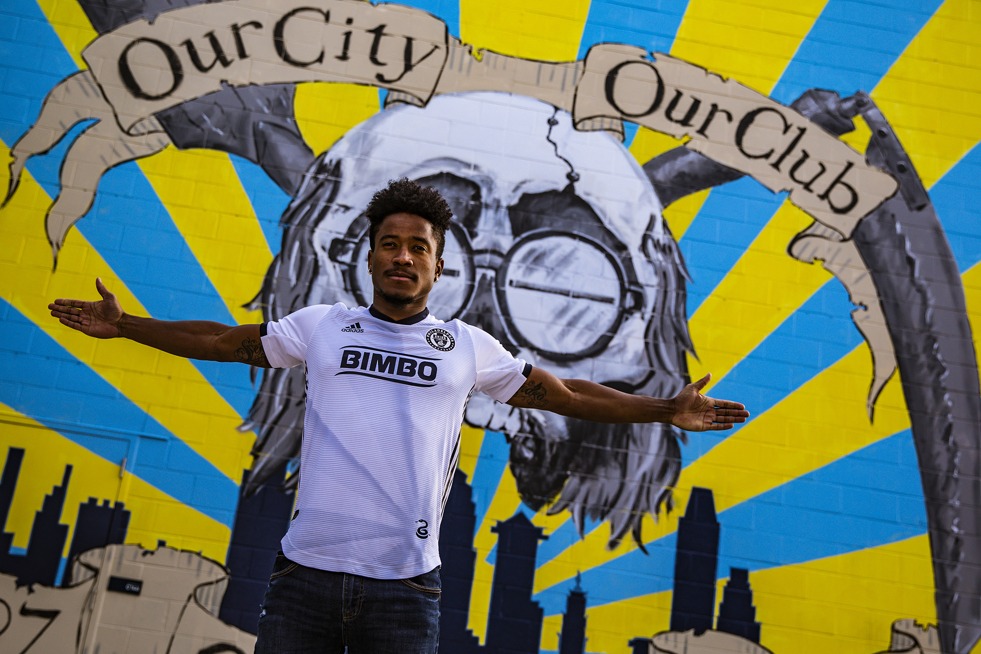 PR people and Adidas apologists will be quick to point out that new kit features a flag-of-Imperial-Japan style sunburst, radiating from the snake logo at the hem. But good luck noticing that, even in the idealized world of press photos. Only the picture to the right showcases it in a way that’s remotely noticeable. On-field and in-person it will unquestionably disappear even easier than the #DoopHoops.
Now before we go any further, let’s get something clear: neither of these designs are bad. In fact, I kind of like the #DoopHoops and would consider buying the secondary if I thought I could be trusted to keep an all-white $100 tee shirt clean. They’re not bad, they might even be good. But they’re not memorable.
Maybe the Union (and Adidas, and MLS) are trying to sell more shirts by making them more friendly for every-day wear. But if that’s the goal, why aren’t we seeing more Union jerseys in the wild? Sure, they’re everywhere in Chester on select summer weekends, but the #DoopHoops haven’t make the Union a part of the Philly fashion landscape in the same way almost every other sports team has. You’re only slightly more likely to see a Union jersey than a Soul jersey, and even that’s not a lock depending on your neighborhood.
No doubt Adidas deserves some of the blame. Have you seen Chicago’s new secondary? If you saw Toronto play in 2016-2017, you have. But teams have say — allegedly a lot of say — in what their kits look like. So either the the Union actively sought this milquetoast look, or they made the tough choice when Adidas presented them with several even worse options.
As discussed previously, merchandising matters because it is in part marketing for the team. Not seeing Union gear in the wild means casual fans aren’t reminded about the team outside of the regular phone calls from their ticket agents, and more dedicated fans don’t have the opportunity to cultivate a culture outside of attending the game itself.
There’s nothing wrong with the Union’s current wardrobe, but it’s so unmemorable. It’s likely that the only attention and interaction you’ll get from wearing it is another round of the exhausting “who are you calling a bimbo?” conversation.

LOL
i didn’t even know — with hard-looks — what this “burst” was.
if you can’t see the hoops, you can’t see the burst.
“10th Season Inspired kit” – may not be true for other teams who have to deal with Adidas and/or make poor decisions, but this kit perfectly sums up 10 seasons of mediocrity well.
You sir, are way too spot on.
I know it’s a case of beating a dead horse – and maybe even resurrecting it only to kill it again – but…
.
My daughter has several jerseys from the past 10 years. She wears them regularly, not just to Union games. Invariably, if anybody says anything at all to her, it’s not a comment about the most recent match or a signing or whatever. Nope. The most common comment? Some variation of, “Why would you wear a shirt that says ‘Bimbo’ on the front?”
.
It’s become a rote answer for both of us to correct the pronunciation, explain it’s a bakery company from Mexico, and that they own several well-known brands here – Thomas’s, Entemann’s, etc.
.
I really continue to wonder if sightings in the “wild” would go up if we had – by way of example – Comcast instead of Bimbo.
It definitely kills jersey sales. It shouldn’t, but it does. If Wawa was the jersey sponsor, everyone would wear them. Even Xfinity, which nearly everyone hates, would be vastly better and help move more jerseys.
I don’t see any benefit to Wawa being a jersey sponsor – from Wawa’s perspective, that is. Most jersey sponsors seem to be large companies with a national, or near-national, presence. On a quick look at a list of jersey sponsors, the only one that appears like it could be regional is Orlando (with Orlando Health as their sponsor). (Here’s the link I used for my quick look, if anybody is interested: http://www.soccer365.com/2018-mls-jerseys-and-sponsors/)
.
Xfinity, on the other hand, would likely benefit from a jersey sponsorship deal. Every Union match, they get prime advertising space in both the Philadelphia market as well as the opponent’s market.
.
Xfinity (and Wawa, for that matter) both potentially share a problem with Bimbo, though. Bimbo’s issue isn’t just the name – though it’s a large part of it. It’s also not a good fit for our jerseys. It’s the wrong color (partly red for Bimbo; all red for Xfinity and Wawa). And in Bimbo’s case, it looked absolutely terrible when we had the gold panel on the jersey. (And… is this a likely reason we moved from the panel to the #DoopHoops?)
.
Don’t get me wrong. I’d take Xfinity or Wawa in a heartbeat. Hell, I’d keep Bimbo and their money if they’d simply change from “Bimbo” to Thomas’s or Entemann’s or another of their brand names, with the Bimbo logo blended into that brand name logo.
The benefit for Wawa is name recognition, in that they’re looking to grow yond the region (though arguably, a local club jersey in a not-so-popular sport might not be the best way to do that). But I just picked it as a big, local company. I could just as easily see Verizon or T Mobile or Vanguard investing on the jersey.
–
There are few companies that would be worse than Bimbo from a name perspective, though from a corporate perspective, it’s hard to do better than a bakery. Bimbo might be better than Draft Kings, for example. (That’s coming soon). That said, I can’t even imagine a jersey with Thomas’, Sara Lee or Entenmann’s on it.
3 potential “local/national” sponsors that would obliterate 10 years of Bimbo jersey sales within 6 months…
#1 Yuengling
#2 Campbell’s
#3 DuPont
Does it DEFINITELY kills sales? Would a subsidiary of one of the most hated companies in the country be VASTLY better? Is there data to back this or is it just hyperbole? I’m not arguing that it will move more/less merch, but can we honestly say it would be THAT much better?
–
Pete mentioned growing brand recognition. To John’s original point, having to explain what Bimbo is gets old fast…but you’re explaining what Bimbo is which IS growing brand recognition. Which is the point.
–
Ultimately, it’s subjective. I know people who won’t buy a jersey with “BIMBO” on it. I know people who bought jerseys SPECIFICALLY because it says “BIMBO”. But most people I know don’t care either way – it’s just a word, and words can have multiple meanings. Personally, I’d rather a bakery with a slightly questionable name than something like a sports betting site, brewery, or hated telecom monopoly.
–
An honest question to those who demand they drop Bimbo: where is the line? Are sponsors like Dick’s or BJ’s acceptable? Is the sponsor’s name more important than the nature of their business/business ethics?
Their North American offices are based in Horsham. Additionally, McDermott mentioned if they retain Bimbo, they have discussed (albeit I’m assuming internally and not with Bimbo directly) using another one of their brands in the future, i.e. Entemanns, Thomas’, etc.
.
I do agree with you (John) overall though… there are plenty of other options to go with that would present WAY better and spurn jersey sales, just because it would no longer be Bimbo
I haven’t bought a new jersey since the inaugural season. Some of it is because the previous changes were so incremental, and the price is also high to keep buying the updates. But the largest reason is that I just don’t want the Bimbo advertisement across my chest. It’ll look nicer this year in the blue and white color scheme, but not enough for me to buy one.
boy I never liked that ‘the Golden Road’ path up the front of the kit even a little…. though I do like the Dead song,
.
hey hey, hey- come right away,
come and join the party every day.
I’m not inherently opposed to the Doop Hoops, but I do think the Union need to play up the gold. The first season’s khaki kit was a failure, but if they want to change from the strip to hoops, it needs to be bold, bordering on garish. Alternate blue and gold hoops — the brighter, the better. Or lighten the colors closer to cobalt and yellow.
.
We were the only side with a front strip for our first 8 years, and now the hoops just blend in with the rest of the navy crowd.
The University of Delaware had a real solid blue and gold hoop uniform, which perfectly shows how awesome Doop Hoops could have been.
So if you get rid of the money Bimbo pays per year to be the sponsor and replace it with something more pleasing that would sell more jerseys, how many more jerseys do you have to sell to make up the difference? What’s is the percentage of money on a jersey sale that the team receives? If the difference between Bimbo and xfinity is a million dollars a year, do you have to sell 30,000 jerseys a year if the teams cut is $34 to make up the difference? That’s over the yearly average of jerseys you already sell now and keep it at the new level every year the deal is in place just to break even.
I think if they could use one of their other brands that would help solve this problem. If they continue with the Bimbo logo, at least find a way to get the bear on the jersey as that would at least soften the look and get people to ask what Bimbo means.