Images courtesy of the Philadelphia Union
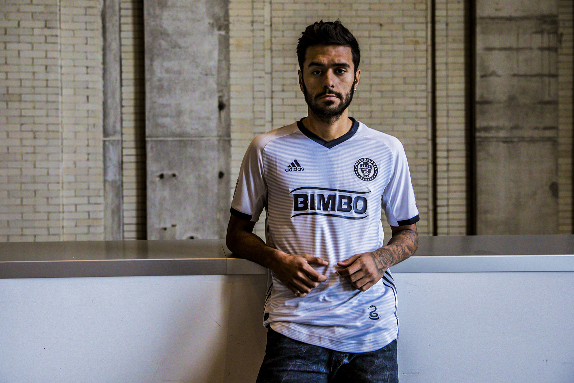
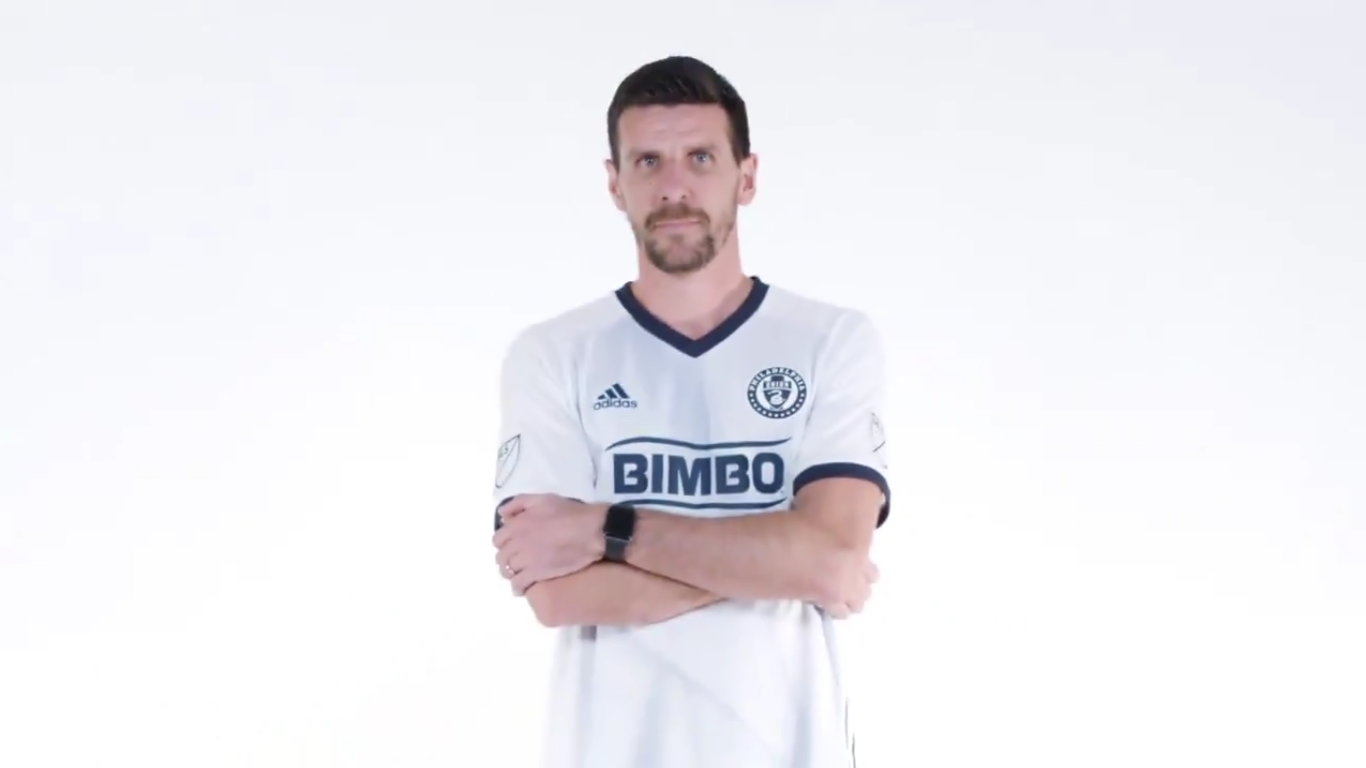
Moments ago the Philadelphia Union unveiled the first details of 2019s secondary jersey. The release video (below) highlights the multiple collar tag options that the Union will rotate through this season and an always welcome cameo by Union Ring of Honor inductee Sebastien LeToux.
https://twitter.com/PhilaUnion/status/1089900986758582272
The new jersey also makes use of the monochrome Bimbo logo we’ve already seen on the primary jersey. That single-color logo gives the kit a sleek and clean look, but there’s no escaping the fact that it’s just another white kit.
Since MLS (along with most soccer leagues and tournaments around the world) uses a primary/secondary kit distinction, rather than the home/away distinction used in all other North American sports, it is not certain at this time how many games the Union will play in this new kit.
Full press release here.

I’m tired of all the White kits in the MLS..
blah.
Commented on the news thread about the bland white kit. Snore. MLS really needs to let clubs negotiate their own kit deals. I wonder who the Union would end up with? I think we’re an Umbro or Macron sort of club. Does Diadora make any kits these days?
–
Wondering, though…. Whatever happened to 3rd kits? Have they been abandoned across MLS?
I haven’t seen anything official, but third kits have been dead league-wide for a few years now.
Better than previous white kits, but still just a white kit. I guess they’re limited in choices Bc of MLS’ kit deal, so can’t blame the U, seems like they’re trying to change up what they can. Still just meh
It is so bland and blah. No way I’ll buy one.
.
I will give credit, though, that Bimbo looks better in black and white
I’m not sure that kit could look any more uninspired.
Real’s face says it all.
.
Union Photographer: “Ok, now show how excited you are by this kit!”
.
Real: “I am.”
It isn’t just another white kit. I think you’re missing the blue details down the body and “burst” coming from the snake. Monochrome Bimbo makes it 100% better. Yeah, it’s not electric blue like a Sounders secondary kit, but I like it better than most previous secondary kits (bring back the gold kit!).
—
This is a kit I would consider buying
hoops so small you can’t appreciate them makes the primary kit’s hoops look more credible.
sleeve caps would’ve greatly helped this like the 2017 kit.
–
bored.
BOOORING! Why not go bold with Bright Blue or Snakeskin patterns… And I don’t care how you place it – the Bimbo logo is better full color – Should be Strohmann’s – Tye dye fade looks horrible. The Snake logo is the best part
Can we stop calling stripes, “hoops,” now?
Stripes always struck me as an up and down (North/South) type of things. Whereas hoops, being roundish in nature go around, like around one’s body, on a kit.
Curse of the Bimbo ! No Union shirt will ever be popular in the USA until they lose the BIMBO logo. Never Ever Ever!
unless Kim Kardashian…
I know this is snark, but get Kendall Jenner in one of these and watch the team make $100 million in merchandise.
Chris g if that gets us Doakal or Barnetta and. Proven forward please llet all the Kardashian and Jenners wear it proudly