Standard soccer statistics often aren’t the best way to determine how well a team played. I want to get that out of the way immediately.
I think that most of us understand that soccer is a very challenging subject to evaluate objectively with numbers, and that broad statistics, such as those most commonly available to us, are limited in their ability to describe why teams succeed or fail.
Nonetheless, it can still be worthwhile to look at how the Union have fared so far this season within these statistics, and compare their results to winners and losers so far this season. I worked on these charts to try and glimpse at what underlying factors are driving Philadelphia’s performance, and I thought they might be interesting to share.
I have two types of “Radar” charts that I wanted to share for each section, showing aspects of how the Union have performed.
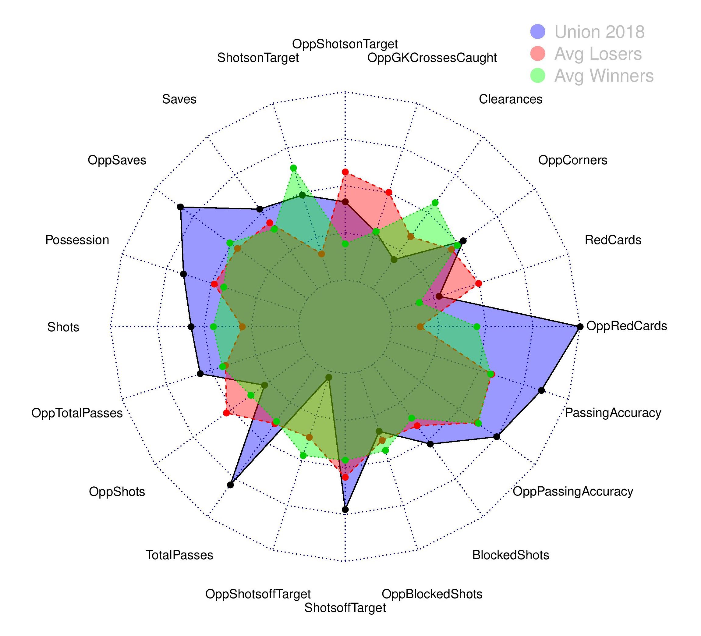
2018 Union Average
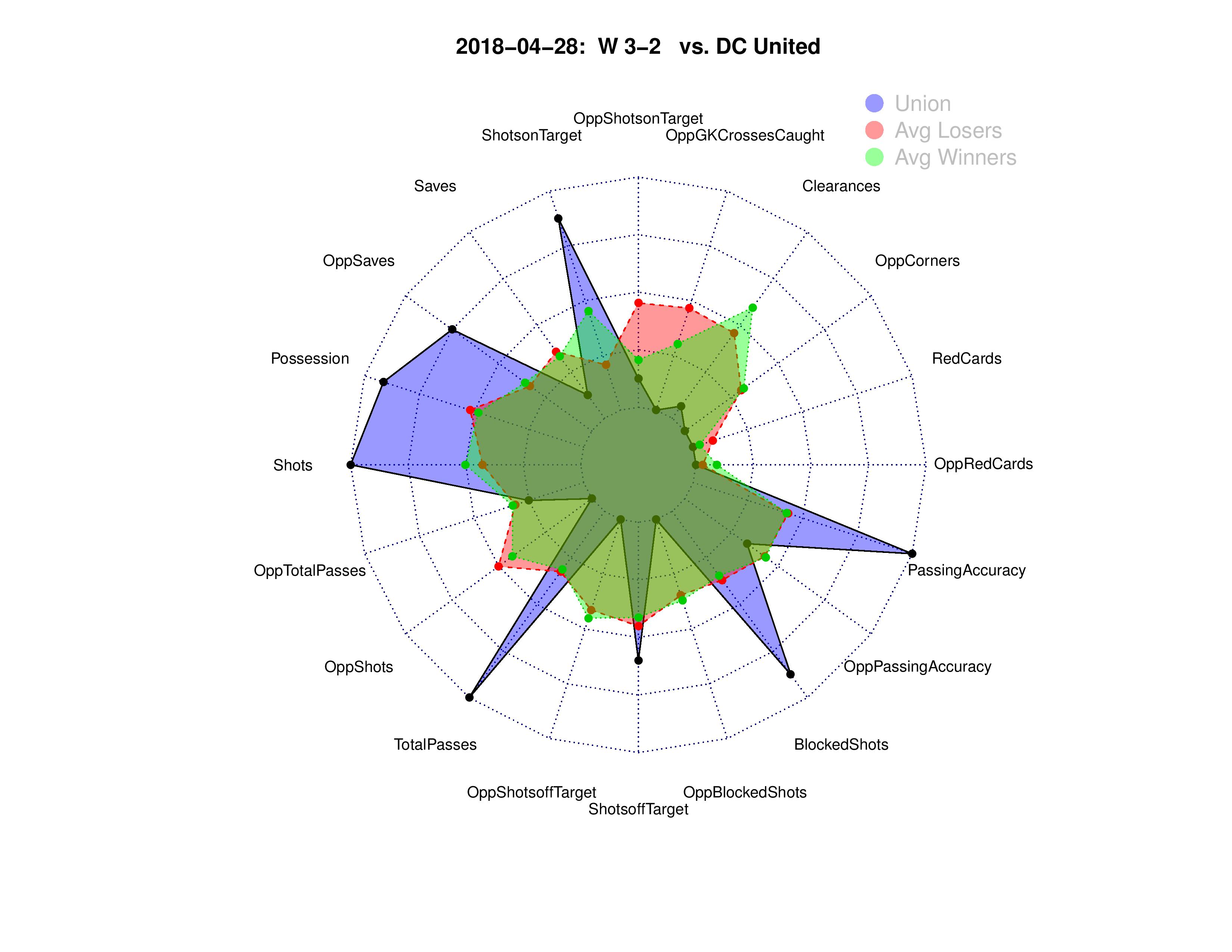
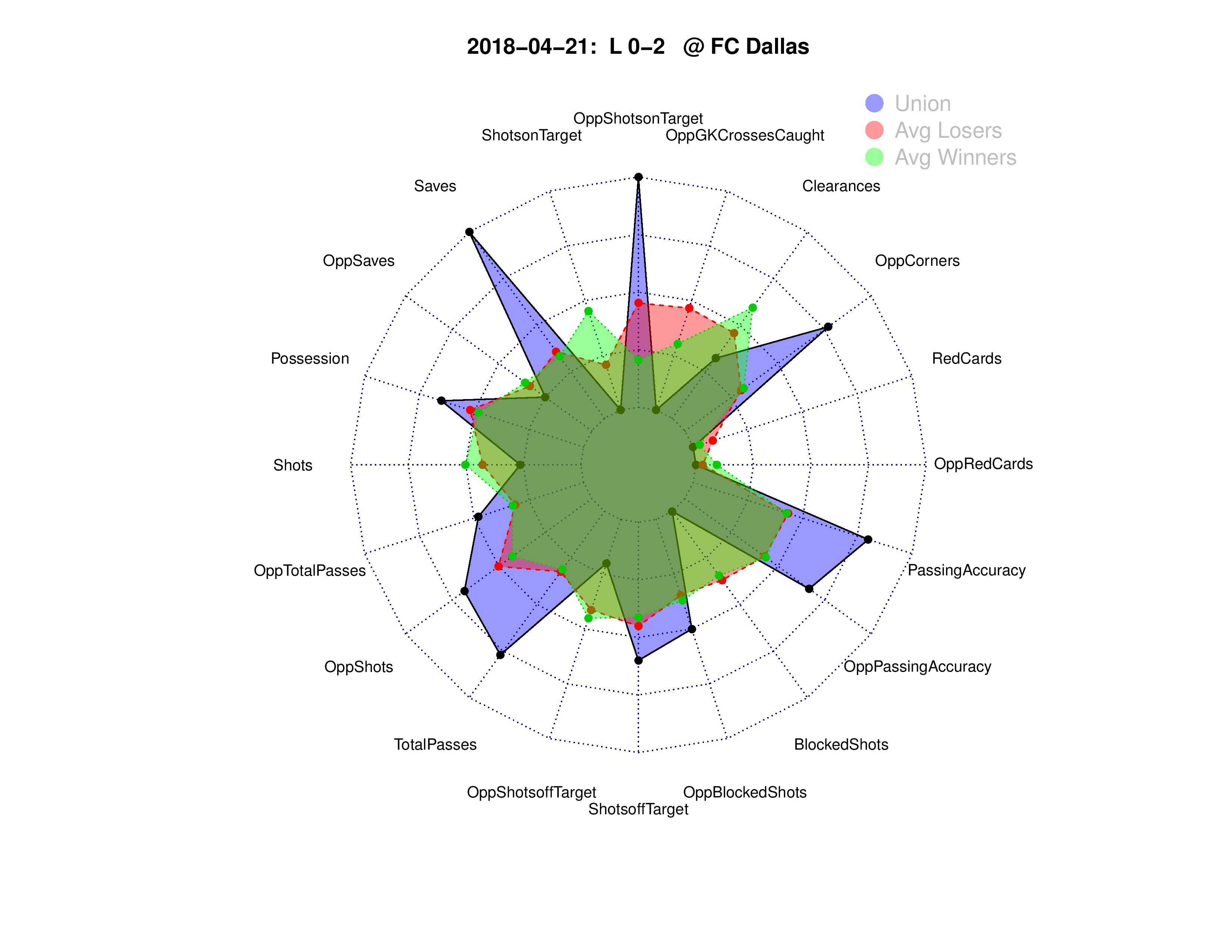
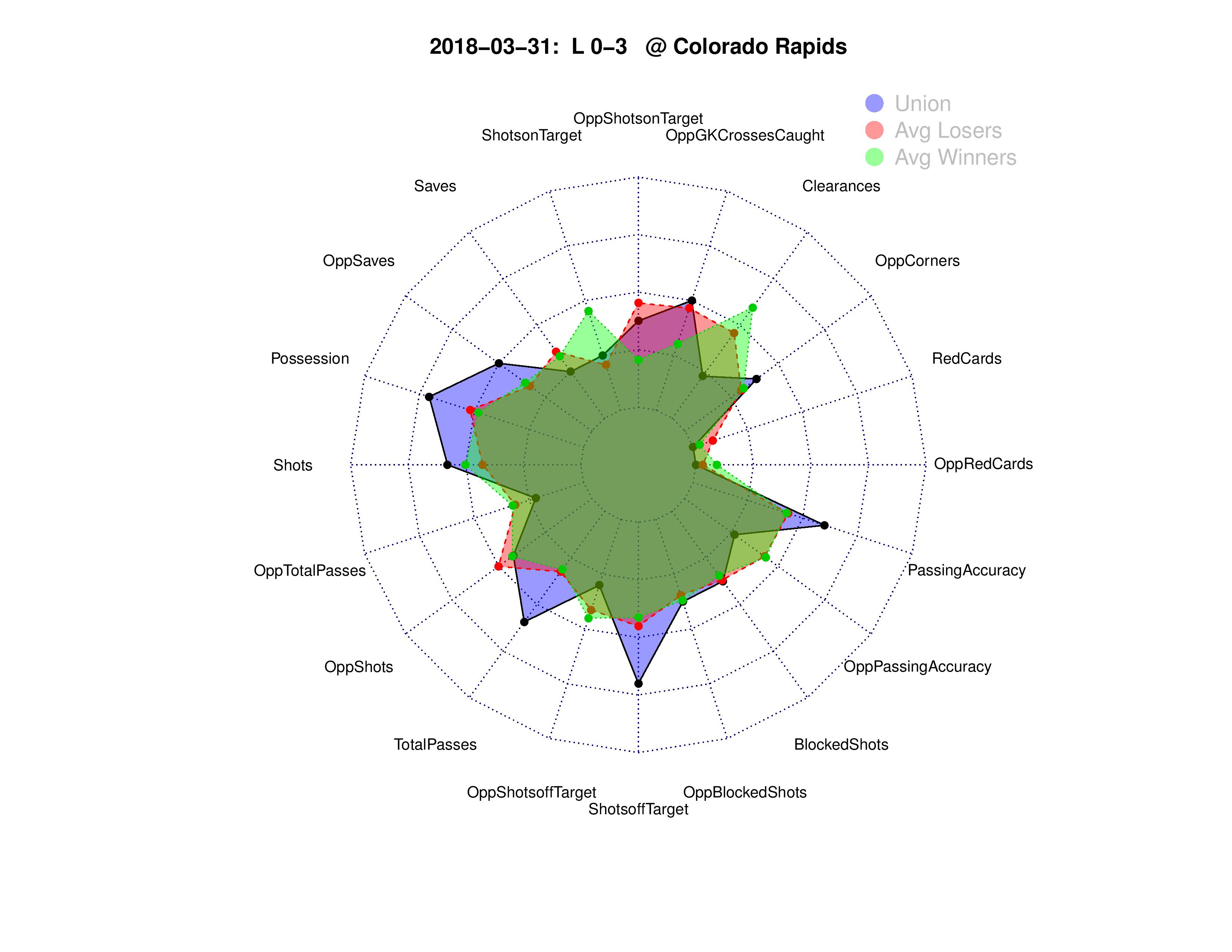
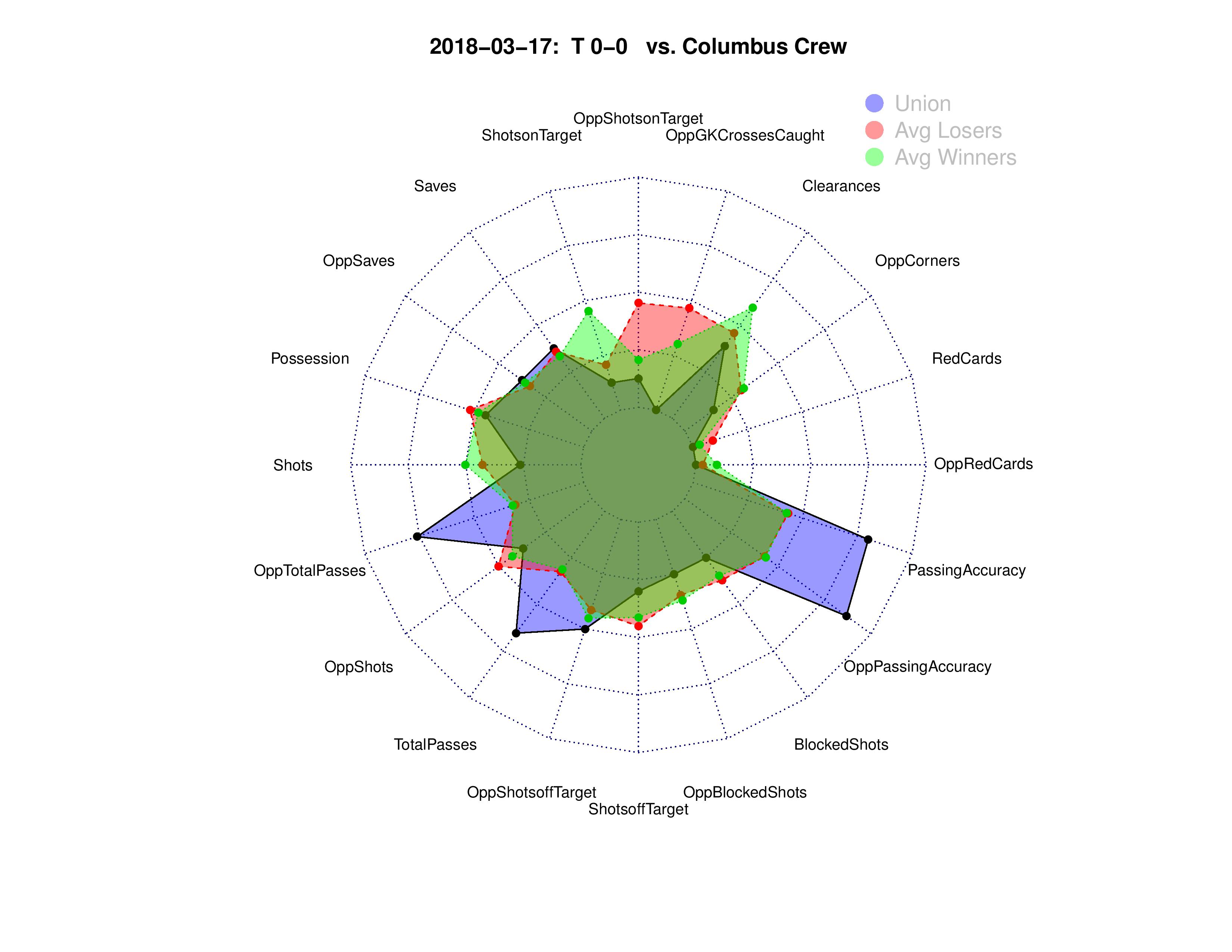
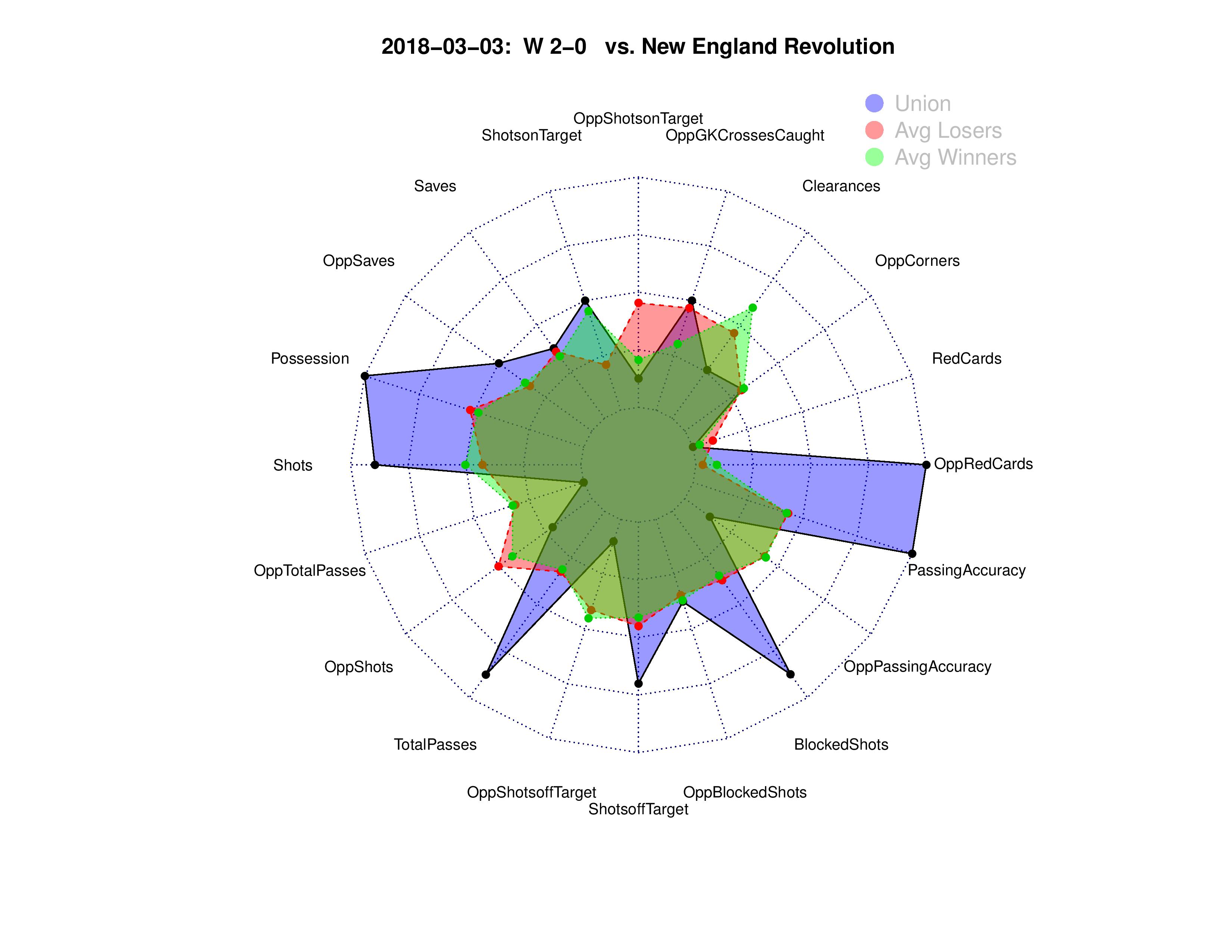
This first type of chart shows the statistical magnitude of the Union’s performance (blue) compared with the average performance in each statistic from winning teams (green) and the average from losing teams (red).
For practical reasons, this only shows the top 20 statistics ranked by “variable importance” from a model, which ranks the statistics based upon how consequential the statistics tend to be in predicting match results.
First, some notes on reading this chart:
- The order of the ranking of statistics starts at the top (“OppShotsonTarget”) and moves counter-clockwise in importance.
- “Opp” refers to the opponent’s statistics against the Union at the time.
- Even if winners and losers tend to average at around the same value for a statistic, this doesn’t mean the statistic is meaningless. It just means that this stat doesn’t drive victories on its own, but it is still likely a factor in some matches.
- You may be surprised to see red cards so low in importance, but remember that teams with only 10 players will see impacts in all of the other performance statistics.
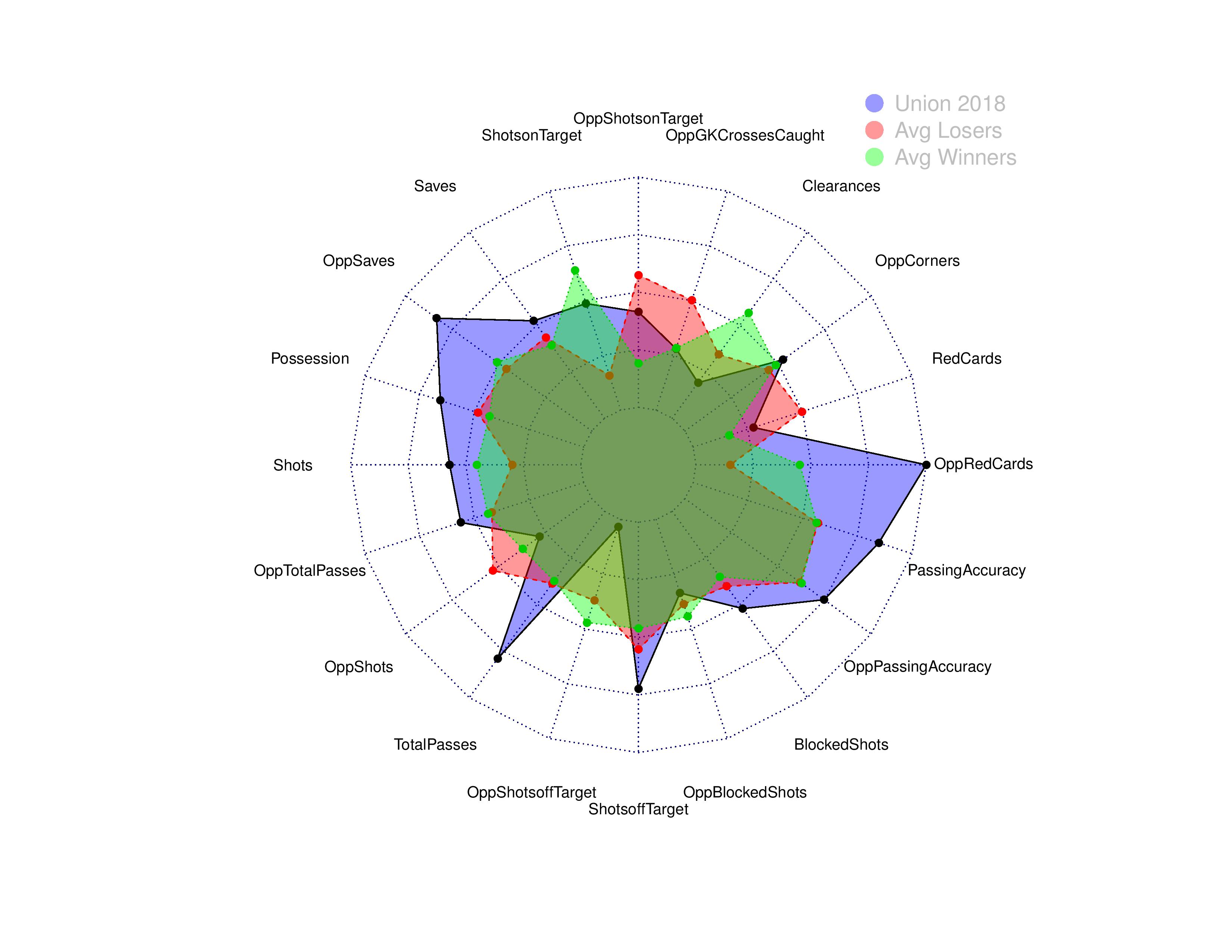
What can we take away from this chart?
- Given their record, the Union have put a lot of shots on goal, usually a heavy indicator of winning. This could indicate bad luck for the Union or unusually poor quality of shots. The reality is probably a bit of both. Opponents have made a substantial amount of saves against the Union, which follows this same line of thinking here. The Union’s shots are also being blocked a bit more than normal.
- Philadelphia has also given up a fair amount of shots on goal, but not a crazy, out-of-proportion amount considering their record. Philadelphia’s opponents have an extraordinarily low amount of shots-not-on-goal, which could be due to either luck or poor defending. Again, this is probably a little of both. The Union’s defense is similarly not blocking as many shots as winners tend to, especially given how many shots are on-frame.
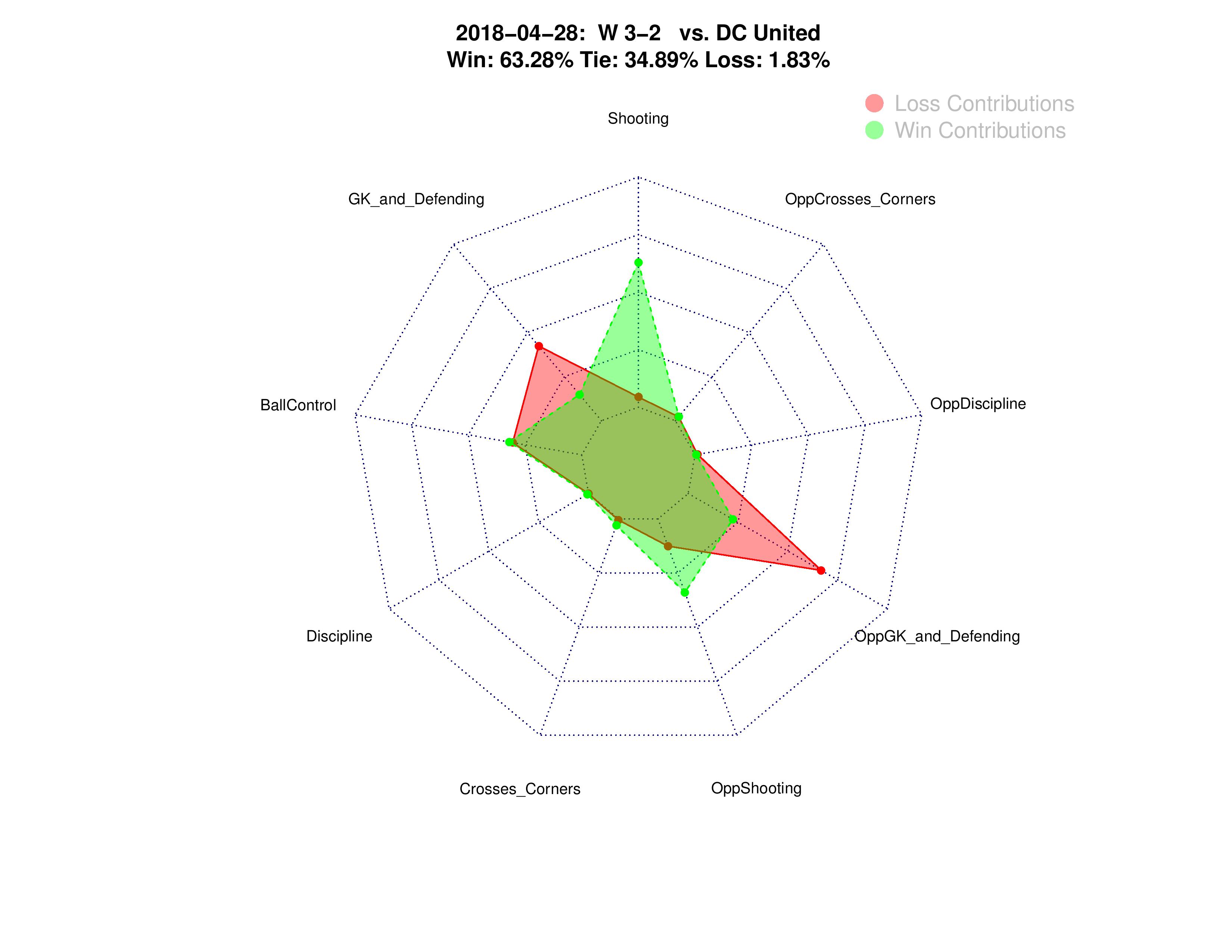
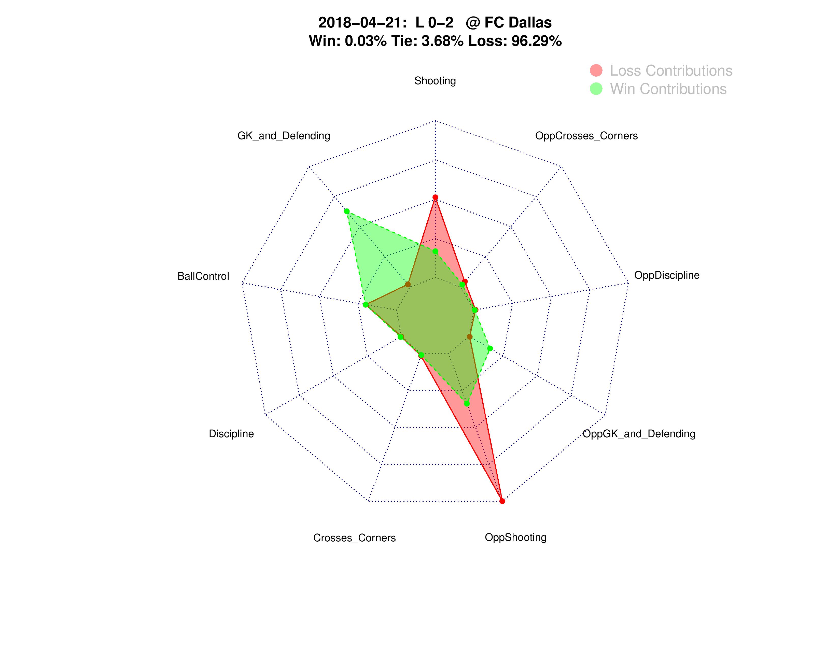
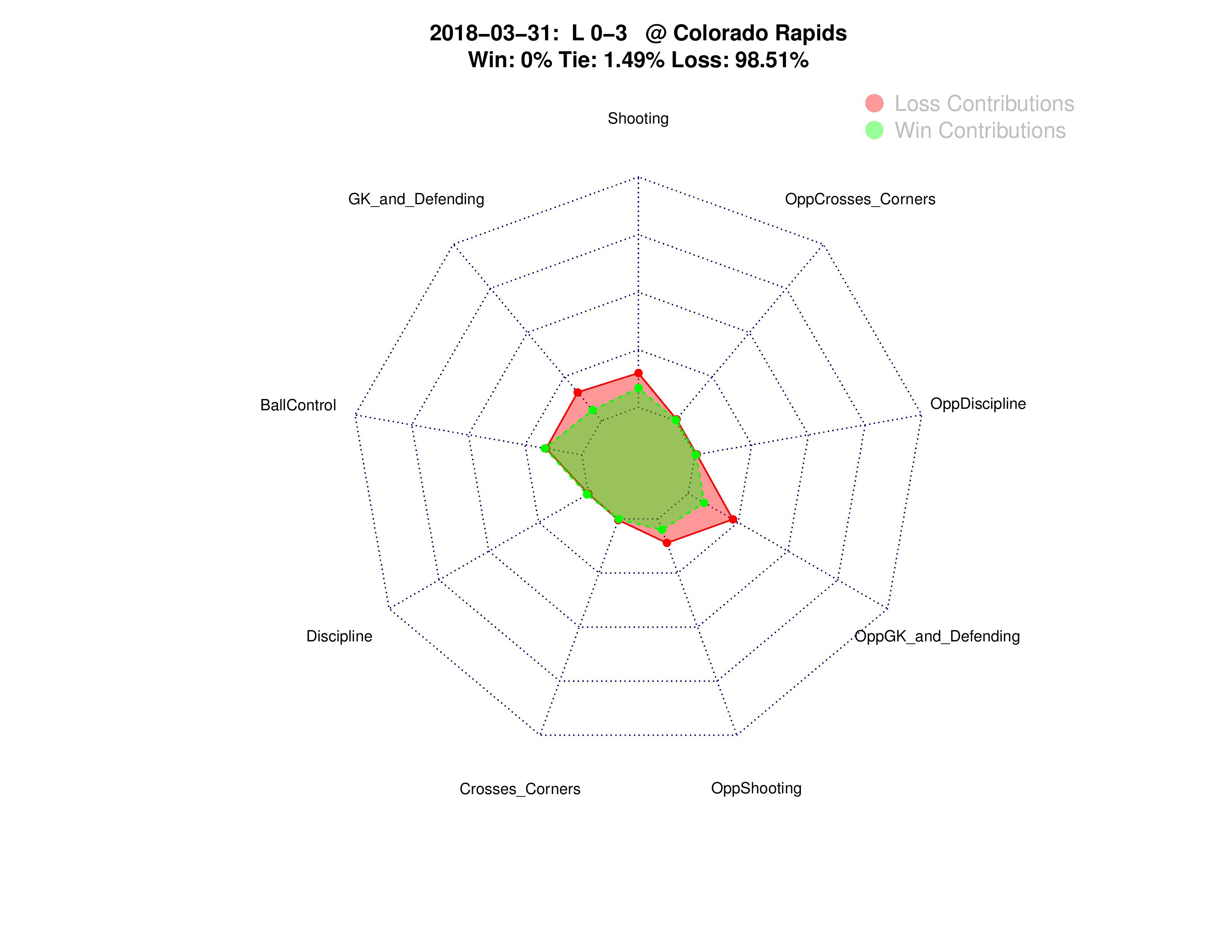
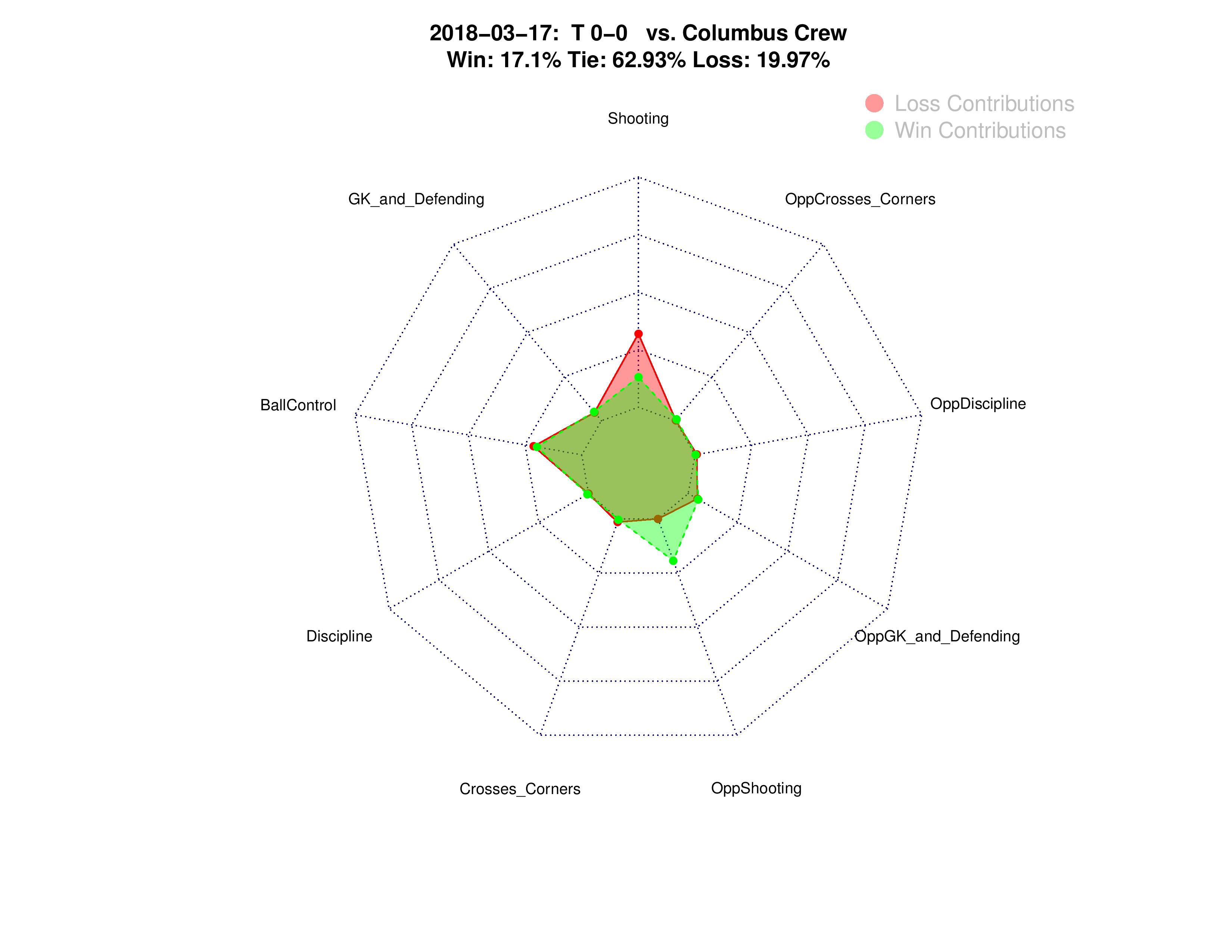
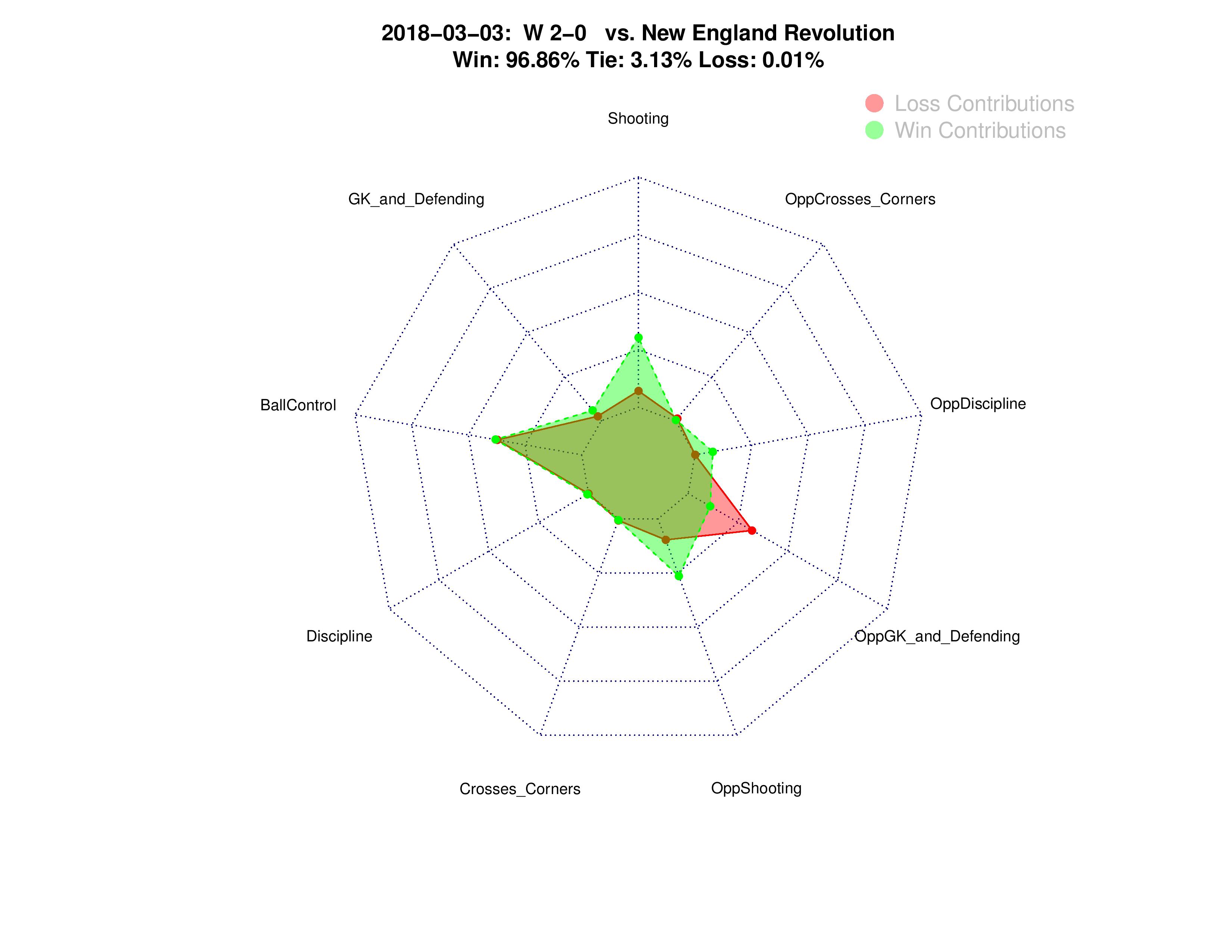
The next chart is a little different. I dug into a model’s predictive expectations to break apart “win contributions” and “loss contributions,” to try and help determine what statistics were more or less predictive of results and where the Union have excelled or under-performed. Again, we’re still looking at the average for all of Philadelphia’s 2018 matches.
While some statistics and categories don’t appear to contribute directly towards wins/losses, it could be that they are correlated with other statistics. For example, if crosses are correlated with shots (they are), then the effect of crosses on wins might be partially replaced by the influence resulting shots have on wins.
To avoid some confusion, I also grouped all of the statistics into categories.
- Shots, Shots-off-target, and Shots-on-target all combined for the Shooting category (and the opposite for “OppShooting”).
- Clearances, Saves, Tackles Won, Opponent’s Blocked Shots, GK Crosses Caught, and GK Punches all combined for the “GK_and_defending” category (and the opposite for “OppGK_and_defending”).
- Duels Won, Offsides, Passing Accuracy, Possession, Total Passes, Opponent’s Duels Won, Opponent’s Offsides, Opponent’s Passing Accuracy, and Opponent’s Total Passes all combined for the Ball Control category.
- Fouls, Yellow Cards, and Red Cards all combined for the Discipline category (and the opposite for “OppDiscipline”).
- Corners and Crosses combined for the “Crosses_Corners” (with the opposite true for “OppCrosses_Corners”).
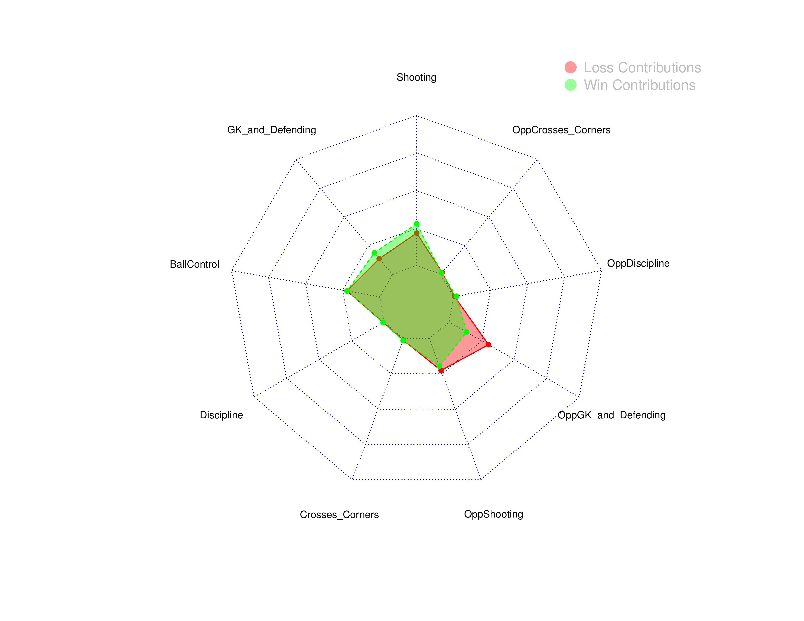
A key takeaway for me here is that, on average, a big thorn has been Philadelphia’s opponents saving, blocking, or otherwise successfully stopping the Union’s attack. This could be due to less-than-average quality by the Union attack and/or a higher-than-average quality of opponent defense when playing against the Union (i.e. bad luck).
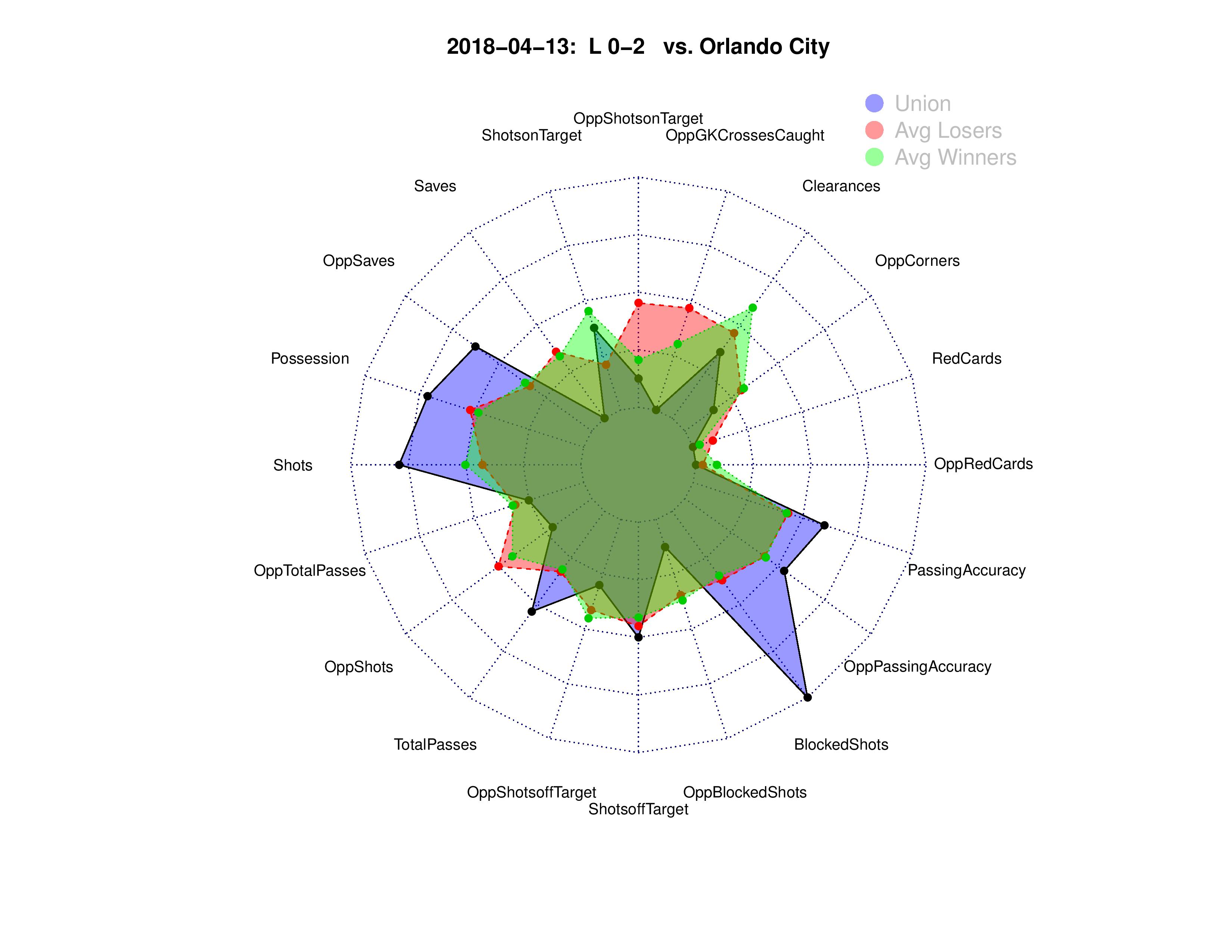
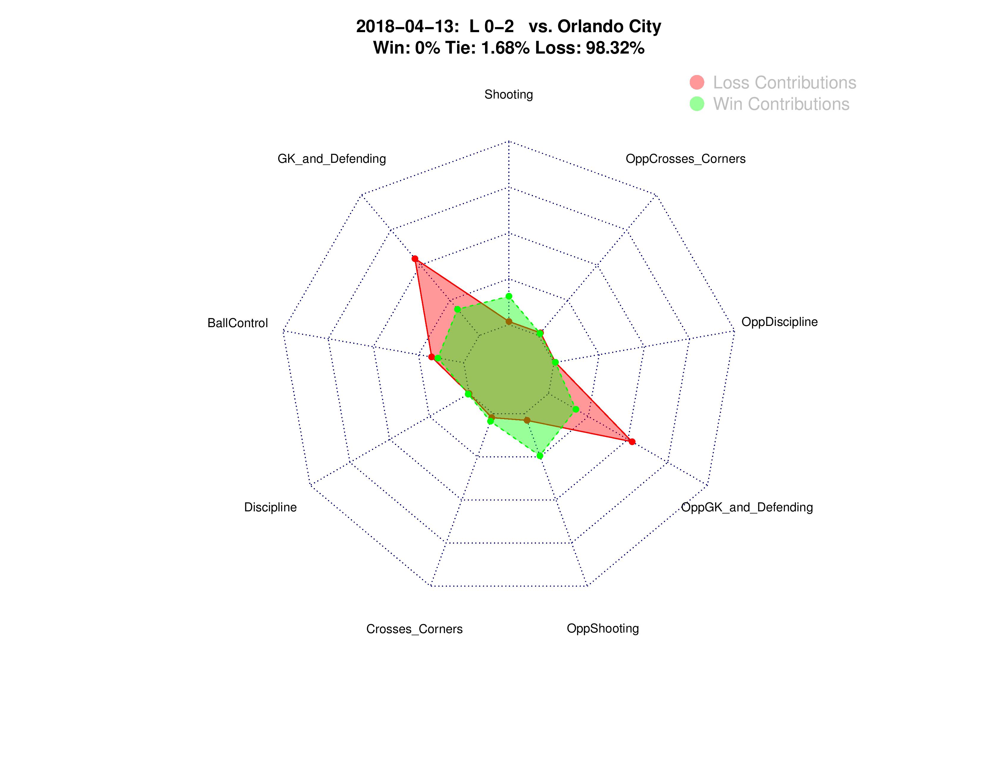
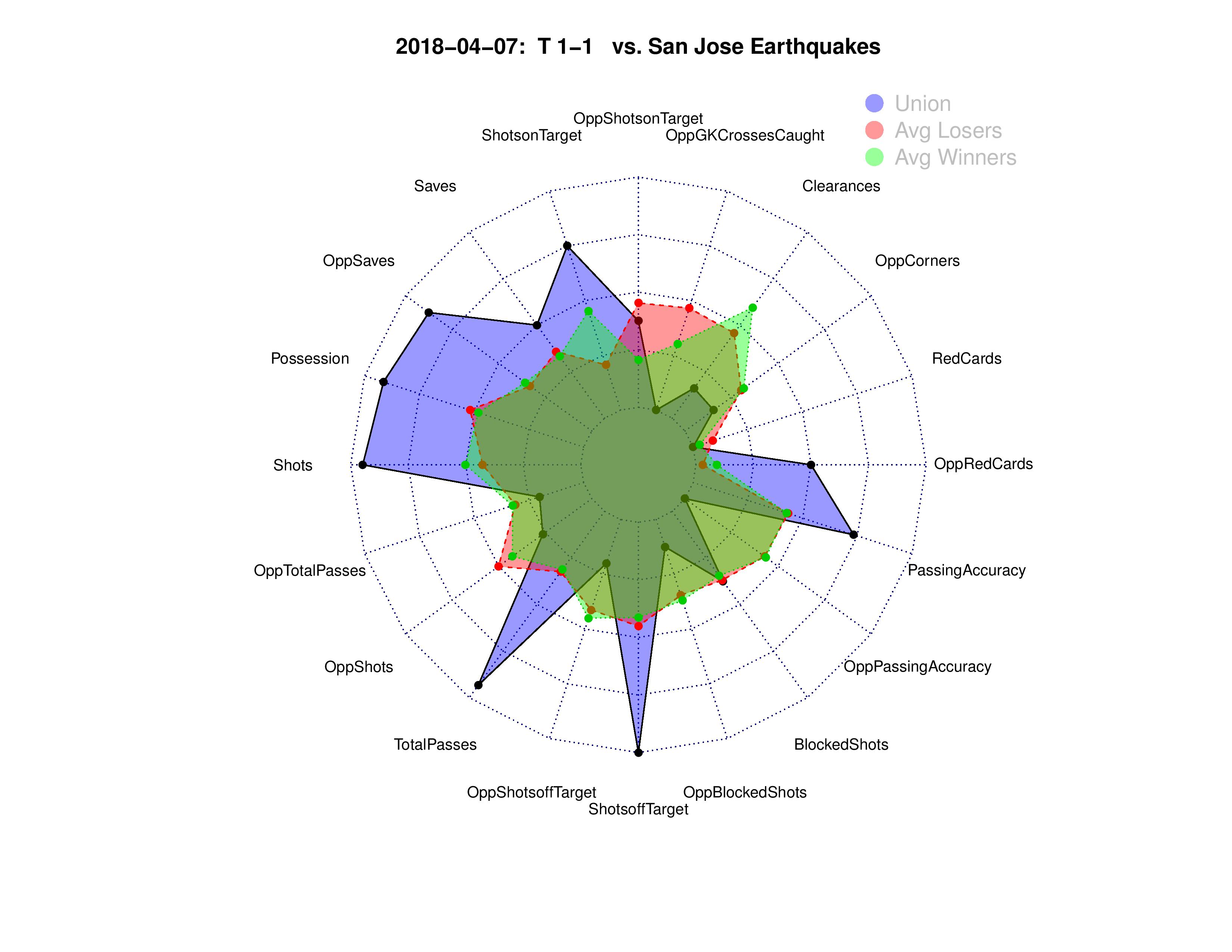
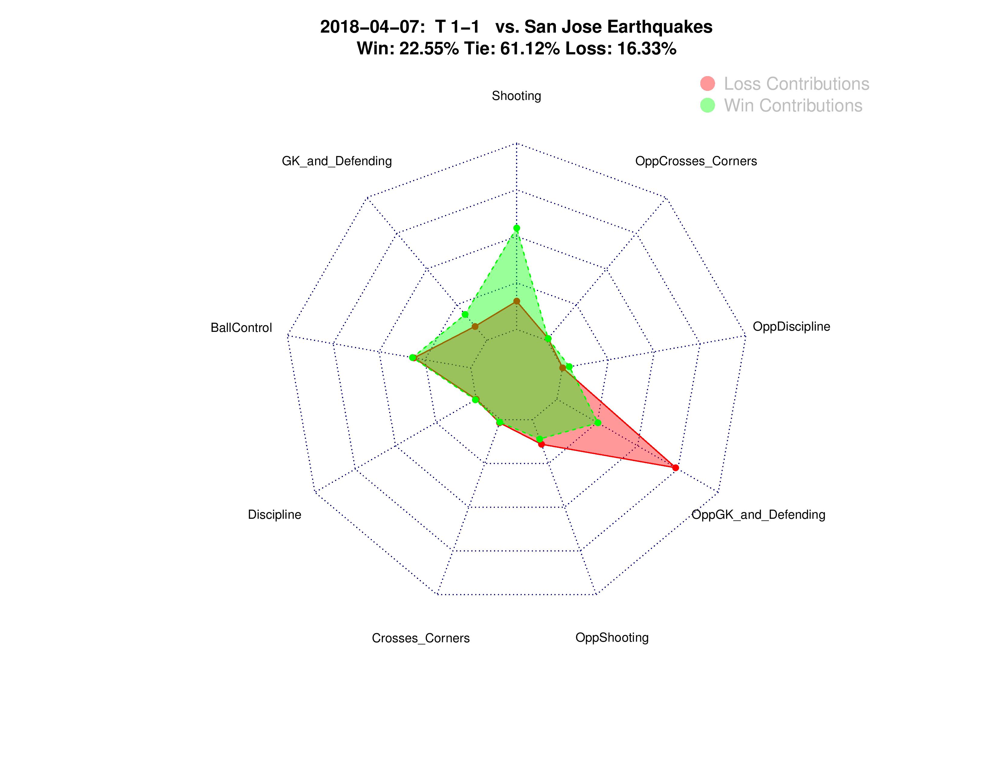
Per-Game charts
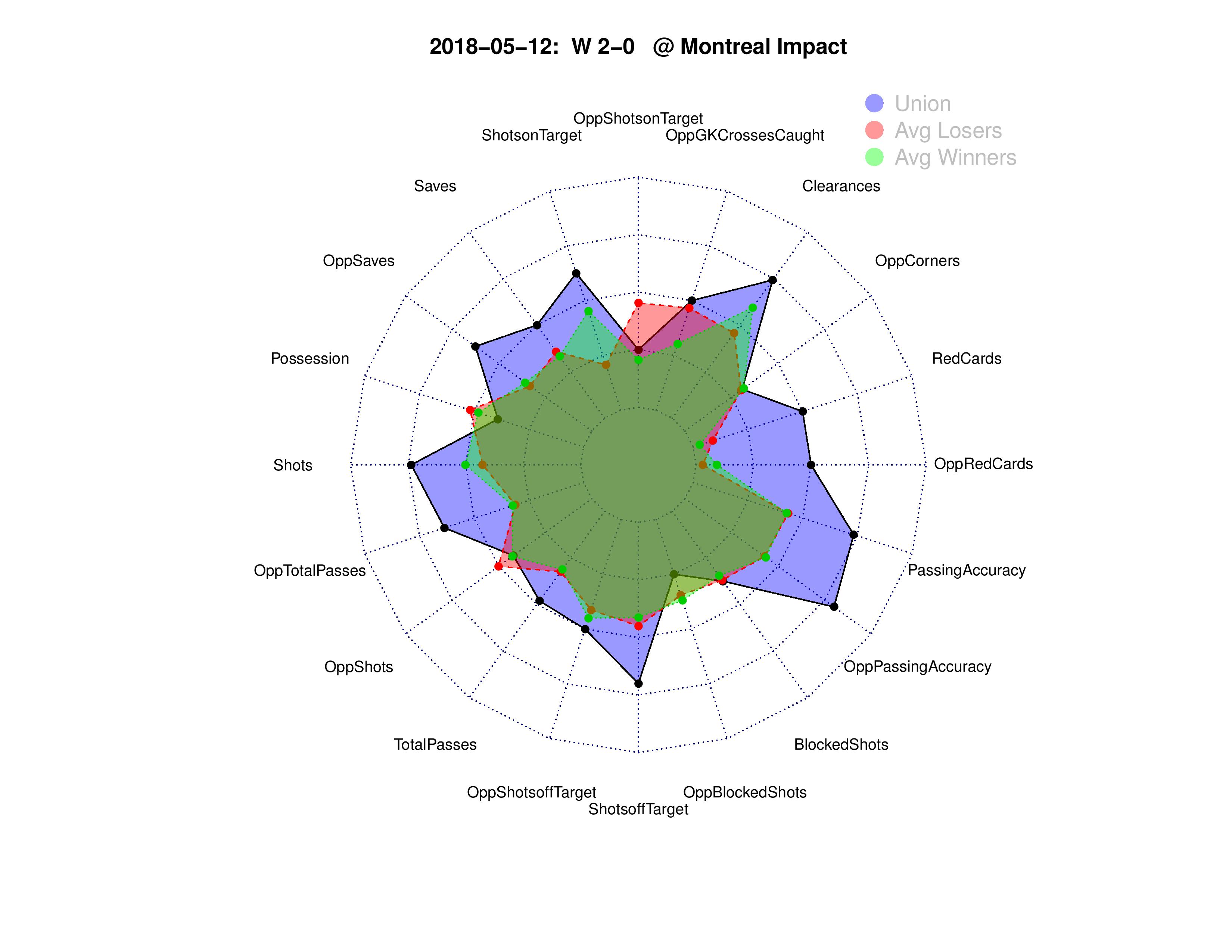
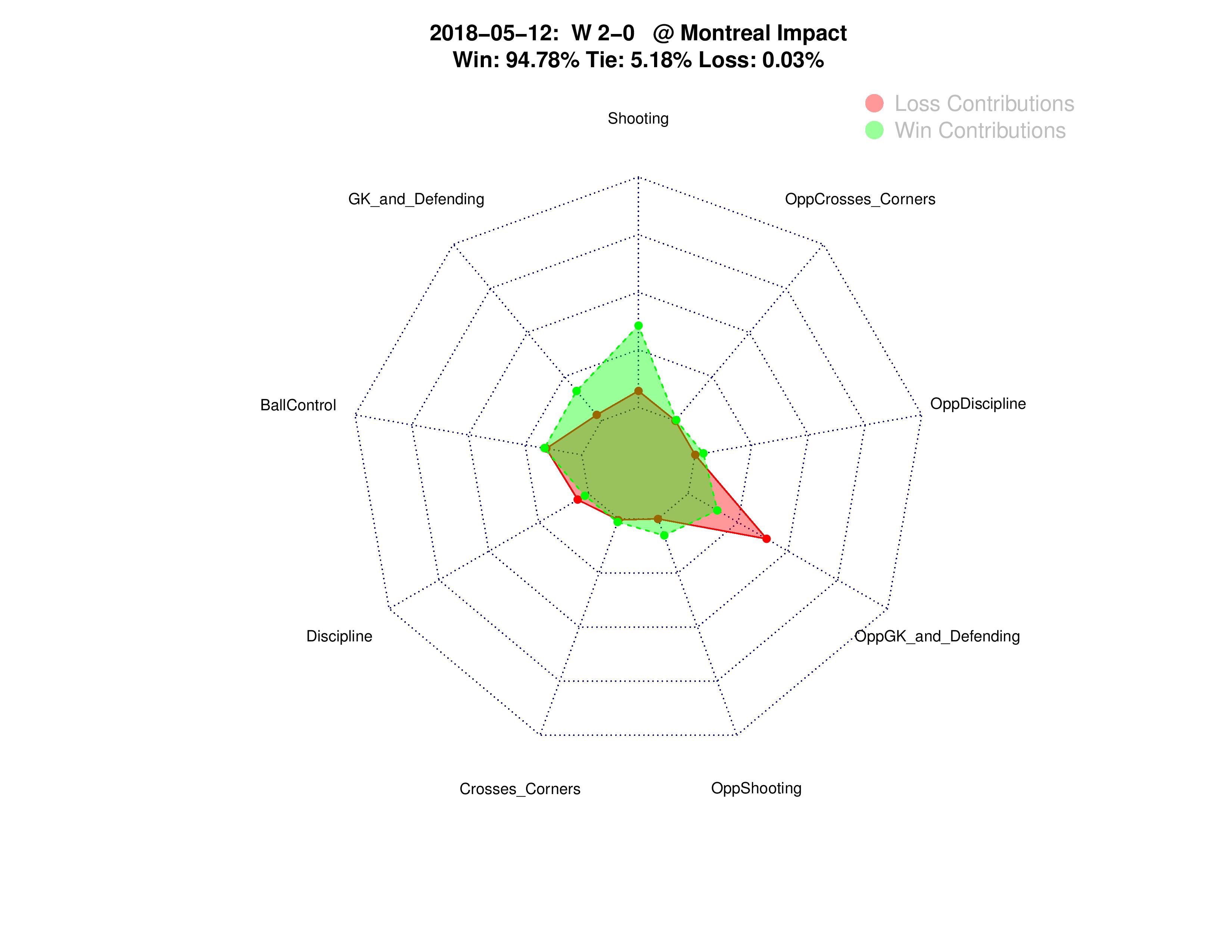
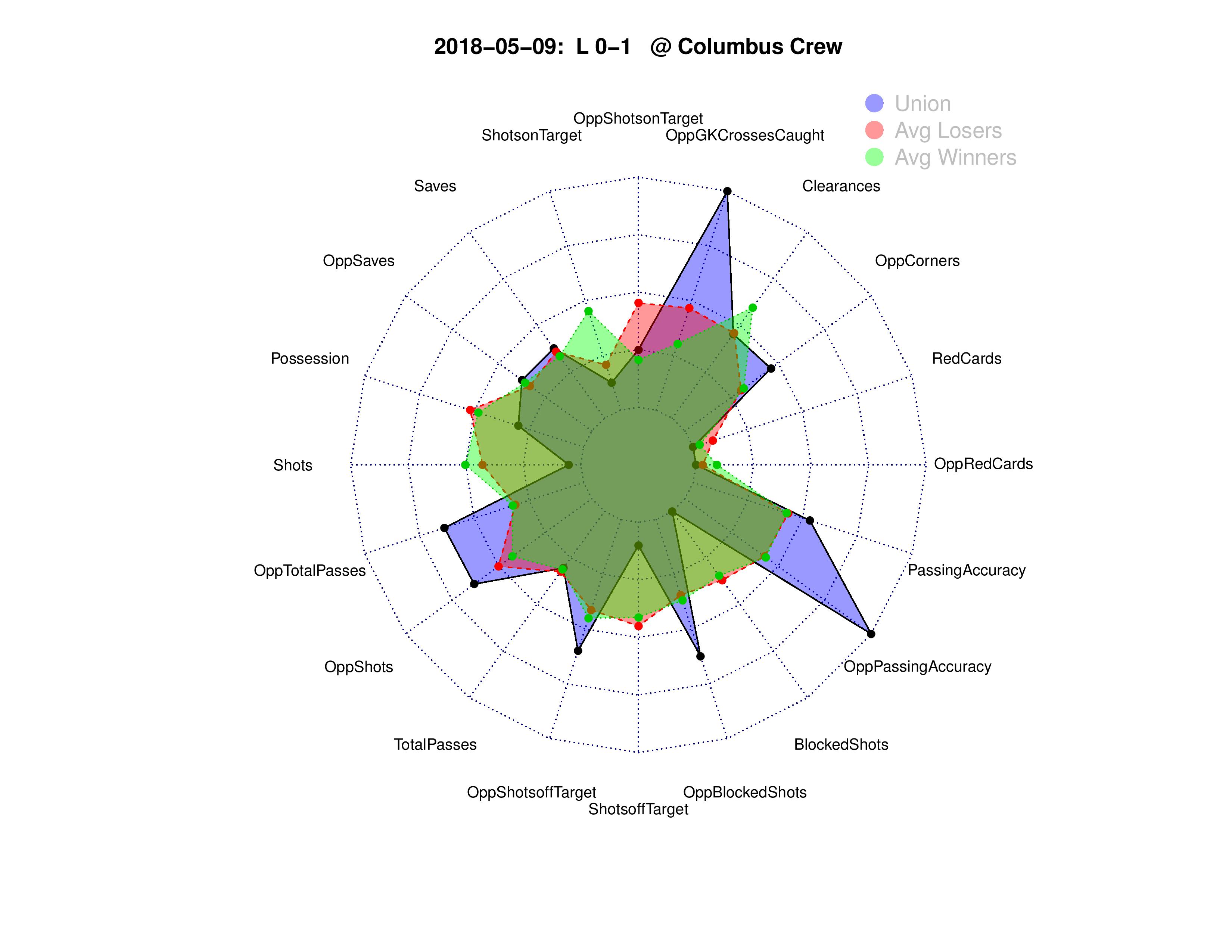
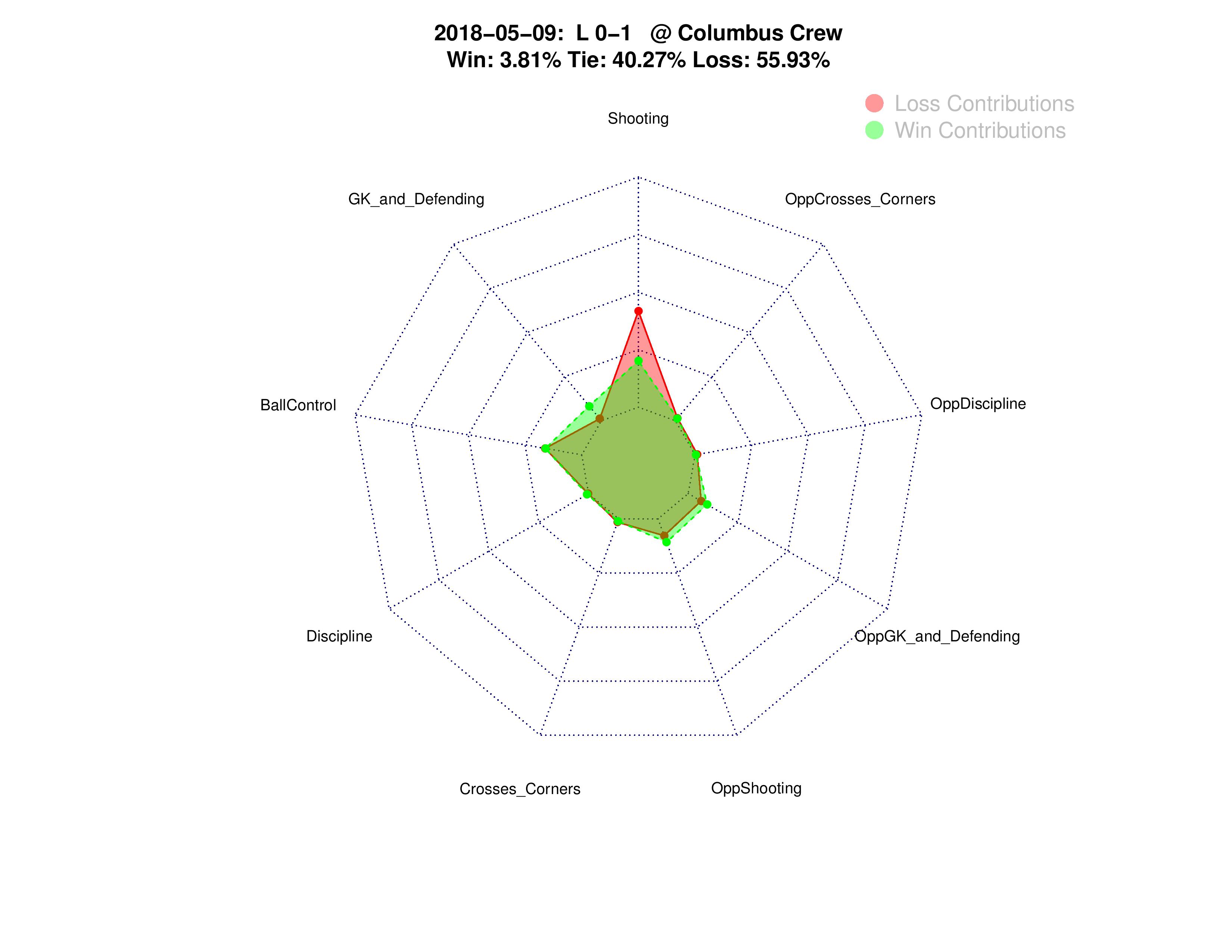
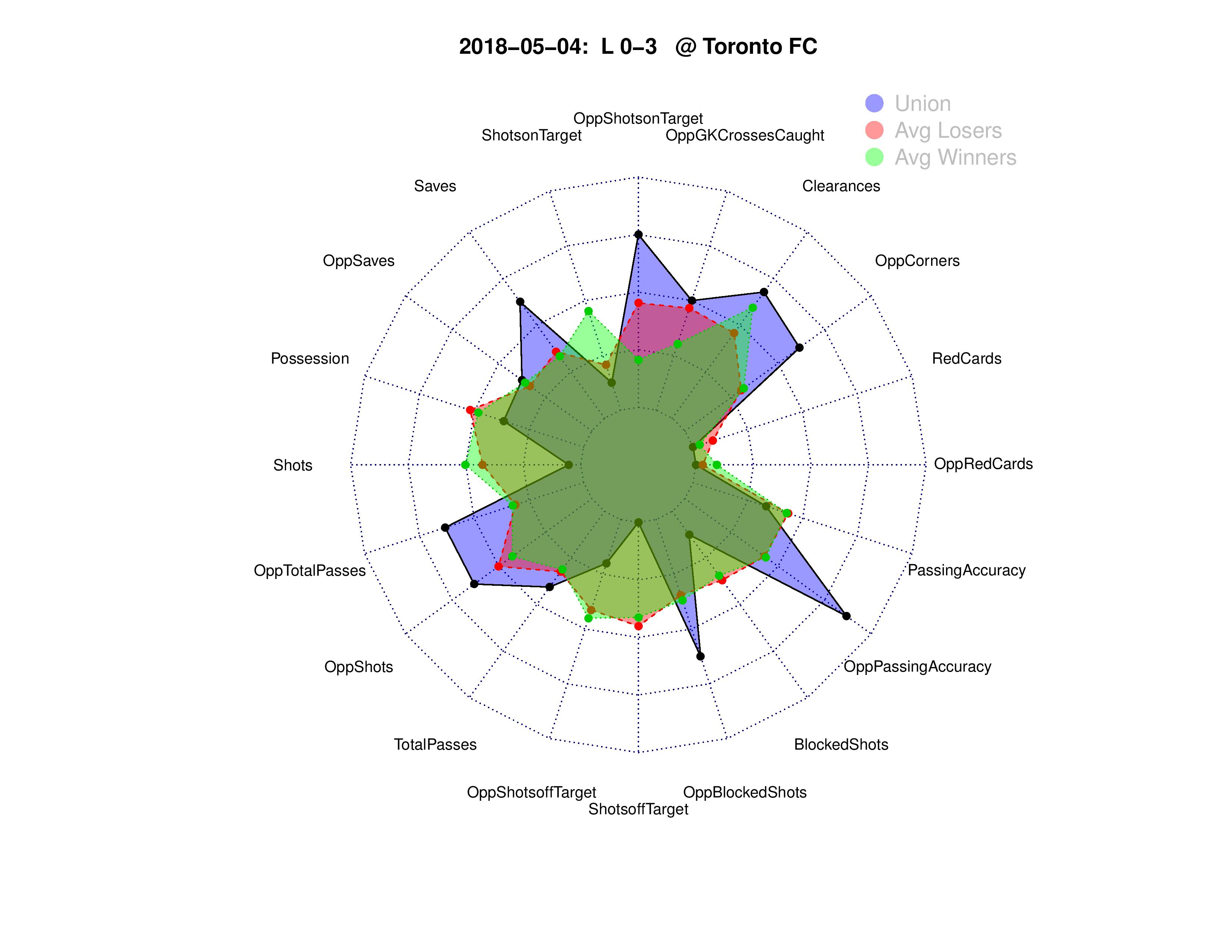
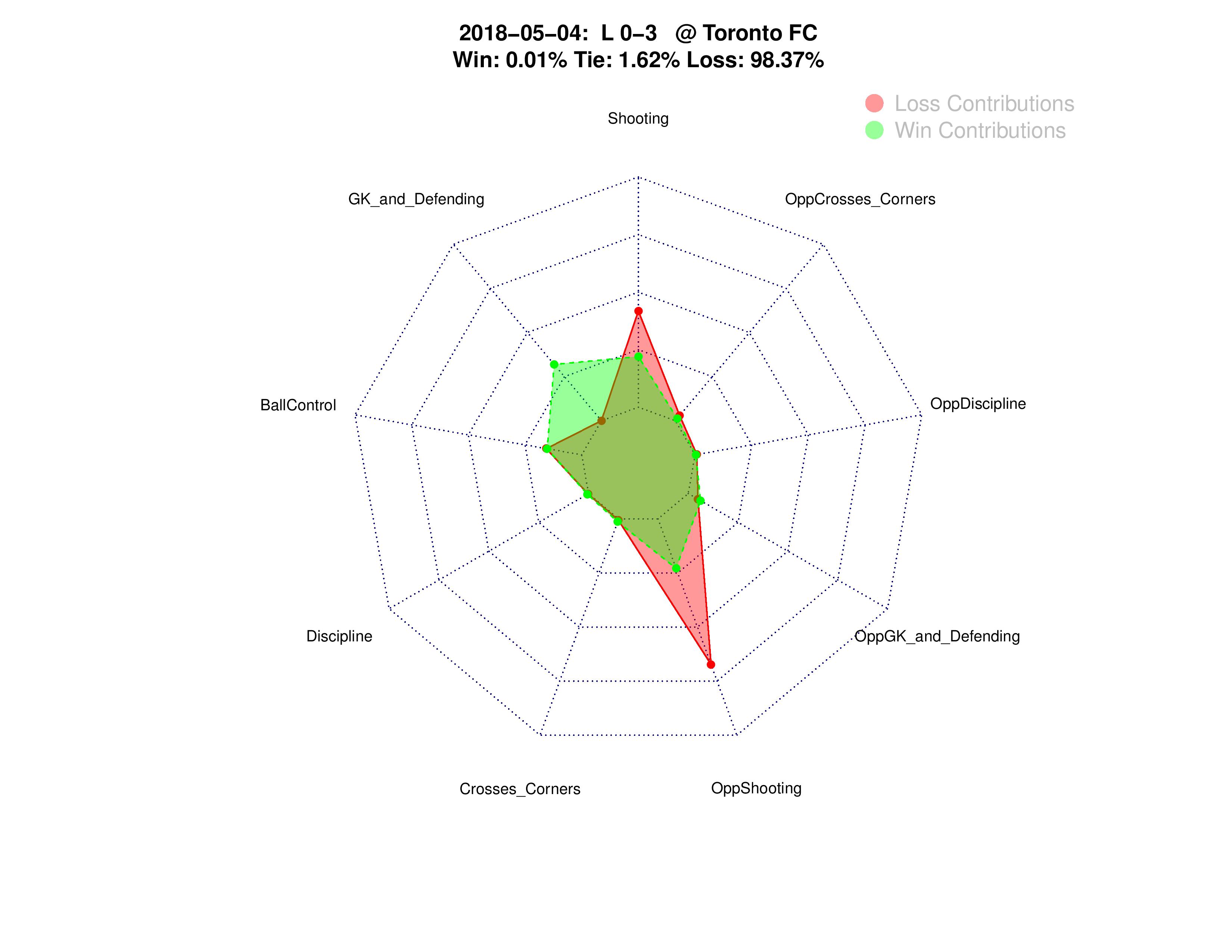
Now that I have the 2018 Union averages done, it may be helpful to show these charts for each Union match individually.
The only difference for these charts is that the Win/Loss contribution chart also shows what the model would have predicted for the result given the statistics.

Chris – good stuff. You mention, to some small degree, the Union may have “bad luck”. When I look at the stats that are outliers, OppRedCards, OppSaves, Passing accuracy and total passes, and square that with one of the lowest performing offenses in the league, it paints a picture less about luck and more these are the stats I’d expect to see. I see a team that says it’s counterattack/high press; but watch games where the other team often cede possession to the U to watch them kick it about in their own end (high total passes and accuracy), knowing they’ll get the ball back when they press one of our less adept technical players into a turnover.
.
Teams are packing it in knowing we will take low percentage shots that are save-able. I haven’t seen many that “threaten the keeper”, more like slow rollers that were struck in frustration. As for OppRedCards, that points to good luck, not bad and more worrying for the U. If opposing teams are picking up reds at a rate much greater than the rest of the league against us, and we’re still just a 1.10 PPG squad, no es bueno.
Also, wondering if offside calls would be telling. i.e. – more offside against is indicative of teams that are aggressive and looking to get in behind defenders. Other than Accam, not sure anyone else has been called?
I do know that, without controlling for other variables, Offsides calls are correlated with winning teams.
–
It’s still a negative-impact play, but winners tend to be in a position to commit offsides more often than losers.
Thanks. Yeah, I agree with your points on the skepticism of luck as a possibility. When I watch I also don’t see a whole ton of bad luck on would-be-goals, but I also don’t examine how often mediocre shots-on-goal works for other clubs.
–
With regards to Red Cards, we have been luckier, however, the red cards should have led to increases in our shots-on-goal, which may indeed have happened, which would then lead to ‘bad luck’ that they didn’t go in.
Very interesting, Chris, and thanks for doing this.
–
One thing I have been wondering is the extent to which the Union have really been lucky or unlucky this season. On the one hand, I’ve seen stats from Kevin Minkus suggesting that, based upon quality & quantity of shots taken and given up this season, the Union have improved more than almost any other team in MLS since 2017, suggesting that the ought to be doing better in the standings than they are. On the other hand, they don’t LOOK like they deserve to be doing any better when you watch them play.
–
Since you have the “results percentage” for each match, it seemed the next logical — and very easy — step would be to just multiply those out to determine how many points the Union “should” have right now, based upon the in-game stats. For example, for the most recent Columbus match, the Union had an expected acquisition of 0.52 points ((.0381 x 3)+(.4027 x 1) = .517).
–
So, I just went ahead and calculated that for each of the 10 matches, and added them all together.
–
Match/date Win % Tie % Expected points
–
NE 3/3 0.9686 0.0313 2.9371
CLB 3/17 0.171 0.6293 1.1423
COL 3/31 0 0.0149 0.0149
SJ 4/7 0.2255 0.6123 1.2888
ORL 4/13 0 0.0168 0.0168
DAL 4/21 0.03 0.0368 0.1268
DC 4/28 0.6328 0.3489 2.2473
TOR 5/4 0.01 0.0162 0.0462
CLB 5/9 0.0381 0.4027 0.517
MON 5/12 0.9478 0.0518 2.8952
–
Total 11.2324
–
Based upon your win/tie/loss percentages for each match, the Union’s expected point total after the first 10 games is 11.23 — which matches the 11 points they actually have.
So, it seems they may not really have been so unlucky thus far this season. They really haven’t earned any more points than they’ve gotten.
The caveat I’d point out about Expected Goals which I think you’re referencing, is that my model was aware of how many saves the opponent made, whereas Expected Goals models baselines against an average goalkeeper save rate for each type of shot. Therefore, what Kevin’s statistics might be suggesting is that, given the location and quality of Philadelphia shots, our opponents have had been better than an average goalkeeper performance against us.
–
That said, the only time this season I’ve felt like we were unlucky with the opposition save rate was the 1st half of the Montreal game… which we won anyway.
SJ had a lot of tough saves against us. Plus the last Columbus game Sapong missed a super easy tap in that would have gained us a point. I do feel like we have been slightly unlucky on average, but it’s mostly just bad finishing which could just point to us not have good finishers more than being unlucky.
I agree that the data does seem to say that the Union have been unlucky. Well below average opponent shots off target, high opponent saves for shots on target on par with winning teams, the xG differential.
.
The save Steffen made on Sapong’s shot at the end of the Columbus game was more difficult than most people here are realizing. Quick reaction down and left after a cross from the right, stopped the shot and held the rebound.
These are great!
.
I think the radar charts would be a bit easier to read if the stats were grouped by offense/defense rather than alternating team and opposing team around the chart. For example: put shots, Shots on target, opponent blocked shots (assuming this means the opponent blocked you shot), opponent saves, opponent GK crosses caught, and opponent clearances all next to each other. This way it may be easier to see at a glance if the team had more offensive or defensive actions during the game, as the radar chart would swell in the same direction for each offensive or defensive action and would be less jagged.
.
If the Union @Dallas chart was arranged this way it would probably show the many offensive actions taken by Dallas and few by the Union with the blue area skewed to one side of the chart.
.
Just a suggestion, these are great to have.
Good idea! I’ll start adding these to the weekly SEBA projections starting next week, and I’ll look to make that change.
I’m not sure these fit in the SEBA article. SEBA is forward looking where this looks at previous performance. (unless these radar charts describe how you make the W L and T % bins for SEBA)
.
I think it would go well in the player ratings, so we can see if the match actually went as well or poorly as it looked, or as it’s own standalone post like this one.