This is a continuation of the Home Field Advantage statistical analysis series:
Part 1: Traveling Distance (and proof of premise)
This article uses MLS data exclusively from 2013 through 5/7/2017.
If you’d like to learn to conclusion but not bother with the investigative journey, you can skip down to the conclusion section for my summary.
Common theory #2: Size of Crowd
A common theory to describe Home Field Advantage is the crowd.
In part, it is logical to think that the crowd’s enthusiasm might spur the team on and/or their jeers demoralize the opponent.
Crowd reactions might also sway the referee to give make-up calls or finally give that long-awaited yellow card for persistent infringement upon C.J. Sapong.
The implicit assumption this argument invites is that the larger the crowd, the greater the advantage. This is what we will attempt to reinforce/debunk.
We begin with a scatter-plot showing the points-based-outcome of matches for home teams vs. the reported attendance at the match.
- The dashed red line is a linear approximation to the relationship between points and distance. This is good for avoiding overreactions to small-samples, but it forces an assumption of a linear relationship.
- The curvy blue line is a locally-weighted average. It is helpful for gauging patterns in data, but it can also be prone to overreaction to small amounts of data.
- The lighter blue shade is the confidence interval (think margin of error) around the curvy blue line, which will help demonstrate where we have small samples.
- The grey dots are the observations. You may notice that there appears to be a wide range of outcomes along the y-axis even though the true possibilities are only 0, 1, or 3. This is a graphical technique known as ‘jittering’ in which some randomization is forced upon the observations for the graph so that our scatter-plot reveals the concentration of data points. Otherwise, with only three possibilities, the observations would often occupy the same space and appear as if any clusters are less significant then they truly are.
- The size of the grey dot is due to their weight, which in this case, represents the goal differential of the result. Those matches won 3-0 are to be considered more confident data points than those won 1-0, as luck plays a greater role with low-margin-affairs.
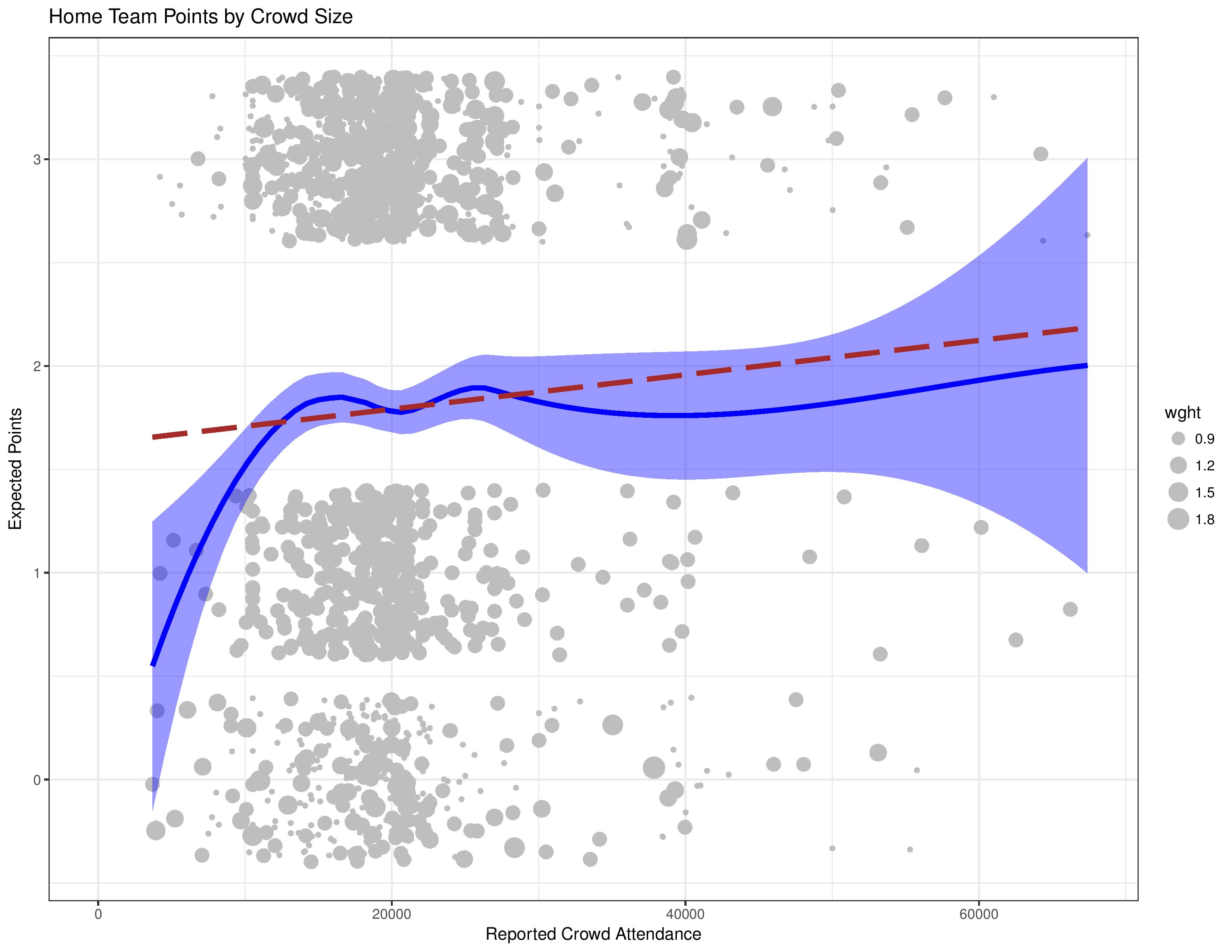
This chart shows that there is a correlation between the size of the crowd and the results. It mostly appears linear, too, except at extremely low attendance levels (which are primarily Chivas USA matches) where performance drastically falls off.
The following chart breaks out the same relationship by the results themselves. Here, the green line represents a win by the home side, the blue line a draw, and the red line a loss.
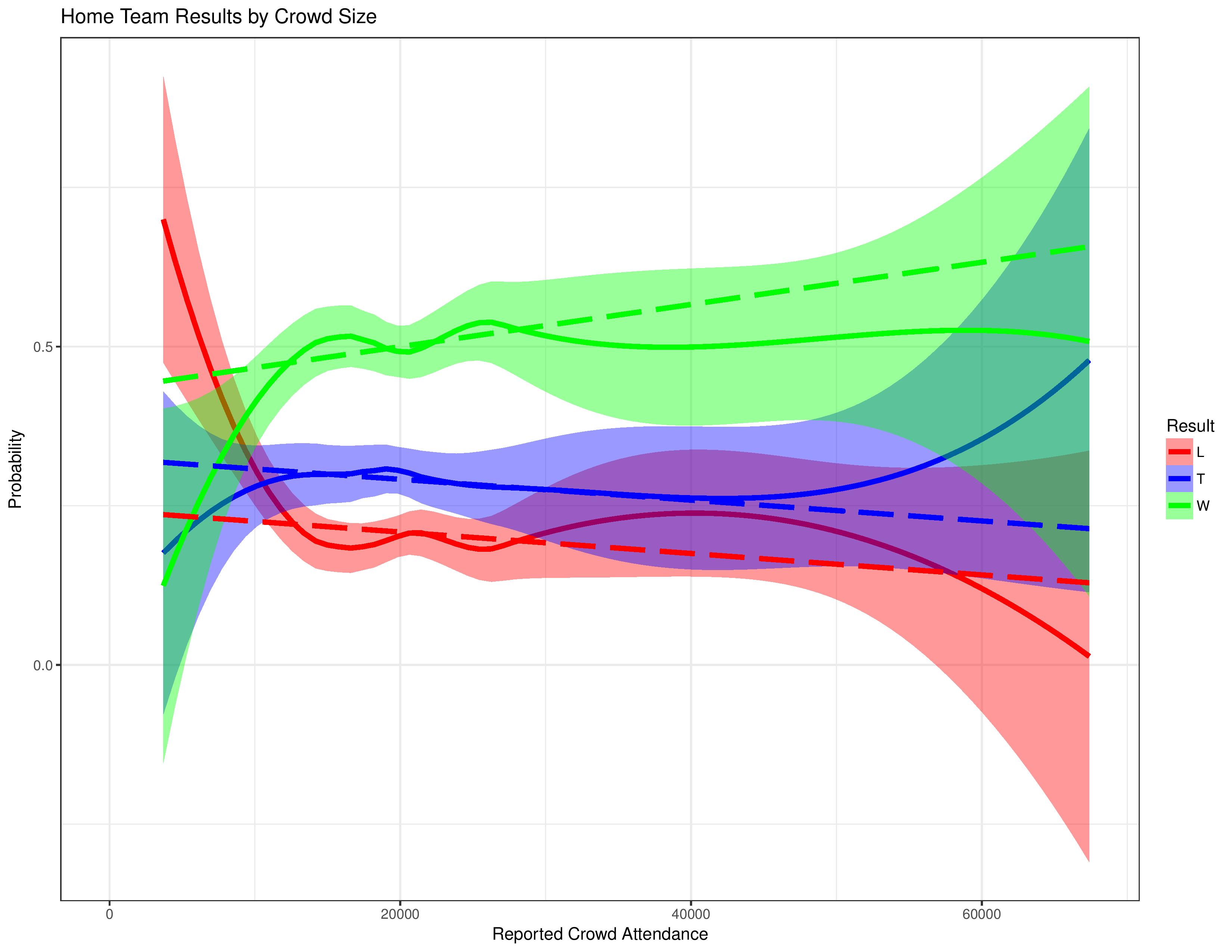
This chart shows that at extremely low levels of attendance (again, Chivas), home teams tend to lose a lot more at the expense of both wins and ties.
At extremely high levels of attendance, home teams tend to tie a lot more at the expense of the rate of losses.
At less-extreme levels of attendance at both ends, however, we see that home performance doesn’t change in very clear ways.
The following chart is the same as the preceding one, except that it treats ties as if they don’t exist. This is a helpful analysis supplement (but not a substitute) to get a full negative/positive effect reading on the data.
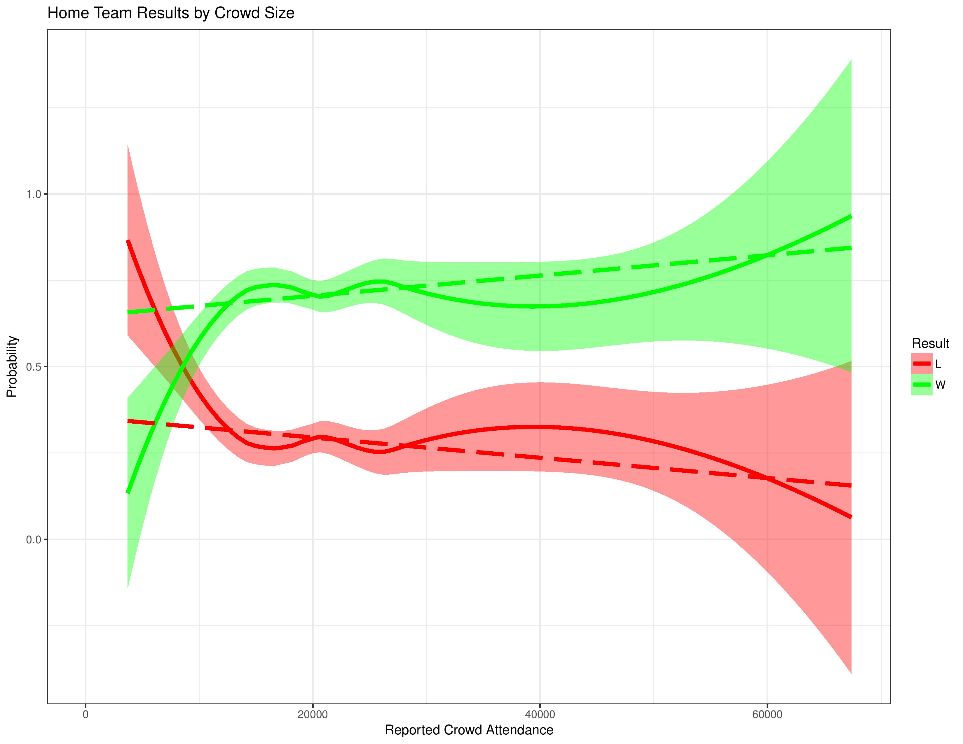
As with the chart above, this one shows effects at the low and high ends of attendance, but little statistically significant effect in between.
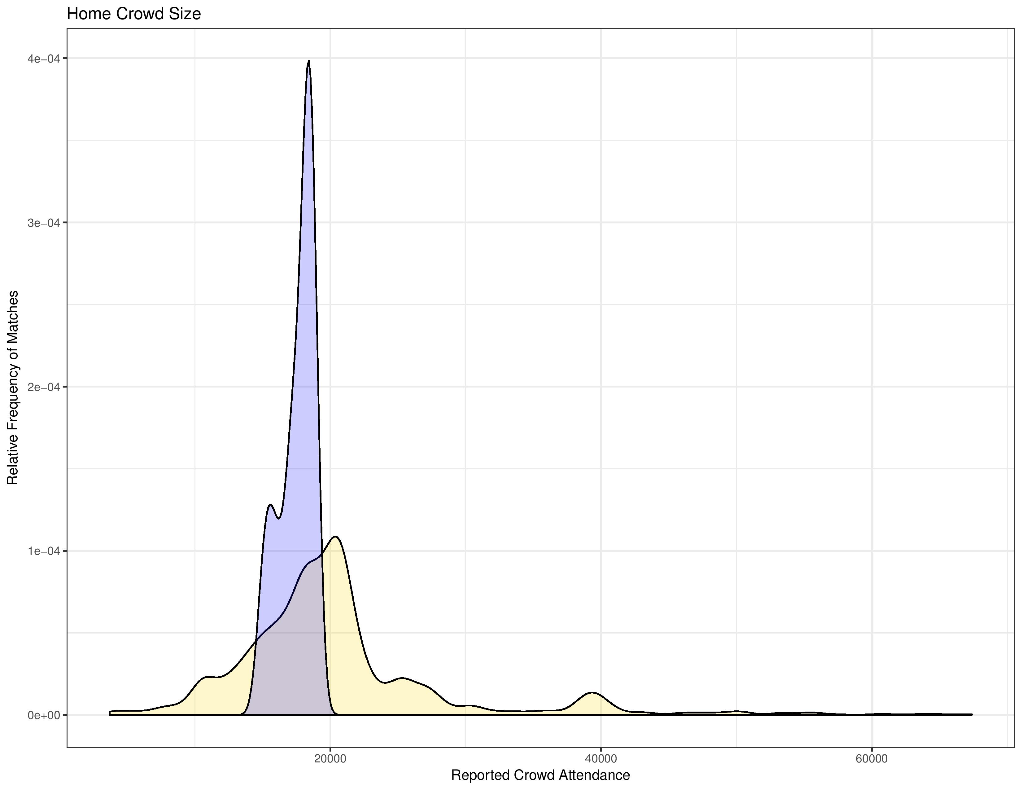
The following chart shows the relative frequency of matches occurring with various crowd sizes. The gold shape is MLS as a whole. The blue shape is purely for the PSP audience, showing the relative frequency of attendance at Philadelphia matches.
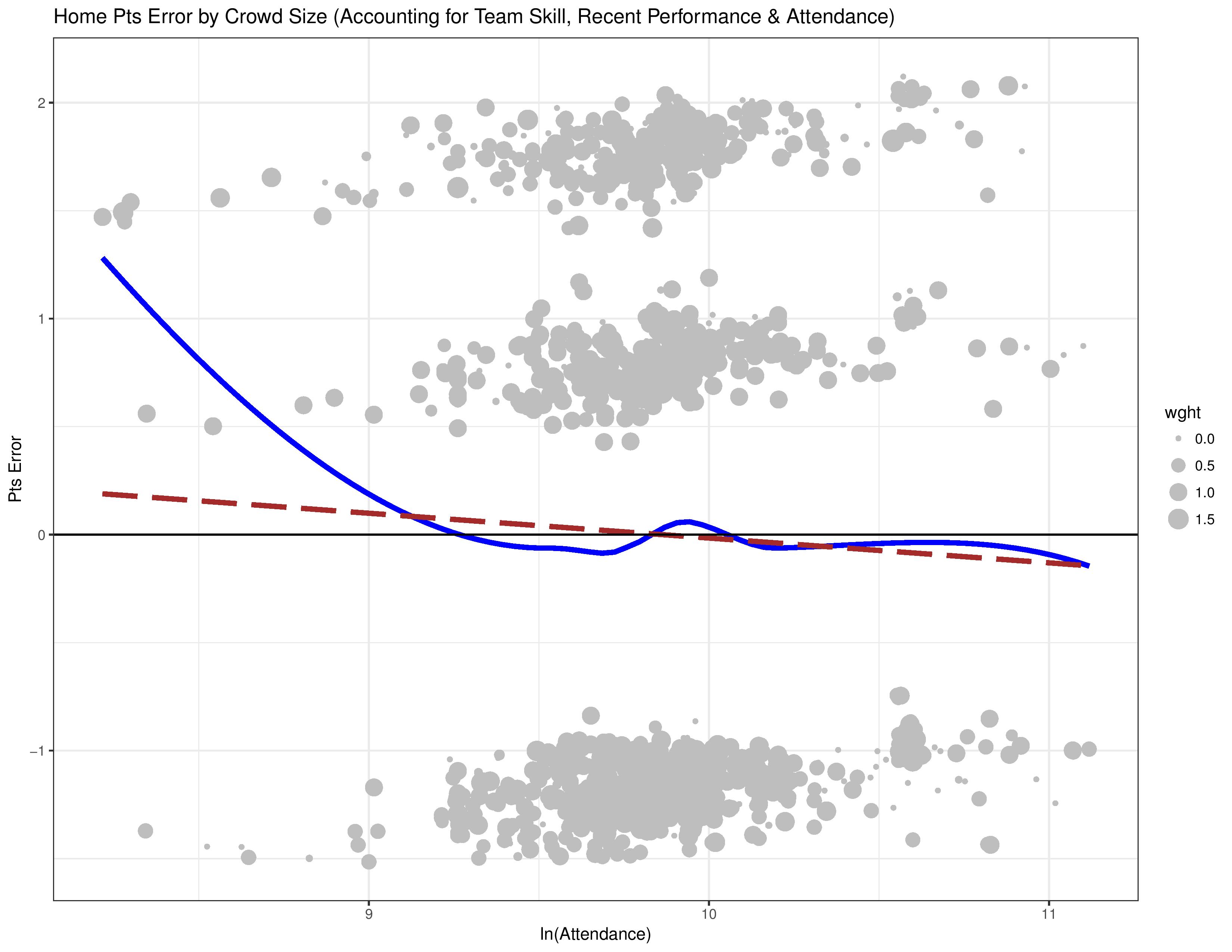
As we did when investigating the effect of travel distance with regards to team performance, we need to adjust for the skill of the home team and their opponent (over the whole data time period) in this calculation to see if attendance still holds a correlation.
The reason is that some teams have radically different attendance expectations, not to mention stadium sizes, and therefore could cause us to mistake the influence of a team’s home field advantage with their typical attendance range.
For example, Portland has been selling out all of their matches for a long while now, but as they cannot exceed their stadium capacity, we cannot see their home team effect at a greater volume of crowd. As a result, if Portland were to go a large winning streak at home, our data may mistake their stadium capacity as being a highly valuable attendance number within the scatter plot.
It should also be noted that, along the x-axis, attendance is measured after being transformed by the natural log function.
This transformation is helpful when we know that the relationship between attendance and points isn’t linear, that is, that any effect of bumping a crowd up from 50,000 to 60,000 is not going to be the same effect as when bumping up a crowd from 5,000 to 15,000, despite both having a 10,000 person difference. This transformation treats the distance between higher values as being smaller than the distance between lower values.
- The grey dots here are called ‘residuals’ (errors) within this residual plot. They represent the error that the model makes (with regards to points) when merely accounting for team and opponent skill.
- When these residuals are mapped against attendance, if there is some correlation, it is an indication that attendance should be included in the model’s calculations.
- The dots above 0 represent the model over-estimating the home team’s performance. Those under 0 represent the model under-estimating it.
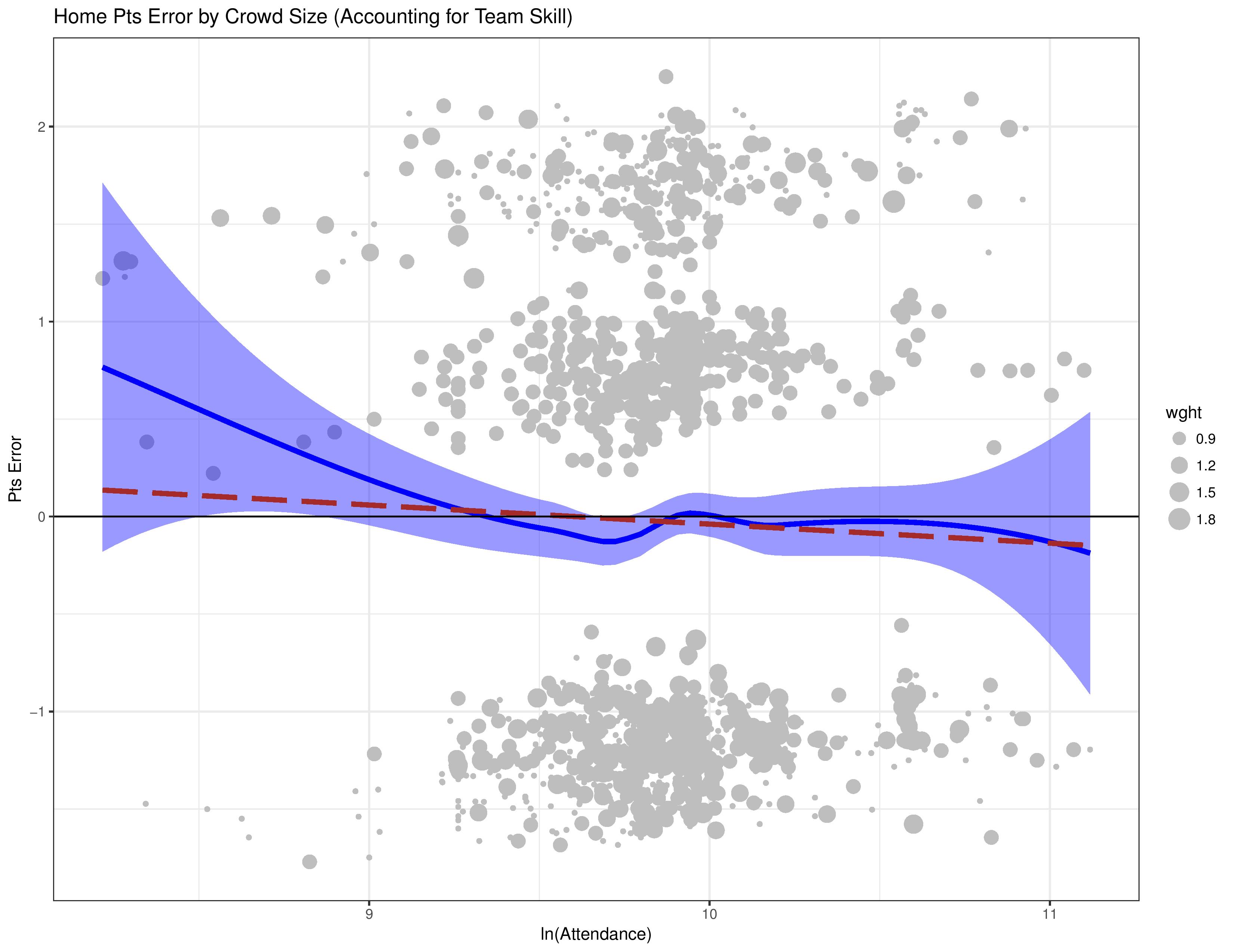
This showed as we might expect, that the model over-estimates the home team’s performance at low attendance levels, and under-estimates their performance at high attendance levels.
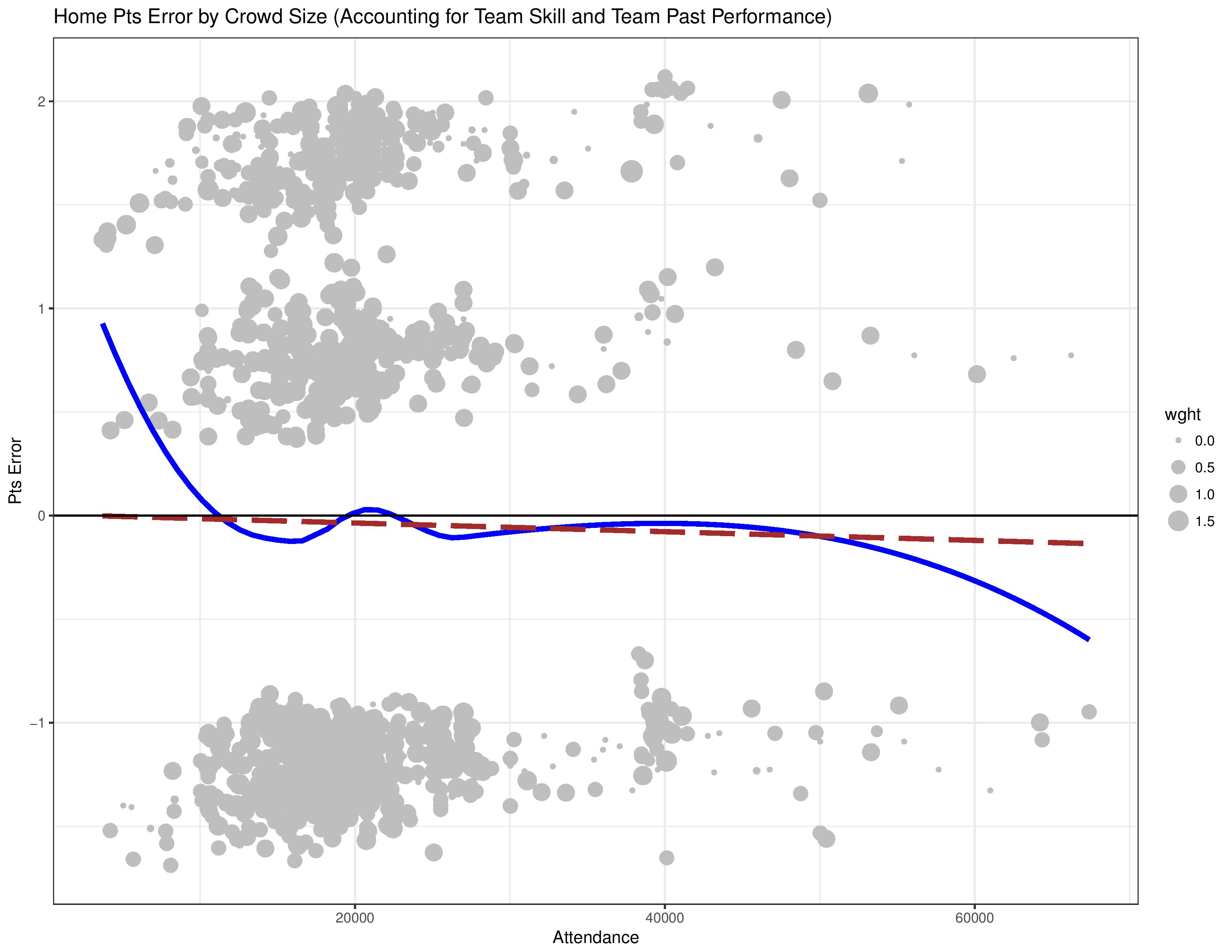
The following chart now shows how the model’s residuals correlates with attendance when attendance is factored into the model itself. Ideally, we’d like to see the blue and red lines hanging out around 0 now that we’ve included the very factor we’re mapping against into the model’s considerations.
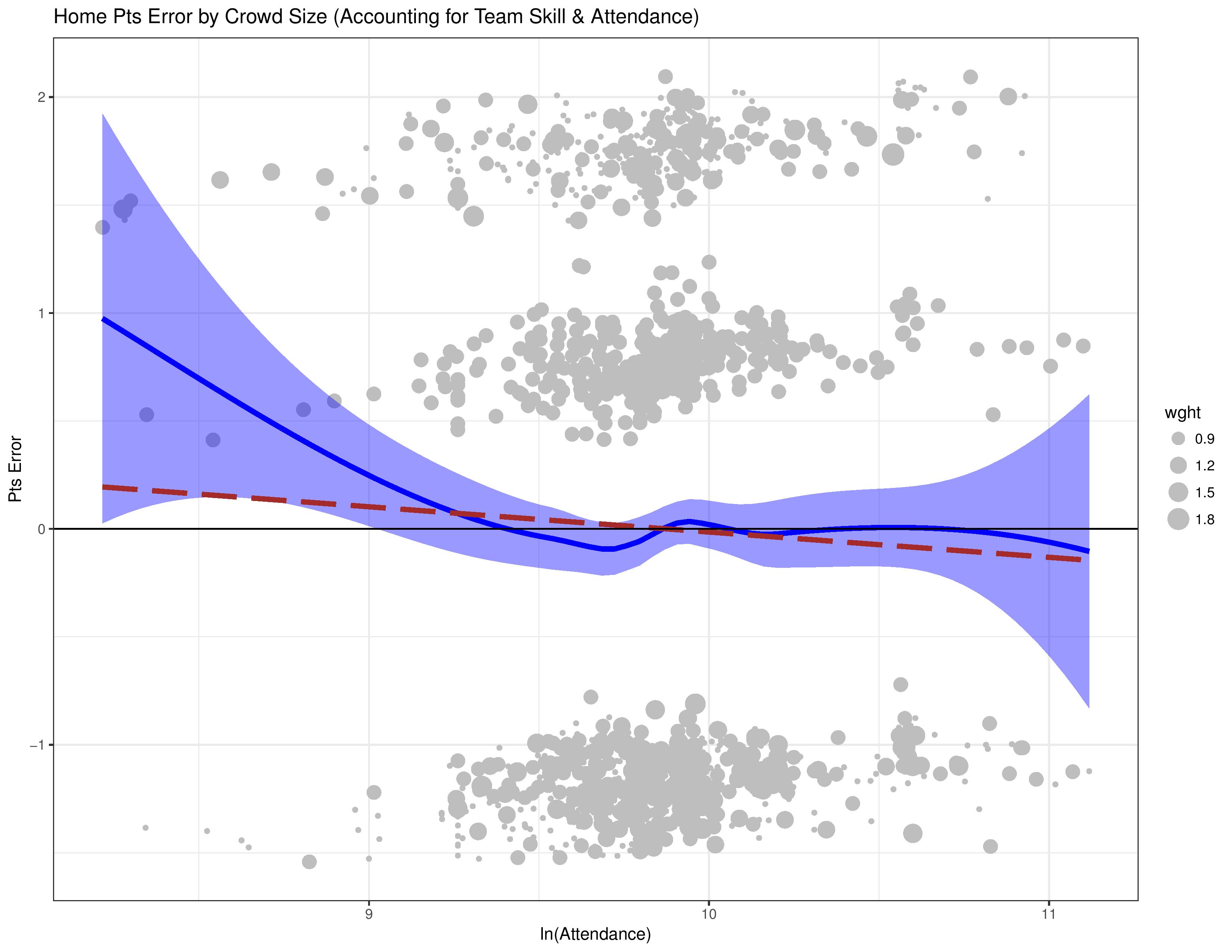
Wait… what? The graph hasn’t really changed? Uh oh, we’ve found ourselves in a classic analysis trap: the endogenous relationship.
An endogenous relationship can occur when the target variable and an explanatory variable are both explained by the same 3rd-party variable.
In this case, a team’s skill level around that time can explain both that team’s home performance in a match as well as the attendance.
Yes, we tried to account for the team’s skill level by including it as an explanatory variable, but that variable was a yes/no representation of the team and its skill over the entire 2013-2017 observation window, and therefore isn’t sensitive to a team’s changing skill patterns in the same way that the crowd size or a single match’s performance would be.
What we need to find, instead, is a way to measure a team’s home advantage which has nothing to do team skill.
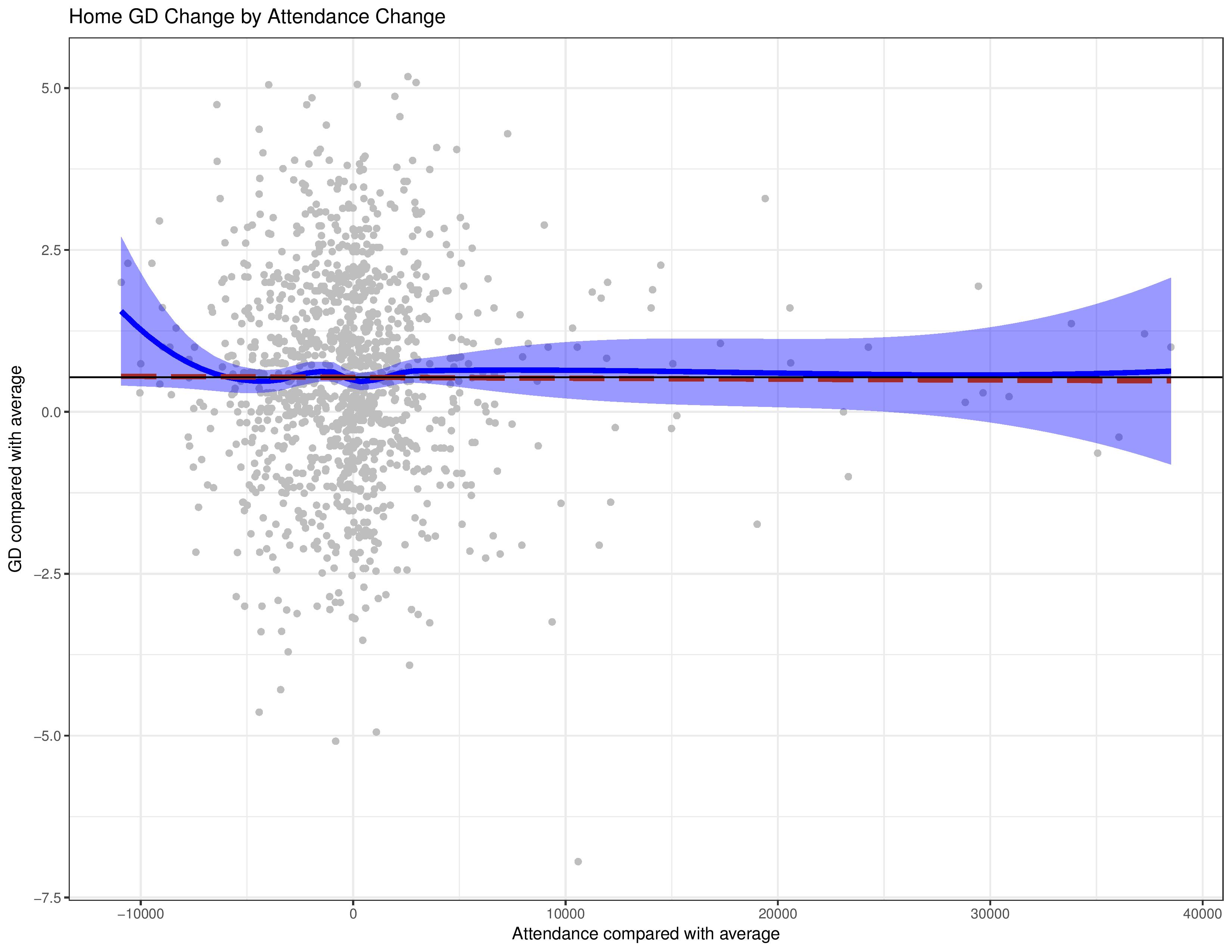
That thought led me to consider away performance. As we’re trying to measure the home field advantage as independent of team skill, away performance of the given team should be independent of their home field advantage.
Team skill should affect performance for home and away matches equally. If so, then the difference in performance between home and away matches for the same team should represent the advantage given by their home.
When we chart that difference between home and away performance against crowd attendance, we should have no conflicts with confounding variables like we did before.
The downside is that we can no longer use match-level-data to prove our point and instead must use averages.
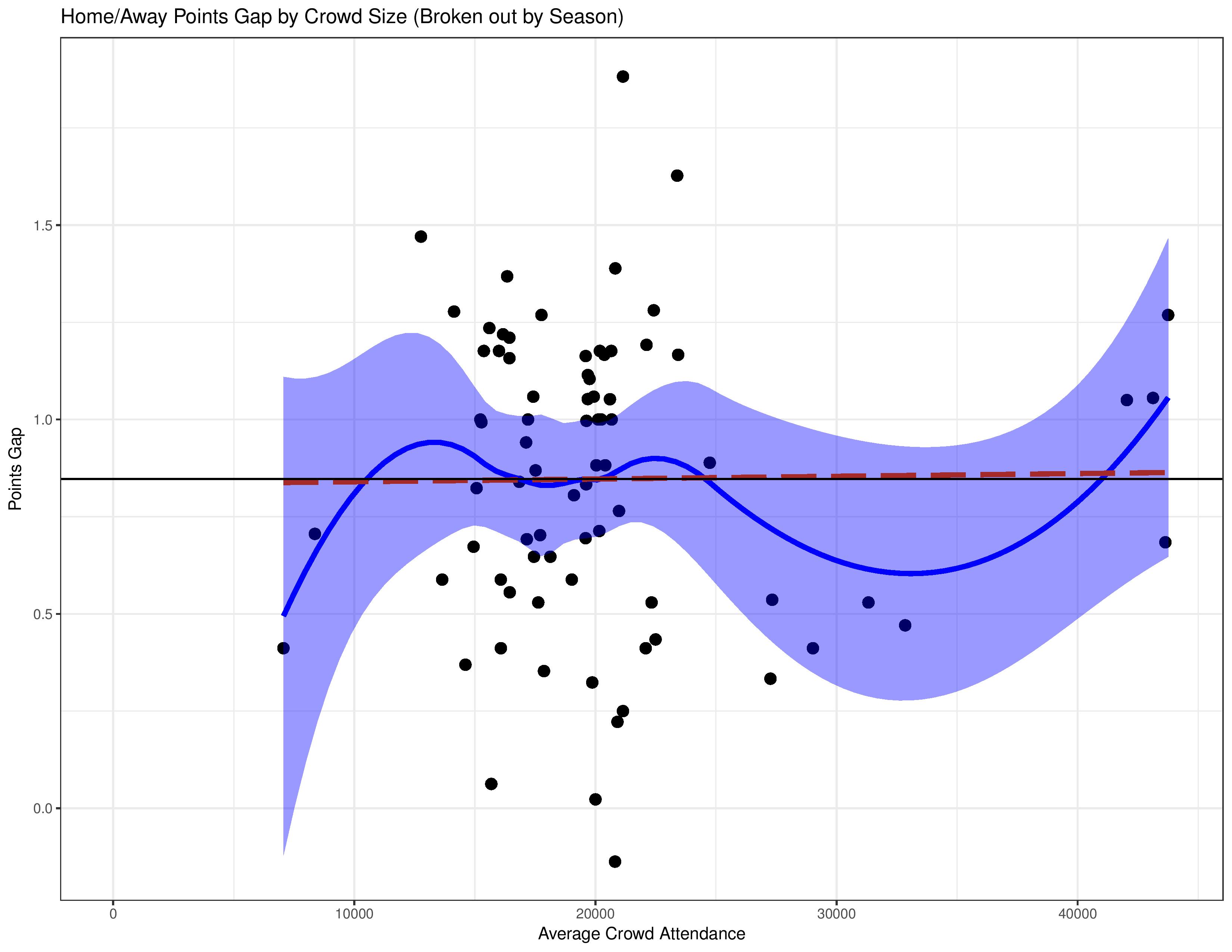
The following shows, over the entire observation window, how average attendance for a club maps with the gap in their home/away performance. The black y-intercept line represents the average points-gap for the league. Atlanta and Minnesota were excluded here due to their small sample sizes.
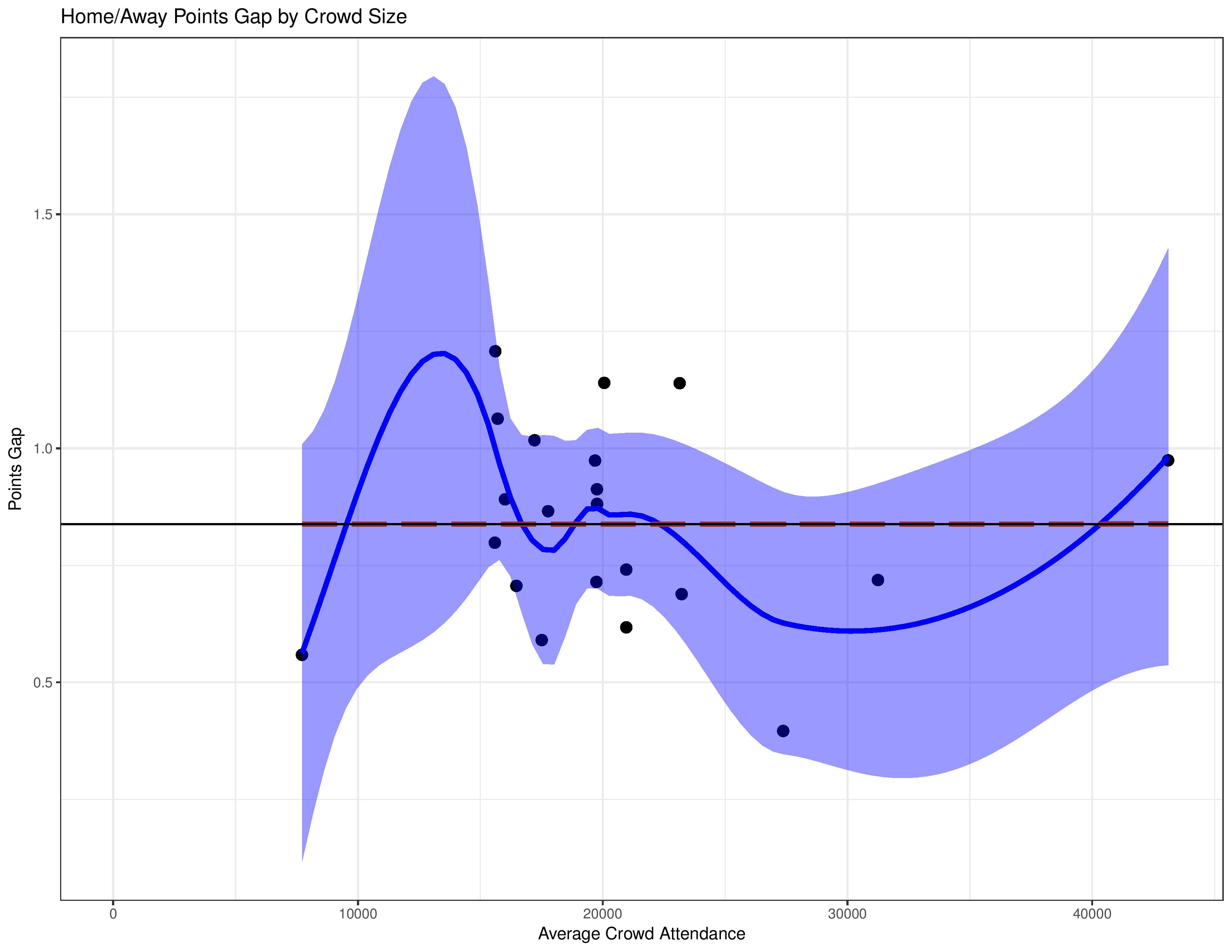
Yikes, this shows absolutely no correlation between average attendance and the home/away points gap.
Points are the way we generally consider performance due to the competition’s rules, but the 3/1/0 point structure for results doesn’t always represent skill in an unbiased way. The following uses the same analysis structure, but uses the home/away goal-differential-gap instead.
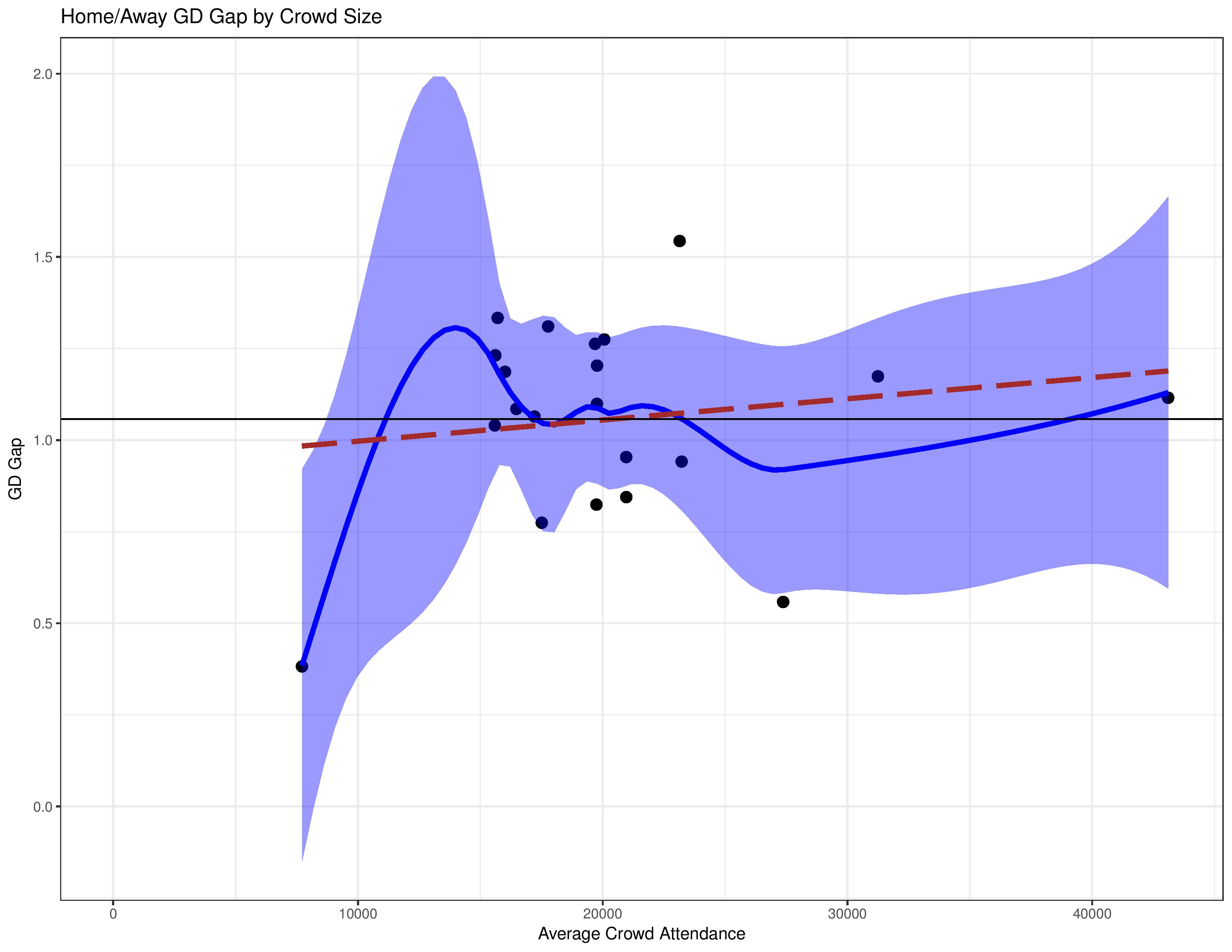
This shows a little more of an effect. However, even that is tricky to conclude with these data points. If you remove Chivas USA (the only data point with < 10,000 average attendance) and removed the pre-drawn lines, it would be hard to notice a pattern with just the scatter-plot given that the three-highest average attendances have a smaller GD-gap than many more modest average attendances.
While the above chart shows the impact over the observation window, it may be helpful to break it out by season. The following is the same analysis as before, but shows the home/away gap and average attendance by season. 2017 is excluded here due to the smaller sample causing averages to be more volatile.
We see the same negligible effect we saw earlier with the points gap.
Again, we break out the by-season analysis using the goal-differential-gap instead of with points.

The chart shows a tiny correlation, but not of a convincing nature. Again, if you remove the pre-drawn lines, it’d be hard to even notice a pattern of any kind.
Conclusion
- It does not appear as if the size of the crowd has any effect on home field advantage
- This is evident based on how average crowd size of a team lacks correlation with the difference between a team’s home and away performance.
- Crowd size is correlated with home performance, but it appears that both attendance and home performance are driven by the team’s skill, rather than one influencing the other.
- It is still possible that the mere fact of having a home crowd represents an advantage (despite the magnitude of the crowd size lacking importance)
- That would be impossible to measure given that we cannot see what a home match without the existence of a crowd would demonstrate.
- Perhaps if, as in Europe, teams may get disciplined where they must host a closed-door, without spectators, regulation match as punishment for some infraction, we will have data for this question (although we’d probably need this to happen a lot to prove anything).
Appendix
The appendix is here to show charts people might find interesting, but which were not important for the conclusion being drawn. If you’re still reading, enjoy!
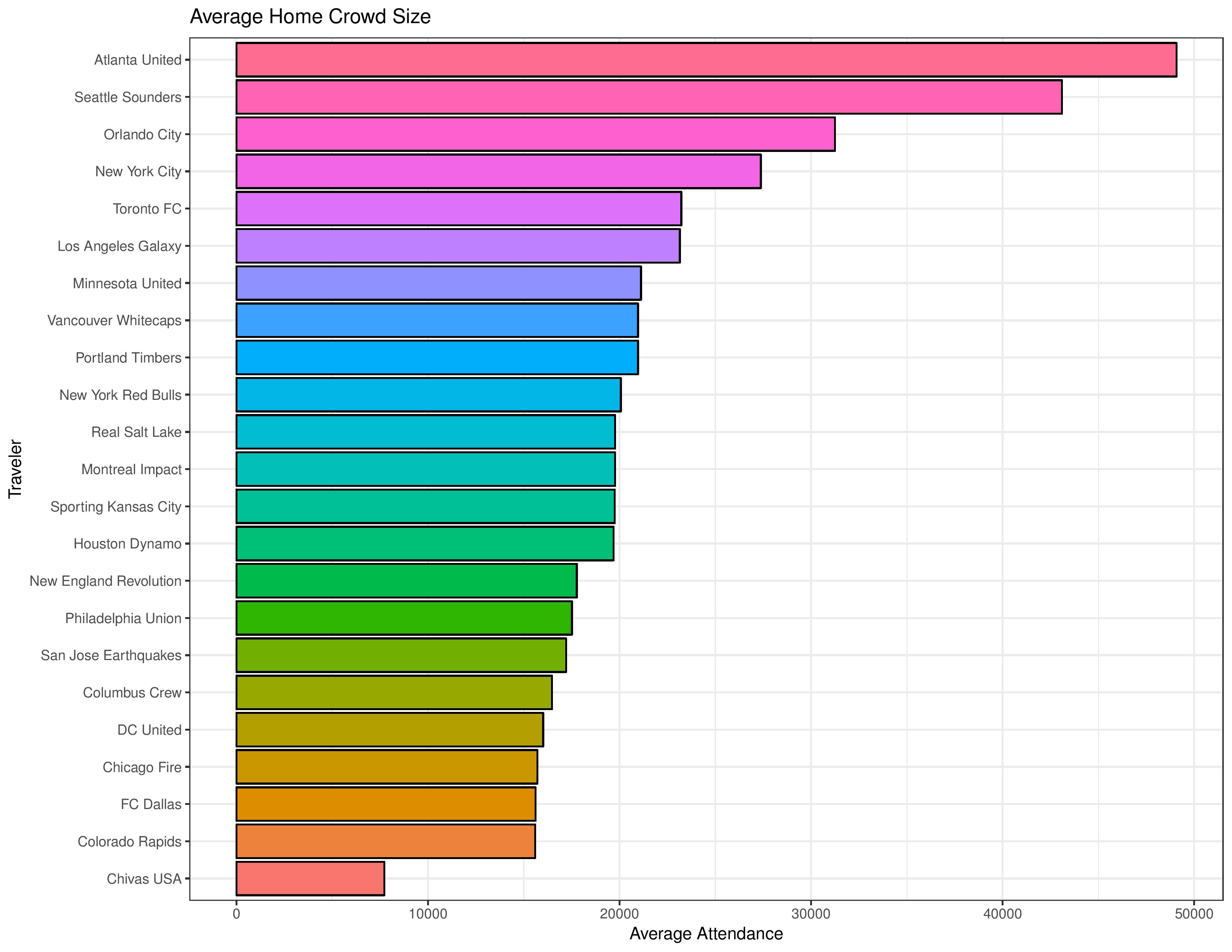
The following shows the attendance-per-game since 2013 for all MLS clubs for regular season and postseason matches.
The following shows the attendance-per-game of each club’s opponents when they travel.

In the main section, you saw how crowd size correlated with home points in matches. The following breaks it out by season for a narrower view.

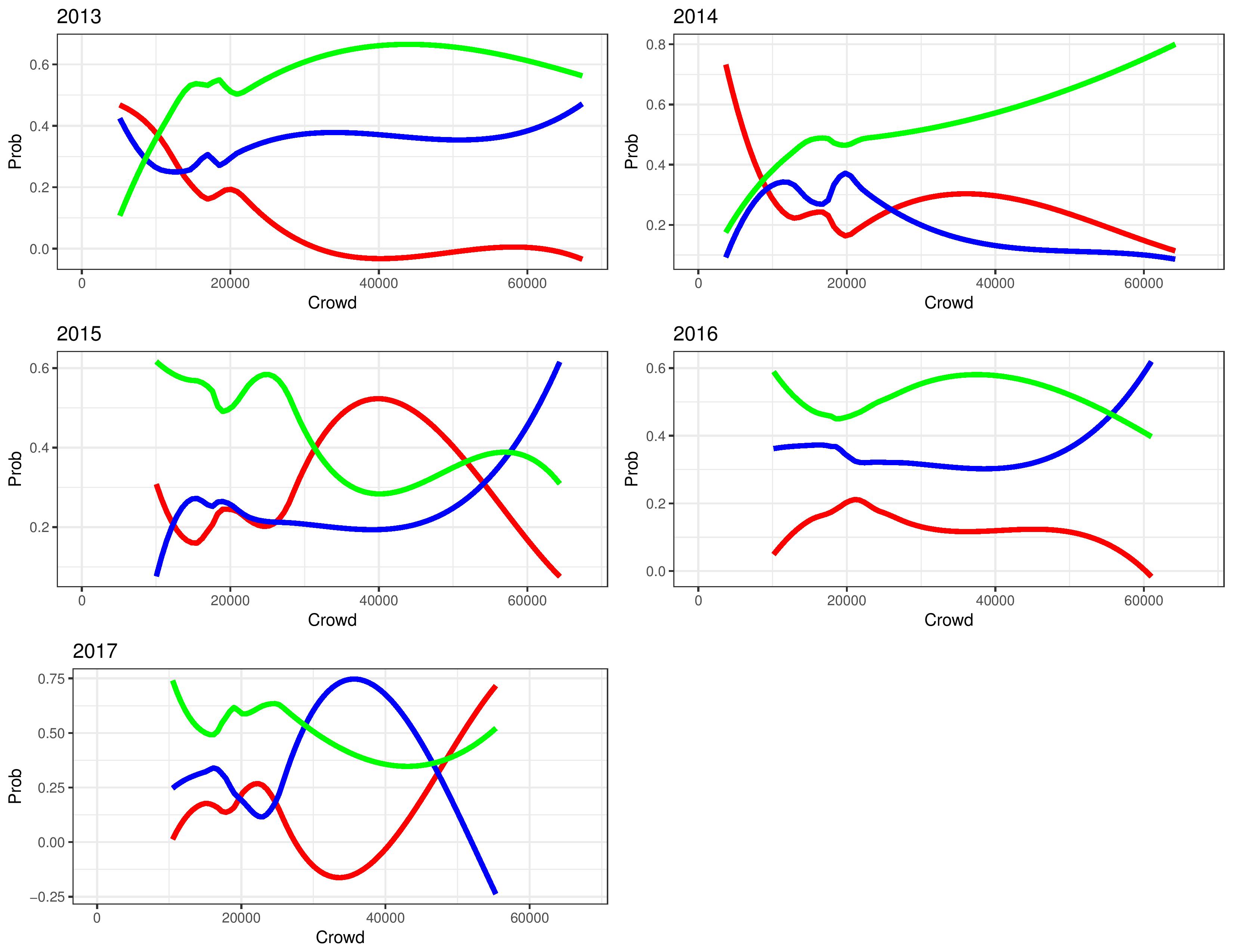
The following shows how the different probabilities of home results occur at different crowd levels, broken out by season. As a reminder, the green line represents the probability of a home win, the blue line represents the probability of a home draw, and the red line is the probability of a home loss.
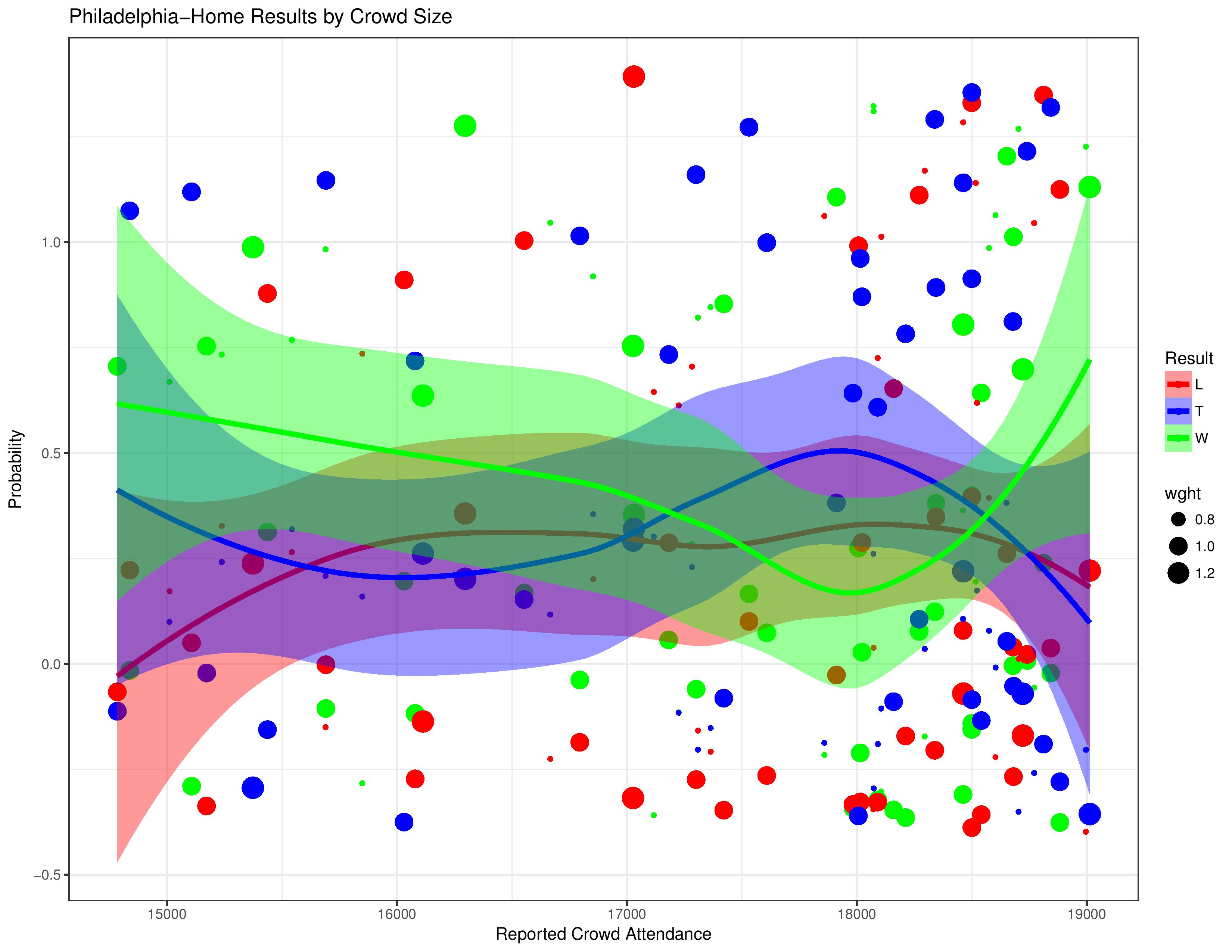
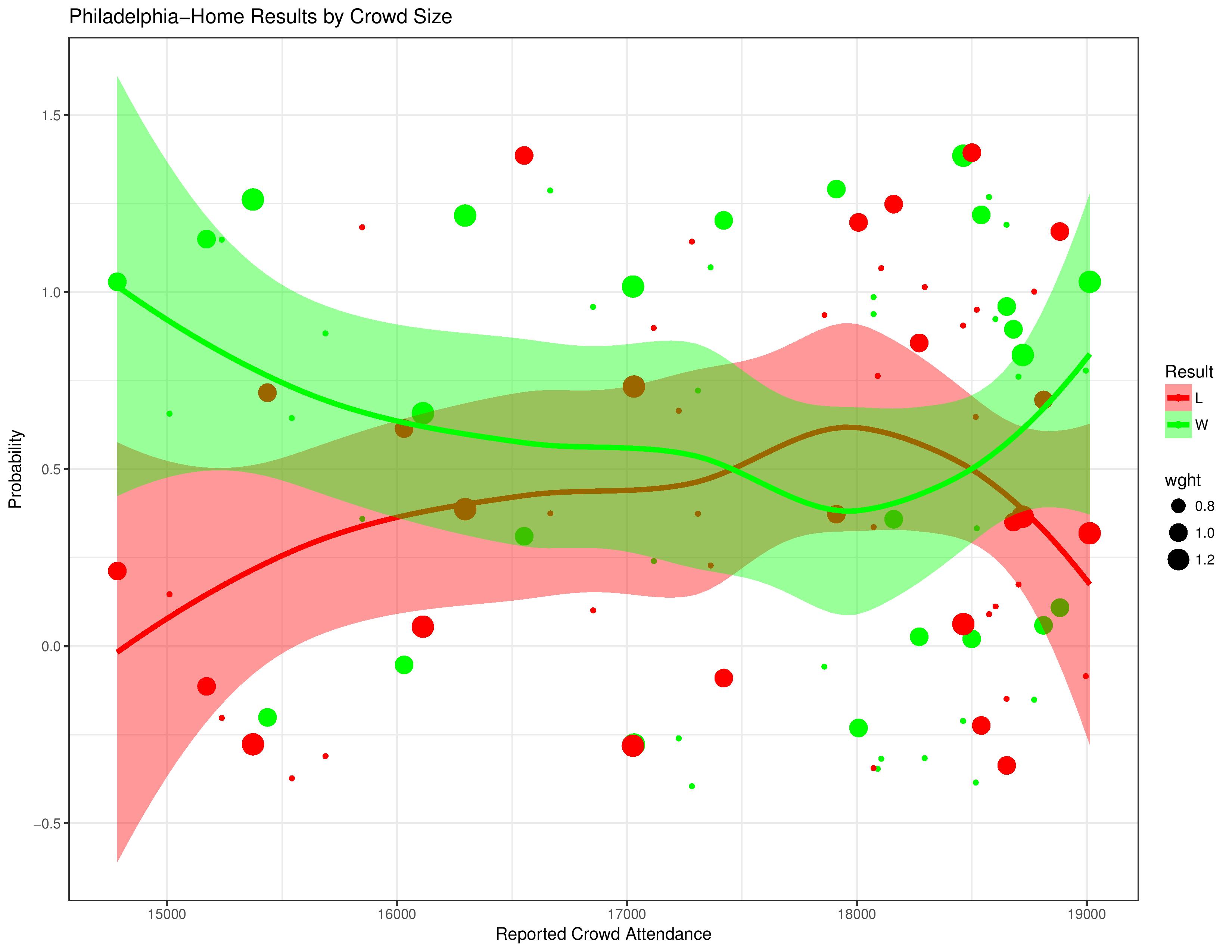
The following shows Philadelphia’s relationship with result probabilities compared with changing crowd sizes. As a reminder, the different sizes of the dots relate to the goal-differential of the match.
The following shows the same as immediately above, but behaves as if ties don’t exist.
Before I tried using the gap between home & away performance, I tried to factor in a team’s recent performance. As we were having difficulty separating the common cause of a team’s home performance and their crowd draw, I thought measuring a team’s performance over the past 8 matches would help explain the crowd size in a way that was separate from team skill.
As this ended up entirely in the appendix, you can probably foresee that I was wrong and it does not remove the endogenous relationship between home performance and attendance.
The following shows the correlation between a home team’s points and the team’s points-per-game over the previous 8 matches.

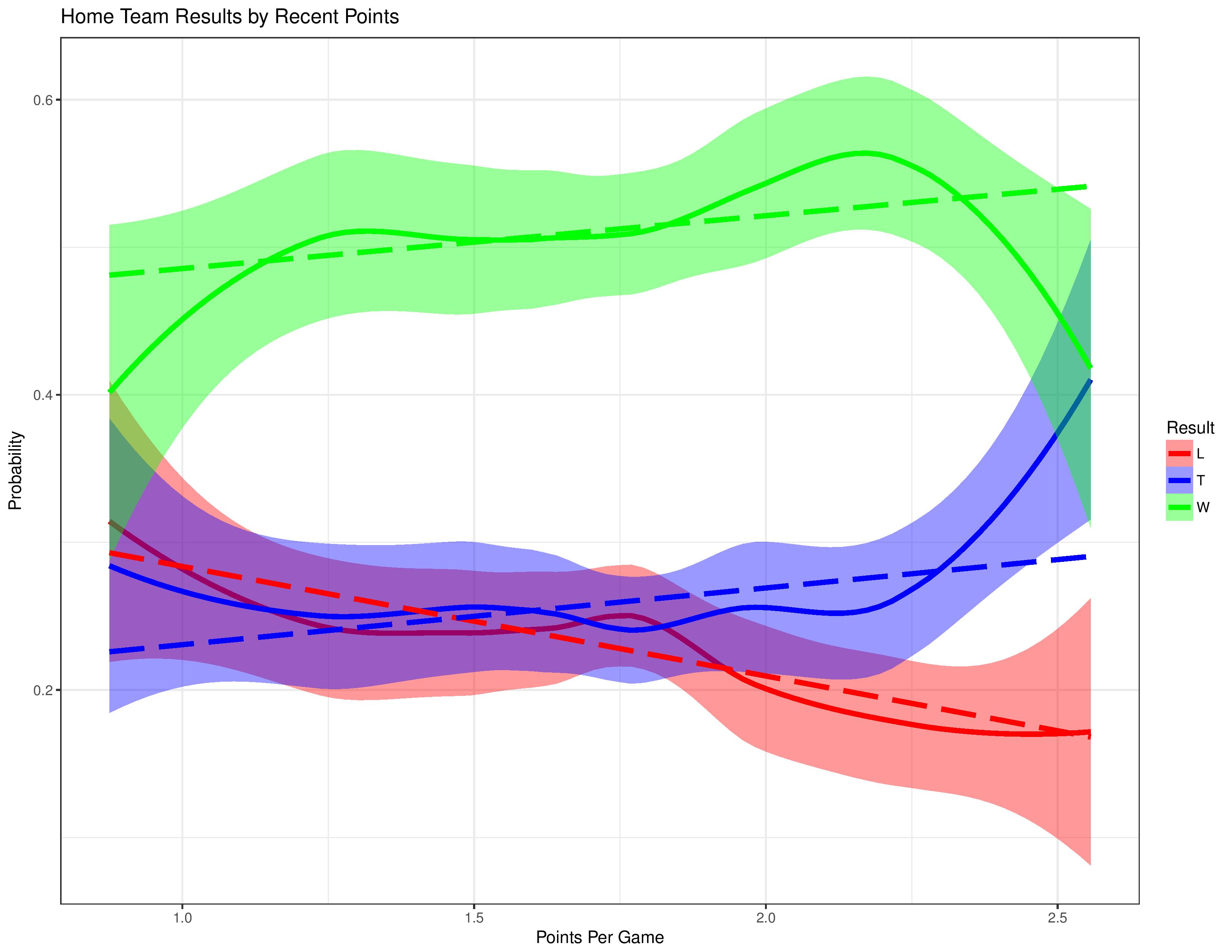
The following shows the home team’s result probabilities mapped against the average points-per-game for the team of their previous 8 matches.
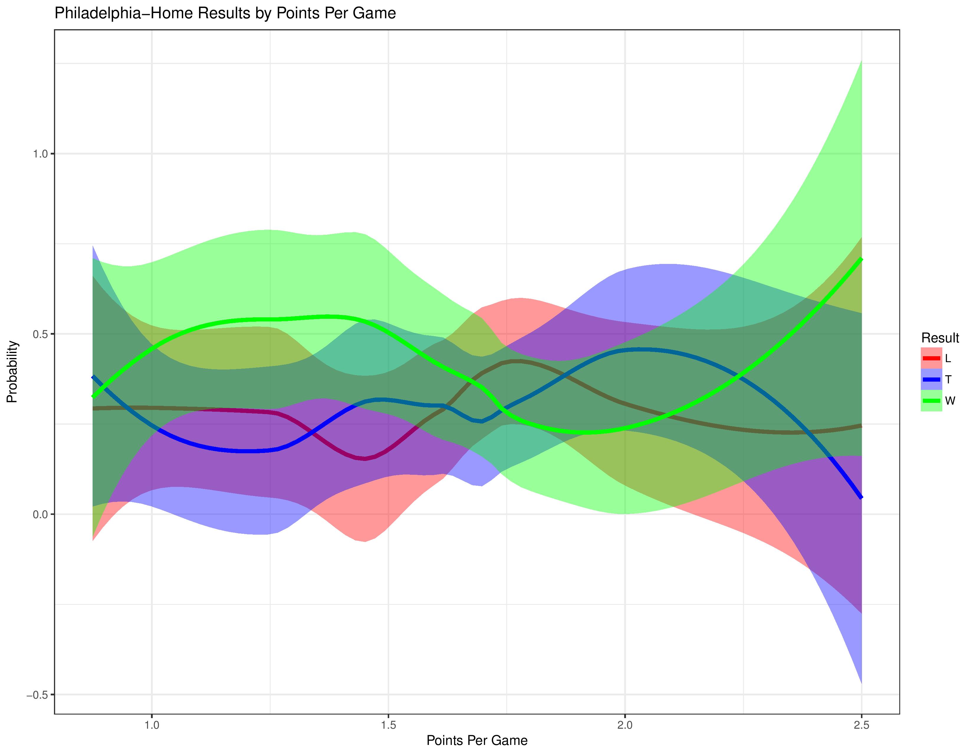
The following shows Philadelphia’s result probabilities compared with their points-per-game in the preceding 8 matches.
The following shows how a model, which includes a team’s ability (over the course of the whole observation window) and that team’s points-per-game over the previous 8 matches into account, performs when mapped against the crowd size.
The following shows how the same model, taking attendance into account as well, maps against attendance.
As the results look the same as the original, attendance vs. home performance analysis, that confirms that the endogenous relationship still exists.
This section below attempted to verify the conclusion presented in this article. What this shows is, by team, within each season, how the average goal-differential changes compared with their average attendance with home matches. 2017 has been excluded due to small sample sizes allowing more volatile averages.
What this chart shows me is that there is seemingly no difference, even within each club itself, in home performance at varying attendance changes.
There is perhaps an argument that at unusually low levels of attendance home performance will increase, although it lacks a lot of data to be certain. If it is, in fact, true, perhaps this is because, at the lowest attendance levels, the team is likely to have been at its unluckiest point in performance and has discouraged potential fans from heading out despite the team in question likely being better than they had been showing.
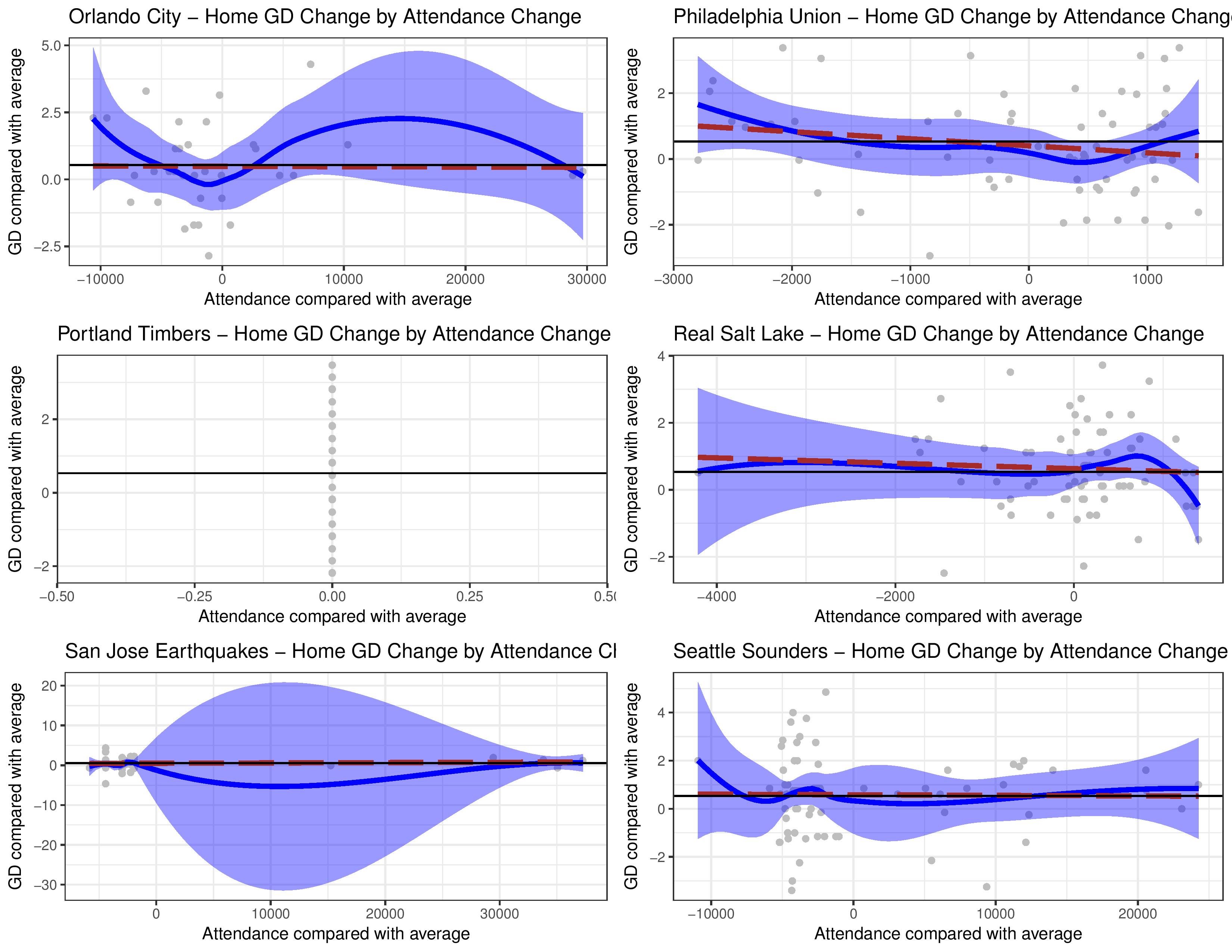
The following breaks out the above by club, in case you are interested.
You’ll notice Portland doesn’t have any variation in attendance. That is because they have sold out all their matches in the observation window. Their attendance did actually change between seasons as their stadium capacity changed, but all matches within each season had the same attendance level.
You’ll also notice that Vancouver is there twice, but that’s just because it was easier for me to export these in the way this was built. I figured no one would really care.


The tough thing is that, as you mentioned, team success and attendance are correlated.
.
I know when I played, I never heard the crowd. Friends would be screaming at me from 4 feet away and I would have no idea.
Wouldn’t it have been better to use percentage of capacity?
The theory is that size of the crowd influences the match. I’d argue that if that theory is true, then a sold-out Seattle match should provide a stronger influence than a sold out Philadelphia match.
–
Otherwise, you can still see that in the very last exhibit in the appendix, that teams still show little difference in performance while varying within their own stadium
A question and an observation, Chris, should you happen to see them, as I am late reading the article.
.
I think I remember you assumed team skill level the same home and away. Do not certain managers play different styles home and away? They certainly do given perceived strength of opponent.
.
During conversation with Coach Burke of the Steel last season, I realized that even though Lehigh is 65-70 miles away from HQ in Chester, the team does not travel there together by bus. When I asked, coach indicated they wanted the game to feel like home matches. It seems like a long commute until you think about places like LA and NY
.
Parenthetically, I discovered purely by accident that the team does provide a van for some of the younger players to get back to Chester. I happened to follow it from Goodman to the NE Extension at Quakertown.
In addition to differing styles, there can also be cases of differing lineups. Remember a couple of years ago when Seattle and Portland both had cross country trips and played their B teams at Talen and the Union beat both?
I Remember it quite clearly. So far this year not one has brought a real B team.
.
That point is to the Union’s credit, even though it shows up nowhere in numbers.
Tim and Andy: Yes, I think those are great points at helping to explain Home Field Advantage. Once I get to it, those will be part of an analysis of “defeatism” in which teams choose to play differently (or use different lineups) on the road, despite having a worse record on the road.
–
The ‘team skill’ was attempting to measure and remove the raw talent level of teams’ effect on crowd size, since the Union’s away team performance could not possibly be affected by their home crowd size.
–
If a team’s home/away gap is exaggerated by defeatist managerial choices, we would still expect to see some correlation between crowd size and their home field advantage if the crowd size had an effect.
–
Tim: That’s an interesting detail to learn about the Steel games. I suppose if I lived close to Chester, I’d be annoyed at having to drive myself back/forth to Lehigh as a home game, but if I lived in the suburbs north of Philadelphia, I’d probably be thrilled to not have to go all the way back to Chester before going home.
And you raise the human interest piece that is directly challenged by the individual privacy right, where do the guys live?
.
I was struck between the difference in approach, based on presumed maturity and reliability, with high school, where I myself would want the planning opportunity of having the bus ride to know what I had and a chance to think about how to use it.