
Photo: Courtesy of Bethlehem Steel FC
Bethlehem Steel FC unveiled its inaugural home and away kits on Thursday.
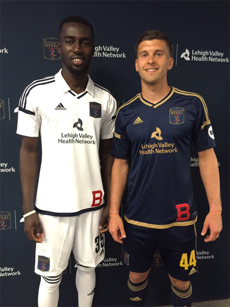
The v-necked home kit is navy blue with gold trim. The away kit is white, with a collared v-neck and navy blue trim.
On the lower left side of the front of each jersey is a red “B”evoking the most famous logo of the original Bethlehem Steel FC, similar to the wildly successful Philadelphia Union third kit released in 2013 that paid homage to legendary team.
An announcement from the club says, “Jerseys will be available online at www.bethlehemsteelfc.com and at all Bethlehem Steel FC and Philadelphia Union home games.”
Before the unveiling, Lehigh Valley Health Network was announced as the team’s jersey sponsor “and medical provider for health care, orthopedic, sports medicine, medical and physical therapy services.”
LVHN is also the club’s first “Foundry Partner,” the premier corporate-partner status for Bethlehem Steel FC.
If you would like to know more about the evolution of the kits worn by the original Bethlehem Steel FC, click here.

i’ll be getting a home for sure. sweet job!
look at the subdued sponsor logo, meshing with the kit so nicely. some day U, some day…
Why do we insist on yellow numbers and names. It’s horrible. Clashes with the gold. Who thinks this is a good idea?
Someone who is color blind or has terrible taste
Well at least one of our local clubs is listening about the imperial white kit. The white is so fresh… with the collar…that much is well done… even if a little backwards as the away colors.
.
The home kit is tragically unhip. I struggle with our team colors in general…. kind of a blah blue and ungold gold… even for the parent club. The baby blue from a few years ago… now that says something… except for the sponsor’s name… which is laminated across the front.
Yes! I thought the baby blue was the best uniform. Even if they don’t play in philly at least that’s the flag of the namesake city. Thank the heavens we don’t live in Columbus! Now that’s a hideous flag and jersey!
I’m not a graphic designer- but that doesn’t stop me from having an opinion on the matter, haha. Any thoughts on that “B”? I like the nod to history but it just looks out of place there. Like they pulled the jerseys out of the dryer and a rogue B happened to be clinging to it like a wayward sock. I’ll stand corrected if any graphic pros give it the OK.
White with a collar is always regal. Great kit, should inspire confidence in the boys.
White with a collar is always regal. yup.
I would only make one change. The crest on the white looks awkward. Why not replace the navy with white and then the gold with navy. I think that would make it pop.