Third kit photos courtesy of Philadelphia Union
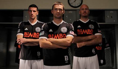
The Philadelphia Union unveiled its new Bethlehem Steel FC-inspired third kit design at Tuesday evening’s Meet the Team event at Xfinity Live. PSP talks to the man who oversees the design of every MLS kit, Mike Walker, the global product manager for MLS at adidas North America, about the new design.
Philly Soccer Page: A third kit can be an opportunity for you to move away from the brand identity expressed in a team’s first and second kits. What kind of challenges does this freedom present for you in the design process?
Mike Walker: Yes and no. A third kit is still a team’s uniform and thus part of their identity. So it must be done in conjunction with the team and the direction they want to go in, and be seen in. We do tend to have more creative freedom and can propose more “outside of the box” ideas, but it still must work with the organization.
 Different organizations have different takes on what a Third means to them. Portland’s retro inspired is much different than Houston’s desire to reinforce their Orange branding with a different shade of Orange for their Third than what is on the Primary or Secondary. But both were equally well received and the teams really like them.
PSP: What were your initial guiding thoughts when you began the process of designing the new Union third kit, what did you hope to achieve with the new design?
MW: Well, I had two thoughts that I knew I wanted to explore. One was this history of soccer in the Philadelphia area. The other was to stay within the brand guidelines of the team and do something different with a center bar on the jersey. I needed the organization to tell me which they preferred—and they did. That led us to the kit that just launched.
PSP: You described in the Q&A we did in January how the design process is a collaborative one between your team at adidas and the club. Can you tell me about how that collaboration played out with the new Union third kit?
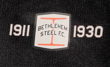
MW: Once I got the OK to look at a “retro” kit, it became about what era, what team, who own the rights to team marks, and so on—lots of details. Should it be an exact replica of a specific team? Honor multiple teams? Should it be inspired? Traditional Union colors? So once we settled on Bethlehem Steel FC and the 1915 team, that gave us the inspiration for this current kit.
We then did some options for the team to review and smoothed out the different options to make sure the team was happy with the final version.
PSP: When you developed the concept that the Union’s foundation rests on the Philadelphia area’s rich soccer history, what appealed to you about Bethlehem Steel?
MW: Let me answer that by asking a question to you … unfortunately I’m asking you of all people, and you will know this!
What year was the first professional soccer league in America? Yep. 1894. Think about that for a second since we are now in 2013.
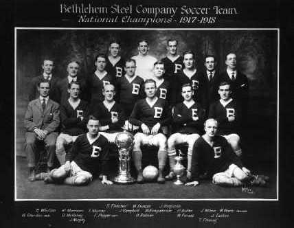
We needed to define which Bethlehem Steel FC look we wanted to be inspired by. A single year? Or all of them and pay homage through multiple details? Once I saw the 1915 jerseys they wore for the first US Open Cup championship with the distinctive “B” on the chest and white V-neck, I knew I was on to something. (That is a great picture of the 1917-18 team with the trophy, by the way.)
There are so many teams in the Philadelphia area that it was very tough to settle on just one. The 1894 Phillies. The 1911 Philadelphia Hibernians. The Nationals. The Spartans.The Atoms. On and on. Looking at Open Cup wins list is what really sold me on BSFC. One of only two five-time US Open Cup champions. They played for many years and have a fairly well-documented past that we could really follow.
I would also like to take this time to say a big thank you to Ed and PSP for all the research you did to help me here. This design would not have been possible without your help. Thanks again!
[Author’s note: Mike got in touch with me in early December of 2011 to help him with research on Bethlehem Steel FC, which consisted of finding photographs as well as reading through old newspaper clippings, Spalding Guides, and other primary and secondary historical sources, all of which contributed to a month or more of very entertaining emails in which we speculated about the colors used in the team’s kit. That research was the genesis of my article Evolution of a kit: Bethlehem Steel FC. To be clear, I was never privy to any descriptions or photographs of the Union third kit throughout the design process from Mike or anyone at the Union, nor any discussions about the kit design between Mike and the Union, and did not see images of the finished kit design until Monday evening.]
 PSP: The jersey references Bethlehem Steel but it’s still a Union jersey. Can you tell me about how you integrated the historical references into the design? Do you have an element that is a particular favorite?
MW: We didn’t just want to do a straight Bethlehem Steel jersey though because after all, it’s going to be the Philadelphia Union playing in it, so then it kind of evolved into the idea that there are all these teams in Philadelphia area, ones that laid the groundwork to get the Union to where they are today — they are the foundation.
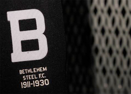
But it’s still a Union jersey and needs to be able to function like a modern jersey and have the proper Union marks on it. Once we settled on the look of the design we picked poly fabrics that would wick moisture and perform like a modern jersey, but have an old school look to the weave. Then we needed to do something about that distinctive “B.” That lead to two of the things I really like about this jersey. The “B” at the lower hem is felt and stitched on like they would have done in the early 1900’s. We also took that felt and made the Union crest with it and embroidered the rest of it in tonal colors. The crest itself is still heat applied for the players comfort and meeting out industry leading standards, but it looks very old school.
And now the modern twist: Look at that Union crest. Now look inside the jersey under it. That’s one foundation from where soccer in Philadelphia has come from and lead to the Philadelphia Union of today. I was very happy when the Union agreed to that detail.
PSP: What challenges do you face in going for a retro look while meeting the apparel needs of contemporary players?
MW: I briefly mentioned it before but even though this is a retro-inspired kit; it still needs to function on today’s fields. We were never going to make a wool jersey, for example, no matter how cool it may have looked. So it was a balance. The fabric is ClimaCool to help regulate the player’s temperature and wick moisture, we did a bonded hem and lightweight elastic cuffs with reduced seams all to help eliminate weight. The details are heat transfers and the design lines are Formotion to allow the players to perform on the field of play at their best.
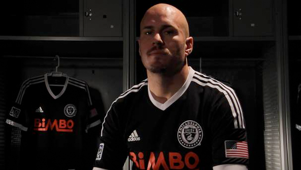 PSP: The use of a retro version of the shirt sponsor’s logo is something you pioneered with the Portland third kit in 2012. What were the negotiations with Bimbo like to be able to use the retro logo from 1947? Are shirt sponsors generally responsive to the idea of using a retro logo?
MW: We asked, and the Union partnered with their jersey sponsor, Bimbo, and got us the ability to use the oldest mark they had. I can’t thank the Union front office enough for their help with that. I think that is a great touch for this particular kit and really brings it all together.
PSP: Looking ahead to the launch of a new third kit in 2015, do you see the historical foundation concept continuing or is it more a case of all options are on the table when you begin the design process?
MW: I think it sets the table, but it will need to be a discussion with the Union and see what direction that would like to go in. I’m sure we will show it as an option, but if they want something different then we will do that instead.
I personally think it would be great to come back to this concept and delve into for the next few Third designs.
PSP: How are things going with the Union first and second kit designs for 2014? (Had to ask!)
MW: Oh, they are good—how do you feel about Magenta?

Our front 3 on Saturday?
That’s the dream. Given that Carroll has to play as captain, I’m hoping for the three of them up top, with a midfield of Torres, Marfan, and Carroll. Then a backline of Garfan, Parke, Okugo, and Williams.
Still says bimbo. No way to get around it.
Try getting over it.
never
I am not buying a shirt that says Bimbo on it. Why not Stroehman’s or Entemann’s?
My theory is this I understand why the team is doing it… they are getting 3 million dollars. I never understood why I have to pay money to advertise a shitty bread company.
after watching the preseason matches, I would place big money on a 4-4-2 diamond. would rather see the Mac, Le Toux, and Casey up top in 4-3-3, but if that’s the case I don’t see Torres and Marfan on the field at the same time. Torres is not an outside mid.
That said, I’m betting Garfan [unfortunately – would rather see Gaddis], Parke, Okugo, Williams, Carroll, Keon, Marfan, Cruz, Le Toux and Casey.
I would be willing to bet that Mac, Hoppenot, Torres definitely dress if they don’t already start over on of the above.
Excited for this season. Good Luck Saturday guys!
Anyone else notice Le Toux eyeing up Jack Mac in the promo pic? Weird.
I saw that too…it is interesting to say the least.
How about the lighting on Casey? Or lack thereof. He could have just been photoshopped into these images.
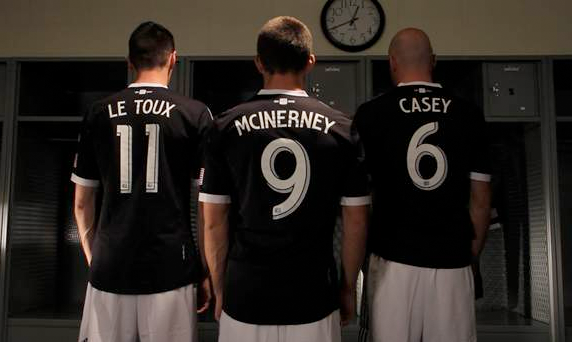
They are bad ass…favorite part is the change of the name and number font on the back, cannot stand the MLS standard font.
That’s the new name and number font for every kit – first, second and, third. I’m with you, the old font is dead, long live the new font.
The bimbo logo on these kits don’t look all that out of place compared to the others. Maybe it is just because they don’t have the full logo with the white background and all. I really like these.
If you compare these jerseys to the other new releases you can kind of see how generic the Addidas templates are. But all in all I would feel like an idiot being an adult and wearing this around. But now way i
m paying a hunnid plus dollars for them.
But enough of this jersey talk lets talk about the hot new scarf that I did pay 25 dollars for.
Which scarf? I like that Olde English one…
The Grey on Black one…
http://www.philadelphiaunionstore.com/ProductDetails.asp?ProductCode=SARFN-DARKTONES&CartID=0
I think the new jersey is ok. It’s a cool tribute and what not, but I’m not sure I’d pay for it. It’s underwhelming compared to the last home & away release. I’m glad they at least went with the white shorts.
I dig it! But not enough to displace my OJ away.
I’m ambivalent on this jersey. I like the tribute to history aspect of it. Like it better than the “signal blue” second jersey.
—–
I would have liked to see a Union hoops jersey
—–
What I REALLY, REALLY like is the new track jacket (the one we saw in the Daytona pics). Can’t aseem to find it on the Union store webstie (which has 4 different links for jersey, but none for tshirts, sweatshirts or jackets) but its is on the MLS site. Awesome!
where is it on MLS site? I can’t find a new one anywhere. All I can find is the older “Ultimate MLS Track Jacket” Thanks for the help!
If you are in the city Tri-State Soccer at Grant and Academy has them.
dig it