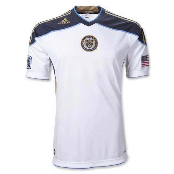
So, I was poking around the MLS site on Tuesday morning and decided to take a look at the Union shop at MLS Gear.com to see if there is any new swag available. I clicked on the link to the jerseys and nearly jumped out of my seat.
Holy Christmas, is that the third kit that I’m looking at?
After frantically making a copy of the image I started searching around the Internet for the notice that I had obviously missed about the release of the design.
I found nothing. No missed press releases, no announcements on the main MLS or the Union website and certainly nothing in the Union’s online store.
I went back to the MLS site to make sure I wasn’t seeing things. When I clicked on the image of the shirt—presto chango—it disappeared, replaced by “Image Coming Soon.”
Is this the third kit design?
Is some web guy at the MLS store in big trouble?
What do you think of the design?
Will you buy one, even though it appears that it will only be available as an Authentic jersey at $109.99?


The Bimbo logo will look better on that one than it does on the the blue-based kit. Maybe that’s the reason they’re coming out with a white? We shall see.
love it! yes, I’d buy one
It’s beautiful, i was hoping to see a white kit. Hopefully this really is it!
Realizing the Bimbo wordmark doesn’t look great on it, I hope they never do away with the home jersey’s iconic gold stripe design.
@andy i couldn’t disagree with you more about the “iconic gold stripe”. i find the gigantic vertical stripe to be one of the worst designs in MLS. it’s just a big rectangle that abruptly stops at the shorts. off the field, as a supporter, it’s difficult to wear the shirt without looking silly. It looks like you’re wearing a bib. I really wish, if they’re dead set on keeping a huge stripe, that they’d arrange it more like Ajax. http://www.soccerjones.com/wp-content/uploads/2010/07/New-Ajax-kit-for-the-2010-11-season.jpg
Union has the strongest crest in the league yet one of the weakest kit designs. (Perhaps Chivas’ striped kit is worse, but their blue kit is much better.)
At least this white design shows promise at being stylish both on and off the field. that is, until they slap BIMBO on it. ._.
Iconic doesn’t necessarily equate to something being beautiful. That said, I love it. Maybe the stripe should continue down into/through the shorts then? 😉 However, the jersey design IS instantly-recognizable amongst the other MLS teams, with elements not currently shared by other squads in the league. This supposed third kit is a template, and very similar to what’s being used for the Rapids. But since you’re bringing up Ajax, take a look at their earlier striped-designs – http://www.classicfootballshirts.co.uk/media/catalog/product/cache/1/image/0dc2d03fe217f8c83829496872af24a0/A/j/Ajax-89-Homewear_2.jpg – seems to have a similar stripe width to the Union. It’s only latter designs that have widened the stripe itself.
Are we still going on about the Bimbo thing? Let it go already.
As for the kit: you can’t please all of the people all of the time. I hated the home kit until I saw it on the pitch, and still hate the away jersey. My question with this one: will they be adding the Star Trek badge or not?
A lot of folks that I’ve talked to or whose comments I’ve seen on the web seem to be disappointed the kit isn’t light blue. Personally, I was hoping they might evoke the jersey design of the 1973 NASL championship winning Philadelphia Atoms.
GALAXY RIP OFF!