Photo: Marjorie Elzey
It’s been a minute. Swamped by work and school, The Change Strip fell to the back burner for a bit. No longer, and no delays. Let’s jump straight into the biggest news from the last few weeks of soccer aesthetics.
THREE POINTS
CHICAGO FIRE REBRAND
On June 18, the Chicago Fire revealed their rebranded rebrand. After a visually lackluster two seasons, Chicago will be ditching one of the worst crests in professional sports and moving on to a look that screams both soccer and Chicago.
The new look drops the gold and navy, replacing the dull tones with a vibrant Chicago-centric sky blue and red. The crest features a Florian cross of light blue encasing a red C and a six-pointed star, seamlessly utilizing some of Chicago’s most iconic visual identities.
The crest is a welcome departure from the clip-art style “Fire Crown” badge and does a fantastic job being immediately recognizable as a Chicago brand. Unlike some other clubs, *cough* Columbus *cough*, the Fire did an excellent job welcoming feedback from the community and crafting a brand that screams civic pride.
As more and more clubs update their identity in the next few years, let’s hope that clubs elect to go in the Fire’s direction of welcoming and accepting feedback instead of the Crew’s decision to steamroll fans and compromise to avoid total revolt.
Chicago will debut their new brand on field in 2022, with a rumored return to red primary kits coming in 2024.
REVERSIBLE KIT
Soccer is all about tradition. Some of the best kits of the last decade have had their inspirations rooted in the past. And then there’s Forward Madison. Bucking tradition at any opportunity, Forward Madison continued their trend earlier last week, unveiling the first-ever reversible pro soccer jersey.
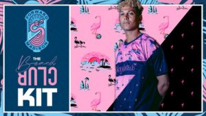
(Photo courtesy of Forward Madison)
On one side, a clean, simple flamingo print that would be the most subtle of Madison’s wardrobe, the other a cacophonous design that looks like Jimmy Buffett did his laundry with Palermo’s primary shirts. For any other club, it would simply be too much; for Forward Madison, it’s another brilliant bit of design that continues to make them the darlings of the American lower divisions.

(Photo courtesy of The Athletic)
Debuting the shirts in a match against Greenville, Madison started the match wearing their flamingo print design before flipping them to the bright pink design at halftime. The club had to receive special permission from USL to wear the shirts for the match, and at this time, it’s unclear whether or not they’ll be allowed to continue flipping the shirt in future games.
Here’s hoping!
VENEZIA PROMOTION
Constantly finding the harmony between tradition and innovation, Italian style has dominated the globe, and the country continually finds itself at the forefront of fashion. The football pitch is no exception, especially in the case of Venice-based Venezia.
Winning promotion to Serie A for the 2021-22 campaign, Venezia may not be a traditional Italian power, but they’ve been second to none in style over the last three years.
https://twitter.com/VeneziaFC_EN/status/1398022928441167882
Venezia has an aesthetic best described as luxury. Their crest features a brilliantly styled lion, based on the Lion of Venice located in Piazza de San Marco, and looks more like a sports car mark than a sports logo. Similarly, the clubs’ black, green, and orange stripes feel like something more akin to a Gucci bag than a soccer kit.
Fans of the club’s striking style can look forward to four designs for the sides return to the top flight of Italian Football. While no leaks have surfaced as of yet, there’s no doubt that Venezia’s return to the Italian top division is sure to be marked with some of the best kits of the year.
You can browse the club’s interesting kit history here.
FROM THE ARCHIVES
Would it be possible to have a throwback section this week without bringing up France’s gorgeous 1998 kit? For many, it’s the first shirt they think of when they think of France, and with the 2021 Euro’ side borrowing heavily from the design, it’s worth looking at again.
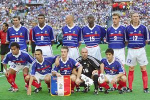
(Image courtesy of Grailed)
EXTRA TIME
Can we talk about the Suns’ Valley jerseys for just a second?
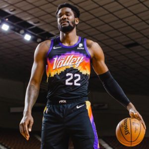
(Photo courtesy of Bright Side of The Sun)
These things are absolutely killer, and I can’t wait to see them wear them in the NBA finals. Honestly, I’ve got nothing more to say on them than that; they’re just incredible, and the court they’ve got to match brings it all together.
Agree? Disagree? I miss something? Hit the comments.

i really want that Club America pre-match jersey but have delayed for out inevitable triumph over them. like beating a Canadian hockey team, i’ll drink their beer after.
as for Forward Madison, love their attitude and welcome them pushing design and innovation. imagine having a poor first half and flipping over to something cooler for the second than what you were wearing. inspiring. imagine the fans doing the same. like rally caps in baseball