Home field advantage is a phenomenon we have long understood to be true. However, why it is a true factor in predicting the outcome of matches is not entirely clear. Without knowing exactly why this is an issue, many people propose common sense theories and many of us go on accepting these logic-based arguments on merit.
This series (non-regular, I will post when analysis is complete) is part of an attempt to investigate some of the common theories for statistical support or debunking.
While we begin today with the traveling demands in MLS, I am in the midst of also analyzing the influence of crowd size, fouls/referees, scheduling, and, if I can think of a way to analyze it with the data available, defeatism (performing worse on the road because one expects to perform worse on the road). If anyone has other suggestions for investigation, please put them in the comments. No promises, though.
The whole of this article uses data from 2010 through 4/17/2017 and, with one obvious exception, uses exclusively MLS data). The distances were calculated using Google Maps. You can view Philadelphia’s distribution in the appendix at the bottom of this post.
Home Field Advantage
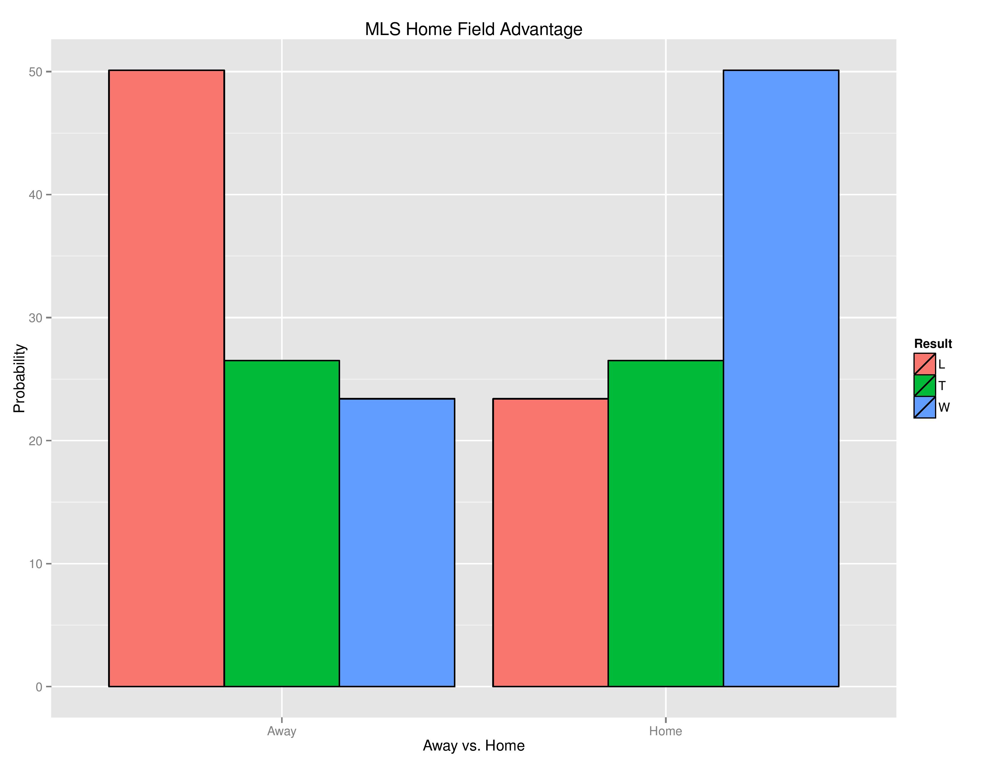
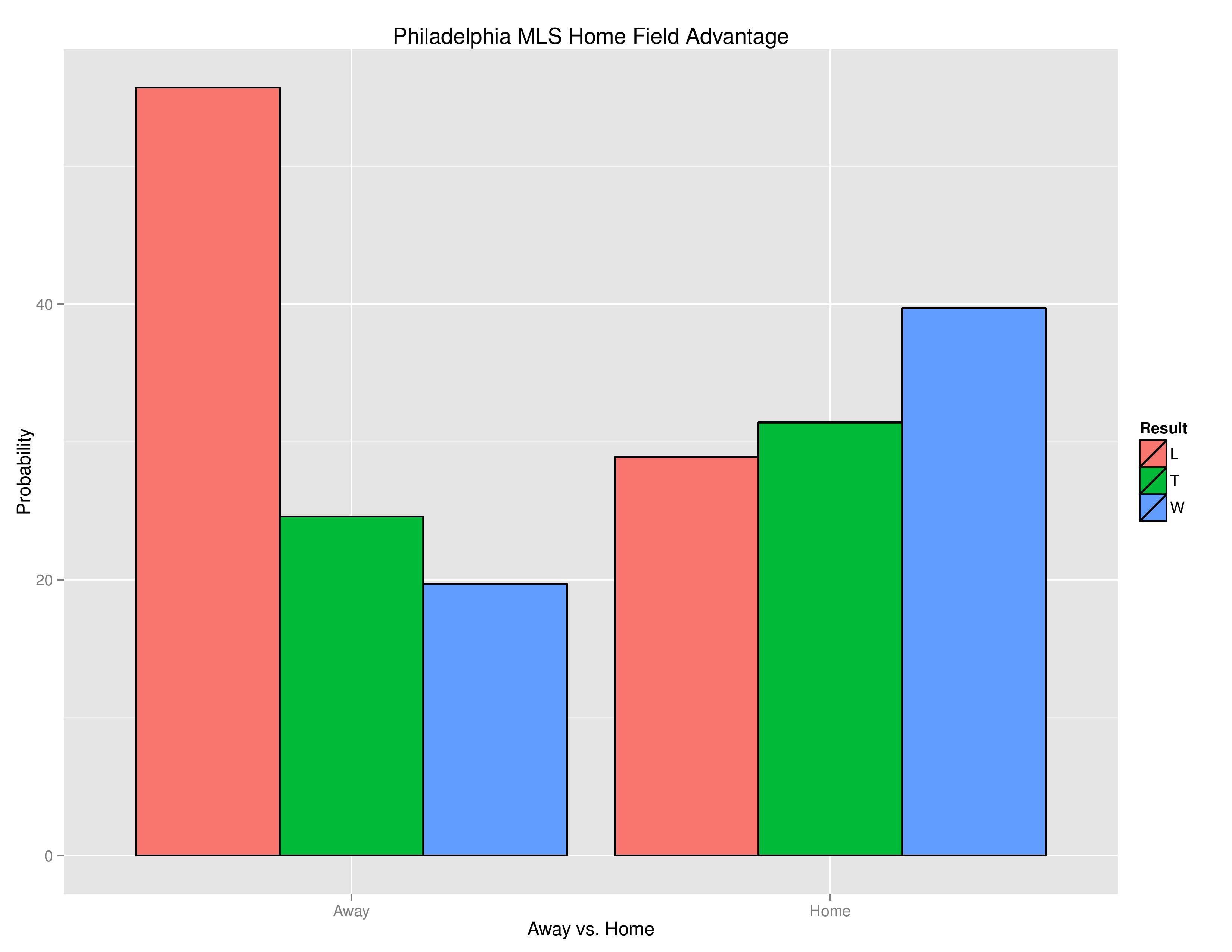
Before we get into why home field advantage exists in MLS, we should probably start with proving its existence first. Below we see the simple distribution of match results by Home vs. Away.
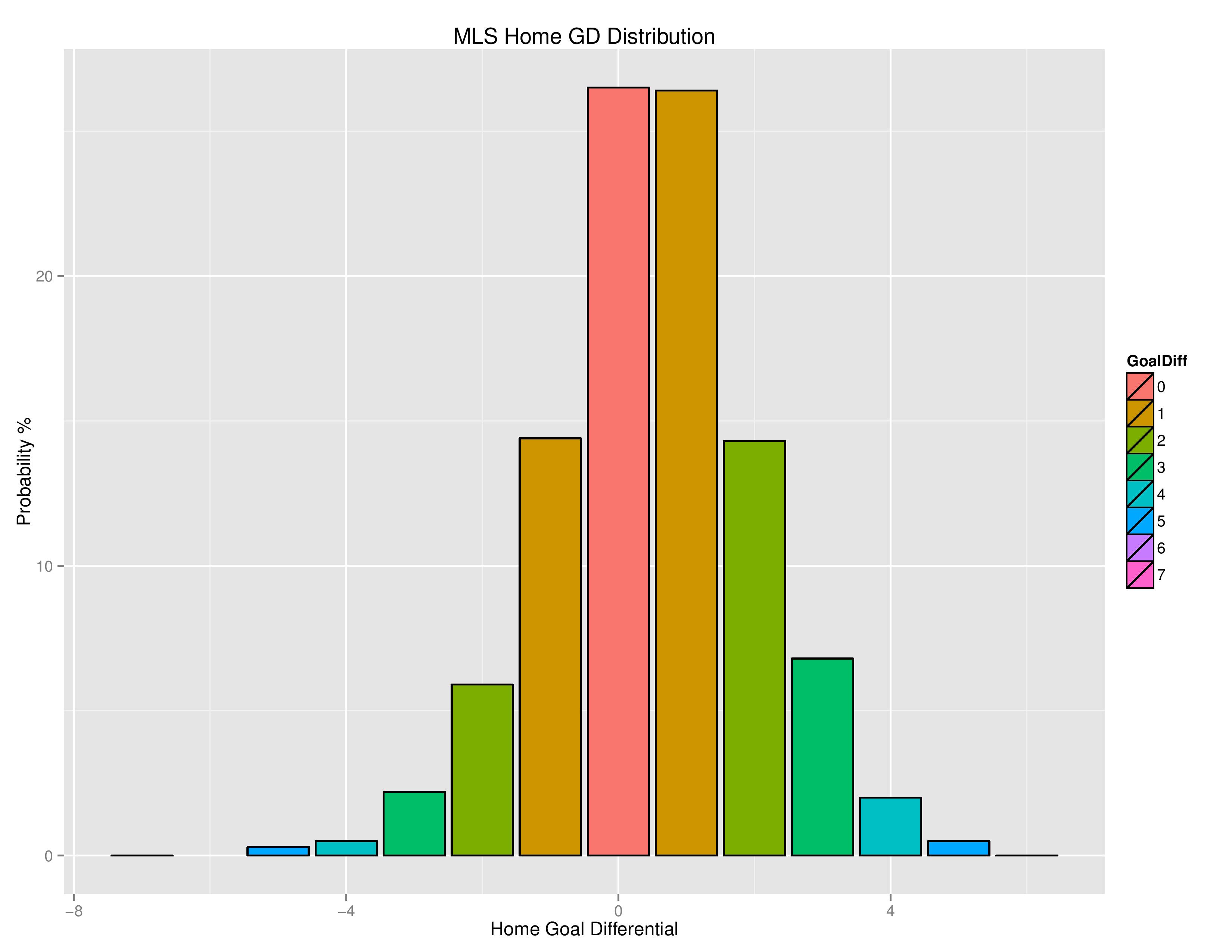
Not only do categorized match results skew towards Home clubs, but all manner of goal differential is affected by home field advantage:
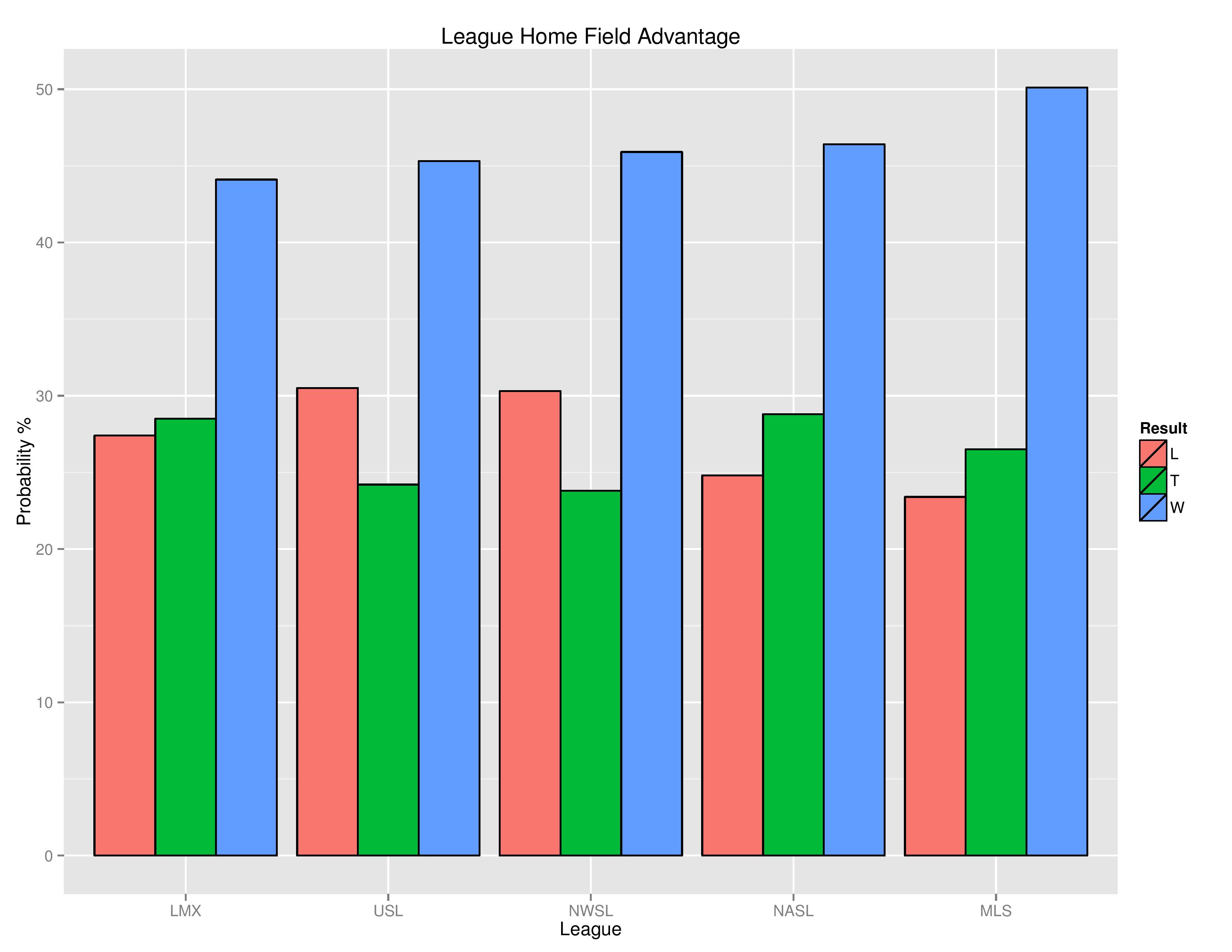
While MLS has among the largest degrees of home field advantage, you can also see its advantage in other leagues (LMX = Liga MX).
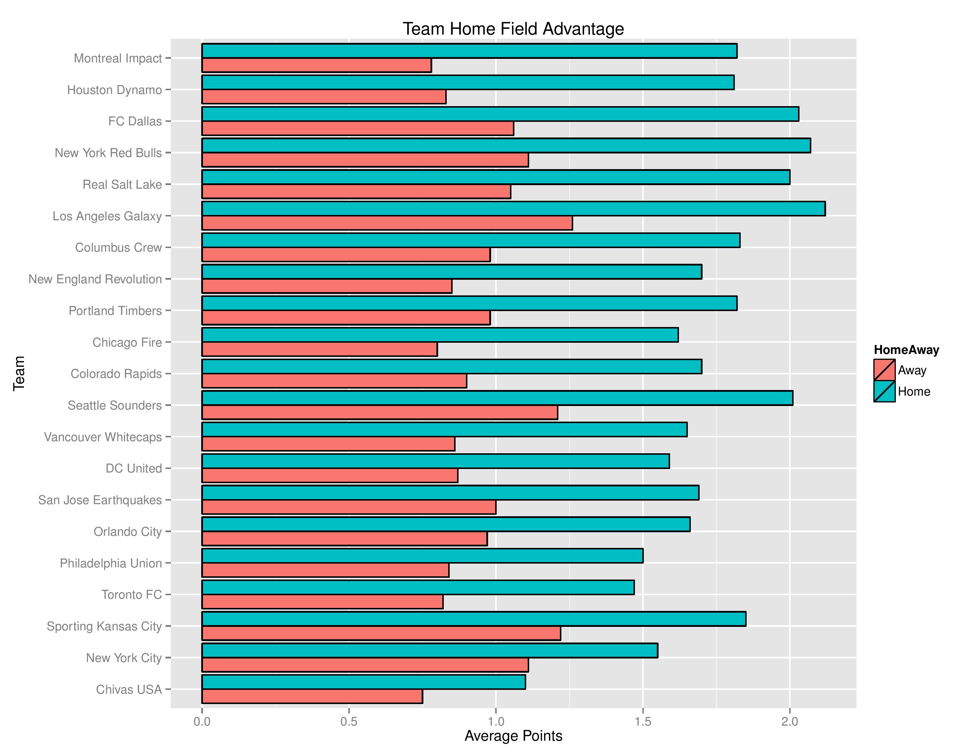
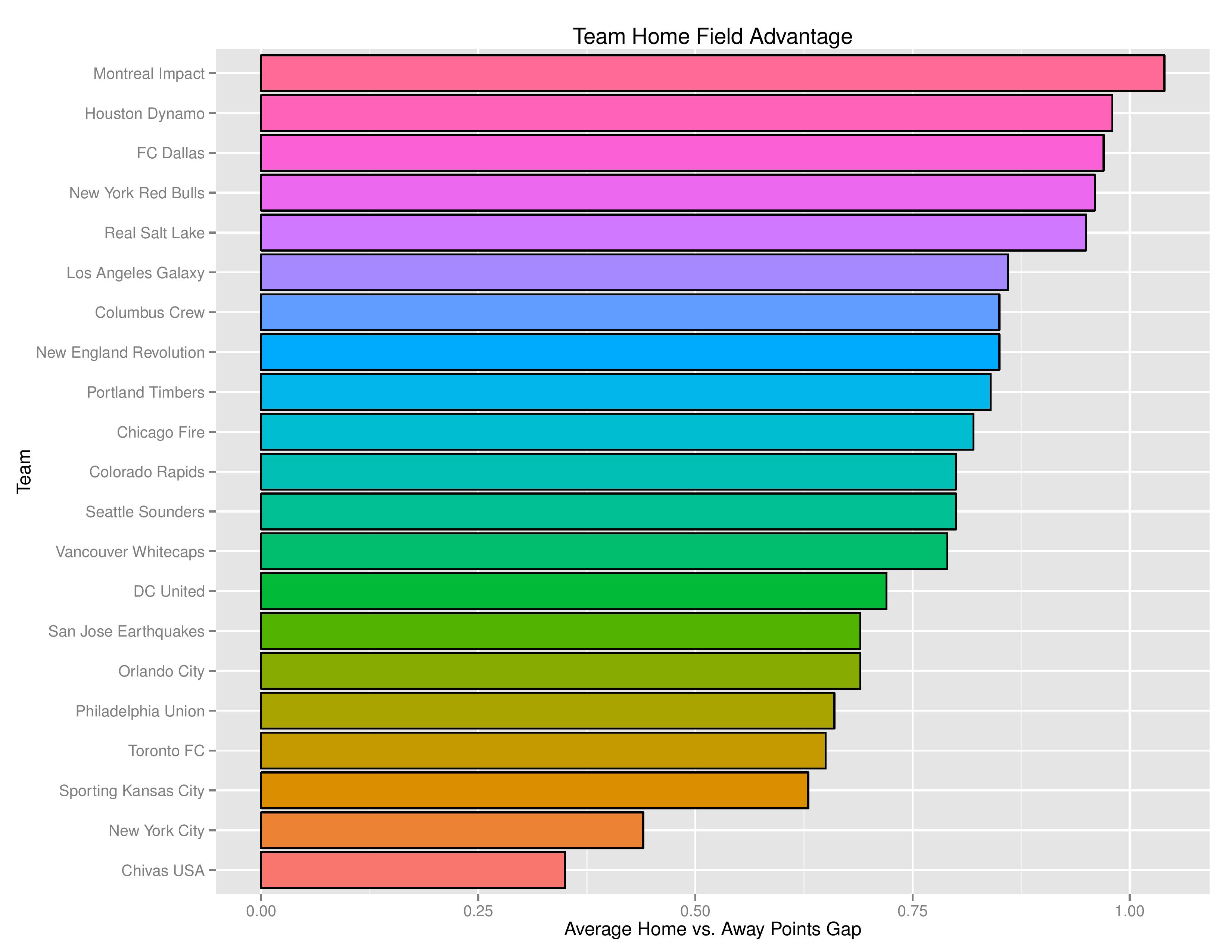
The following shows how the advantage has impacted each MLS team (expansion clubs Minnesota and Atlanta are excluded due to their small sample size). These are sorted by the points gap between Home and Away.
This tells us is the phenomenon is not limited to some clubs vs. others, nor is it clear whether some clubs have a stronger home field advantage or whether the difference is simply based upon team skill over the time period.
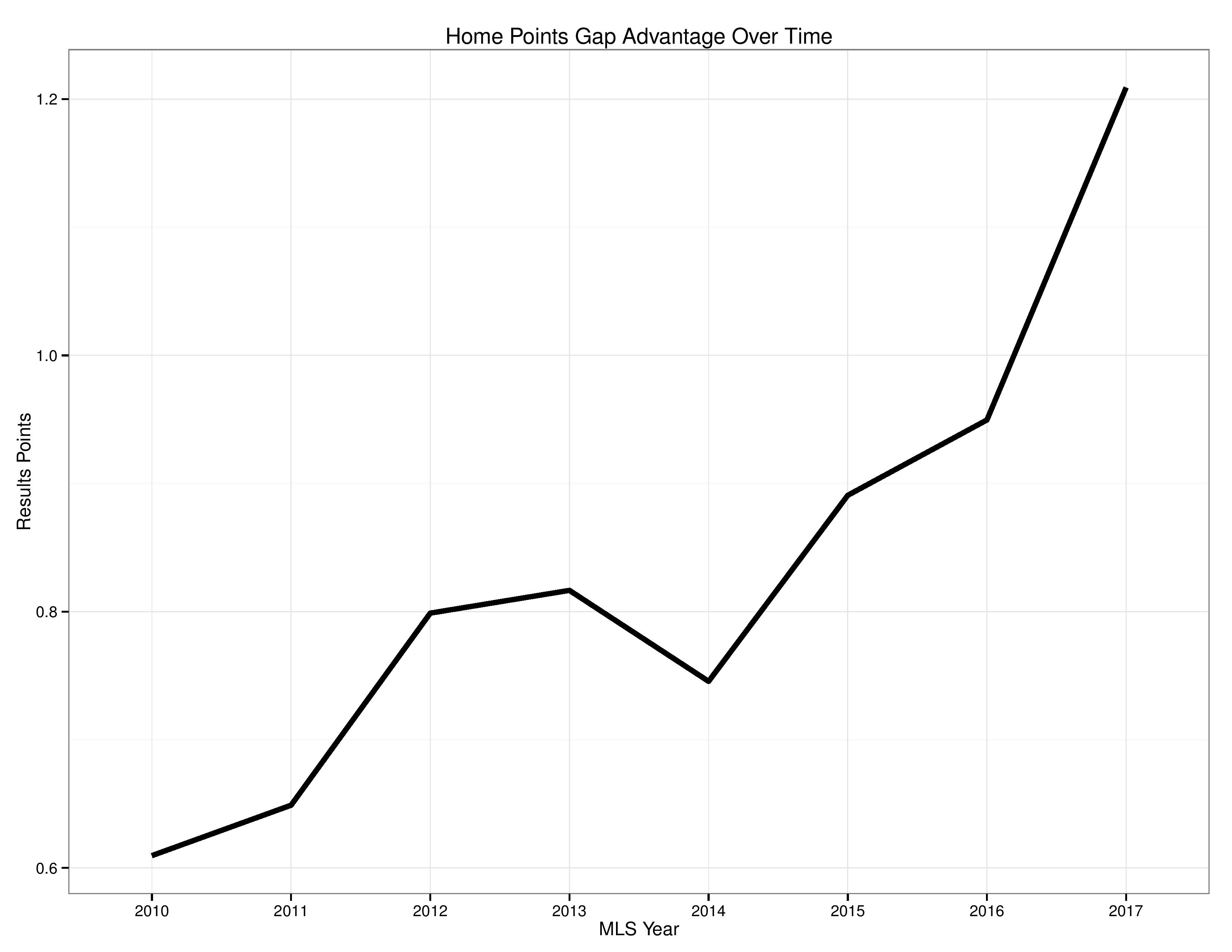
The following is the same as the preceding graph, except that it simply shows the points gap between Home and Away.
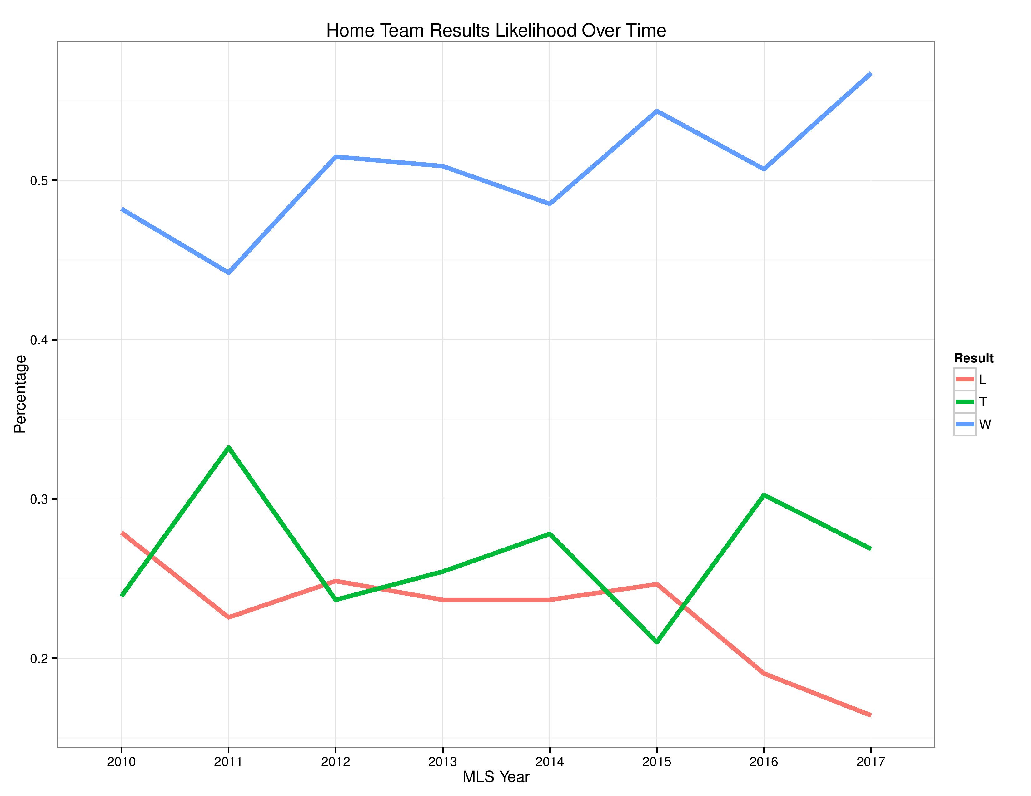
The following also shows how MLS home field advantage has evolved from 2010 to 2017.
More directly, we see the points difference between Home and Away clubs over time, generally showing an upward trend.
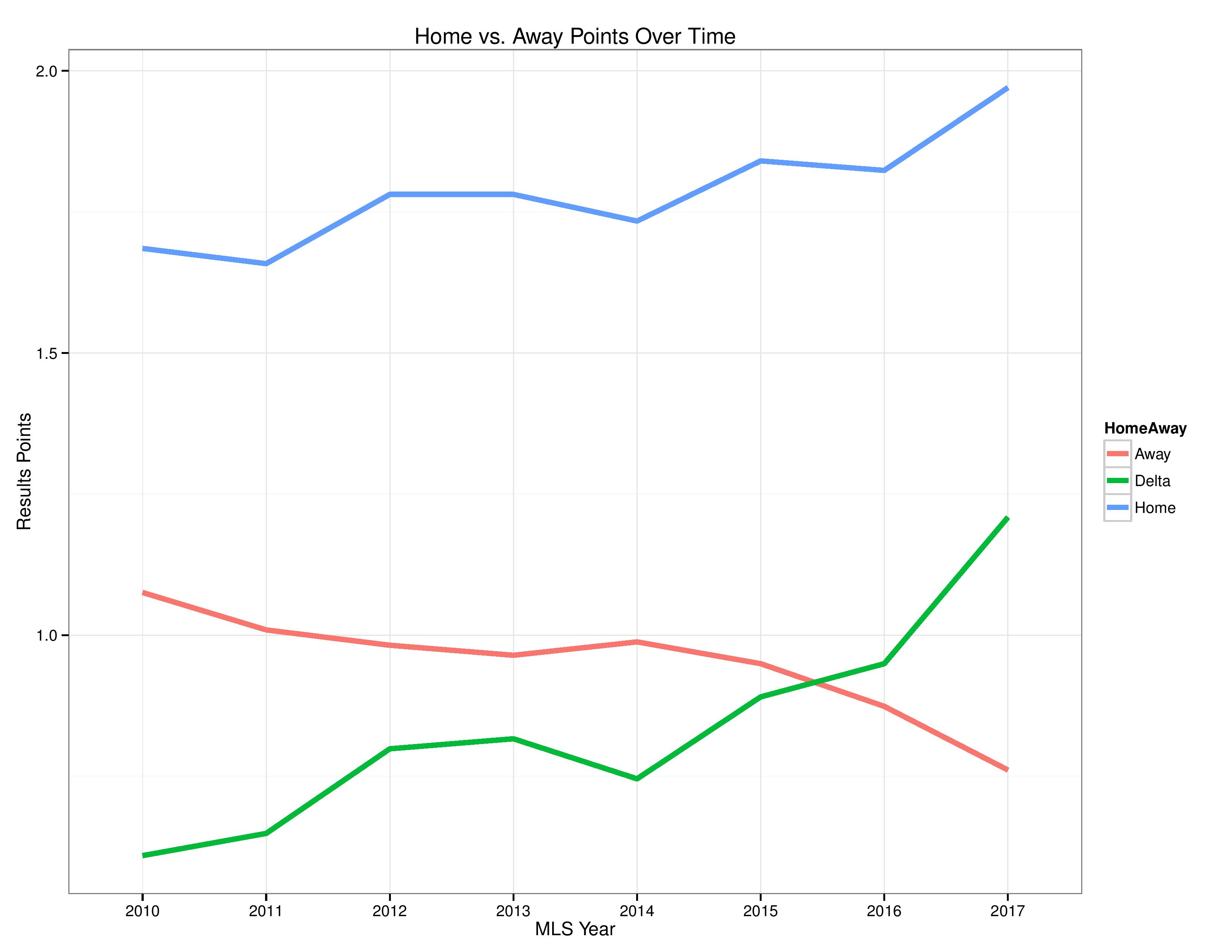
The following shows the points over time for Home and Away (with the green “Delta” line representing the gap from the above chart).
Common theory #1: Traveling
One common theory to explain the Home/Away gap in team performance is the grueling travel required by a USA/Canada league, where clubs are substantial distances from one another.
For that research, we start with mapping how Away teams score points compared with the distance they travel.
- The dashed red line is a linear approximation to the relationship between points and distance. This is good for avoiding overreactions to small-samples, but it forces an assumption of a linear relationship.
- The curvy blue line is a locally-weighted average. It is helpful for gauging patterns in data, but it can also be prone to overreaction to small amounts of data.
- The lighter blue shade is the confidence interval (think margin of error) around the curvy blue line, which will help demonstrate where we have small samples.
- The dashed, vertical black line is a reference point. This point is based off of the player’s union collective bargaining agreement with MLS that distances 250 miles and up require air travel.
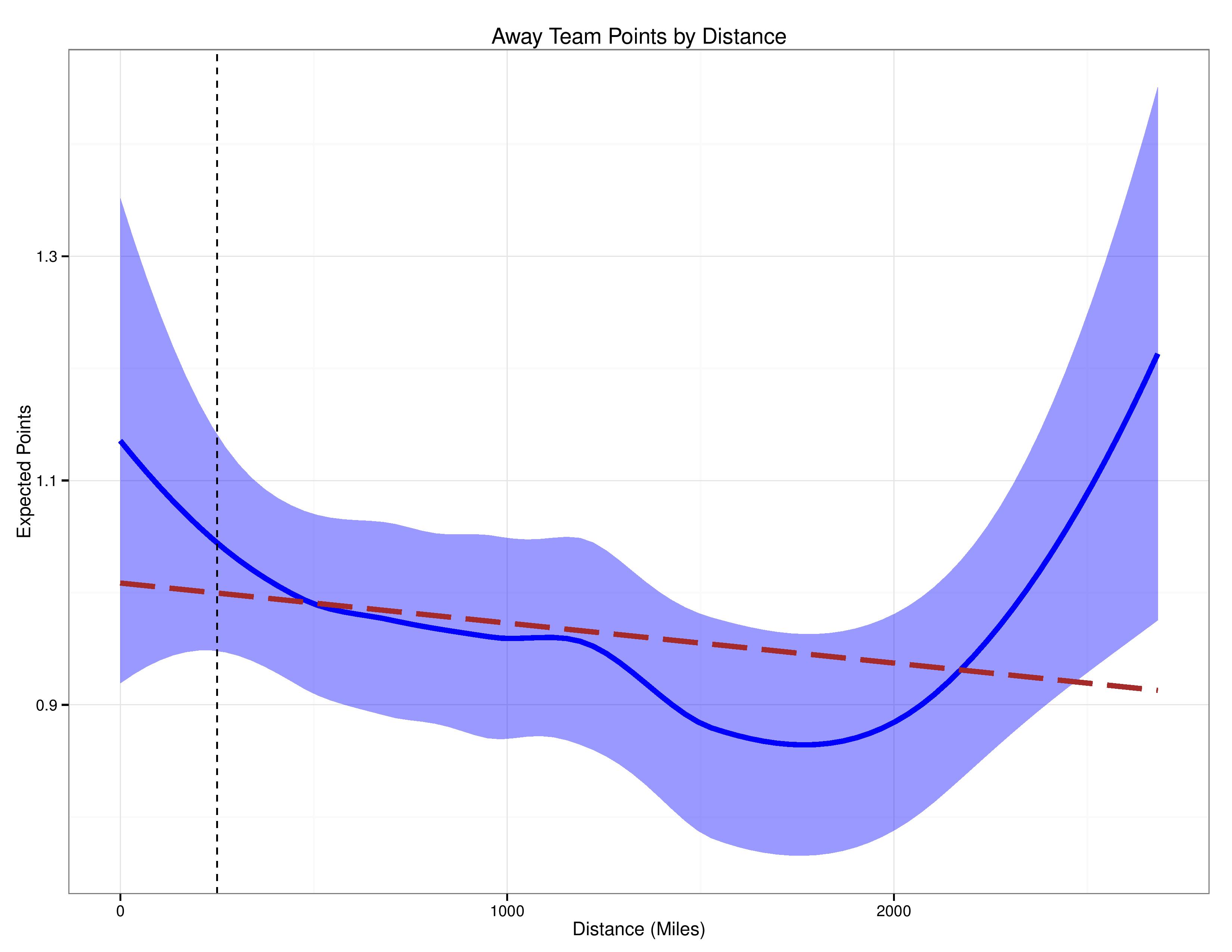
We can see with the above that, in general and as suspected, away team performance declines as distance traveled increases.
What is odd is that after around 1700/1800 miles, away team performance actually beings to increase, and after roughly 2200 miles, performance of away teams actually improves beyond more moderate distances.
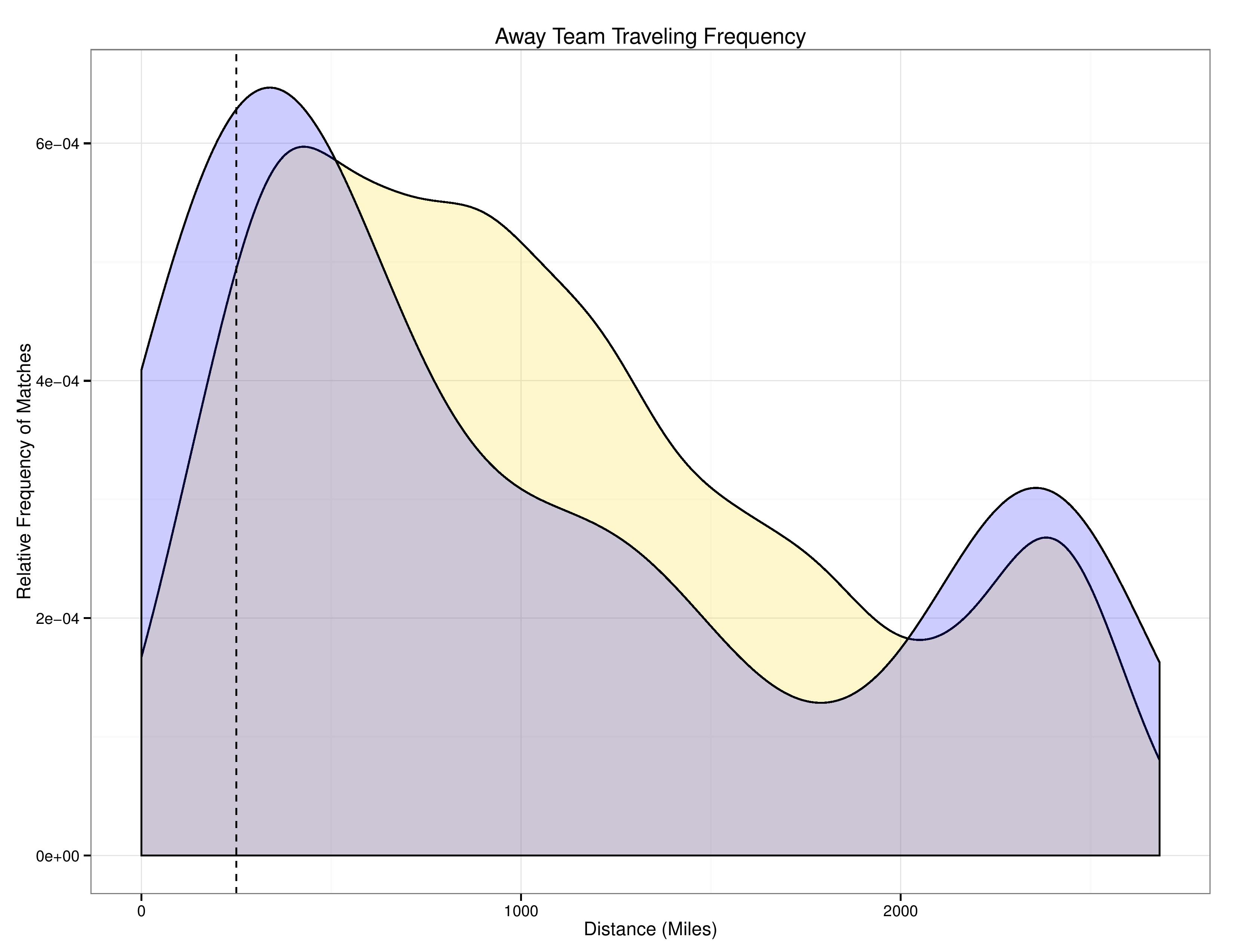
If you’re wondering if that is due simply to small samples, the following chart shows the relative frequency of matches at different distances (the y-axis is the relative density of matches). Again, this includes data going back to 2010.
The gold shape is MLS as a whole. I included the blue shape as a reference, which shows Philadelphia’s relative frequency of traveling distances.
The following chart shows, instead of points, the probability of different results by distance.
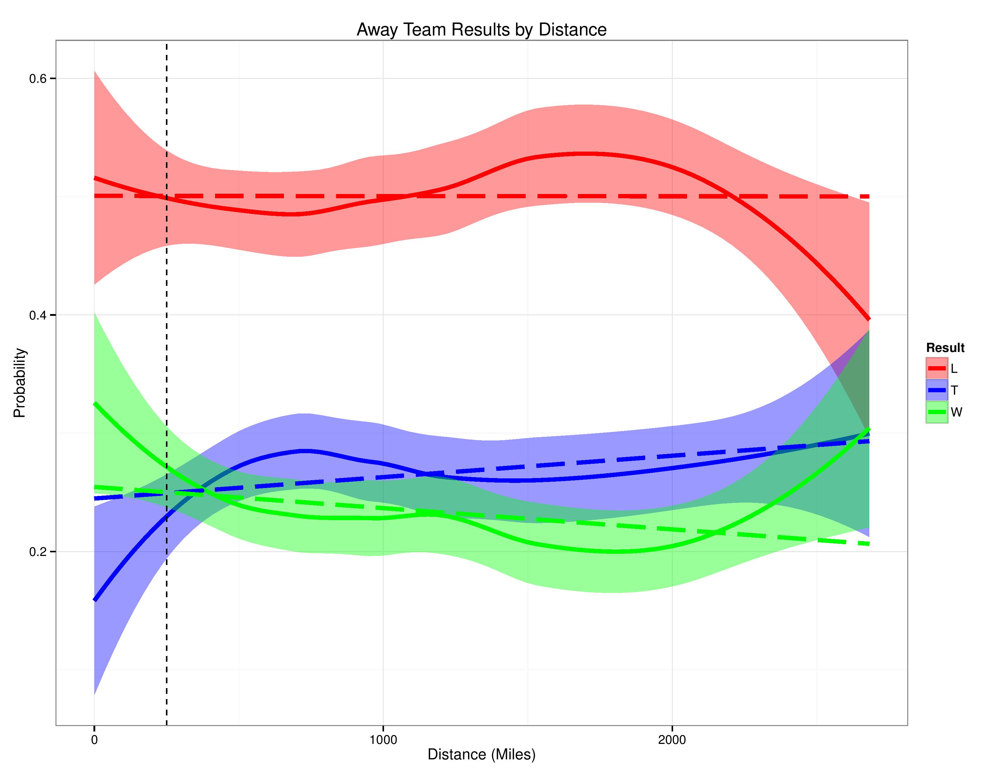
What this chart shows to me is that, in general, as distance increases, away teams start taking more draws and fewer wins.
The odd phenomenon of performance increase after substantial distance emerges here as well. The pattern of draws increasing with distance appears to continue, but the rate of away team wins begins to drastically increase at the expense of the rate of losses.
The following chart is the same as the previous, except that it treats ties as if they don’t exist (or as if the results were inconclusive and require removal from the data set).
This will allow us to see a little more closely the way distance affects positive and negative results.
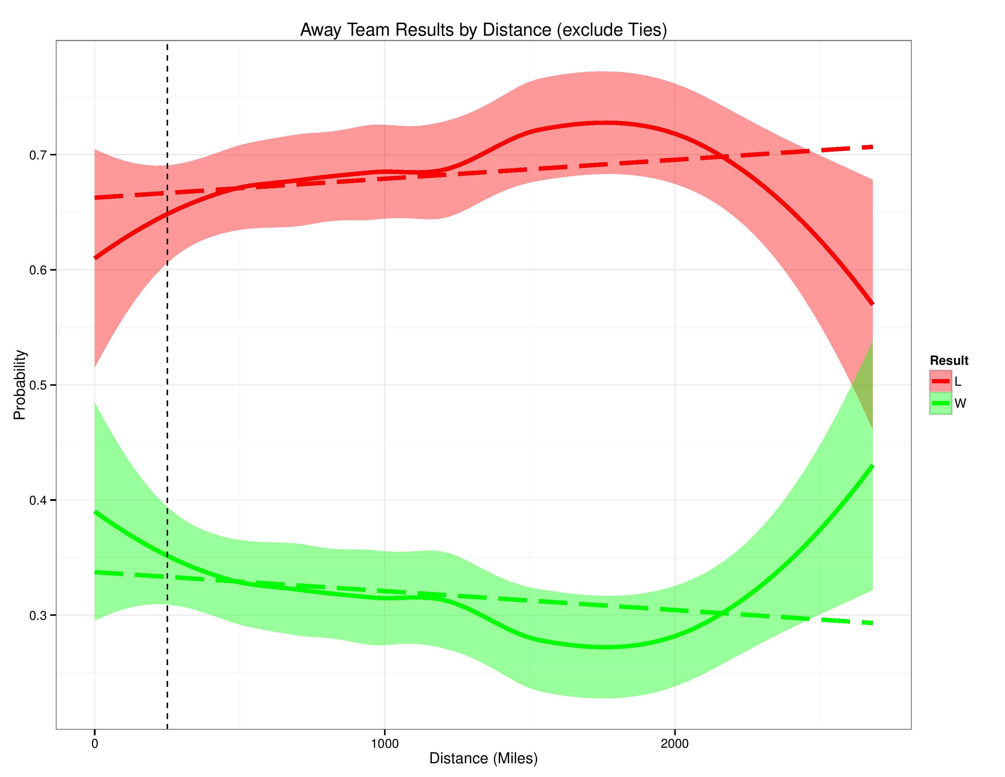
This chart shows us, again, that distance has a negative influence on away team performance… until that travel reaches roughly 1700/1800 miles, at which that distance begins to improve team performance.
The following chart, instead of treating distance as a continuous variable, groups distances into buckets and evaluates the points away teams earn within them.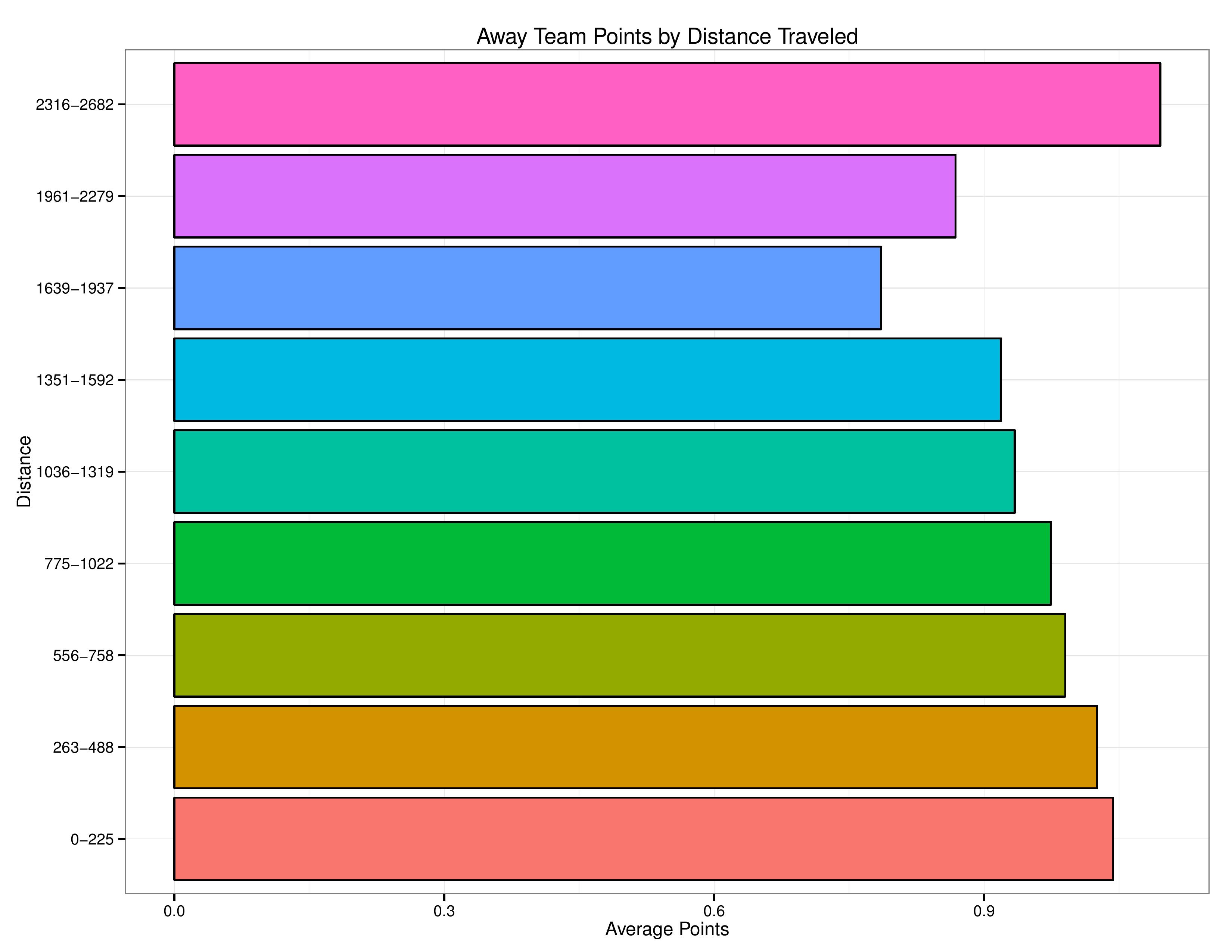
We can see the clear pattern emerging here again.
Previously, we have only been examining traveling distance in a ‘univariate’ context. That is, we are examining distance’s influence on team performance without regard to potential, confounding variables.
For example, Seattle has been mostly good since 2010 and are likely to travel far distances for their matches. It is possible that the phenomenon we have been observing is merely showing that better teams have happened to be located in areas which have to travel substantial distances.
The following chart uses a model to adjust for team & opponent skill before assessing distance’s impact on performance. This is what is referred to as a “Residual Plot.” This maps how a model’s prediction errors (residuals) interact with variables. If the error appears to be correlated with a variable (say… distance traveled), it is a pretty good indication that the variable needs to be factored into the model’s calculations.
- As before, the red dashed line is a linear approximation of the correlation between the errors and the distance traveled.
- As before, the blue curvy line is non-linear and is more sensitive to the data points near the given distance than those further away.
- The grey dots are the residuals. Those above 0 indicate that the model’s prediction over-estimated the away team’s likely performance, and those below 0 indicate and under-estimation of the away team’s likely performance.
- The size of the grey dot is due to their weight, which in this case, represents the goal differential of the result. The model is configured to consider the error of predicting a win for a 3-0 loss as a more serious error than that of a 1-0 loss.
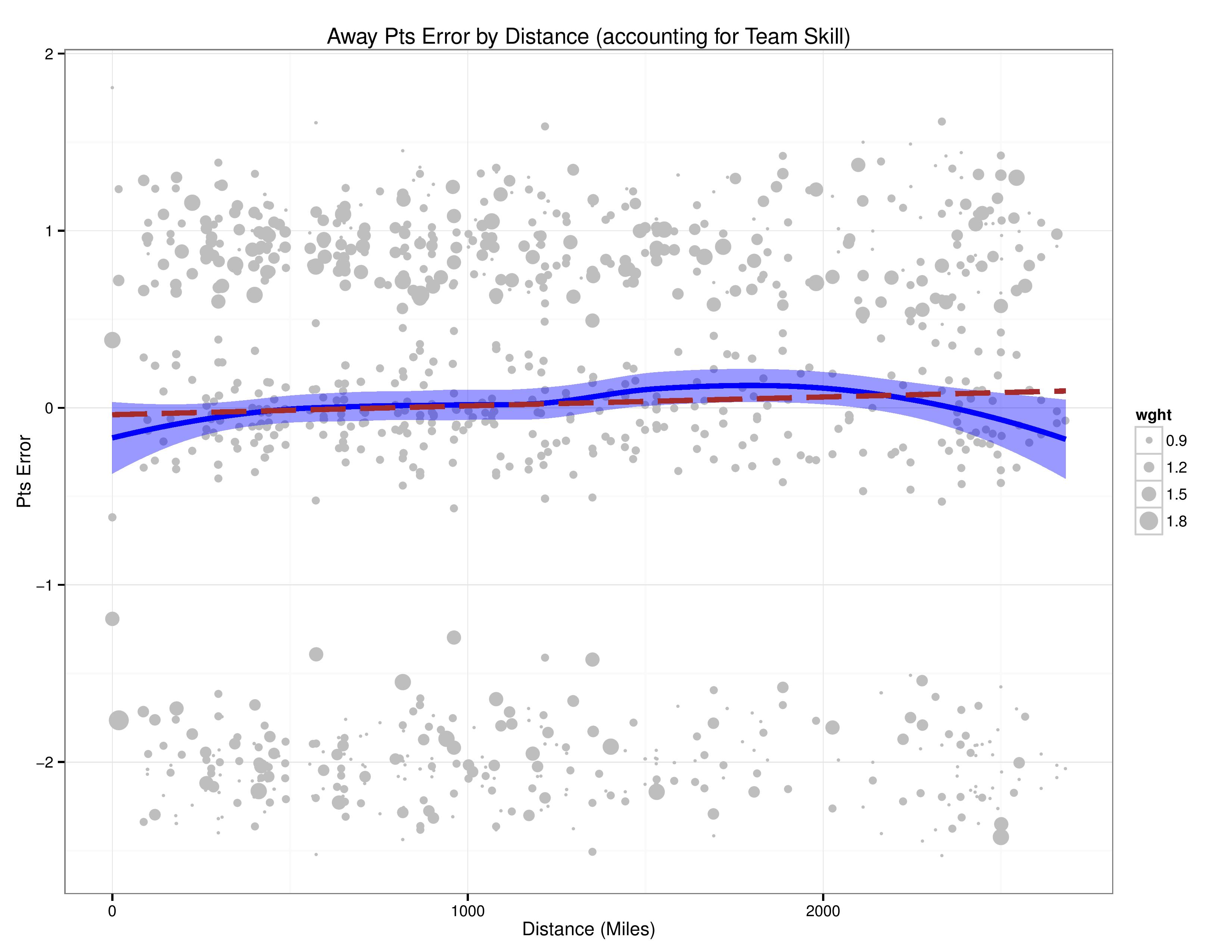
As shown above, similar results exists as we saw before. It looks like the differences are far more nuanced, but it is important to remember that the scale on the y-axis is very different.
What this chart is telling me is that a model without distance-traveled factoring in tends to overestimate teams traveling roughly between 1300 and 2000 miles while underestimating teams traveling fewer than 250 miles or greater than 2400 miles (all numbers are rough approximations).
The following chart shows the residual plot after factoring in Distance into the model.
- As distance’s impact on team performance appears to be non-linear (that longer distance does not always lead to worsening performance), it was included by using the 9 bucket groupings of distances shown in a previous chart, and treating all observations within each of them as having the same impact on team performance as the rest of their group.
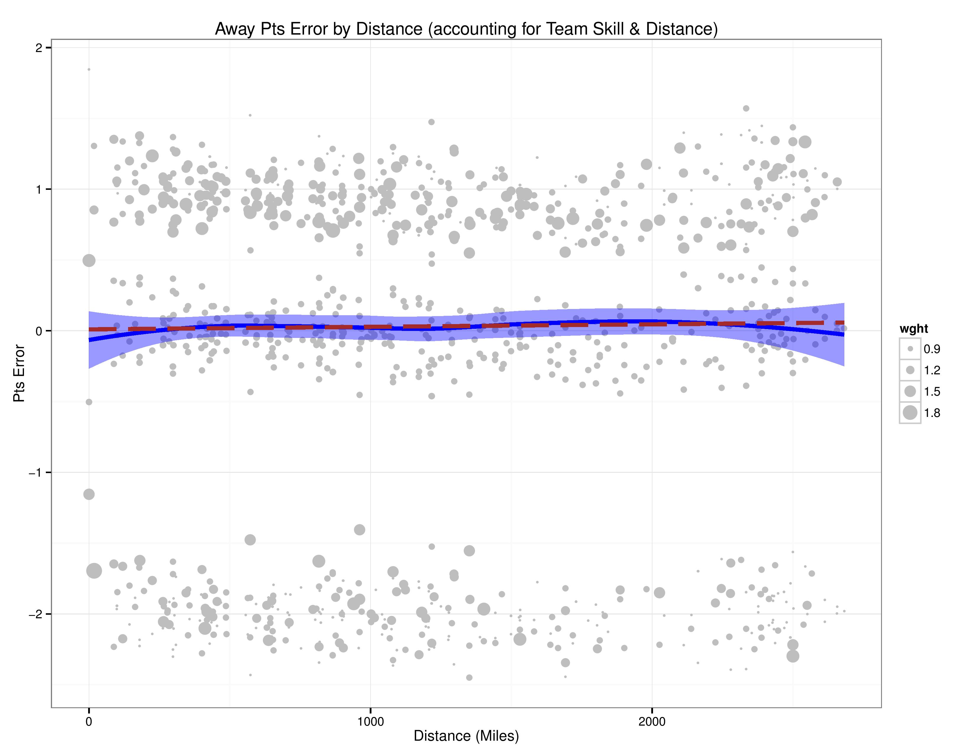
We can see that the model improves substantially in the error’s correlation with distance. It is therefore worth factoring into a predictive model.
Conclusion
- It is safe to say that distance traveled has an impact on team performance that can partially explain home field advantage, although not entirely in the manner we would have logically expected.
- It is, however, by no means an explanation of all of home field advantage, nor even a majority of its explanation.
- Performance declines when teams travel lower and medium distances for matches, but actually begins to improve when facing the farthest of distances.
My best guess at explaining the phenomenon of long-distance travel improving performance over moderate travel is that, when facing such distances, clubs tend to go a day or two earlier than usual to get accustomed to time zones and prepare to compete at a high level.
I reached out to the Philadelphia Union’s press office to ask if they can tell me anything about MLS or Philadelphia’s travel policies for such distances, to bolster or debunk this theory, but I have yet to hear back.
There are other possibilities, such as, perhaps, home squads being overconfident when facing a long-distance guest, but that was outside the scope of this particular research.
Appendix
The appendix is here to show charts people might find interesting, but which were not important for the conclusion being drawn. If you’re still reading, enjoy!
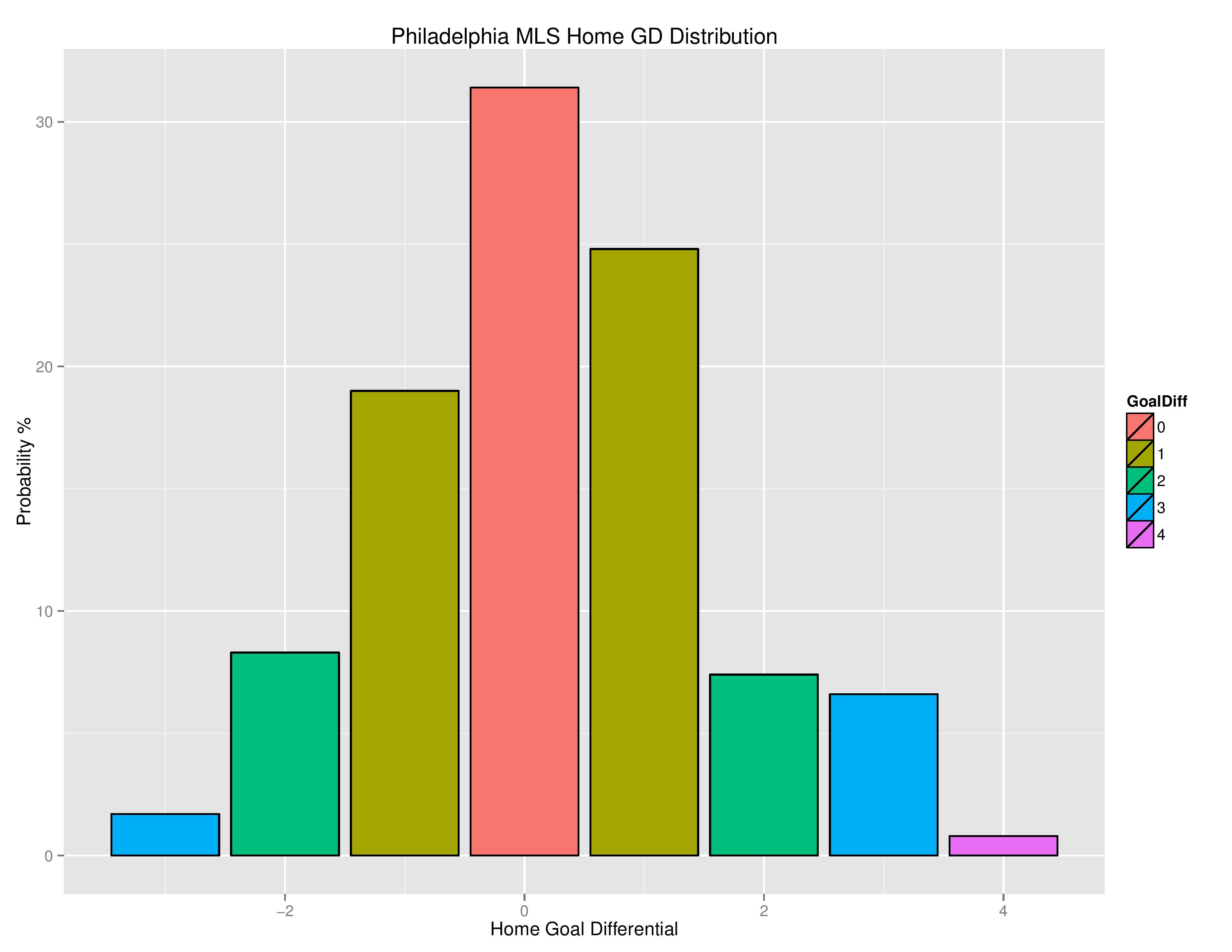
The following is the home field advantage distribution for Philadelphia.
The following is Philadelphia’s goal differential distribution for home matches.
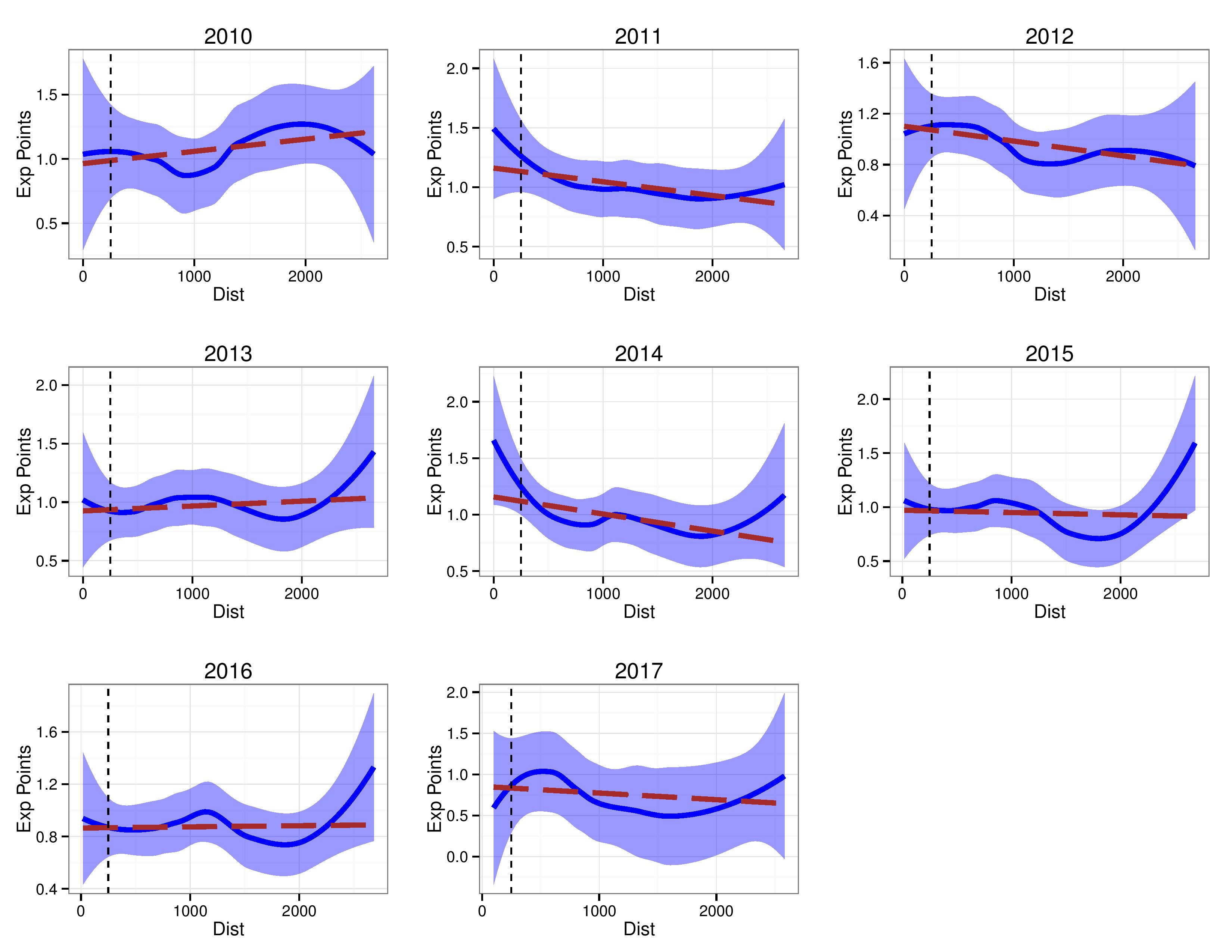
The following shows Away points vs. distance traveled for each separate year.
Please note that the y-axis scale will change for graph to graph.
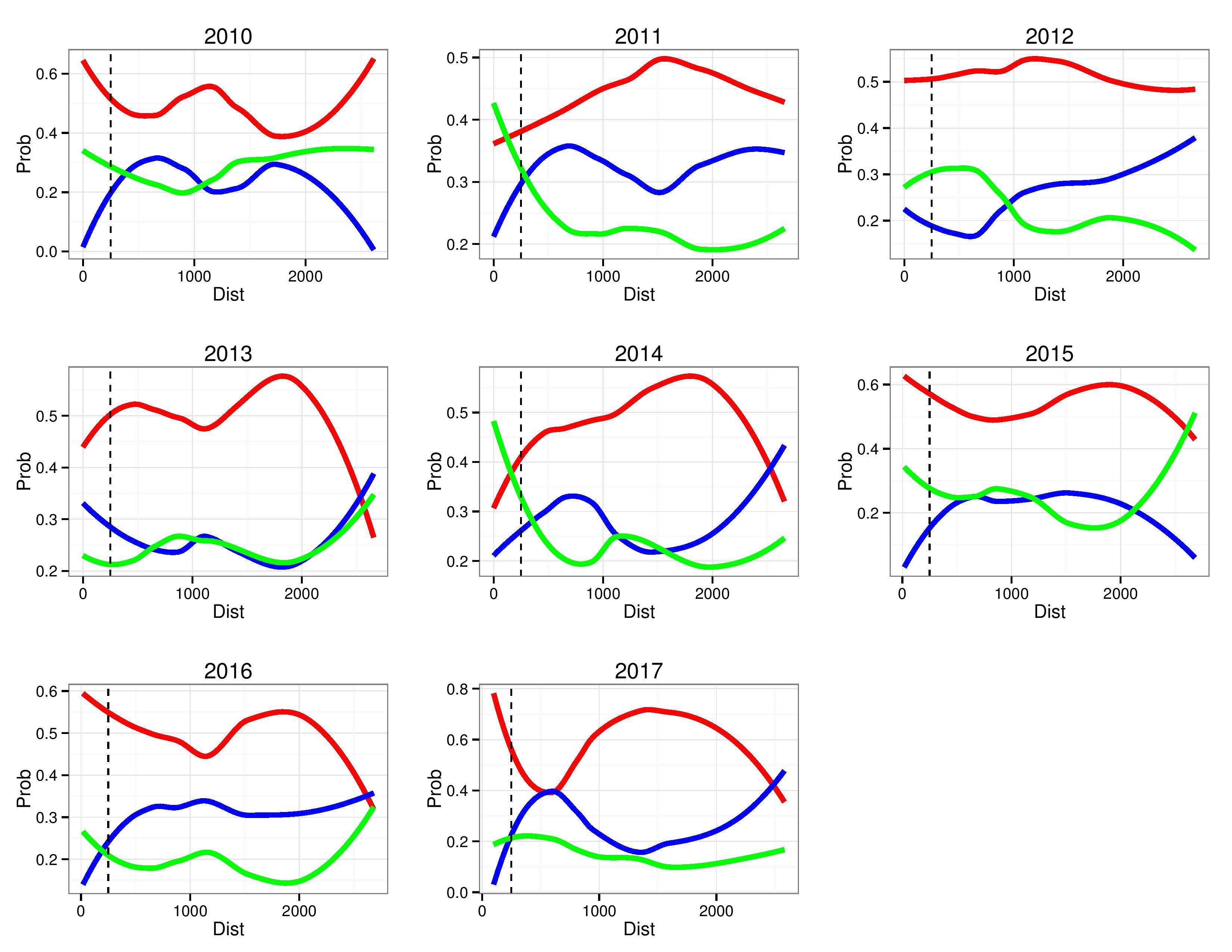
The following shows Away-team-results-probability vs. distance traveled for each separate year.
Please note that the y-axis scale will change for graph to graph.
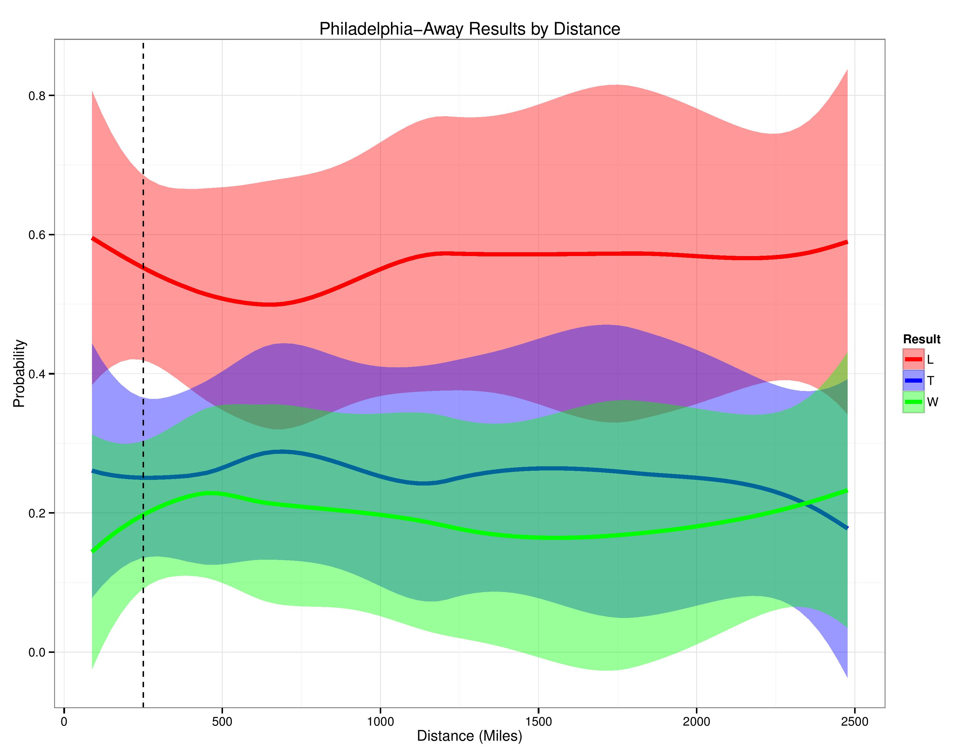
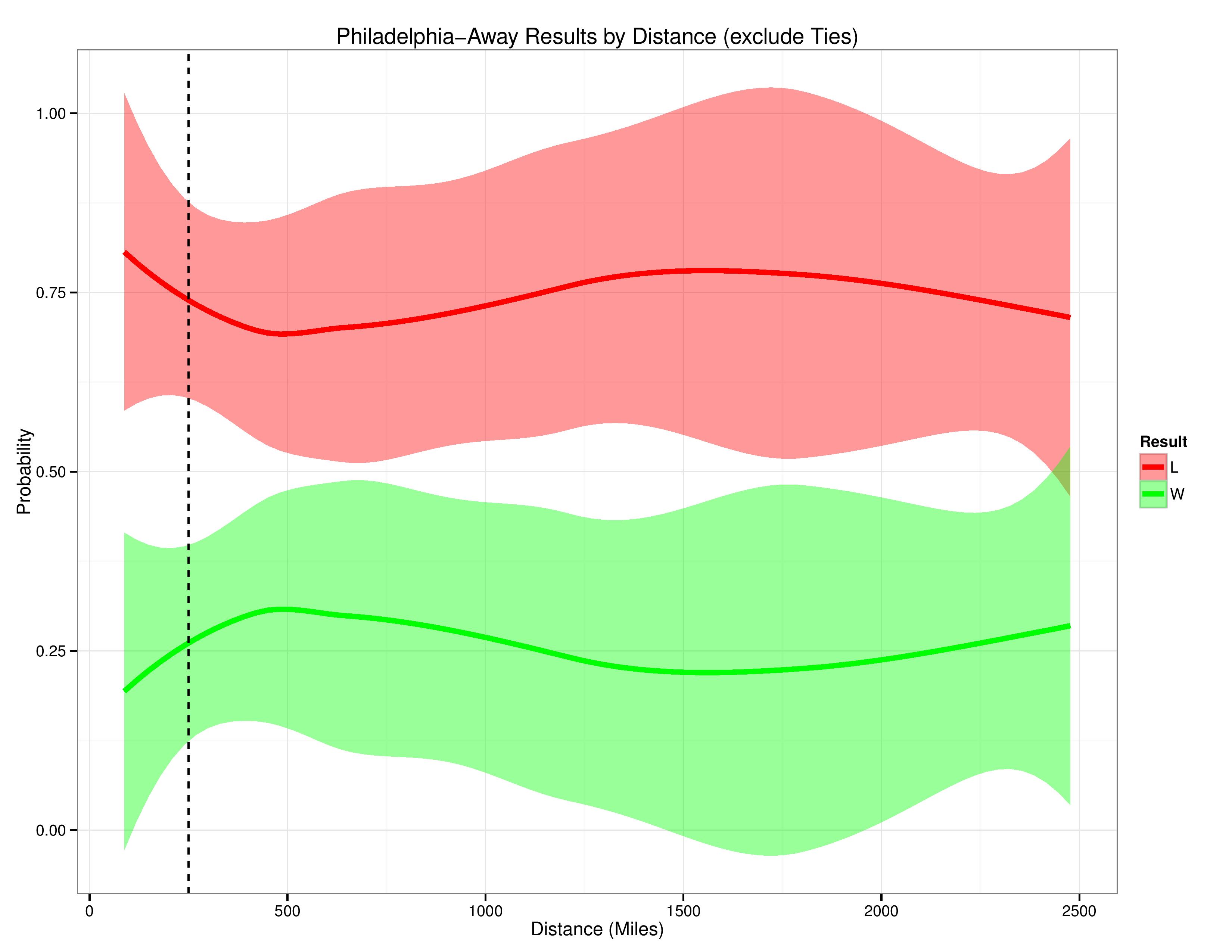
The following shows Philadelphia’s results vs. distance-traveled.
The following shows Philadelphia’s results vs. distance-traveled while excluding ties from the data set.
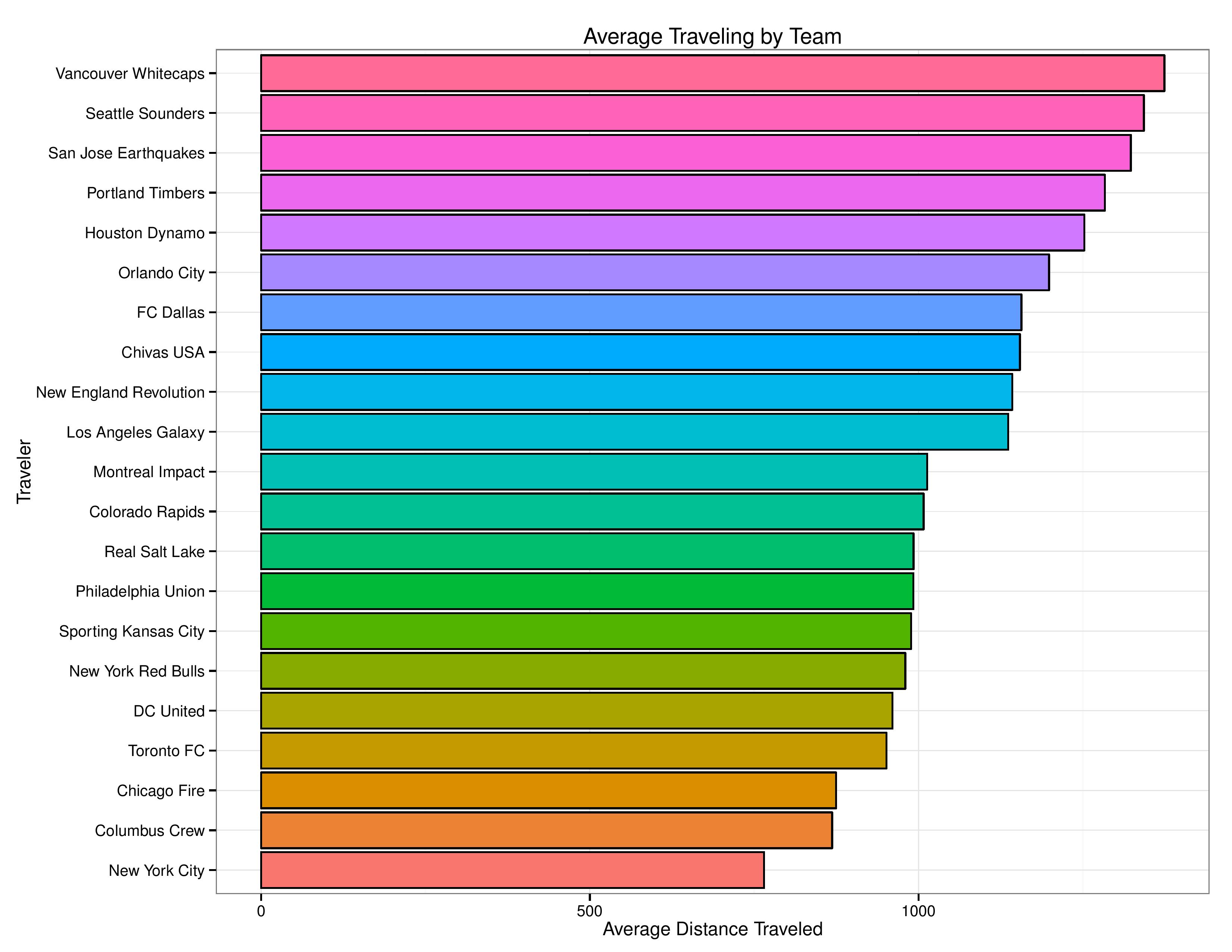
The following shows the average distance each team travels for away matches since 2010.
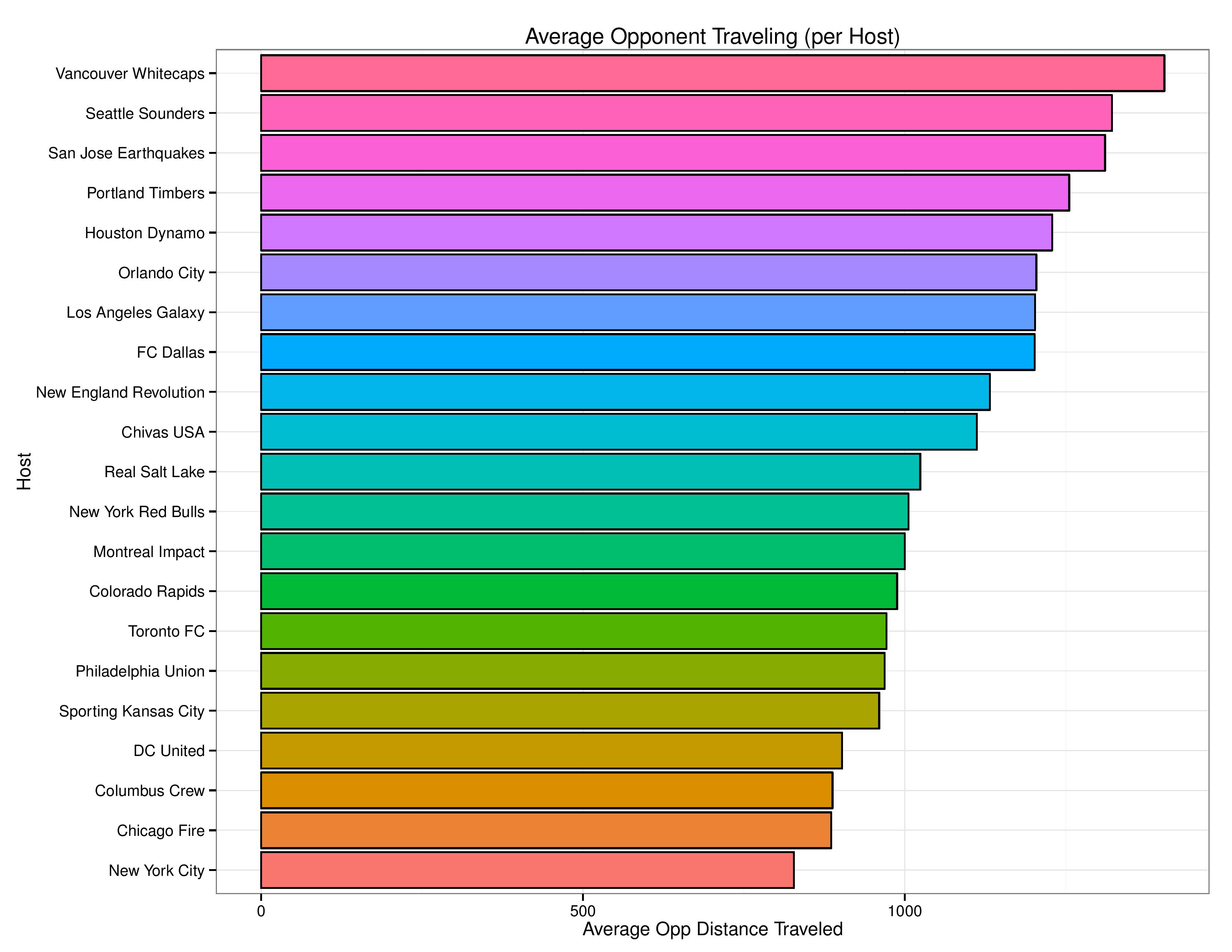
The following shows, for each host, the average distance opponents travel to visit them.

Synopsis:
Union aren’t very good at home-
Really suck on the road
This is fascinating! I can’t wait to read the rest of your investigation into the other factors. Thank you.
.
Once you get to the bottom of this, your next investigation should be into why CJ can’t get a call.
Yes, please, I would love to know why refs can’t see him getting hacked
This was a pleasure to read. Thank you!
Agreed
A few factors I would look into, based on other sports:
.
In the NFL, it has been suggested that game time is an important factor. An East Coast team playing a 1PM game on the West Coast is essentially playing a 10AM game. A West Coast team playing an 8:30PM game on the East Coast is essentially playing an 11:30PM game. I don’t know how much of that is a factor here. Day of the week may also be a similar factor to look at.
.
In this article http://www.thefixisin.net/homefield.html, it points out that the big difference between home team and away team is that refs favor the home team. You may want to look at fouls, penalties, cards, PKs/FKs awarded, even offside calls to see if there’s a statistically significant difference home and away.
.
I look forward to reading more!
When have we ever had home ref advantage?
I like the idea with the time of game and generally considering the time zone. It could be an extension of this distance analysis.
–
Yeah, refs/fouls are on the queue because I believe they do impact the home field advantage. HOWEVER, as a spoiler of the disclaimers I will loudly announce in that piece, it is very hard, from the data at hand, to separate referee bias from other factors in fouls. For example, Away teams are more likely to protect a tie at the end of the game than a home team and so may bunker in, which is likely to cause fouling too.
OOOh all the pretty colors.
Another factor may be appropriate rest due to scheduled next game.
.
Bethlehem Steel flew to Louisville last year because they had afterwards a Tuesday game in Harrisburg.
.
I very much support your tentative explanation that the longest distances provoke special behavior by the clubs.
.
USL eastern conference uses a lot of bus travel. In the Steel’s usage, roughly, and travel significantly longer than ten hours on a bus leads to flight. I expect the Steel to fly to Orlando and Tampa and St. Louis.louisville is right on the edge.
USL western conference has only a few potential bus trips, on the other hand.
The travel differences between the conferences are striking. RIo Grande
Valley v Vancouver B is a long flight.
Bus v flight would be an interesting variable to explore.
Interesting idea. I had Rest in between games as a future study factor for outside of Home Field Advantage, but it may be interesting to combine that analysis with HFA to see if the impact shifts.
–
In MLS it didn’t appear as if bus vs. air made a difference apart from distance (although that is, in part, because so few matches are within 250 miles mandated by CBA). I can’t promise I’ll do research on USL given a long list of research topics, but do you know if they have a standard threshold for flying?
Actually, this may be a point. MLS flies commercial. The longer the flight distance, the potential for a direct flight. Those middle distance games can involve connections, so while PHL-LAG is longer miles, PHL-RSL may involve more actual travel time. Remember too, PHL is an American hub, so I’d think road trips to CHI/LA/FCD are a snap. As a frequent traveler myself, there are some cities that are just aright PITA to get to. SKC would be one. So maybe there’s a way the travel manager would share the typical flight itineraries for the U to better gauge the effect. Also, if you’re flying a dreamliner to VAN vs a 737 to Orlando, there’s better ventilation systems, reduces jet lag, etc.
.
File all of this under “comments a few months late”, but an “acclimatization” metric taking into temp/humidity (OCSC, HOU), altitude (COL/RSL), flight distance (west coast teams), general malaise (CMB) would be interesting.
Good
I wonder if it would be interesting for MLS to look at the defeatism argument with respect to position in the table. I.e – teams at the top possess more confidence and are less susceptible compared to teams at the bottom. For a while, the Union had the odd habit of performing better on the road. I had always theorized that young players without as much experience may feel under more pressure to perform at home, and very susceptible to any negative feedback from the typical Negadelphia fans. How to test this, I have no idea.
The fact that the travel trend starts to reverse is surprising. Maybe at that point it’s long enough that everyone gets some sleep on the plane out of sheer boredom?
A possible explanation for the uptick in performance after 24k mi may have to do with the relationship between conference versus out of conference tactics. Travel of that distance likely suggests an out of conference match-up which often yields more aggressive tactics. I’ve read quotes from a few MLS coaches (Caleb Porter comes to mind) who say they play for a win when away to out of conference foes since giving their opponent those three points means less than giving a conference foe three points.
or could be because the medium distance travel typically ends up being from east/west coast to middle of the country (and vice versa). Not sure you can isolate that variable from your analysis. Could the teams in the middle of the country skewing the results? (Columbus, Kansas City, Chicago, Houston, RSL, Colorado, Dallas, etc.) or even, could the east coast to west coast trips be so slanted in favor of the west coast teams?