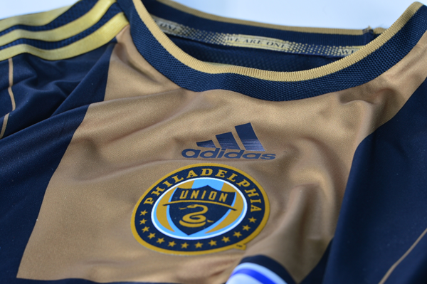
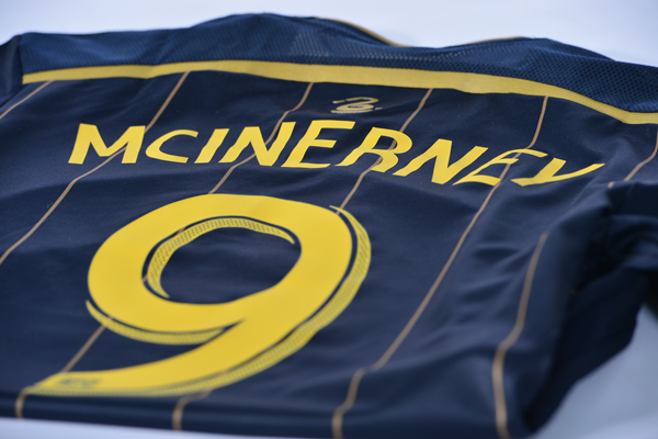
As every Philadelphia Union fan knows, MLS kits are on a two-year cycle, which means that the Union are due this season for new home kits. Following the success of the tremendously popular Bethlehem Steel-inspired third kit that was released in 2013, interest and expectation in the new designs is understandably high.
A reliable source has provided PSP with two images of what appears to be the Union’s new home jersey. The images are close-up shots and so don’t provide a complete sense of what the new home kit will look like. But, from what can be seen in the photos, the jersey features subtle gold pin stripes, gold name and number lettering, and a new collar design.
The new home kits will be officially unveiled at the Meet the Team event on March 4 (time and location to be determined). Pre-orders for authentic and replica versions of the new home kit are being taken at the Union online store now.
Union fans can look forward to new away kits in 2015.


Is it me or does the gold in the lettering and pin stripes look more yellow?
Yeah, there’s a distinct difference between the jersey’s gold accent and the number/letter color.
im in the biz….the jersey color is whats called “old gold” the lettering looks like “varsity gold”
same with the crest…they need to get that consistent. Also, too bad it looks like the BIMBO hasn’t changed or been toned down.
Eh … not bad at all, I think.
Those are so nice, can’t wait to get a Jack Mac or Mo jersey of this
No Bimbo?
I think there is a tiny smidgen of the Bimbo logo on the bottom there. If not, what else would be so giant and white?
Looks like you can see a bit of the standard Bimbo logo on the front jersey image. Jim – the number and lettering definitely looks yellow, though it seems like the pinstripes are gold. Overall, looks pretty good!
I like it overall. The pinstripes are cool looking. Not I favor of the gold letters or don’t. Also I really liked the old collars, this one seems to be that annoying material.
I definitely dig the pinstripes. I can see a navy buffer zone for the Bimbo logo, interesting, we’ll see how they integrated that I guess…
I like it! If it didn’t say Bimbo on it, I would buy 4 of them for the whole family. If it is Bimboed – we will stick with our original 2010 models.
I still don’t understand why “fans” of the team are still griping about the damn bimbo logo. Money is money.
“Oh but bimbo means something completely different.” I’ve never had a single person come up to me and say oh excuse me why do u have such a vulgar word on your shirt/jersey.
I’m not griping about the Bimbo logo – if they got a ton of cash for that deal, more power to them. I hope it was a lot and is being used well.
I’m just stating a fact: the members of my family do not want to wear an item of clothing that says BIMBO on it.
Not an opinion, a fact.
I think that’s a perfectly fair sentiment. I’ve actually had comments muttered behind me (by some old ladies) about wearing a “bimbo” shirt while food shopping with the jersey on. I get that Bimbo is a respected soccer sponsor, but the U has to understand what the word means here and that people are not always comfortable wearing it in public.
I assume they felt that the potential loss of some jersey sales was outweighed by the deal, and if so, fair play to them.
I’ll still be happy when it’s gone, though.
And yes, I am a “fan” – season ticket holder since the beginning (and will always be one as long as the money holds out).
We are still griping because it is still ugly. It’s not just the dumb word (although that is a huge factor). It also sticks out horribly on the blue/gold jerseys.
i agree here- i have a jersey and wear it and the multiple meanings of the word don’t bother me at all. i just wish it weren’t such an ugly logo that clashed so much with the shirt. a small part of the niceness of the third kit is the throwback logo isn’t nearly as jarring to look at
Well, if we’re going to let annecdotal evidence rule the roost… I’ve had at least a half-dozen people ask me why my daughter has the word “bimbo” on her shirt, and don’t I have an issue with a young girl identifying herself as such.
Looks good to me! I’ve been concerned with the move away from the signature blue and gold in recent team materials (season ticket holder scarves, for instance), so I’m glad to see that it looks we’re sticking behind our colors. Blue and gold feels Philly to me, and blue and white feels like, well, a million other generic places.
The lettering/number would probably look better as white instead of having multiple shades of gold on the jersey, but I still like it. It’s an improvement over the last one, which I wasn’t a big fan of.
im thinking the number/letter color is more like the gold surrounding the crest on the front. Prob just the photo. there is no way its a crew frenchs mustard yellow, that just wouldnt even make sense
The Union online shop lists the signal blue away shirts as 2012-14, whereas the new home shirts are 2014-15. Would seem that they will be bringing out new home/away shirts on alternating years.
.
http://www.philadelphiaunionstore.com/ProductDetails.asp?ProductCode=TT-AD7682A-SP4-HERO-EDU
The fact that last year’s home jersey is on sale for 50% off on the Union store site while last year’s away jersey is still listed at full price would back that up.
Per the new uniform contract between adidas and the mls, each teamwill have1 new kit ever year. So the union will only be getting a new primary kit this year, secondary will be next year and 3rd will be the year after.
I thought it was AT LEAST one new kit per year.
i like this idea, one per year is good
I’m not a big fan of the khaki (center stripe/pin stripes) and gold (player name & number/used in crest/3 stripes on sleeves) against each other. I think it should be one or the other, not both, and then use white or signal blue (the bright blue from the crest) for the player name and number. With all that being said I’m liking the pin stripes, and I guess if this is the final product it could be far worse.
I think the lettering/numbering matches up with the brighter shade of the Union crest, rather than the dusty gold of the jersey accents. Either way, I like the look of it!
my 2¢ on the Bimbo: it’s one of the few sponsor logos that don’t respect the color scheme and contrasts the look.
what was done with the 3rd kit was brilliant.
from the sneak in the lower right of that photo it appears it’s still a full color RW&B logo.
rest of league (dated): http://www.centerlinesoccer.com/wp-content/uploads/2012/01/AllMLSuniforms2012.jpg
like the pinstripes. never been a fan of the gold center panel.
as for buying merch, i’m 10x more likely to purchase items w/o the Bimbo.
ditto
I, for one, can’t wait until the Bimbo deal expires and the team signs with Qnet, the Cobra Group, or BurnLounge.
Unless you take it off yourself, you aren’t getting a new jersey without the “Bimbo” on it. That is literally the point of a shirt sponsor. It’s not that big a deal in my opinion. That said, I wouldn’t mind some integration of the word (like the 3rd kit did)… it does stick out like a sore thumb. But hey, if the new kit is nicer than the last one, I’ll buy it, regardless of the “Bimbo”
+1
I love wearing Bimbo jerseys.
My kids only wear the jersey on home game day. As far as new deal I don’t care so long as they get more money into the team. It could be DICKS sporting goods and I’d buy 4 for the family.
I love DICKS. In other news, it’s time to drop the mustard gold stripe down the middle, make the whole jersey navy blue, outline it in yellow or mustard gold, keep the pinstripes, and move the crest up to the left. It keeps the blue and gold color scheme, but tones down the contrasting yellows. You’re welcome, shirt designers.
i don’t mind the center crest though the 3rd kit has opened the door to left breast. that mustard gold down the middle is a legacy element i can do without. i think some of the more successful designs on the team’s kits and merch have used the gold sparingly, like in the adidas stripes.
Outside of the contrasting yellow gold/khaki gold my biggest problem is the collar. Why is “WE ARE ONE” stitched inside rather than “Jungite Aut Perite”? I want the tradition and the history associated with that phrase. We are One is a nice marketing gimic and I like the message, but the original phrase is so much better IMO.
If I remember correctly “We are one” was on the inside of the original collars, and dropped on the last home and away jersey. Its supposed to be the whole union of fans and players and only seen by those who wear the jersey kind of thing.
You remember correctly. Mine was shipped the first day they started shipping. My only complaint over the years was when they wore their gold shirts with the gold shorts that one time in Seattle – they looked like they were running around in waders.