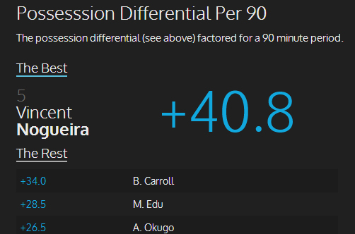
Dan Stover and Jim Prestifilippo present their infographic of Philadelphia Union player stats for March 2014’s games, kicking off the new season. For an interactive version of the infographic, click here.


Dan Stover and Jim Prestifilippo present their infographic of Philadelphia Union player stats for March 2014’s games, kicking off the new season. For an interactive version of the infographic, click here.
I feel bad for Noggy. He is clearly leaps and bounds above this team. Not just technically, but mentally as well. I wonder how long before he gets tired of putting up with the bums surrounding him.
Pretty sure he knew what he was getting into. It’s not like he would be surprised that MLS is still far behind Ligue 1 in terms of talent.
For the plus/minus graphic, how about the idea of setting the player’s name in the middle of the chart as “0”; positive goes up, negative goes down.
.
Love these charts! Glad to see them returning again this year.
Hey John, thanks for the suggestion. That was the idea behind the chart, to mimic last year’s infographics and have the negative plus/minus valued players extend down. However, the charting plugin being used does not support a negative Y-axis and therein lies the problem. So I either have to A) fix it so that it does or B) find another plugin that does what I want which might increase load time substantially, hindering the user experience. I’m toying with the idea of a horizontal display for next month’s.
Yeah, I thought the “just extend it down” idea was too simple.
.
So when you say “horizontal display” do you mean run the numbers along the X (bottom) axis and names on the Y (side)? If so… That would result in a longer but narrowed chart, since your X would have 5-6 values and your Y would have 14 (more if anoher player sees the field). The only issue I can think of with that sort of alignment would be if the chart was so long that readers couldn’t see the labels for the X axis. That can be mitigated by putting the labels at the top and bottom (if it’s possible), but there would still be a point where a certain number of players would take the labels off the page. That said, I keep my resolution pretty large because I have bad eyesight. And right now, the graph would fit vertically on my screen without any changes at all. Shrinking the thickness of the bar allows even more player names to fit along the Y axis – and I’d be surprised if you ever needed to fit more than 17-18 names on the Y this year.
.
So flipping the alignment would certainly work to let the negative numbers stand out better; but the “cost” would be more length.
Note to Hack: Purchase a French forward during the summer transfer window.
*cough* Hoppenot *cough*
Two things that jump out at me immediately:
1) Brian Carroll is a huge defensive asset to this team.
2) Vincent Nogueira’s ability to keep the ball and create offensively is rare, not only for this team, but this league – again, continues to be my preseason favorite for MVP.
The total number of passes by Nogueira is amazing…and to still complete over 80% is fantastic. Can we go to France and get a few more of him? I think I’m developing a man crush.
.
Seriously though…get those scouts over to France!!