With decision day looming, and the Union needing a result this weekend away at NYCFC to avoid finding themselves on New England’s side of the MLS Cup bracket, it’s a bit of a stressful time for those supporting the Union. For that reason, this edition of the change strip is stepping back from the stresses of MLS, and away from the U.S.all altogether. Today we’ll be jumping over to England, to look at some of the best shirts of the year from the often aesthetically-underappreciated lower divisions.
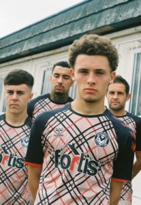
NEWPORT COUNTY THIRD KIT (EFL League 2)
Third division Newport County’s third shirt is an homage to comedy rap group Goldie Lookin Chain (GLC) and a throwback to the ‘04-’05 season when Newport County first unveiled a shirt inspired by the group.
The jersey, designed to mimic luxury fashion brand Burberry’s iconic tan, black, and red pattern, was intentionally chosen to reference GLC’s intentionally loud and luxurious style. The shirt also features “GLC” through the pattern’s intersection.
 (Courtesy of Soccerbible)
Initially so successful that the club sold out, the sale of the shirts is now halted as Burberry has threatened legal action due to the similarities between the shirt’s design and Burberry’s trademark pattern.
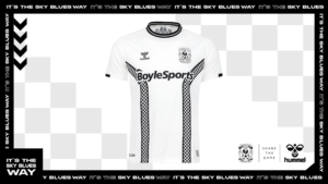
COVENTRY CITY UNVEIL NEW THIRD KIT (EFL Championship)
Coventry City’s third shirt is a class combination of the club’s history and the history of the city it calls home.
Combining the recognizable “tram track” design of Coventry shirts from the ’70s and the iconic checkerboard pattern associated with the 2 Tone musical genre, which originated in Coventry, the club’s third shirt serves as a perfect addition to their already impressive home and away options.
 (Courtesy of Coventry City)
Two distinct visual identities can rarely be married so seamlessly. Still, Coventry’s ability to do so has resulted in not only one of their best shirts of recent memory but one of the best shirts in Europe this season.
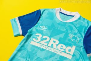
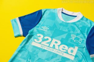
DERBY COUNTY AWAY (EFL Championship)
After two shirts dripping with history and references, Derby County’s away offering lacks some of the symbolism but none of the style.
Inspired by the colors of the sides 1988 away shirt, Derby’s ‘21-’22 away shirt is a bright “ice” blue, with a blocky geometric pattern across the chest. The majority dark blue selves serve to offset the brighter colors nicely, and the overly large cuffs of ice blue and white pull the design together well.
 (Courtesy of Footyheadlines)
In recent years, many clubs have opted to go with subtle geometric patterns, but many fail to hit the mark due to a lack of accents or other design elements. Derby’s use of cuffed sleeves and a tall white collar do tons in elevating what could be an uninspired design to one of the best looks of the season.
WREXHAM AWAY (National League)
If you’re an Eagles fan as well as a Union fan, you may have seen this one already. Wrexham’s away 2021-22 away shirt is a familiar, kelly green shade of green inspired by, well, the Philadelphia Eagles.
Late last year, it was announced that Ryan Reynolds and Always Sunny star Rob McElhenney had purchased Wrexham United. The duo announced that they had plans to take the club to the top flights of English Football and document the journey over the next several years.
 (courtesy of Wrexham)
The 2021-22 shirt is a nod to McElhenney’s hometown of Philly, and admittedly, some of Wrexham’s history, as seen in the throwback collar that subtly hides the “It’s always sunny…” text printed right at the top of the jersey’s back. Wrexham pairs their kelly green away shirt with silver shorts, and while this is admittedly a homer pick, the resulting combination is top-notch.
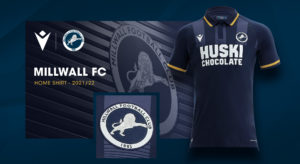
MILLWALL HOME SHIRT (EFL Championship)
Another shirt that lacks explicit symbolism but still shines, Millwalls’ home shirt for this year, is (excuse the cliche) a modern classic.
Dark navy with hints of gold and lighter blue, Millwall’s home shirt is the perfect embodiment of the historically tough side. The vertical chest level stripes and polo collar seem ripped from the ’80s in the best way possible, and the hits of gold provide the perfect touch of modernity and color to a no-nonsense design.
 (Courtesy of Macron)
While Millwall’s shirt won’t win any awards for innovation, there’s something to be said for a shirt that can so perfectly encapsulate a club’s mentality.

These are fun reads Tom. I really appreciate the time and effort you put into this. Its great to have a young person contributing a unique article to this great page! Keep up the great work!!